How to make your visualizations more accessible with good alternative descriptions
Add text-based screenreader descriptions to the visual aspect of your Flourish graphics
Data visualization is a powerful storytelling tool that transforms raw data into clear, visual narratives, helping us understand complex patterns and insights at a glance. But the true impact of data visualization lies not only in its aesthetic appeal or its ability to simplify complexity — it’s also about making information accessible to everyone.
Accessible visualizations ensure that data stories are not just heard but also felt by a wider audience, including those with visual impairments. By crafting thoughtful alternative descriptions and implementing accessible design principles, we create an inclusive space where data speaks to each individual with the same clarity and impact.
Accessibility in visualization is not an afterthought — it’s a critical component that enriches our understanding and brings a diverse audience into the dialogue. With Flourish, you can — and should — add screen reader descriptions to all your visualizations.
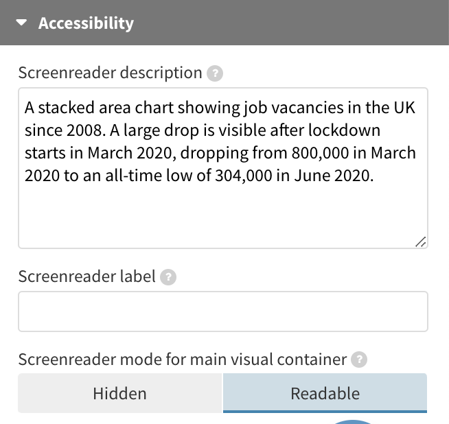
What a sighted user sees
What a screen reader sees
How screen reader descriptions in Flourish work
All our visualization templates come with built-in screen reader descriptions to offer a better alternative to the visual components. By default, titles, subtitles, and footers are already screen reader friendly. They’re read aloud either upon user interaction or when assistive technology navigates through a webpage featuring our embedded graphics.
If you set your main visualization container to be readable, screen readers will attempt to read the content inside it. Importantly, the screen reader description for the main visual container will always be read out before the content inside the container is accessed. Setting both a screen reader description and having a readable main visualization container might be a suitable option for text-based visuals like a Cards grid, or if the data points in your visualization are limited and well-labeled with adequate aria-labels and focus features. You can find a list of compatible templates that meet these criteria here.
Flourish offers functionality that enables a dual experience: a readable and keyboard-navigable main graphic along with screen reader descriptions. This gives you the flexibility to make your data points and axis labels accessible, while also providing a separate description that supplements the visual information.
We’ve enhanced the user experience further by incorporating additional aria attributes, refining how screen readers interpret Flourish visualizations.
With these features, you have more control over the accessibility of your visual content, ensuring it’s not just visually appealing but also universally accessible.
Under the hood, the text is added to the page as a hidden paragraph which becomes visible to screen readers via an aria-describedBy attribute on the main visual container, the contents of which gets an aria-hidden attribute.
We’ve also added a title attribute to the iframes that visualizations are embedded in, to differentiate their content as “visual or interactive content”.
How to write a good screen-reader description
Whether you’re designing for sighted or non-sighted users, the main title and subtitle should usually be descriptive, summarizing the main point of the graphic rather than just describing what data is being visualized. As your titles and subtitles in Flourish visualizations will always be read out by screen readers, it doesn’t make sense to repeat these in the screen reader description.
Instead, use the screen reader text to provide an alternative to the visual aspect of the graphic specifically. What type of chart is it? What aspects or values are the most important and stand out? Try and get in all the key details while keeping the message as short as possible.
Tip: Advancements in AI have greatly simplified this task. With OpenAI’s latest GPT-4 model (only available to ChatGPT Plus subscribers) you simply have to upload an image of your visualization and ChatGPT will supply you with an alternative description for your chart.
Lots more to do
Screen reader text is only one part of the accessibility picture. There’s lots more to consider, from text sizing and color contrast to keyboard navigability and giving access to the underlying data for non-visual exploration, as shown in the example above via a simple link in the footer. Read more on how we’re making Flourish visualizations more accessible in our blog.
We have a long way to go and as we work more in this areas we’d love to hear your suggestions and feedback. Feel free to get in touch via Twitter or hello@flourish.studio.