Choosing the right map type for your data
Looking to represent your geographical data on a map? This post will help you pick the most effective map type for your data
Plotting data geographically can help you understand and show your data findings in new and insightful ways. But choosing the right kind of map can be challenging. In this blog post, we’ll cover the most common map types, their strengths and weaknesses, how you can build them with Flourish, and some tips and tricks to improve your creations.
Be sure to bookmark this page as we’ll be updating the content in this blog with any new features and templates that get launched along the way!
But first, when should you use a map?
In a nutshell, maps are a good way to represent your data if some of the variables relate to geographical areas. For example, if you are working with data about wildfire incidents and you care to show whether they are becoming more common, then you’ll probably want to use a line chart. If, however, you want to show which areas are hit the most by the fires, then a map is the right choice since the position of the events is your point of focus.
Asking yourself the question “what do I want to show?” will help you find out if you need to dust off your cartographic skills for a specific project.
Choropleth maps
Arguably the most common type of map, choropleth maps convey information by shading regions in different colors. The hue can be determined by a category (which political party has won a local election) or by a number (percentage of arable land per state).
Choropleth maps are great for showing data at a quick glance – shading areas with darker or lighter areas can help the reader reach certain conclusions. However, they come with a downside too: larger areas on the map will bring more attention to themselves and smaller areas will get lost. There are several ways to help counter that and we’ll explore a couple later in this post.
Beware of using absolute numbers as this can be misleading because the figures don’t weight in factors like population or land extension. To avoid this pitfall, it’s a better practice to plot rates or per capita rates where possible.
This map shows how many people died of heart-related diseases in the US in 2020. At first glance, it seems as if California, Texas and Florida have the highest death toll, which might lead the viewer to think heart disease is an issue in these particular states, but…
… if we look at this map which shades the states based on population, we can see that the pattern is almost the same. Highly populated states have higher death rates, naturally. To bypass this…
… we can plot the rate of heart-related deaths per share of the population and discover that, actually, states like Mississippi and Alabama have a much higher rate than some of the larger states.
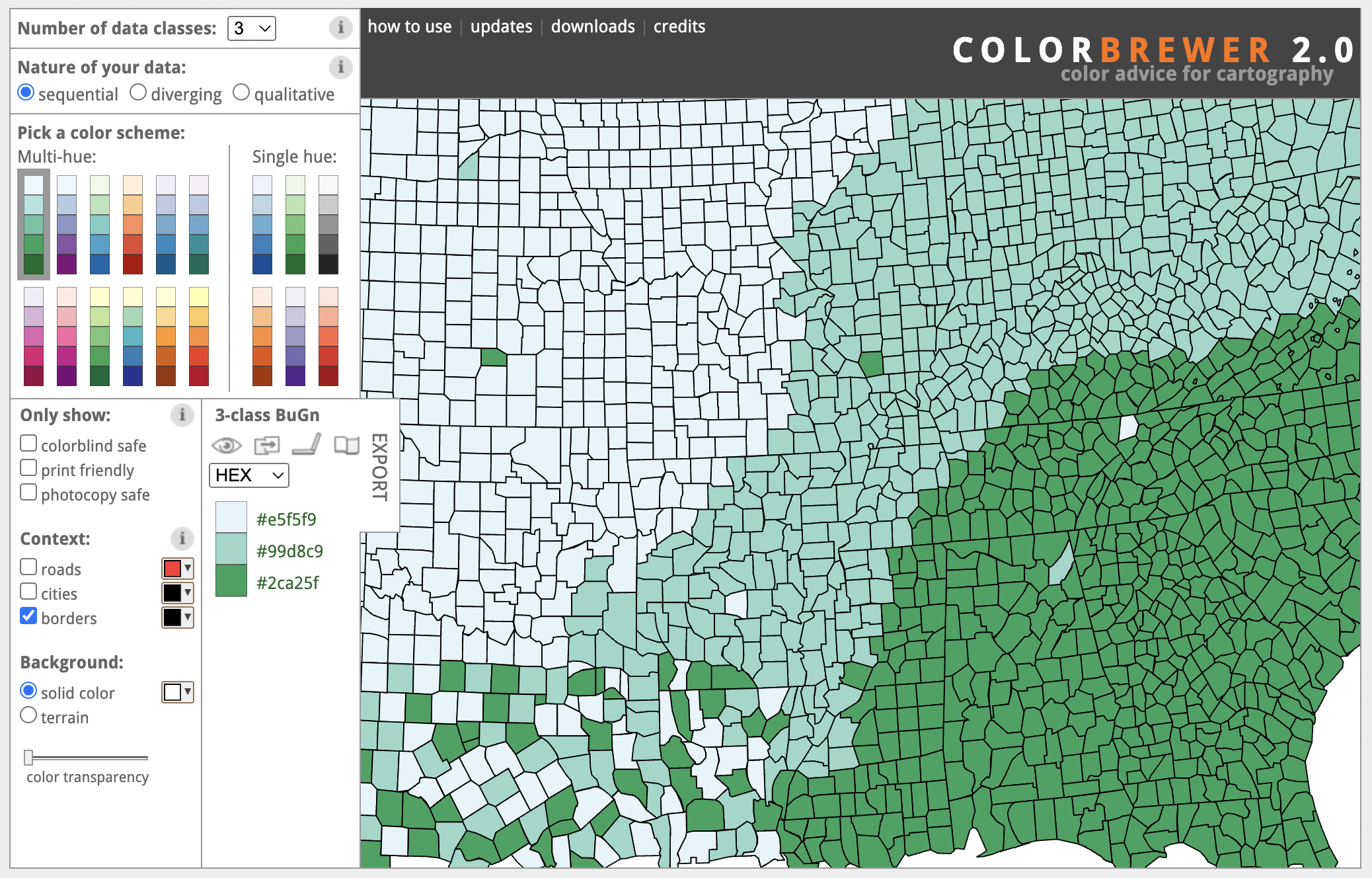
ColorBrewer is a free tool that generates color palettes optimized for maps
Color is very important in choropleth maps. Resort to general good practices: choose accessible hues, check contrast and saturation, and select appropriate colors for each topic. You can read our help doc on how to use and set different color scales in projection maps to learn more. A great free resource to generate map-specific color palettes is ColorBrewer, developed by Cynthia Brewer, Mark Harrower and The Pennsylvania State University.
You use the Projection Map or the 3D Map templates to build a choropleth map. The main difference is that 3D Maps can sustain bigger datasets and the street view provides a more powerful zoom capability, while projection maps are better for larger regions and specific countries.
Point maps
Point maps show information by positioning symbols on top of a specific space. It can be as wide as the world or as small as a single street. The main objective of point maps, generally, is to show the hidden patterns of the positioned elements. Scroll through the next example to understand this better.
Here’s a map showing all the trees in the London borough of Westminster. Every point is a single tree and by plotting their position, we can see which streets and areas are greener.
We can add another layer of information by coloring the points based on the type of tree. This allows us to discover hidden patterns and to reach simple conclusions, like which are the most common tree types in this borough. But, having too many categories can hide our findings.
In this final version, a color is assigned to the three most common tree types — Cherry, Pear and Plane— and a fallback color is applied to all the other types. This gives us a decluttered view of our data and a clear narrative.
You can build point maps in Flourish using the Projection Map template by adding data to the Points layer, or with the 3D Map template following similar steps. One variant to the traditional point map is the Marker Map template that uses images or symbols rather than simple shapes to mark locations.
Proportional symbol maps
This map type builds on all the principles of the point map but adds a second dimension: size. Here the symbols on top of the map are scaled based on a numeric value.
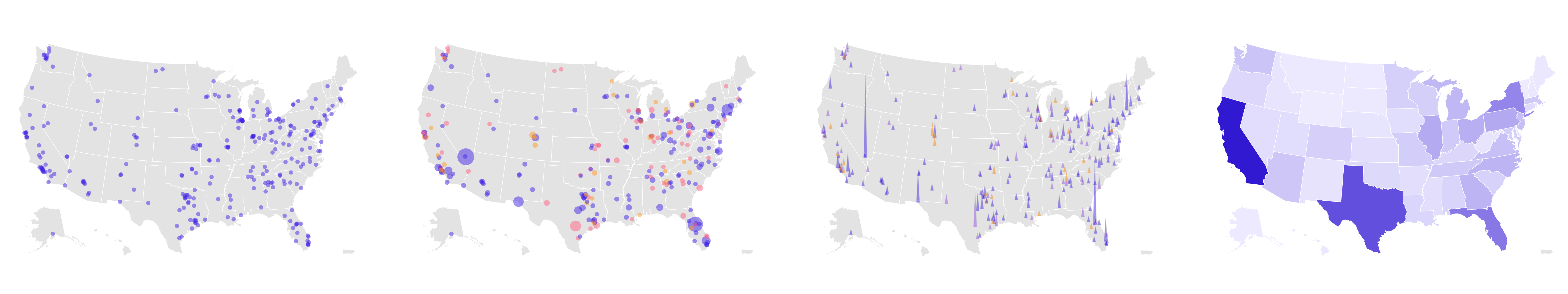
This map shows the location of all the mass shootings registered in the US between 2009 and 2023 so far. Every dot is an incident. In this view, you might be able to estimate which states have the most number of shootings — California, Texas, and Florida — but there isn't a clear narrative.
Sizing the dots based on the number of fatal victims in each shooting adds another layer of information to the map and tells a clearer story.
Adding color categories to the dots provides an even deeper view of the gun issue in America: while most incidents were carried out by non-prohibited shooters, over one hundred were carried out by prohibited shooters or in-review ones.
You can also swap the circles for spikes. This is a less cluttered view that allows us to distinguish each data point more easily.
Proportional symbol maps can show highly complex data thanks to the multiple variables we can encode in them. However, a well-known pitfall of this map type is the sizing of the symbols. For example, spikes are scaled only in height while circles grow in area. Both have many use cases, but when you’re selecting your symbol keep in mind that the human eye is not as good at understanding differences in areas as it is at perceiving changes in lengths or hues.
As with point maps, you can build proportional symbol maps in Flourish with the Projection Map or the 3D Map template.
Arrow maps
This map type is similar to the other proportional symbol maps, but it has an extra dimension: direction. Here, arrows are plotted on top of a region and their orientation will depend on the change in the data, meaning they are a good tool to show variation. Let’s look at an example to understand arrow maps better:
This map is showing the change in the electoral democracy index per country between 2000 and 2021.
Changes can be represented by negative or positive values, meaning a simple point map won't work in this case. Instead...
... an arrow map is the best way to show our data. The countries that improved their democracy index have blue arrows pointing to the right and those who did worse have red arrows pointing to the left.
The bigger the arrow, the bigger the change.
You may have seen maps like this as part of elections coverage. You can learn how to make your own here.
Heatmaps or isoline maps
Heatmaps are great tools to show density in geographical areas. They are a good alternative to point maps when the occurrences are so close to each other that they create clusters that would affect legibility, or when showing general trends rather than specific data points is the goal of the map.
This map shows Japan’s earthquakes from 1802 until present. The dots have been colored based on the intensity of the earthquake according to the Richter scale. Note how the dots stack on top of each other, preventing us from spotting any significant trends.
By switching the heatmap mode on and blending those dots together, we are able to see a clear pattern as to which areas of the country have been hit the most...
... but we're still able to explore individual events. Click on a cluster to see the details of each earthquake.
Adding a timeline expands on some of the findings in this data by revealing how some years and decades have been more intense in seismic activity than others.
You can build your own using the 3D Map template.
Line maps
So far, we’ve focused a lot on regions and symbols, but maps can also be used to showcase something as simple as a line. If you want to show routes, rivers, railways and speedways, or just connections between different points in a geographical context, then the line map is for you. We’ve delved deeper into how to use line maps in Flourish in another blog, so make sure you check it out.
Adding a line layer to an existing map can help you tell the story inside your data better. Look at this example:
This map shows the busiest train stations in Europe. Each black dot marks the capital of a country and the pink dots represent the stations. Their size is determined by how many people visit a station per year.
Now, see what happens if we add an extra layer plotting the railway system in the region.
Our map now has a lot more context! Now we can see how the railways web out of these major stations.
Germany gathers quite a few of these big stations.
A bunch of them are clustered near Berlin, the capital
and the same happens with Paris, which hosts the busiest station of all: the Gare du Nord. Expore others by clicking on the bubbles.
You can add line layers to your Projection Maps and 3D Maps in Flourish. Learn how here.
Arc maps
Arc maps are under the category of line maps as they convey information through the positioning, direction and thickness of lines on top of the geographic area. In the example below, the map is showcasing the number of asylum applications submitted by Afghans in 2021, the year of the US army’s withdrawal from Afghanistan.
The color of the line highlights the countries with most applications received and the thickness of the line maps the actual number.
One of the shortcomings of this map type is that the overlapping of the lines and the varying thicknesses can make it difficult to trace all the lines back to their origin. However, it is a great way to uncover underlying trends, like the fact that most applications were received in Europe, or that there were barely any in America.
Use the Arc Map template to build your own map.
Cartograms
Cartograms are maps that alter the geometry of the regions to plot represent data. A specific type of cartogram called equalized cartograms resize all the regions to be the same size and shape. Equalized cartograms that use the hexagon as their base shape are commonly called hex maps.
Hex maps are great ways to bypass some of the downsides of the choropleths maps, like the difference in the size of the regions. By creating a more abstract representation, hex maps bring all regions of a map to the same level of importance.
This is a choropleth map showing the results of the UK general election in 2019. By looking at it, the viewer may get the impression that the Conservative party had won overwhelmingly but…
… even though it amassed over 43% of the constituencies, Labour got over 30% of the votes and that is clearly more noticeable in the hex map.
The same occurs with the SNP's results (highlighted). Since Scotland has a considerable size, the first map inflates those results…
… when, in reality, the party won just 3.9% of the votes.
To get started, you can use one of our hex maps for US states, US electoral college seats, and UK constituencies in the Projection Map template. You can also use the UK constituencies starting point in the 3D Map template if you want to extrude your regions.
You can generate your own custom GeoJSON using online tools like the Hex cartogram builder developed by Open Innovations and upload it to one of the templates. Flourish Enterprise users also have a tile map option in the Data Explorer template.
Extrusion maps
Our final map type is, likely, the less common of the lot. Extrusion maps convey information primarily by adding a third dimension to the regions: height. In this map type the polygons of the regions are elevated to match a numeric value. Extrusion maps are another solution to some of the pitfalls of the choropleth map since the height of a region can compensate for their small size.
You can build your own extrusion map using the 3D Map template. We’ve written about how extruded regions can bring your data to a next level and briefly covered how you can also extrude custom shapes.
In this map of Spain, we’re shading regions by population density or how many people per square kilometer are there in a province. The map looks a bit off and too light in shade.
By zooming in, we discover that the enclaves of Ceuta and Melilla, two free ports and military bases, are outliers within the data with a very high population density. However, they are invisible in this map.
By extruding the regions based on population density and shading them based on actual population, we get a more realistic picture of the situation and we reveal a larger extent of the information in our data. Drag the map and see the data from different angles — literally!
Before you go…
Maps are an incredibly versatile tool to show your data but, as highlighted in this post, there are many aspects to consider to make sure the final result is as accurate and informative as possible.
Although not covered in here, projections are a crucial aspect of mapmaking. To learn more about them and to understand when you should use each one of them, visit our help page. There you can also find hundreds of articles and how-tos on all things mapping, including a doc about the technical differences between our various map templates.
Remember that you can also add your own custom regions to our projection maps. Check our GeoJSON respository to download dozens of files with boundaries from countries all over the world.