Ready, set, race! How to make a line chart race visualization without coding
The Line Chart Race template offers a dynamic perspective of your data, where every point tells a story
Our Line Chart Race template has been exceedingly popular since we introduced it back in 2019. Users around the globe have used it to visualize everything from sports data to political results to Game of Thrones characters.
Also called a horserace or a bump chart, the line chart race adds a cool feature – instead of the axes being fixed, you can turn on the “zoomed” view to keep the dots representing the competitors in the centre while the axes animate in the background. This adds the same kind of dynamism that makes bar chart races so popular – and it also helps when displaying a long time series on a narrow mobile screen.
With its versatile three play modes, the added flair of captions, and customizable filters to toggle between scores and ranks, it’s clear why this template has captured the imagination of so many. Dive into our blog to discover exactly how you can harness the full potential of this template!
Choose between three play modes: All, Zoomed, Reveal
The Line Chart Race template comes with three play modes:
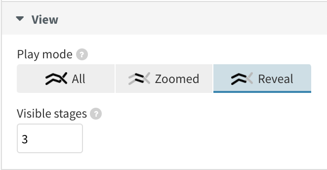
You can choose from 3 different view modes
- In All mode, the entire X axis is visible
- In Zoomed mode, the X axis is only visible for a specified amount of time slice – you can set the visible stages yourself
- In Reveal mode, the X axis is visible from the start until the current time slice
The last play mode can work nicely if you want to focus on the overall trend while keeping the competitors in focus. As your lines expand over time, the shape of your data gets put into context.
Customize with confidence: setting up dynamic axes
Similar to the Line, Bar, Pie template, you can customize the axes of your line chart race. On top of recognizing dates and being able to set how many ticks display on your axes, you can also flip your X axis to the bottom of your chart and configure everything from axis tick length to number formatting. You can learn more about editing axis ticks and labels in our help doc.
You can even adjust the Y axis to be dynamic, so the vertical scale updates as the race progresses. This feature is particularly useful for highlighting the differences between competitors rather than focusing on their absolute scores, which may be less clear with a moving axis.
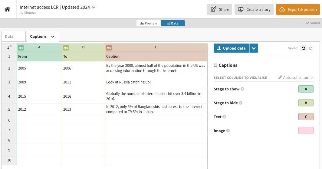
Add more context to your charts with captions
Just like its sister template, the Bar Chart Race, you have the ability to weave in a richer story with your line chart race by using timed captions that appear and disappear at different points along the animation. This allows you to explain key dates and events – you can even add images and GIFs!
To use captions, all you need to do is add a start and end time as well as some caption text and, optionally, an image to the Captions datasheet. Read more about this in our help doc.
Create your own Line Chart Race visualization
To dive deeper into our Line Chart Race template and explore all its capabilities, have a look at our overview help doc. Alternatively, check out the step-by-step tutorial below to see how you can craft your own engaging visualizations. Happy racing!