3 reasons why your charts need popups and panels
The Flourish tooltip and panel overlay features offer more flexibility to tell rich data stories
Ever find yourself trying to pack detailed information into your charts without making them look overcrowded? You’re not alone.
Charts are fantastic for offering a quick snapshot of data, but they often need to communicate deeper insights without overwhelming the viewer. This is where the magic of popups and panels comes in. These interactive tools not only enhance the user experience but also turn basic charts into powerful storytelling devices.
But before we dive into the benefits of incorporating popups and panels into your charts, let’s define what these tools are.
Understanding popups and panels
A popup, or a tooltip, is a small window that appears when you hover over or click on a data point in a chart. It typically displays more detailed information about that data point, such as exact figures, percentages, or brief descriptions.
A panel, on the other hand, is a fixed or floating sidebar that provides additional context or data related to the overall chart or selected elements within it. Panels often include longer text, links, images, or even smaller charts!
These tools are designed to enhance the user’s understanding without cluttering the visual space of the primary data display. With that in mind, let’s explore why popups and panels are such effective additions to your charts.
Why your charts should include popups and panels
From improving user engagement to providing additional context, tooltips and panels serve a critical role in making your charts more effective and user-friendly.
1. Enhance information detail
By incorporating popups and panels, you can provide additional, detailed information without overcrowding the main view of your chart. This feature aids users in delving deeper into the data points that interest them, accessible with a simple click or hover.
In Flourish, you have the option to make tooltips “sticky,” which means they appear automatically when the chart loads. To set this up, just add your visualization to a Flourish story, click on a specific popup, and there you have it – your tooltip will now stay visible without needing a hover or click to activate it!
Disable the navigation to make a single-slide Flourish story
2. Maximize space efficiency
Using popups and panels helps keep your charts tidy and easy to navigate, which is particularly useful in complex visualizations where too many labels and details might make things messy. Plus, it makes for a smoother experience on mobile, where fitting in a lot of information can be a real challenge.
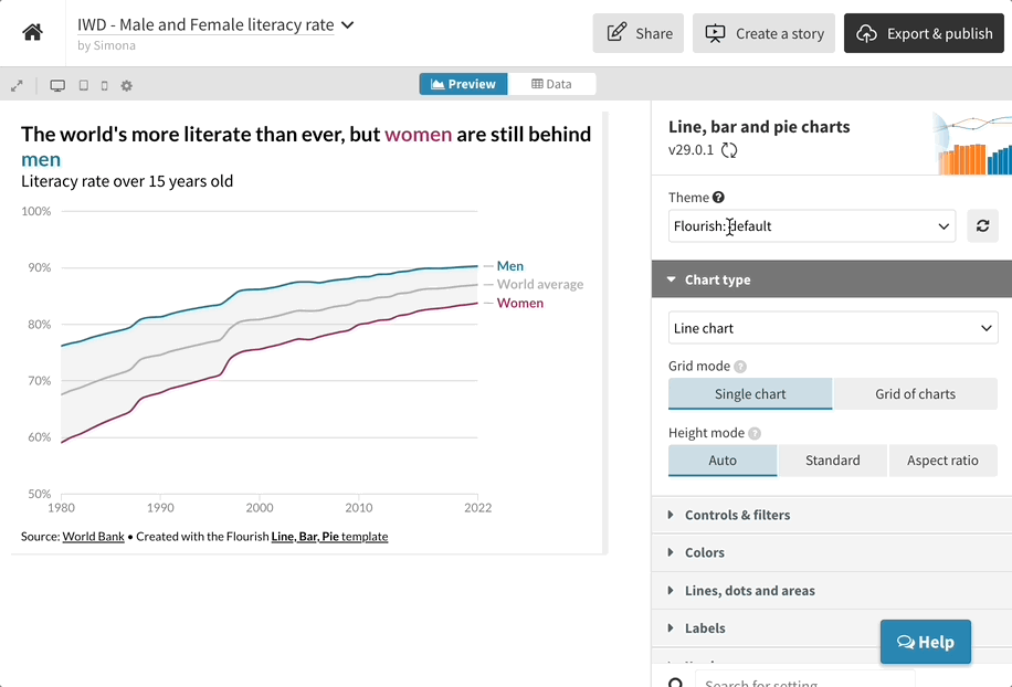
Popup panels are also handy when you can’t visually encode all of your data and other information within the same visualization. When panels are enabled in a Flourish chart, you can choose from 5 different layout options, configure height, width and styles, and set how and when they should appear.
In our example below, we’ve configured the panels to always show on the right-hand side. To learn more about the settings available, head over to our help doc.
3. Boost user engagement
Interactive elements like popups and panels actively engage users by allowing them to interact directly with the data. This interaction keeps users interested and encourages them to explore the data more thoroughly.
In addition, incorporating popups, panels, and other interactive features really takes your data storytelling a step further. By integrating both tooltips and panels, your charts not only presents the raw numbers but also offers a rich, layered exploration of the data.
The tooltips offer specific, detailed data when users seek it, while the panels maintain a narrative that supports broader understanding and strategic insights. This approach keeps the chart clean and uncluttered while also making the insights more digestible.
How to add popups and panels to your Flourish charts
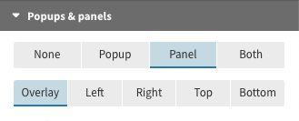
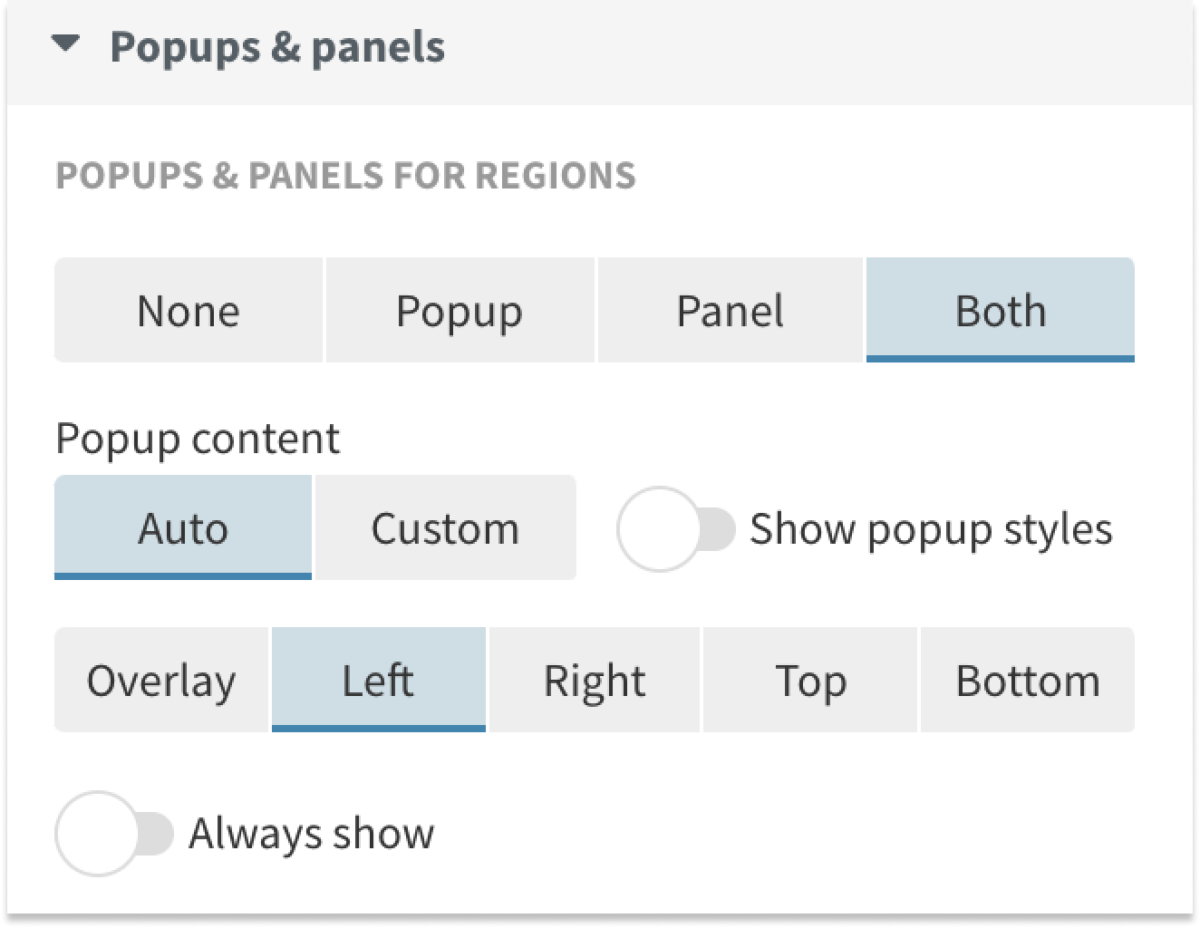
To include popups or panels (or both!) in your visualization, head to the Popups settings in the Flourish editor. You can choose between 4 different options.
- None: No popups and panels will display
- Popup: Popups will display on hover and “lock” on click
- Panel: Panels will display on click
- Both: Popups will display on hover and panels will display on click
When using “Both”, the popup will display “Click to see more” by default, but you can change this to whatever you like.
For more customized results in your popups and panels, switch to custom content mode in the settings. This lets you rearrange content, add images, links, or HTML. You can also pull in dynamic content from your data using curly brackets around your column name – see this help doc for more info.
Ready to take your data visualizations to the next level? With Flourish, it’s easy to integrate popups and panels, bringing depth and engagement to your data storytelling – try it out yourself!