New! Tools to help you use color effectively in your visualizations
Introducing the new Palette menu and other tools to give you full control over colors in your Flourish visualizations
Getting color right in charts can be difficult. At Flourish we’ve been working hard on trying to make it easier for you, the Flourish user, to create and edit palettes so that you can pick the colors you want and use them across templates. (And if you don’t want to think about this complex issue too hard, we’ve got options for you there too!)
In this post I’ll focus on some new features we’ve added recently to help you construct categorical (aka qualitative) color schemes. As the name suggests, they’re for data that naturally falls into categorical groups, rather than a numeric scale.
Ready-made color schemes: the new Palette menu
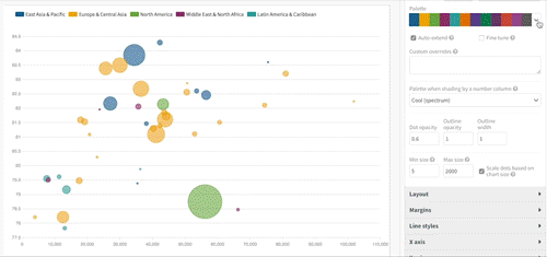
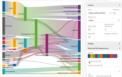
The most significant change we’ve added is the visual Palette menu. You can see this now in the Sankey Diagram template, and it’s coming soon to most Flourish templates.
This new menu makes it easy to choose from a range of predefined color palettes, using a dropdown menu. Choose any palette to try those colors in your visualization.
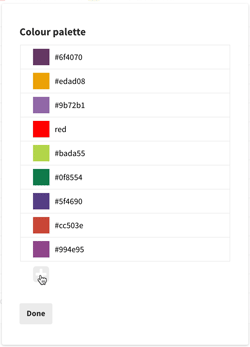
How can I add/delete/edit colors in a palette?
But you don’t have to stick with one of our palettes - you can customize them too!
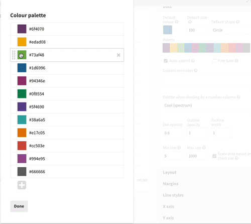
At the bottom of the palette dropdown is the “Edit color palette” option. This brings up a new dialogue showing all the colors in your current palette. You can…
- Change the order of colors by dragging and dropping;
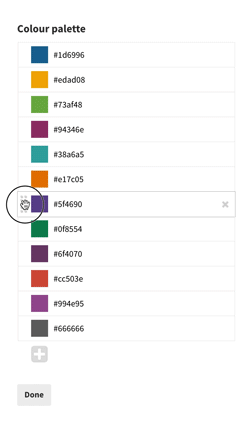
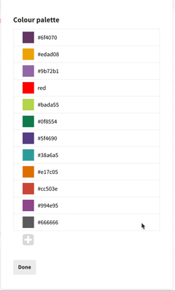
- Edit colors by either clicking on a swatch and using the color picker menu that appears, or typing in a new color name or code;
- Delete colors using the cross on the right hand side;
- Add colors by clicking the plus button and then editing the new addition, in the same way as 2) above.
What if my palette doesn’t have enough colors?
But, you ask, what if your visualization has more lines/nodes/series than there are colors in the palette?
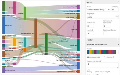
We’ve thought of this too. Below the Palette dropdown you’ll usually see an “Auto-extend” checkbox. If this box is not checked, Flourish will loop round and re-use colors from the start of the palette.
If this box is checked, then Flourish will automagically generate more colors, designed to work nicely with your existing palette. Like this:
This is by no means a perfected science, so results may vary. It will probably work best if your chosen palette consists of a set of colors of moderate saturation.
How does it work? Well that’s worthy of a blog post of its own so I’ll be writing one soon. In that post you will also find out what lies behind the mysterious “Fine tune” check box. Be warned, it’s definitely one for geeks 🤓.
How do I assign specific colors to specific elements in my visualization?
It’s also quite common to want to use specific colors for specific elements in your visualization. For example, in your Sankey diagram, you might be showing political parties, each of which has a well-known color.
We’ve thought of this too. To set specific colors for specific elements, use the “custom overrides” text box in our palette menu.
In this box you just type in the name of the thing (series, group, node etc, depending on context) you want to set the color of, add a colon (:) and then type the color you want.
Use a new line for each element you want to customize.
How do I use my company’s brand colors in all my visualizations?
The above is all well and good, but it’s a pain to edit color palettes in each individual visualization: what if you want to make all your projects consistent with a company color scheme?
This is something we’re now working on as part of our Business plan. Users with this plan have custom company palettes, as well as custom fonts and layouts. Get in touch to learn about our Business plans.
That’s all for now, until my geeky post on color generation: as always, please get in touch at support@flourish.studio if we can help with anything.