Make explorable and animated charts with our new filters and controls
The Line, Bar, Pie template now offers a range of new ways to make charts your readers can search, explore or play through time
Adding inline menus, buttons or sliders to your visualizations can be great for letting your viewers explore a rich dataset. Controls are also handy for Flourish stories: just click a filter or drag a time slider to capture a particular view of your data in a slide.
Lots of users have asked for more features of this sort, so we just launched new control options in our widely used Line, Bar, Pie template. This post gives some examples of the kinds of things you can do with these new features. Each example below is made from a single table of data.
Charts with search or compare
The story below contains a few charts made from the Our World In Data COVID dataset, pulled in via our Live CSV connector. As you can see, it’s now possible to expose user-facing filters for series (i.e. data columns, which in this example represent countries) and for subsets of rows by using the “Row filter” column setting (which in this case contain different metrics). There’s also an optional log/linear switch for the y axis.
As the story shows, for series and rows you can choose from single-select controls (dropdowns, button groups, etc) or a clickable legend. For series, there’s also a searchable multi-filter, as shown in the first slide.
Charts for browsing categories and sub-sets
All the same options are also available for grouped, stacked or simple bar charts, pie charts and even for “small multiples” chart grids. The example below showing Anthony Bourdain’s travels combines a clickable multi-filter on the legend to hide and show regions (columns in the data) with a dropdown to show different seasons (groups of rows).
Playing through time and “racing” charts
If your data has a time element, you could consider adding a slider to let the viewer “play through time”. For some types of bar charts, this was already possible (with extra bells and whistles such as images) in our more specialised Bar Chart Race template. However, that only supports a single series and positive numbers. The new controls in Line, Bar, Pie open the door to racing-style charts with negative, stacked or proportional bars. Or indeed racing donut charts …
You can even add a time slider to a line chart to show how the shape of a line has changed between days, months or years. Here’s an example inspired by the FT’s Alan Smith: a playable line chart showing the yield curve for UK bonds over the last 20 years.
Getting started
To add a filter first open the template. Then:
- To add series filter, make sure you have multiple value columns selected and then switch on the filter in the “Controls & filters” settings panel.
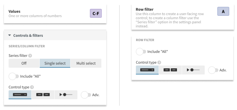
Adding filters by column (left) and row (right)
To filter by row, you’ll need to set the optional “Row filter” column. The relevant settings will then show up in “Controls & filters”.
To filter by the current legend, just click the option in the Legend settings panel. Note however, that legend filtering isn’t possible if it would clash with a series or row filter.
Tips and tricks
- Animation with filtering can work in different ways, so if you aren’t getting the effect you expect, experiment with the settings under Animations. These determine whether the template should, for example, attempt to animate across columns or rows. In many cases you’ll want the previous bars or lines to morph into the new ones, but in other cases not.
- In some cases you may want to reduce the colour palette to a single colour (and turn off “Auto extend”) to avoid the data changing colour as you play through time.
- You can set the speed of the auto-play on a time slider under the Advanced settings for the control in question. But if you speed this up, make sure you also speed up the overall update animation for the chart, to avoid the time slider moving on before the current animation has finished.