15 ways to visualize US elections data
Master every stage of election reporting with our guide to visualizing US election data: from predictions to post-vote insights
During election season, readers expect more than just good writing. They also want exceptional visual reporting – which, however, often requires a lot of time and resources.
That’s where Flourish comes in! We’ve curated a range of visualizations, primarily showcasing US elections and some from the European Parliament. However, these adaptable templates can be used for any global election coverage, helping you enhance your reports and engage your audience effectively.
Show the number of seats owned by each party with a parliament chart
The first question any newsroom has to answer is: Who won? While there are different ways to provide this information, one of the most straightforward is to use a parliament chart.
Parliament charts use a simple color-coding system to represent different parties or groups and show the relative strength of each one. By looking at the number of circles in each color, we can quickly compare the distribution of seats held by each political party.
In Flourish, you can also add filter controls that allow readers to view distribution from previous elections. By switching between 2023 and 2020 in the example above, readers can easily see historical differences.
The best thing about Flourish Parliament charts? They are incredibly simple to make – all you need is a dataset with parties and their seat numbers. Take a look at our blog post to learn how to create one!
Visualize seat majority with an Election Results Chart
The stacked Election Results Chart is a great tool to help people understand the outcomes of elections clearly and concisely. The visualization shows the number of seats won by each party, with the colors indicating which party the seats belong to.
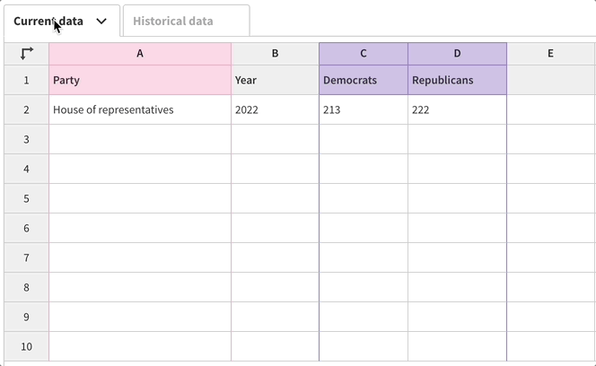
To determine which party gained or lost seats in the latest election cycle, you can provide more information in the Historical Data tab, and the template will automatically calculate the difference.
Another great thing about this chart type is that, unlike the Parliament Chart, the Election Results Chart allows you to add results by subcategory, which you can toggle between using the dropdown menu.
In the example below, you can see the results for the whole of the European Parliament, as well as each of the individual EU countries. The dropdown is a great way to slice the results by any number of interesting factors – things like state, constituency, gender, age, or race.
Map elections in multiple ways
Another way to visually inform your readers about the results of any election is to display them geographically. Instead of just showing who won, you’ll also be telling your readers where they won, adding another level of depth to their understanding.
There are multiple different ways in which you can map the elections – for example, by using a state or county map, or by creating a hex map instead. Whether you want to display county-level vote shares, margin of victory, or even percent of turnover, Flourish maps can showcase any data you choose.
Hex maps
Hex maps are a form of cartogram, meaning that the geography is adjusted so that regions of equal importance – e.g. by population or electoral significance – take up the same area on the map. In the case of a hex map, each region is represented as one or more hexagons.
One benefit of using hex maps is that by standardizing the shape and size of each state, we can show state-level results while countering the visual imbalance created between the significantly larger Western states and the smaller but more populous Eastern ones.
Showing state-level results doesn’t tell the whole story, however, since different states have different numbers of electoral college votes. For a richer visualization, you can choose our Electoral college hex map starting point instead, where each state has hexagons that represent its individual electoral votes.
Traditional political maps
In addition to hex maps, you may also want to make use of our geographically common starting points for US states, counties or congressional districts, all of which you’ll find in the template chooser.
As with almost all Flourish templates, it’s easy to customize the popups with images and styling. As the example above shows, you can even create charts in the popups by using columns from your data sheet! Head over to our help doc to grab the custom HTML code you’ll need.
Swing arrow maps
Swing is a popular election variable to visualize on a map. It shows the extent of change in voter support, typically from one election to another, expressed as a positive or negative percentage.
However, swing arrow maps alone may not provide all the context a reader needs, as a swing towards one party doesn’t necessarily mean that party won the area; it just means they improved compared to the previous measurement.
Regardless, by understanding the direction, length, and color of the arrows, you can quickly grasp the trends and shifts in a given region. Read our help doc to learn how to create your own arrow map.
Looking for UK map examples? Check out our blog on visualizing UK political shifts and elections.
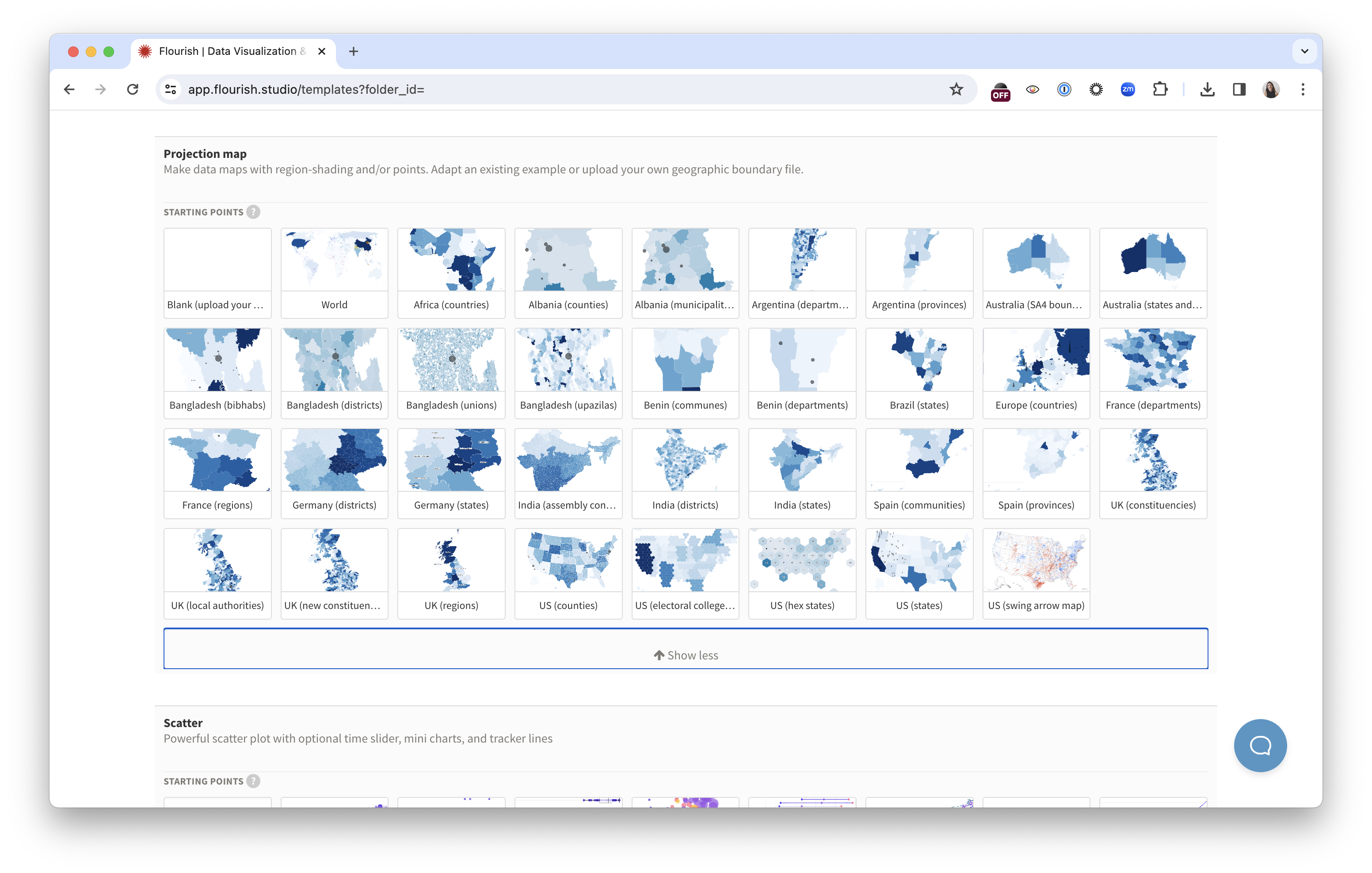
You can find starting points for all examples above in the Flourish template chooser.
Give context to the numbers with an animated Gauge
The “needle” has become a popular feature of the New York Times’ election coverage, providing real-time updates on the probability of each candidate winning the election. It works by analyzing early voting results and making projections based on historical data and current trends.
And as Vox put it some time ago, “The [NYT] election needle is a way to fill in the dead air of election night with science instead of punditry.”
Today, the gauge is often seen in political forecast ratings and predictions, such as in Politico’s forecast across every political district in 2022. And with our free Gauge template, you can quickly create your own needle visualization.
Explain complex political groups with a treemap
Some of the most important pre- and post-election reporting involves explaining the unique characteristics of different electoral systems. Creating graphics is often the simplest way to do that explanation, and Flourish has a lot of templates that can help.
To take an example from the European Parliament: one of the most confusing things about the EU Parliament (and one of the most difficult things to explain to readers) is how each of the national parties fit into each of the larger, EU-wide political party groups. In anticipation of that difficulty, we’ve made a Hierarchy chart showing every national party and its corresponding grouping.
Show the how and why of the elections with bar charts and scatter plots
The elections don’t just end on election night – in fact, post-election analysis is also a major part of any election coverage. In the aftermath of the election, readers don’t just want to know who won or what happened, but how it happened and what are some other outcomes of the vote.
Flourish’s more basic templates are an easy way to provide readers with analysis visually and quickly. In addition to showing the relationship between two main variables — in this example, the median income of each US congressional district and the share of votes cast in that district for Joe Biden in 2020, our Scatter template also enables you to visualize secondary variables, such as dot color and size.
In the example above, we’ve used a stacked column chart to visualize the record number of women voted into Congress since the last US election. By creating a Flourish story, we can simultaneously show both the number of women serving in the House and Senate, and the percentage of seats they take in comparison to male representatives.
And if you’d like to go for a more infographic representation of your analysis, you can choose our Pictogram template which allows you to visualize any stats with custom icons.
Animate the political race with racing bar and line charts
There’s no denying that there is something compelling about racing charts. Whether it’s the competition aspect that tickles our curiosity or the animation that keeps us glued to the screen, these visualizations are both entertaining and versatile.
They also work really well in elections context – in fact, bar chart and line chart races are particularly good for visualizing the polling of volatile races, because the animation gives you an almost physical sense of the contest — the peaks, the troughs, and the changes in position.
For instance, on the day after the election, in a piece breaking down how a certain race turned out, a Line Chart Race (also known as a Horserace chart) can also provide a bit of recall, reminding readers of the narrative turns they may have forgotten.
To see more examples of visualizing polling intentions, check out our blog post.
Give the readers a chance to explore the data with a Survey visualization
In the end, giving readers a simple way to explore election data themselves can be an effective form of journalism. With our Survey template, you can import election outcomes so that readers can sort, color, filter, and interrogate the data with minimal interference from you.
You can add any relevant information you’d like readers to sort by – from party association to demographic information such as age, gender, education, and others. Meanwhile, if you’d like to focus on a specific aspect of your dataset, you can create a Survey story that walks the reader through your dataset – as we did in the example above.
Alternatively, use our Table template to build a searchable database of representatives.
Updating Flourish visualizations on election night
One of the best things about using Flourish to cover an election is that it allows you to update visualizations in real time. There are two different ways to do this:
- Update the data in Flourish and automatically republish your charts
- Use our Flourish API for live data
The first option can be achieved by using our premium Live CSV feature – you can pull data from a remote source and republish graphics automatically when the data changes. This significantly simplifies the updating process – read more in our blog post.
The second option requires having a developer who can connect a Flourish visualization to a live data source using the Flourish API. The difference between the API and editor-built charts is that the API allows you to compose and manipulate these components entirely programmatically.
Interested in any of those options? Reach out to our sales team to elevate your website with engaging narratives.
Looking for more election coverage?
We hope these examples inspire your elections coverage and help you communicate your data in a meaningful and insightful way. To learn how to make some of these charts yourself, watch our webinar “How to effectively visualize elections data” on our YouTube channel.