Masters series: Maarten Lambrechts' connected scatter plot
Our series celebrates great visualizers and helps Flourish users follow in their tracks
The Flourish team spends a lot of time admiring work by the best visualization practitioners. And so do our users. When a cool visualization goes viral, we often get asked: “Can I do that in Flourish?”. Hence this blog series, which celebrates popular visualizations and looks at how you can achieve similar things in Flourish.
Following on from our first installment, featuring John Burn-Murdoch’s step-by-step line chart, this time we are looking at a sequence of charts created a few months ago by data journalist and designer Maarten Lambrechts.
The “main” chart is a connected scatter plot with logarithmic axes showing the relationship between COVID hospitalizations and deaths in Belgium. To get there, Maarten starts with a simple line chart and progresses step by step, in the process helping to explain how a connected scatter works and what it can reveal.
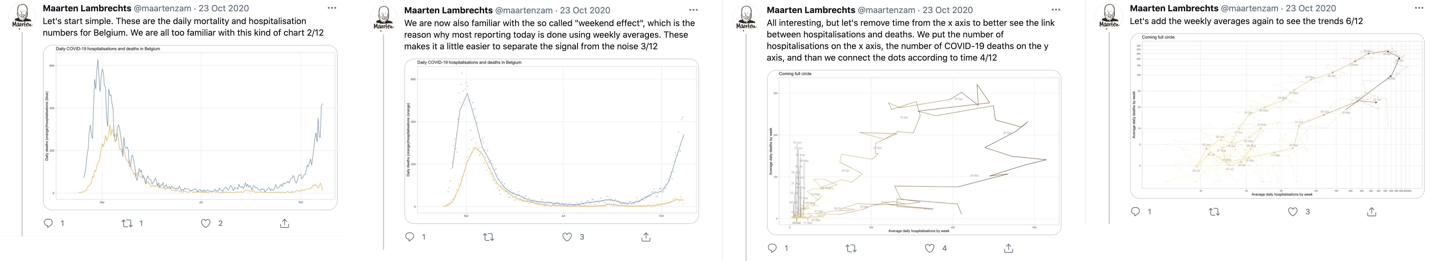
In his Twitter thread, Maarten walks through the steps to create a connected scatter plot from a line chart starting point.
Explained a COVID-19 chart I thought I had seen somewhere to someone, then couldn't find it. Decided to make it with Belgian data, and gasped when it rendered. More details later pic.twitter.com/6gX0plSMaI
— Maarten Lambrechts (@maartenzam) October 21, 2020
Inspired by Maarten, we made a similar step-by-step chart story in Flourish, based on equivalent data from the UK. Let’s take a look at the result before talking to Maarten about why he approached this data in this way.
COVID-19 data like this is typically shown on line charts, where the vertical axis is quantitative metric and the horizontal axis is time.
Even when placed on the same chart, it can be difficult to compare the trends over time.
Let’s first remove the lines to show the raw data points. Currently for each week, we have two dots: one for each metric. Now let’s try combining each pair.
In this scatter plot view, each dot represents both metrics: hospitalizations on the x axis and deaths on the y axis. But we’ve lost the time dimension.
We can add time back in by drawing a line between the dots chronologically. This is called a connected scatter plot.
The distinctive loop shape revealed means something specific on a connected scatter: it happens when one of the variables plotted rises and falls, and the other follows after a delay.
In this case, we first see a rise in hospitalizations before the chart loops back as deaths peak about a week later.
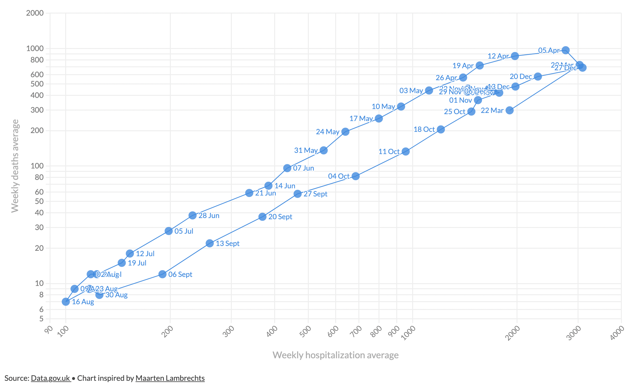
With COVID-19 data the loops help us identify waves of the virus. In the UK, the same level of hospitalizations was seen on 22nd March and the week of 12th April. But in April as we are moving down the chart, there are far more deaths.
This type of chart also helps us identify when we return to the same position we have been previously. The UK had the same level of hospitalizations and deaths by the 27th December as it did back at the end of March. And from there things only got worse…
Adding on the latest data from 2021, we can see the third wave of the pandemic in the UK that saw higher hospitalizations and deaths than ever before.
Maarten kindly answered some questions about his visualization for this post.
Why did you choose this approach for this data?
I was interested to see the relationship between COVID-19 hospitalizations and deaths, but in most cases these are represented as two side by side line charts. I know that connected scatterplots can show the relationship between two variables over time better than line charts, so that’s why I tried this chart type on the Belgian COVID-19 numbers.
I applied two transformations to the raw daily numbers: to remove some of the noise, I calculated 7-day weekly averages. And both the x and y scales are logarithmic, because that fits the exponential nature of the spread of the virus.
Anything you were particularly pleased with?
When I rendered the first version of the chart, somewhere in the second half of October, I was just baffled. The line made a perfect loop and at that time we were at the exact same spot on the chart as where we were when Belgium went into lockdown in March. Of course I could have noticed that on the traditional line chart too, but the loop really made me think about how we could have been so stupid to run into the same trap, after all we learned about the virus. It was also clear to me that we were heading for a new lockdown, which came one week later.
The chart also showed very well how deaths follow hospitalizations with some delay. That’s how connected scatterplots show how one variable follows another with a delay: then you see loops. On the current version of the chart, you can see that the loop of the second wave was wider, but lower, which means that we had higher hospitalizations but less deaths. The last couple of weeks the numbers have been plateauing. On a connected scatterplot, that means that the curve doesn’t move much, and stays more or less at the same spot. So there are a lot of takeaways from the chart. For connected scatterplots you need data that fits the chart type, and in this case it worked very well, I think.
Anything you’d do differently next time?
The chart was put together quite quickly, I didn’t spend much time on the design of it. As a result, there are some overlapping labels, the colors are not ideal and the font is probably a bit small for Twitter, where I published it. So I should have spent a little more time on the design, I think. Afterwards some people did their own version of the chart, and those looked a lot better :)
Some also made animated versions, which also work quite well. With some more time, I would’ve loved to have turned it into an animation.
How to make something like this in Flourish
To attempt this technique in Flourish, we wanted to find a similar dataset for our connected scatter plot. For a similar structure, we found comparable UK data from Data.gov.uk.
Creating this type of chart in Flourish first involves making a simple scatter plot, before connecting dots with a line and adding extra customizations.
Step 1: Setting up the basics
- Create a new visualization with the Scatter template and upload your data in the data tab.
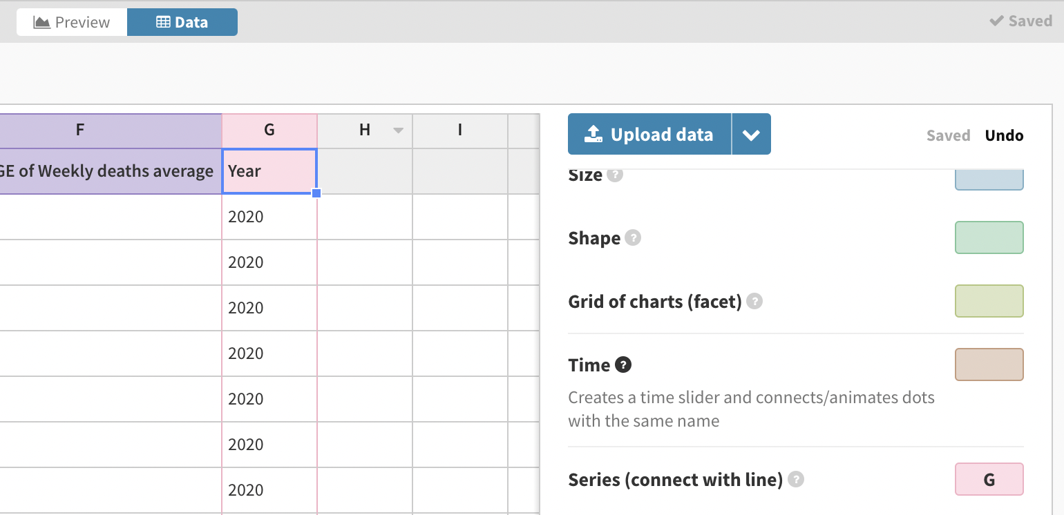
- Select the columns you want to visualize for your X and Y axes, as well as the labels and a series in your data to connect the lines together. If you want all dots connected, you just need a column with a single value in, such as the Year column in this example.
This is what our visualization looks like so far:
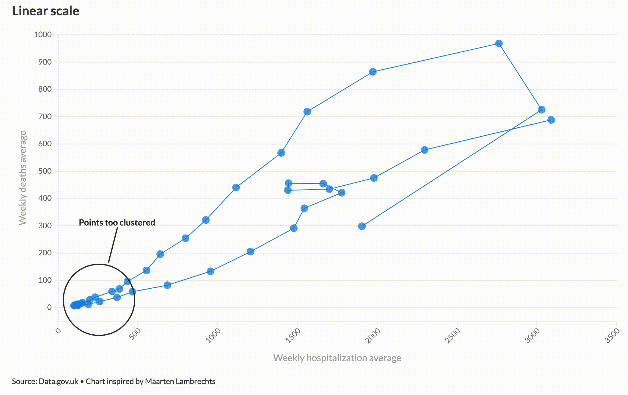
- On a linear scale, the data is clustered in the bottom left corner, but a logarithmic scale on both axes spreads the data out, allowing us to get a better view. Read more about log scales here.
To change your scales in Flourish, go to the X axis or Y axis settings, find Scale, and switch from Linear to Log.
- In the same settings panel, adjust the max and min values on each axes to reduce blank space, and add gridlines to make your chart more readable.
Step 2: Customizing the connected scatter plot
- Add date labels to your points by going to Dot labels and turning on Show labels on points. This will create labels based on the data column you bound to Name. You may also want to position the labels next to the points using the Offset setting.
Under Dot styles you can customize how your points look, including their shape, size, opacity and outline – we opted for circles at size 30 with no outline.
To match Maarten’s visualization, change the font size of the labels and add a column binding for Color to shade dots by a numeric variable. We are colouring by average weekly hospitalizations.
Extra features
We created a story with different slides to create the transitions from the line charts and to “zoom” into the loop at the top of the chart. To achieve the zoom, we simply duplicated the visualization and adjusted the minimum and maximum values on the X and Y axes.
We also added annotations on later slides to highlight some of the useful features of the connected scatter plot that Maarten pointed out in his Twitter thread. To add an annotation in any slide just click the pen icon in the story editor.
We brought our story to life in this post using our no-code scrollytelling tool, which is available to our Enterprise and Publisher customers. Get in touch with our sales team if you’re interesting in getting scrollytelling on your own site.
We would love to see anything you make with this kind of technique, so if you try something along these lines, let us know via Twitter. And don’t forget that whenever you make a visualization that was inspired by someone else, it’s important to credit that person or team. Imitation can be the best form a flattery – but only where it’s properly acknowledged.
Seen a brilliant visualization you’d like to see in this series? Let us know!