How to make interactive waterfall charts
Our new chart mode lets you easily create online waterfall charts with a splash of magic
With summer in full swing here in the UK, we love a chart type that allows us to metaphorically take the plunge. So, what better time could there be to add a waterfall mode to our our Line, Bar, Pie template?
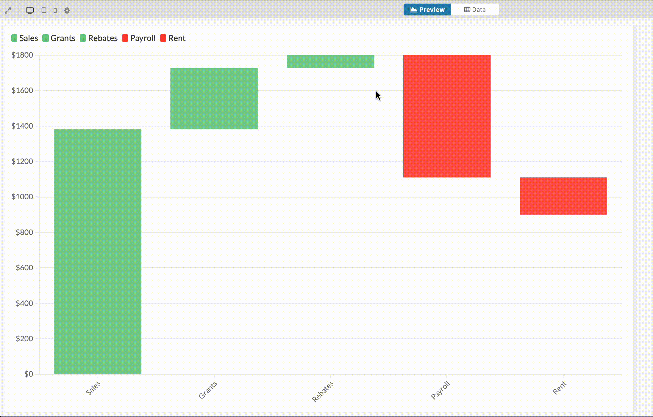
Despite its name, the waterfall chart isn’t used to visualize cascading rapids and gushing chutes. A variation on the column chart, it is useful for showing the cumulation of positive and negative values across time or categories.
Sometimes known as the “floating bar” or “Mario” chart, it visualizes a running total, with each bar plotted relative to the previous one. So you don’t just show the final outcome, but also how you got there.
Since the new waterfall mode has been added to the Line, Bar, Pie template, it comes with loads of features such as small multiples, custom popups, number and date formatting, and animations between different chart types.
Waterfall charts: when and why?
Waterfall charts are used most frequently for financial metrics, such as revenues, costs and profits. They fall into two groups:
- Categorical: highlighting the stages in a process – for example, adding incomes and subtracting expenses to calculate profit
- Change over time: showing one metric that goes both up and down – such as month-by-month profit-and-loss and the resulting annual total
In a normal column chart, each month or category is treated as separate from the next, with each bar starting from a zero baseline. This is optimal when the aim of the chart is to be able to visually compare the height of each bar.
By contrast, in a waterfall chart it’s harder to see how the size of the bars compare, but it’s super clear to see how the cumulative total builds up.
Use the story below to compare to same data in both chart types.
How to create waterfall charts in Flourish
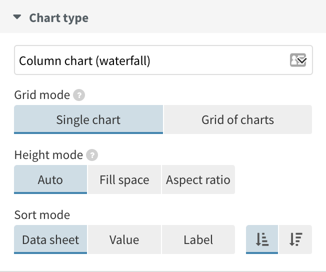
To create a waterfall chart, simply select the waterfall starting point from the template chooser page. Alternatively, when working in the Line, Bar, Pie template, use the “chart type” dropdown to select Column chart (waterfall) for vertical bars, or Bar chart (waterfall) for horizontal bars.
Waterfall charts use the same data structure other bar charts. So when adding your data, you’ll need one column with your categories or time periods, and at least one column of values.
The template recognizes positive values as ones that should be plotted upwards from the previous bar, while negative values will be subtracted and move downwards.
Add a totalizer column to your data by leaving the value cell of a row blank. The template will calculate the difference between the previous bar and the X axis and draw a bar that fills the gap.
Read more about how to create your own waterfall charts (including how to color the bars based on positive versus negative values) in our help doc.
More new features
In addition to waterfall charts, the latest version of our Line, Bar, Pie template (v21) includes a number of other powerful new features:
- Multi-line labels on axis highlights. You can now display text in your axis highlights across multiple lines and control the maximum width.
- Custom date axes in bar charts. Until now, bar and column charts were always treated as categorical, which limited control over axis layout and formatting. They now support numeric and date scales, enabling cleaner axes with custom ticks and date formatting.
- Changing the order of controls. It’s now possible to swap the order of your row and series filter controls.
So, water you waiting for?
From today, you can create waterfall charts and explore the new features in our core Line, Bar, Pie template – we can’t wait to see what you create!