Ready, set, race! How to take your Line Chart Race to the next level
Introducing four new power features to our Line Chart Race template
Our Line Chart Race template has been exceedingly popular since we introduced it two years ago. Users around the globe have used it to visualize everything from sports data to political results to Game of Thrones characters.
With lines racing left and right, we decided it was about time to give this popular template some new features to take it to the next level. We’re excited to announce four new features: reveal mode, captions, line labels and customizable axes.
Reveal mode
Our brand-new reveal mode keeps the user on the edge of their seat as the X axis is revealed as the lines move forward.
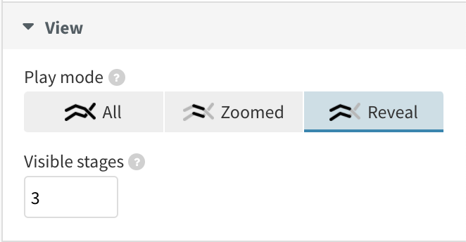
You can now choose from three different view modes
Unlike our existing view modes – showing all the rankings or following zoomed-in competitors – the reveal mode continues to unfold the axis to what has already been displayed within the visualization, revealing the new scores or ranks. This can work nicely if you want to focus on the overall trend while keeping the competitors in focus. As your lines expand over time, the shape of your data gets put into context.
Captions
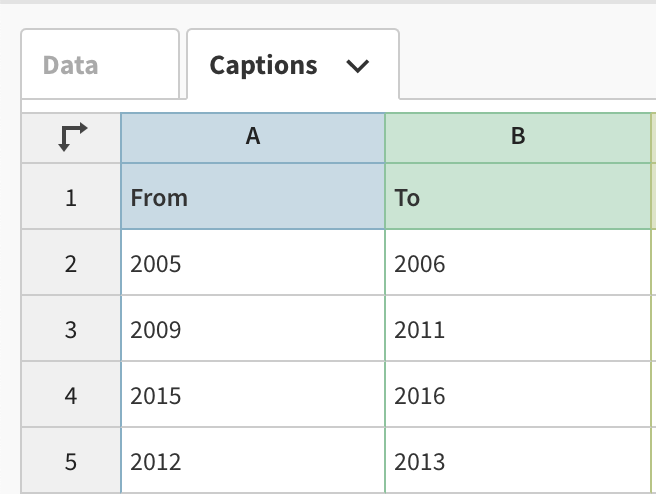
Just like its sister template, the Bar Chart Race, you can now add context to your line chart race using captions that appear and disappear at different points along the animation. This allows you to explain key dates and events – you can even add images and GIFs!
To use captions, all you need to do is add a start and end time as well as some caption text and, optionally, an image to the Captions datasheet.
No more overlapping labels
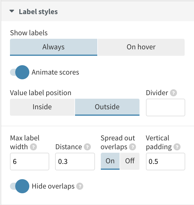
If your line chart race is looking crowded, fret no more! Improved label positioning now prevents overlapping, with new styling settings so you can emphasize lines as you wish.
Even if there is an overlap of competitors at a certain point during the visualization, circles that are behind other data points will still have a label appearing next to them so viewers can understand where each competitor is at all times.
As well as labels no longer overlapping, they are fully customizable and their defaults can be set as part of an Enterprise-level theme. Settings include whether the labels always show or only on hover, the positioning of the labels as well as the appearance of the connector lines.
Customizable axes
Similar to the Line, Bar, Pie template, you are now able to customize the axes of your line chart race. On top of recognizing dates and being able to set how many ticks display on your axes, you can now also flip your X axis to the bottom of your chart and configure everything from axis tick length to number formatting. You can learn more about editing axis ticks and labels in our help doc.
That’s it for today’s Line Chart Race template updates. If you want to know more about our Line Chart Race template, check out our overview help doc or attend a webinar.
We hope you continue to enjoy using the template and can’t wait to see what you create!