Enhance your data storytelling with animated charts
Five ways to create animated charts that bring your data to the next level
While we’ve previously discussed the importance of adding a narrative to your data visualizations, today we’re focusing on one of the key elements that make data storytelling so captivating – animation.
Animated charts provide you with a variety of ways to bring your data to the next level. Whether that’s through axis movement, time sliders or racing graphs, incorporating motion in your data stories can help you communicate insights in ways that static charts can’t.
We’ve put together five examples of animated data visualizations to help you get started.
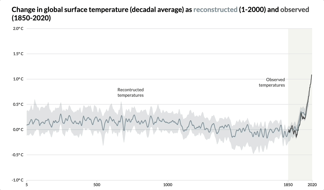
1. Use animation to make your charts easily digestible
Have you ever finished a page of a book only to realize that you didn’t retain any information? This is how complex data visualizations may feel to people with less experience in interpreting charts.
Animating your visualizations can help with information overload. By breaking down your data story, you give the reader enough time to make sense of what they see. In addition, you provide more context which makes your point clear and memorable. See one such example below.
Instead of creating a standalone visualization, you can gradually reveal important milestones in your chart by using Flourish stories. By also adding annotations and axis highlights, your visualization offers enough context without becoming too cluttered. Besides, slow-reveal graphs are great for increasing user engagement – read some more about this topic here.
Incorporate scrollytelling
If you want to bring your data story even further, why not try our low-code scrollytelling? Get in touch with our sales team if you’re interested in getting scrollytelling on your own site – or reach out to the Flourish support team if you’re an existing Publisher or Enterprise user.
See a stunning scrollytelling example that uses the slow-reveal method on our blog.
2. Illustrate changing stats or ranks with our racing bar and line charts
Some Flourish charts come with animation right out of the box – examples are the Bar Chart Race and Line Chart Race templates.
You can use our racing charts to visualize the change in people’s earnings, or focus on groups in competition with each other.
Bar Chart Race
There’s no denying that there is something compelling about racing bar charts. Whether it’s the competition aspect that tickles our curiosity or the animation that keeps us glued to the screen, these visualizations are both entertaining and versatile. Use this animated chart type to visualize any data that can be measured over time.
To create your own racing bar chart, simply choose one of our starting points, upload your data in the correct format and customize the look and feel of your visualization.
Line Chart Race
Similarly to the racing bar chart, the Line Chart Race template has been exceedingly popular since we introduced it three years ago. Users around the globe have used it to visualize everything from sports data to Game of Thrones characters! In the example below, we use this chart type to visualize the busiest train stations in London.
Unlike the racing bar chart, this template doesn’t necessarily need cumulative data to work. All you need is a dataset that measures progress over time – read our overview help doc to make sure your data is in the right format.
3. Animate between different points in time with filters
Looking for other ways to visualize time series data? You can easily do this by using the Flourish time slider option.
The time slider is a mode of the traditional Flourish filter that showcases changes in your dataset over a given period of time. To create a similar animated chart, simply add a date/time column in your dataset and bind it under Filter in the Data tab. Then, you can choose the right control type for your visualization.
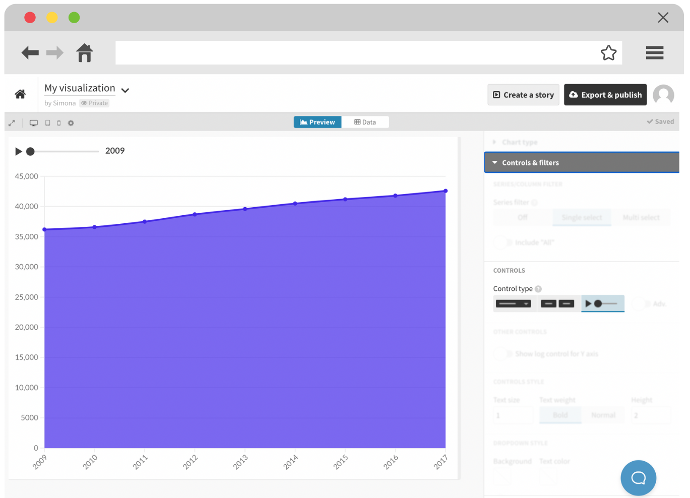
You can find the time slider option under the Controls settings in the Flourish editor.
4. Create an interactive map story
Adding motion to your static map is a wonderful way to get the most out of your geospatial data. Whether you use filters or lock specific locations into view, you can easily visualize where and how things are changing.
Not sure where to start? Check our blog post on how to create an animated map story below.
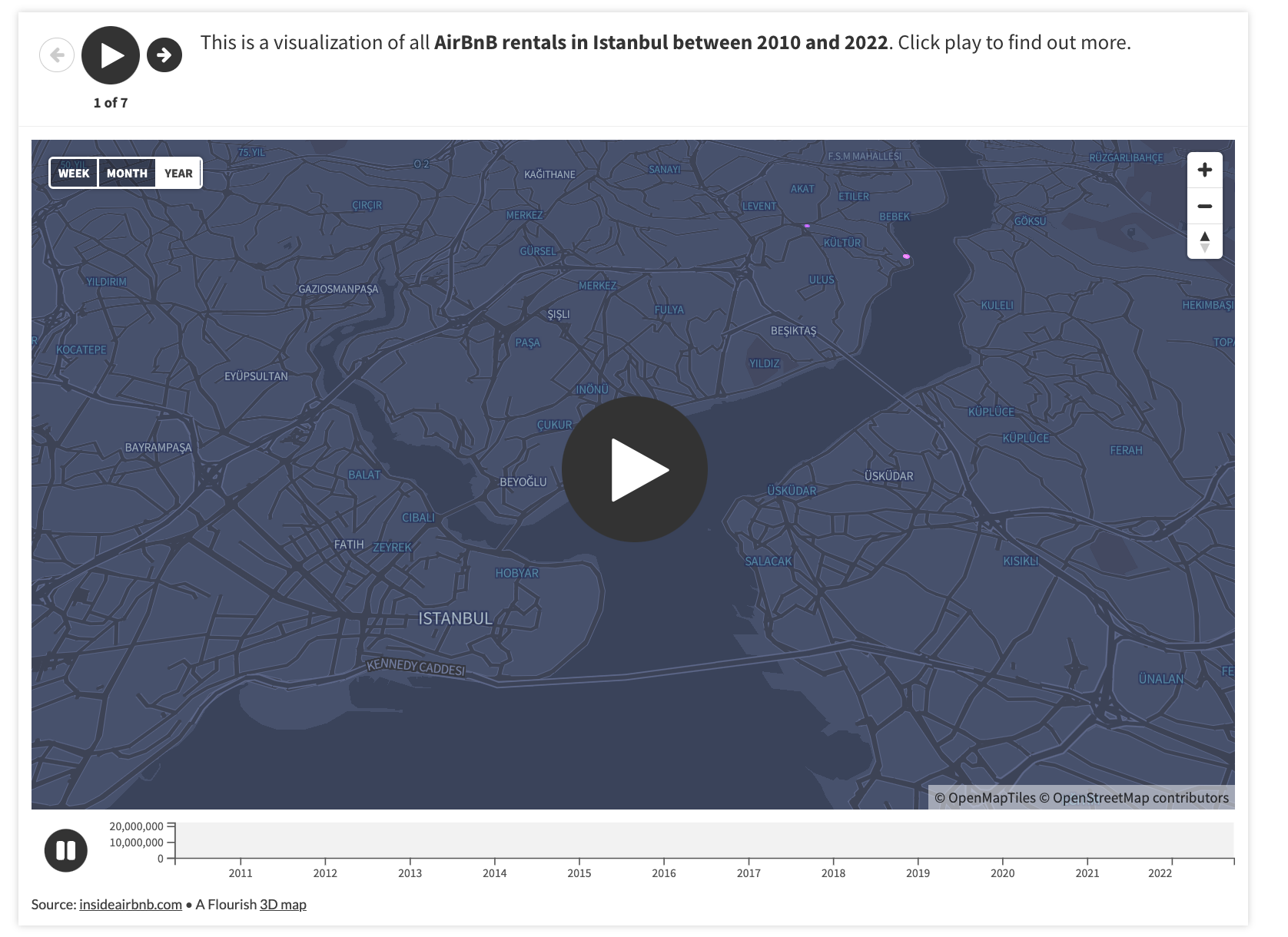
Check our blog post on how to create an interactive map story here.
By combining animation and maps, you can create powerful and engaging data stories. The best part? Flourish offers no-code animation solutions for all map templates that could be achieved through stories, timelines or filters. Animate your point map or jazz up your choropleth maps – the possibilities are endless!
5. Wow your users with stunning transitions between views
Among other chart types, Flourish offers a range of exploratory templates – some of those are the Survey, Data Explorer and Hierarchy. While their main purpose is to allow the user to compare different variables and independently find trends and patterns in your data, it goes without saying that these templates animate beautifully between their different views.
The example above uses our Survey template which is ideal for visualizing survey responses and other data where each row represents a single entity – a movie, for instance. You only need one visualization to create similar data stories in Flourish – read our step-by-step guide to learn how we achieved this.
Bonus tip – replace traditional GIFs with looping Flourish stories
The process of creating GIFs that are both high-quality and small in size can be very time-consuming. And if you need a fully automated chart that uses animations, Flourish offers an easier and more flexible option than regular videos or GIFs – autoplaying and looping stories! See an example below:
Here, we disabled the navigation controls of the Flourish story but made sure that the slides have been set to automatically play and loop. For more information, see our help doc.
Show us your animated charts!
Users are our biggest inspiration. If you have found a different way to incorporate animations into your data stories created with Flourish, let us know – reach out on Twitter, LinkedIn or Instagram.