Draw The Line: introducing a chart type that invites you to participate
Flourish now makes it easy to create fun and engaging “you draw it”-style line charts
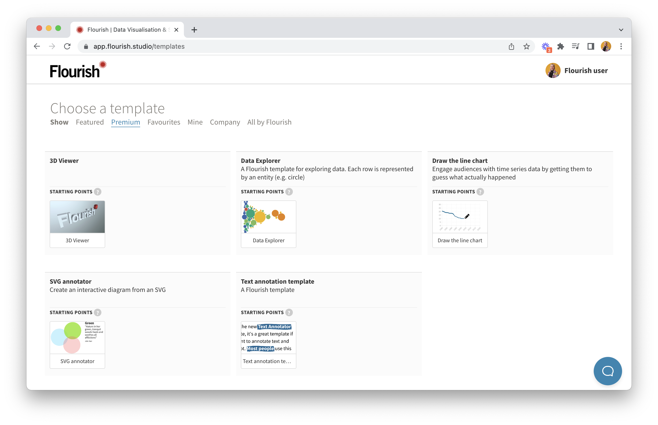
Our new Draw The Line template makes it quick and easy to engage audiences with time-series data by asking them to guess what happened. Simply drop in your data (or import it via Live CSV), choose the percentage of the line you’d like to allow your users to guess, and publish to embed on any website or Canva presentation.
Your chart will display tantalizingly incomplete, and will invite your audience to test their knowledge – or make a wild guess!
“Guessable” line graphs were popularized by the New York Times some years ago via its You Draw It series. A few publications have hand-coded similar visualizations since then.
At Flourish, we always loved the fun interactive nature of these charts, so we decided to create a template to let our customers create them in minutes. Whether it’s to check an audience’s knowledge half-way through an article or invite them to engage during a presentation, this chart type is a perfect way to generate engagement by immersing the viewer in the data more deeply.
Premium templates are available to Flourish Enterprise customers via the "Premium" tab of our template chooser
The new template is launching as one of our premium templates, which means you’ll need to be on an Enterprise plan to use it.
Since Enterprise customers also get a custom company theme, these compelling interactive charts will automatically show up in your company’s fonts, colors and styles. Get in touch with our sales team to learn more.
Features
The new template offers a bunch of powerful features to make your guessable line charts as creative and engaging as possible.
In addition to controlling how much of the guessable line is hidden, you can add reference lines that display in full. This can be helpful where you would like to allow users to compare their guess to a benchmark.
You can also configure the messages that show up when the “real” line is revealed, allowing you to fine-tune the response based on how close the user’s line was to the real data. It’s even possible to include their average error.
Another innovation is the ability to have multiple guessable lines on a single chart. See below for example of this.
Getting started
To create your own Draw The Line chart, all you need is a dataset with a column of times and a column of values – and perhaps additional columns to act as reference lines. Browse our help docs if you need help with getting your data in the right format.
Like with normal Flourish lines charts, you can configure the axis extent, which allows you to fine-tune how much space is shown above or below the line. This is sometimes useful, as you don’t want the space to give away too much of a clue about where the line will go. You can also play with display settings, for example to choose a stepped line style.
Are you ready for guessing or what? We can’t wait to see what you – and your readers – create with this new template!