Dual axis charts: double the fun or double the trouble?
Learn the pros and cons of dual axis charts, how to make them with Flourish and how to master them
While 3D pie charts are considered the bane of the data visualization community, dual axis charts come in a close second place. Their potential to mislead viewers and lack of easy comprehension are just some of the reasons why this chart type is so controversial. The good news, however, is that they are not always a bad choice – on the contrary!
The effectiveness of dual axis charts depends on how they are used and presented. In this blog post, we’ll explore the benefits and drawbacks of using a chart with two axes, offer suggestions for improving its effectiveness, and propose alternative visualization techniques to consider when deciding how best to present your data.
What are dual axis charts?
Dual axis charts, also known as combination (combo) charts, are a type of visualization that combines two different types of charts in a single graph. The two chart types share the same X axis, but have separate Y axes – which allows for two sets of data to be displayed simultaneously.
By using a dual axis chart, you can easily compare the two datasets and see any correlations or trends that may exist between them. However, this chart type does come with a few drawbacks.
The problem with dual axis charts
Earlier this year, the Federal Reserve Bank Of St. Louis went viral on Twitter (for all the wrong reasons) after sharing a dual axis chart that depicts changes in military spending among the top-spending nations.
One of the most cursed dual-axis charts you will see in your lifetime. https://t.co/JBYQgxlpq2
— Matthew Yglesias (@mattyglesias) January 22, 2023
Social media users were quick to react, condemning the visualization as a “chart crime” and pointing out the primary issue with the graph – whether it was a deliberate attempt to mislead or simply a result of insufficient data visualization skills.
Using the same data from Stockholm International Peace Research Institute, we broke down the chart to point out why exactly it is misleading and how a non-dual axis alternative may work better in this case.
Here is the same St. Louis Fed chart, recreated in Flourish.
The current view of the chart has the potential to be misleading, as some viewers might mistakenly conclude that China has surpassed the United States in military spending in recent years.
However, that's not the case – as the shaded axes suggest, the right Y axis is exclusively for tracking USA's spending, while the left Y axis should be used to measure the expenditure of all other countries.
The problem with the chart occurs because of the existence of the second Y axis, created specifically for a single series of the data, with a different baseline and maximum value. Here is what the chart looks like if both axis start at 0 and finish at $1,000B constant US$.
In other words, we may just have a simple line chart with a single Y axis.
St Louis Fed apologized for the graph, explaining that their decision for using dual axis was to “make spending by smaller militaries easier to see.” However, there are much better options to achieve this, which are also less likely to skew the reader’s perception of the data.
Perhaps the easiest option would be to simply use an interactive graph that allows the user to explore the popups and filter out outliers such as the United States. This helps us better see the other countries’ spendings and is generally a more engaging way of presenting information.
Use the color legend to filter countries out or add back the United States to see the benefit of using a dynamic graph.
Another alternative is to split the same line chart into a grid of small multiples – you can easily do this in Flourish.
Since the goal of the chart is to show how much the spending of each country increased over time, the Y axis for each small multiple can be adjusted accordingly.
And there are multiple ways to emphasize various elements of your visualization – see some of the best data visualization practices in our blog post.
As the example above shows, some of the most common problems dual axis charts may cause are:
- Difficult to interpret – it’s not always clear which series belong to which axis.
- Different axis baselines at different heights can be misleading – as was the case with the USA and all other countries.
- Crossing lines may be highly deceptive – the example above showed just how easy it is to draw a wrong conclusion when two values that don’t use the same Y axis cross. In reality, the intersection of lines associated with different Y axes means nothing at all.
When are dual axis charts a good choice?
You may be pondering the question: If dual axis charts are so flawed, why do people even use them? Fear not – here are two instances in which this chart type is most suitable.
Comparing two datasets with different measurement units
Dual axis charts could be the most suitable choice when assessing the relationship between data series with different measures. Say you are a marketer that needs to do a report on a website’s engagement, and you track both engagement rate (measured in percentage) and engagement time (measured in seconds).
To get a clear idea about how your metrics relate to each other, it’s best to have them both in a single chart. And since they have different measurement units, nothing but a combo chart works to combine and compare them within a single view. That being said, notice all visual indicators we added to ensure that the chart is easy to read and understand:
- We colored both axes and gave them appropriate titles, so it’s easier to distinguish which axis responds to which series. We did the same in our header – learn how to do this in our help doc.
- We used our lines and columns starting point as opposed to lines only, in order to avoid the lines crossing at a random point.
- We added labels on all data points (and the relevant suffixes) to ensure it’s as easy as possible to compare the values between the two series.
Showing correlation between two or more variables
Dual axis charts are particularly useful when you want to analyze the correlation between variables and see how they tend to change together over time or across categories. Here is one classic example when talking about positive correlation between datasets:
By using this chart type, we can visualize not only the correlation between temperature and ice cream sales, but also the individual trends of each data series. This enables us to identify a pattern more easily – when the temperature is higher, our shop sells more ice cream!
While dual axis charts can offer unique insights, it’s important to consider their limitations and use them thoughtfully. Read about some other common data visualization mistakes in our blog post.
How to create a combo chart in Flourish
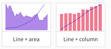
Whether you need a combo chart with a single or a dual axis, Flourish has it all! To get started, simply choose an appropriate starting point from our template chooser, such as the Line + area or Line + column.
In the visualization editor, you can change the combination (line + …) via the Chart type dropdown menu. Under this set of settings, you can also opt for a single or double axis chart. As mentioned above, we recommend using a dual axis only when your data requires two separate measurement units for your series.
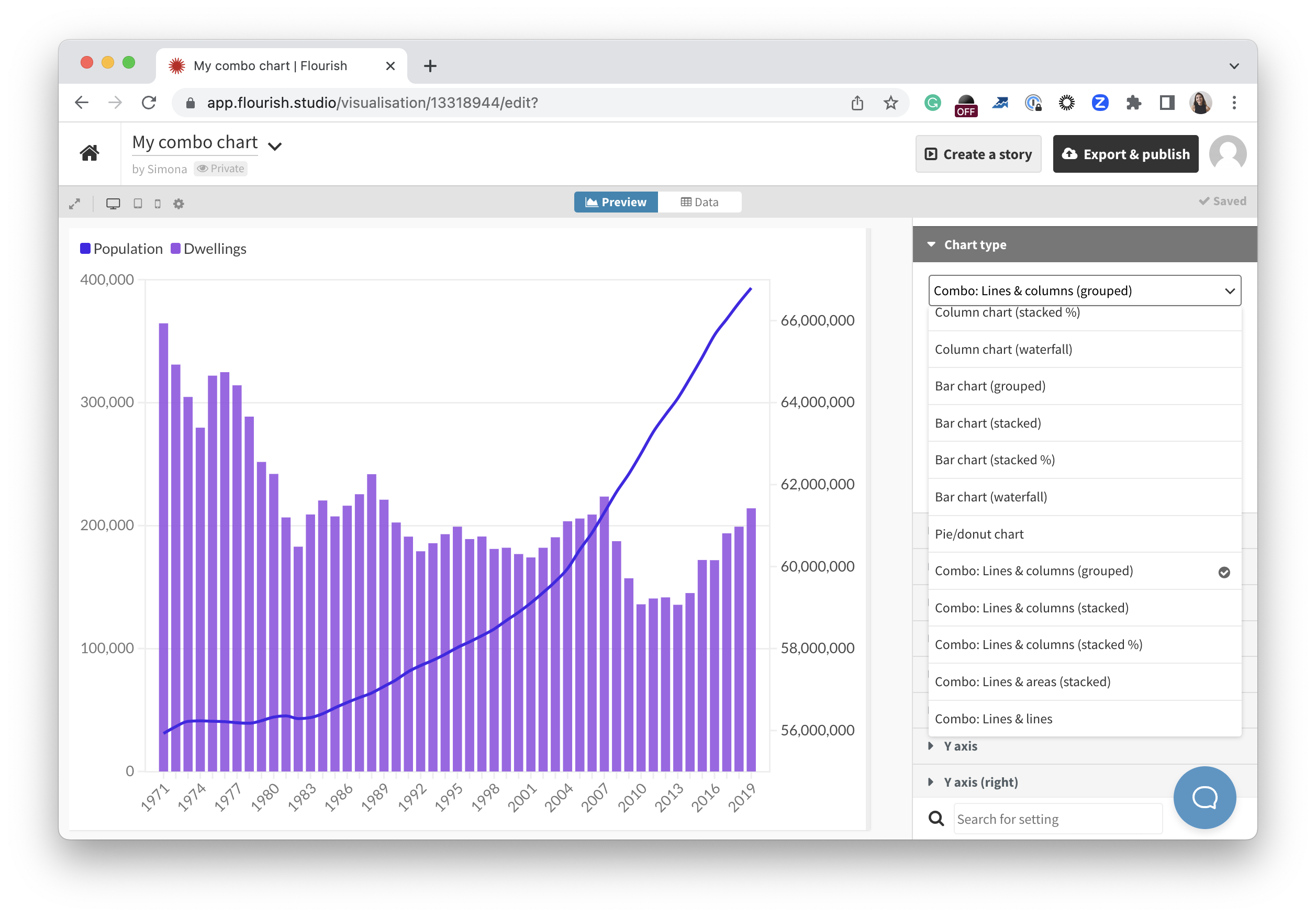
When adding data to the template, the first numerical column you assign under Value will be drawn as a line, while all other columns will be displayed as columns or areas, depending on the chart type you’ve chosen. If you want to change this, you can easily do so by binding your series in a specific order in the Data tab – read our help doc for more information.
Once you add your data, choose how many series to display as lines and further customize your chart – and remember to provide visual clues to make your visualization clear and straightforward!
Dual axis charts – yay or nay?
The decision whether to use a dual axis chart should depend on the specific context and goal of your data story. If you need to show correlation between data series with different measurement units, go for it! For anything else, you may want to explore alternative ways of visualizing your data. Take a look at our blog posts below for more tips on how to deliver impactful and insightful data visualizations.