How to create interactive parliament charts in Flourish
Effortlessly visualize election results with our interactive Parliament Chart template
Parliament (or hemicycle) charts offer a popular method for illustrating election outcomes, mirroring the layout of an actual parliament. This similarity makes them an ideal tool for visualizing the distribution of seats among political parties.
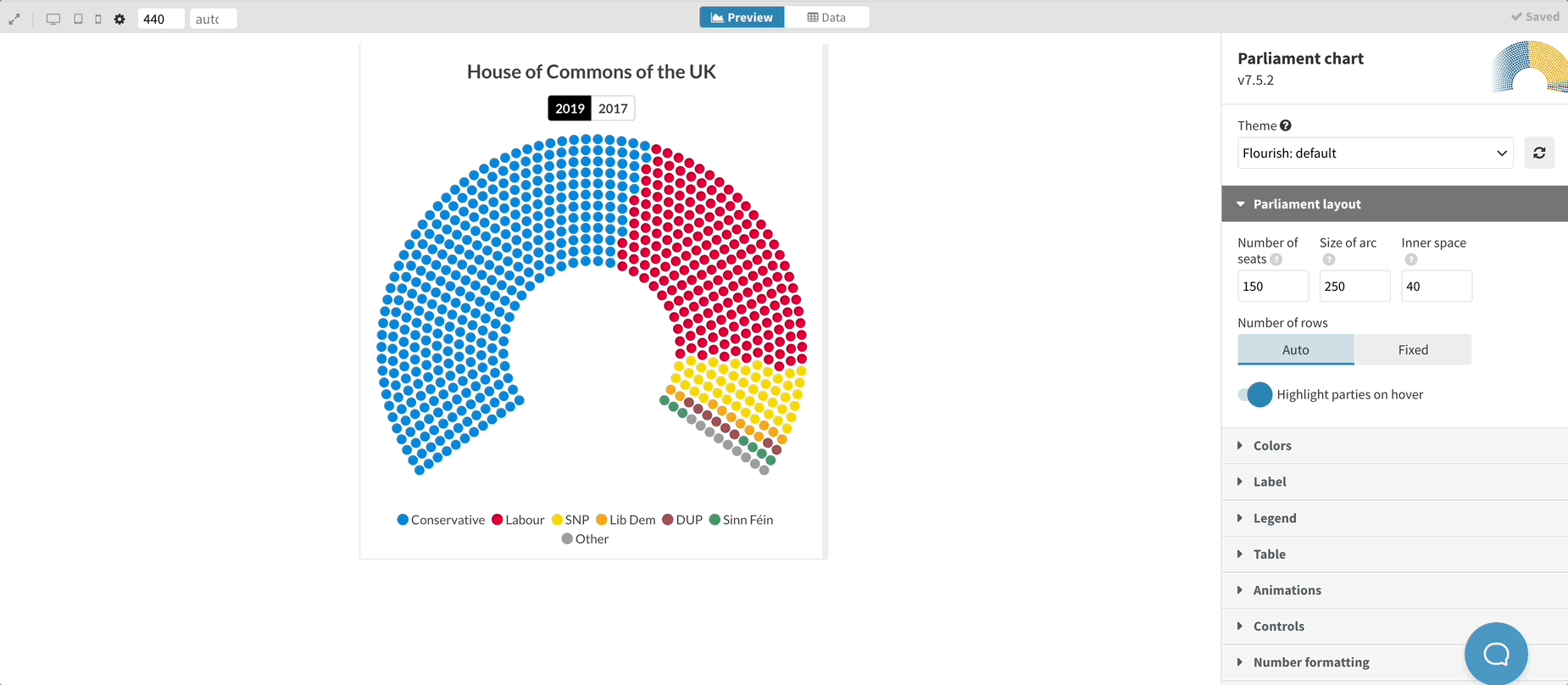
With our user-friendly Parliament Chart template, crafting these visuals is a breeze. Simply input a dataset with party names and seat numbers (and optionally, historical data for insightful comparisons). Check out a example featuring the two most recent UK elections below.
Features of our Parliament Chart template
The Parliament Chart template gives you lots of control for setting up and fine-tuning your chart. For example, you can:
- Adjust the number of seats to fit the size of any parliament in the world
- Tweak the shape of the parliament layout by increasing or decreasing the size of the arc, the inner space, or the number of rows
- Compare current election results to a previous election and animate seats that have “flipped” from one party to another
- Use a default color scheme, or assign a specific color to each party
- Show or hide a results table
As seen in the example below, the results table is great for showing and comparing several election results. For each election, the table displays the number of seats per party. Plus, it is possible to automatically calculate the change in seats between the elections.
How to make a beautiful and interactive parliament chart in Flourish
- Select the Parliament Chart template
- Upload a CSV or Excel file, or just type in your values manually. You must have at least one column with the party name and a column with the number of seats
- Optionally, add another column with data from a previous election
- You can now tweak the chart as you like. Change the colors, the number of seats, remove the table, or add a legend
- Once you’re happy with your parliament chart, you’re ready to publish it to the world, download it to host on your own servers or use it in a Flourish story. You can also download it as an image if you prefer (including as an SVG to edit it in a vector graphics tool)
Parliament chart starting points
Looking for a specific parliament? We got you! Below, we have put together some starting points which you can simply duplicate and edit.
Looking for more ways to visualize election results?
Our package of election-related templates is growing. Here are some other templates that make it super easy to visualize election results beautifully and interactively:
- Show election results and create your own coalitions with our Election Results Chart
- Analyze all members of parliament with our Survey template
- Visualize polling results over time with the horserace charts
- Who lost votes to who? Visualize it with a Sankey diagram
- Visualize the shift in party popularity with slope charts
- Visualize election results geographically with maps