Masters series: William Playfair, the father of statistical graphics
Celebrating the legacy of the creator of the line chart, bar chart and pie chart 200 years after his death

William Playfair was a Scottish engineer credited with creating the line chart, bar chart, and pie chart. Image via Wikimedia Commons.
What comes to your mind when you think about data visualization? If you thought of a line chart, bar chart, or pie chart you’re not alone. These chart types have become synonyms with data visualization.
Imagine a time when they didn’t exist. Awful, right? Thank goodness for William Playfair, the Scottish engineer credited with creating these three pillars of data visualization. With such a curriculum, it is not surprising that he’s considered the father of statistical graphics.
Nowadays, 200 years after his death, we still owe a lot to Playfair. In this blog, we bring together the old and the new, highlighting which original techniques used by Playfair are still valid, while also showing some of the breakthroughs possible with new technologies.
Line charts: still the best way to showcase change over time
William Playfair really liked line charts and he used them thoroughly in his Commercial and Political Atlas, a compilation of charts and statistics on England’s trade balance, published in 1786. Remarkably, they look very similar to line charts today.
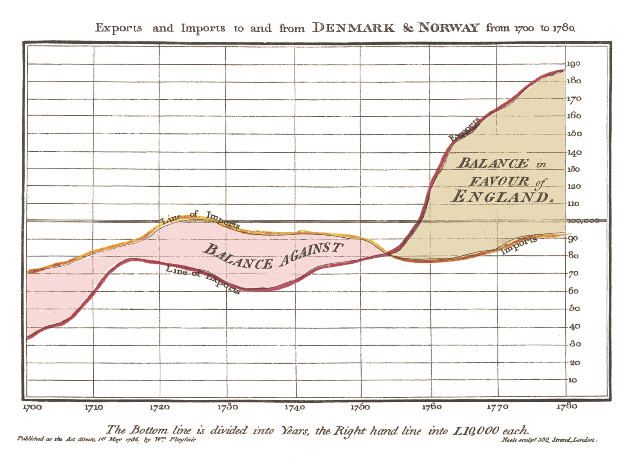
One of William Playfair's line charts in his Commercial and Political Atlas (1786). Image via Wikimedia Commons.
Shading between lines, adding titles to the axis, and adding annotations are some of the features on Playfair’s original charts that remain good practices today. Newer features of this chart range from filters to tooltips when hovering over a single data point, as you can see in the example below showing the UK’s trade balance over time.
Still one of the most straightforward ways to show change over time, it’s hard to not share Playfair’s love for line charts.
Bar charts: a classic tool to show magnitude
Much to Playfair’s frustration, when he tried to plot trade data for Scotland, he found that there were a lot of records missing, meaning he couldn’t plot a time series as usual. And so the bar chart was born. Famously, he stated that the bars were “inferior in utility” to line charts, quite an unfair description of this beloved chart type.
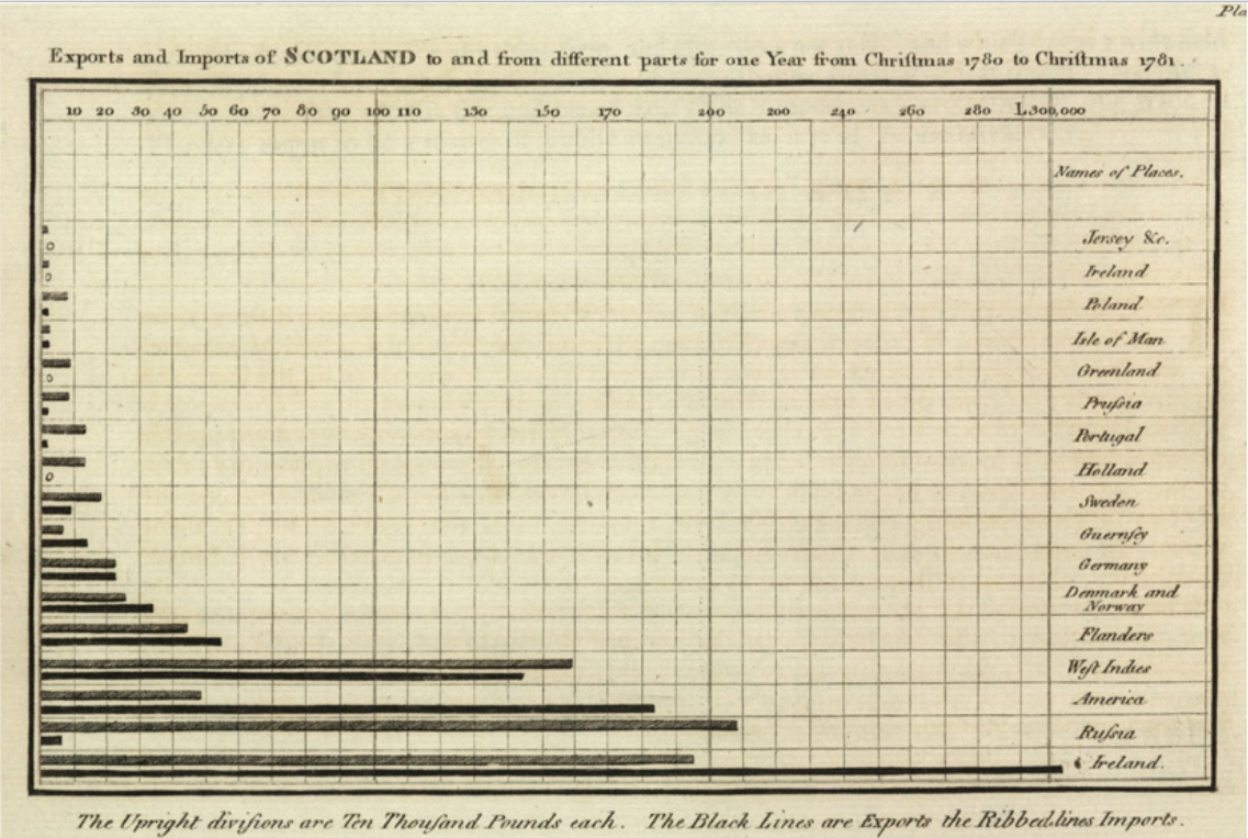
A bar chart in William Playfair's Commercial and Political Atlas (1786) showing Sctoland's imports and exports. Image via Wikimedia Commons.
Much remains unchanged from his examples: sorting bars by value and adding gridlines, axis titles, and labels are some elements still in use today. But technology has definitely transformed bars and columns from ugly ducklings into dazzling swans. Let’s see how in the following story about the top ten importers of UK goods.
Bar charts are widely used to represent magnitude and to compare records and remain one of the most popular chart types.
Pie charts: the original way to show part-to-whole
Pie charts were born in 1801 with the publication of Playfair’s Statistical Breviary, which focused on comparing the power of nations through charts and statistics. Here he drew a series of proportionally sized circles, some of which were split into segments, . Today, pie charts remain one of the most common visualization types to show part-to-whole relationships.
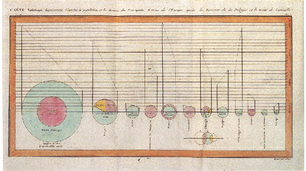
William Playfair's circle diagram in the Statistical Breviary (1801). Image via Wikimedia Commons.
Arguably, pie charts have had the hardest time in the past two centuries. Their simplicity made them popular, but also overused. Technology hasn’t been too kind with this chart type either (3D pie charts anybody?). But, when done well, they are really good at conveying a simple idea. Here’s a slight variant of the traditional pie: a donut chart with a filter to show the top UK exports of the past 4 years.
As long as the number of segments is kept to the minimum and all the slices add up to 100%, pie charts do have a place in every data visualization practitioner’s toolbox.
Something new, something old
It’s pretty remarkable that these charts are so widely used all these years later and that most of Playfair’s practices are still valid. Whether you decide to use one of these charts or go for something more innovative it’s up to you! As always, remember that the right chart for your data depends on what you are trying to show, and, sometimes, a humble line, bar, or pie may be the best way to go.