How to make animated Sankey charts and alluvial diagrams
Our Sankey Diagram template lets you create stunning sankey and alluvial diagrams that help you visualize flow
Without a doubt, sankeys and alluvial diagrams are some of the most visually stunning chart types out there. In addition to being great tools for visualizing the distribution and flow of your data, they are also incredibly effective for communicating complex patterns and relationships.
Since its launch back in 2018, the Flourish Sankey Diagram template has proved very popular – partly thanks to helpful features such as labels that scale with the screen size, as well as the stunning loading animations that give readers a sense of the links “flowing” from the left to the right nodes. See what else this powerful template can do in the example below!
Sankey charts vs alluvial diagrams – what’s the difference?
If you’re just starting with this chart type, you may be wondering what distinguishes the sankey from an alluvial diagram. Both are types of visualizations used to represent the flow of data or entities through a system, but they have some differences in their design and usage.
A Sankey diagram typically displays a single flow of data or entities, where the width of each link represents the amount of flow between each node. In the sankey diagram below, the flow illustrates the number of people migrating from one country to another.
Alluvial diagrams, on the other hand, are great for showing how the data is changing over time or between different stages. Think of it like a river flowing through different areas (steps) that split into multiple smaller flows. The example below, for instance, adds another category (continents) so that we can get a more general overview of the migration flow.
Things can be come slightly more complicated when we add multi-step sankeys to the equation - how do they differ from alluvial diagrams? In a nutshell, the main difference between the two charts is that in an alluvial diagram, all target nodes go through a middle step – in a multi-step sankey, that’s not the case.
Create your own animated sankey and alluvial diagrams
Your data should always be in a long format when using the Sankey Diagram template.
The most important thing to be aware of when starting with our Sankey Diagram template is your data structure. Depending on whether you build a sankey or an alluvial diagram, your data will look slightly different – but regardless, it should always be in a long format.
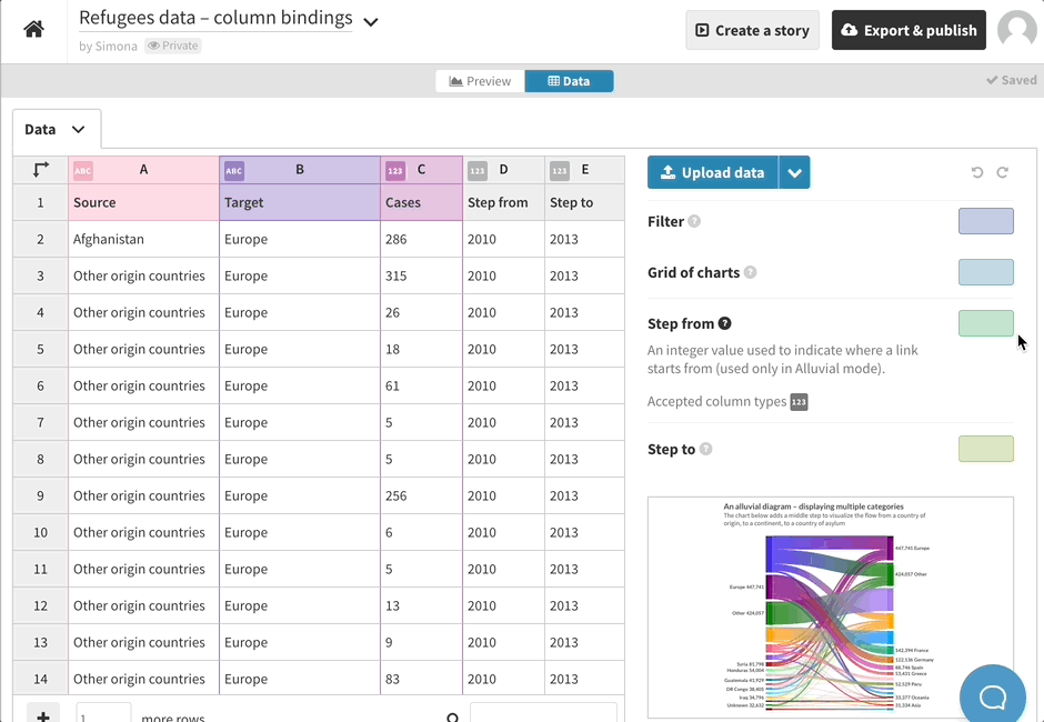
Since alluvial diagrams include multiple steps, you must use the Step from and Step to column bindings in the template to point out the right order of your data. This may require some additional data wrangling but worry not – we’ve got you covered! Check our detailed step-by-step guide on how to properly structure your spreadsheet for this template.
Once your data has been added to the template in the right format, you can move on with the customization of your graph. You can adjust anything from the labels positioning to the animation speed of your links and nodes – and even customize the color scheme of your sankey or alluvial diagram, as we have done in the graph below.
Here are some more useful resources to get you started with this chart type:
- Sankey Diagram – an overview
- How to specify the ordering of your nodes
- How to use the Flourish color override settings
Need some more help with your sankey?
Learn more about our powerful Sankey Diagram template, what are alluvial diagrams and much more in our webinar – and don’t forget to sign up for our upcoming events where we tackle all-things data viz!