Hi everyone,
There’s so much going on in Flourish HQ at the moment that it’s been hard to choose what to highlight today. Here are three new things. Expect more soon!
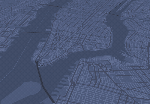
New template: Arc Map
Big news: we’ve built a whole new mapping system based on the latest open-source technology and gorgeous customisable background maps. Over the next month or two we’ll be rolling out the results: a whole suite of new templates.
Here’s the first: an Arc Map template for plotting flows and connections between locations. This one was created in partnership with Google News Lab. We used it to visualize the morning cycle rides in New York City.
• Read the blog post: Make your own arc map
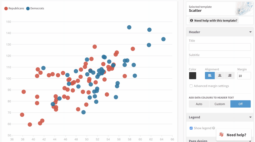
New feature: legends out, colored titles in!
A growing proportion of the best hand-made charts forgo a traditional legend in favour of a colored title. It’s a great technique, so we decided to make this easy in Flourish.
Starting with our core chart templates Flourish can now automatically recognise data labels in your titles and add color accordingly. You can even click them to filter the dots in a scatter chart!
• Why legends suck and what to use instead
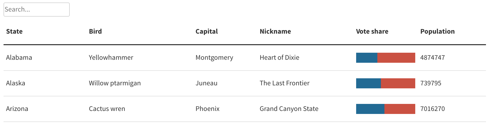
Beta sneak-peek: magical tables
Our new Table template allows you to easily make sortable, searchable, embeddable tables from any spreadsheet. Best of all, you can quickly group number columns together to make little inline charts. This template is in beta so feel free to check it out and send us feedback.
• Try the beta of Table template now
What can we do better?
As always, we want to hear about your experience of Flourish. What’s good, and what can we improve? Hit reply and let us know…
Best wishes,
Duncan and the Flourish team
PS. In case you missed it last time…
• Seven ways to visualize the midterms
• Make custom map templates from GeoJSON data
Flourish, part of the Canva family
33-35 Hoxton Square
London N1 6NN