Hi everyone,
We’ve been very busy at Flourish HQ in the last month, so there are lots of things to tell you about…
Fonts and branding
Every Flourish visualization now offers a selection of nice fonts. Choose a condensed font for a table, say, or something lively for a social post. Even better, Flourish enterprise customers can now get the whole system set up to match their branding guidlines with color palettes, styles, logos and custom fonts. Get in touch for more details.
• Contact us about custom branding
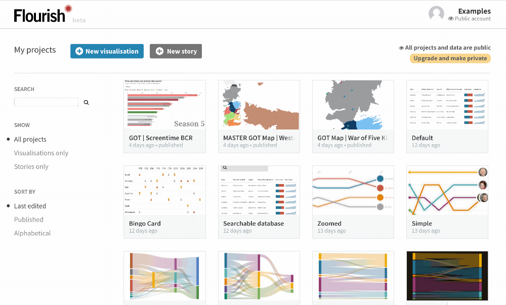
New projects page
Lots of you have asked for better ways to browse and search your (ever-growing) project libraries. The new “My projects” page is here to help, with a search box, filters and sorting. It also has infinite scroll, so if you’ve got lots of projects to browse through you can just scroll down the page to load more.
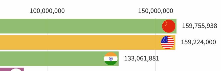
New bar chart race features: images, totalizer, sort
Thanks to everyone for their comments and ideas about the new bar chart race template. In response we’ve added a whole bunch of extra features, including images, a totaliser, different layouts and a replay button. Give it a whirl!
• Read about the new bar chart race features
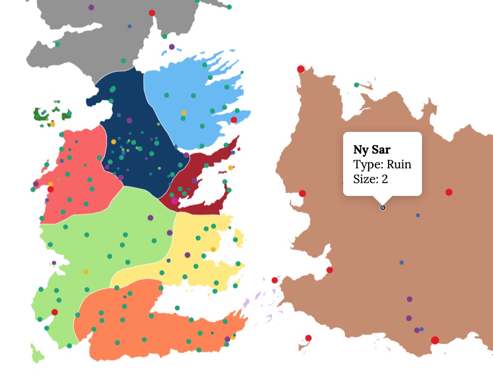
Lands and battles of Game of Thrones. Mapped!
Sad about the end of Game of Thrones? Cheer up with this fun blogpost which uses Flourish to map the #GoT lands and battles!
• See the Game of Thrones maps!
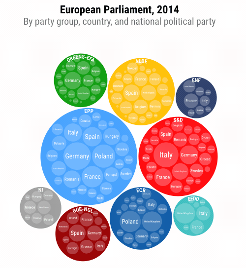
Nine ways to visualize elections
One for our many newsroom users. With EU and many other elections coming up, our data journalist Katie gives nine ways that Flourish can help bring election data to life.
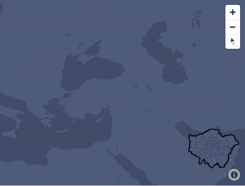
Map improvements
The base maps that appear in templates such as Marker Map and Arc Map now offer multiple languages for place names. They also let you to toggle roads on and off, and also hide national boundaries – handy for doing visualizations that include disputed regions.
Many small improvements
We’ve made loads of small improvements across the tool and many templates. A few examples:
• Images are now supported in our interactive table
• The Survey template now has new label options and settings
• Slides now fade in and out when you change templates in a story
That’s probably enough for now! As always do press reply with any feedback, questions or ideas.
Best wishes,
Duncan and the Flourish team
PS. In case you missed it last time…
• Interactive table template with charts and more
• New 3d region map template
• SSO now available on our business plans
• Podcast about audio-led Talkie stories
Flourish, part of the Canva family
33-35 Hoxton Square
London N1 6NN