Hi everyone,
Apologies for the delay between newsletters. We’ve been so busy building things we haven’t had time to tell anyone about them! So now we’re playing catchup. Here are six quick updates. More to follow soon!
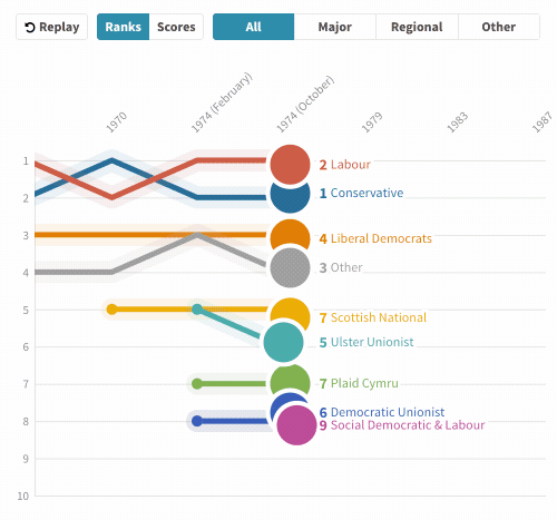
Introducing the line chart race!
With bar chart races still getting so much attention on social media, we thought we’d introduce something similar but different: the line chart race! An extension of our popular “Horserace” template, this is a new type of animated chart where the lines are gradually revealed and the time axis animates to keep the end of the lines in the middle.
Animating Sankeys
Everyone loves Sankey diagrams so we decided it was time to give our Sankey Diagram template some additional magic. You can now set your Sankey or alluvial chart to animate when it first appears, so each link flows smoothly from left to right. Warning: you may end up losing hours just hitting refresh and watching the lines as they criss-cross over the screen!

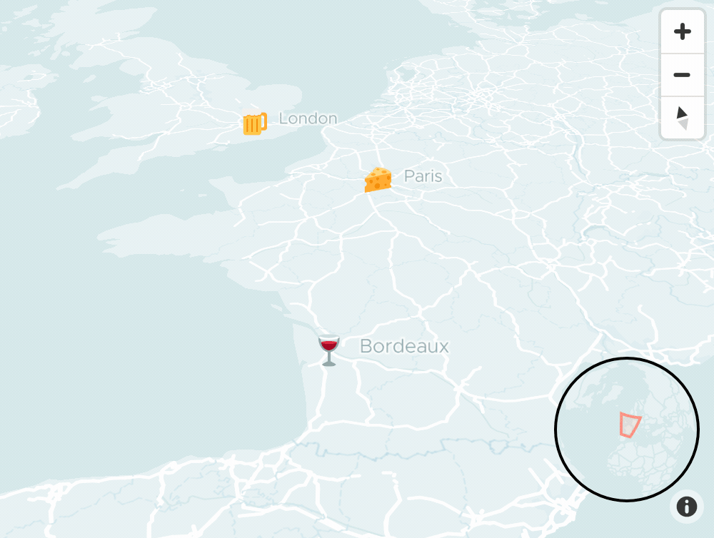
Monochrome base maps
The vector base maps used in templates such as Marker Map and Arc Map have a new monochrome feature allowing you to easily create a map style that ties in with any given color scheme. Just choose “Custom: Monochrome” from the Map style dropdown. We’ve also improved the base maps in various other ways. For example, you can now set the initial view without making a story.
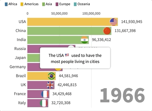
Bar Chart Race timed captions
Lots of you asked for improvements to the bar chart race template, such as clipping images so they don’t overlap the bars and making it possible to lock the order of the bars rather than dynamically sorting them. So we’ve made those changes. Best of all, you can also now add pop-up captions to tell the story of your chart as it plays. You can even include images and styling in the captions by switching on HTML mode.
• View a bar chart race with captions
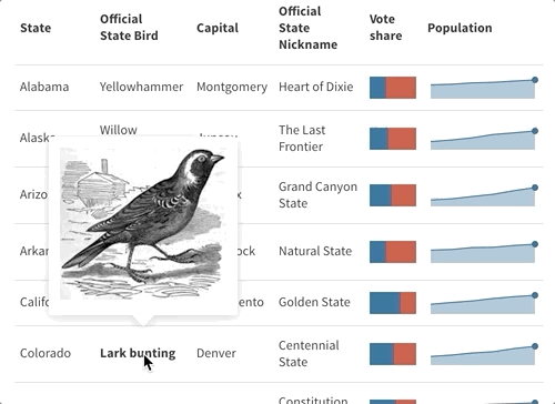
Styling and popups in tables
Our table template now supports formatting, links and popups. Simple markdown formatting makes it easy to add bold, italic, links, images, even HTML. (You could even put a table inside a table. Umm.) For popups, just use “>>” to separate what you want in the cell from what you want in the popup. This is really handy for making tables of images or icons that show more on click or mouseover.
Much-improved bar charts
We’ve just massively improved our standard non-racing bar charts. The y axis labels can now go above the bars instead of to the left, which often looks better – especially on mobile. And the value labels that appear over the bars now automatically set their own visibility and color based on the space and brightness of the bar, and you can align them too.
• Explore the new bar chart labels
That’s probably enough for now! As always just hit reply with any feedback, questions or ideas.
Best wishes,
Duncan and the Flourish team
PS. In case you missed it last time…
• Flourish can be set up with company fonts/styles/colors
• New projects page with search box, filters and sorting
• New bar chart race features
• Game of Thrones, mapped!
• Nine ways to visualize elections
• Slides now fade in and out when you change templates in a story
• You can toggle roads/borders on/off on our base maps
Flourish, part of the Canva family
33-35 Hoxton Square
London N1 6NN