Hi everyone,
Is it really already September? Time flies when you’re busy improving the Flourish platform! Here’s the latest news from our virtual HQ.
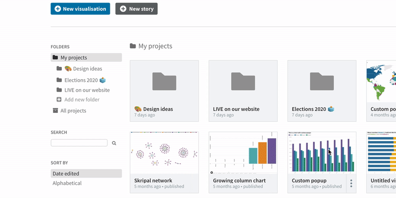
Folders to organize your projects
Many of you have asked for it, and it’s finally ready: you can now organize your visualizations and stories into folders.
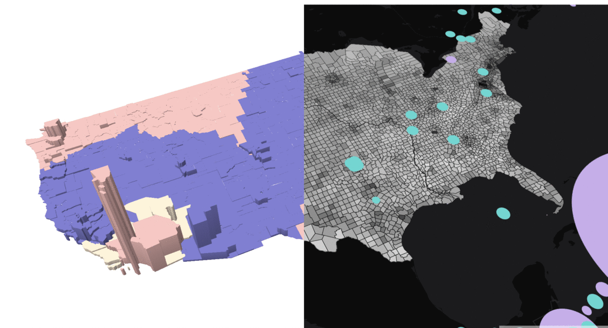
Powerful new map template
Our WebGL-based mapping template has loads of new features. You can now display regions on top of a base map, animate points, and even render detailed boundaries in any projection with amazing performance – all in 2D or 3D.
• WebGL region maps: blog and examples
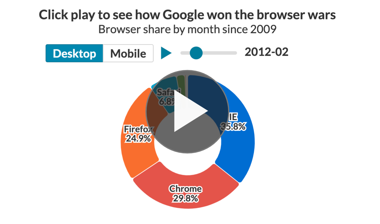
More filters and interaction in charts
The core template for making line, bar and pie charts has loads of new features: a row filter, single and multi series filters, clickable legends, bar sorting, automatic hiding of overlapping labels, and a new contrast mode for label coloring. Phew!
• Explorable, animated charts: blog and examples
Other news…
As usual we’ve been chipping away at all our templates. Recent changes include:
Keep an eye on the new changelog for more!
We’ll be back in a few weeks with more updates. In the meantime, as always, feel free to press reply with ideas, questions or feedback.
Best wishes,
Duncan and the Flourish team
Did someone forward this message to you? Join the list!
Flourish, part of the Canva family
33-35 Hoxton Square
London N1 6NN