Hi everyone,
Springtime greetings from virtual Flourish HQ! Here are this month’s updates.
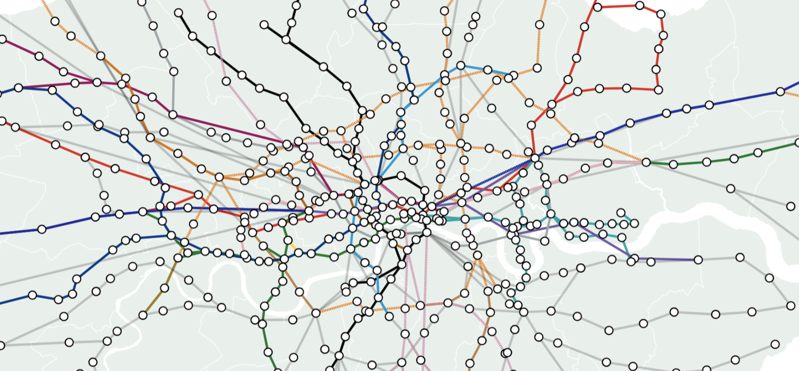
Line layer in Projection Map
In addition to displaying regions and points, our Projection Map template now also supports a line layer. This is great for drawing borders, geographical features and much more.
• View examples and learn more in our blog post
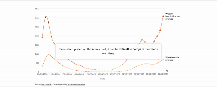
Masters series with Maarten Lambrechts
Our “Masters” series celebrates popular visualizations by the best practitioners, and helps you to produce similar things in Flourish. In our latest post, we recreated a sequence of connected scatter plots by data journalist and designer Maarten Lambrechts.
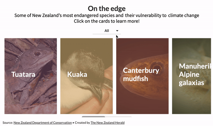
Filtering and popup panels for our Cards template
Our popular Cards template is great for displaying blocks of content in a grid or carousel. It now has two powerful new features: filtering and popup panels!
• Check out some examples in our blog
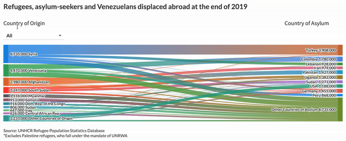
Labels and filtering for our Sankey Diagram template
We’ve also added filtering to our Sankey Diagram template, along with the ability to add labels for each “stage” of the graphic.
• Create a Sankey visualization now
Single-axis line/bar charts
We updated the combo chart mode in our Line, Bar, Pie template. You can now choose between single and dual axis modes, meaning you can keep your lines and bars on the same scale – even when using dynamic data.
• Learn more about combo charts in our help doc
We’re hiring!
We’re looking for an information security manager to oversee and improve our infosec processes. We’re committed to equality and diversity in the tech industry, so we’ll be especially happy to see applications from under-represented backgrounds.
• Apply now or spread the word
More features
• We made our template settings more accessible for keyboard navigation
• Line charts with a lot of data now load much faster
• When sorting a table, the header of the sorted column will be underlined
• Animations and filtering in our Scatter template are significantly improved
• Users in a company can now click through to colleagues’ visualizations via story slides
We’ll be back in a few weeks with more updates. Until then, as always, just hit reply with any ideas, questions or feedback – and keep an eye on the changelog for more updates!
Best wishes,
Luisa and the Flourish team
Did someone forward this message to you? Join the list!
Flourish, part of the Canva family
33-35 Hoxton Square
London N1 6NN