Hi everyone,
April was a busy month and we can’t wait to get you up to speed on some fresh new features and content!
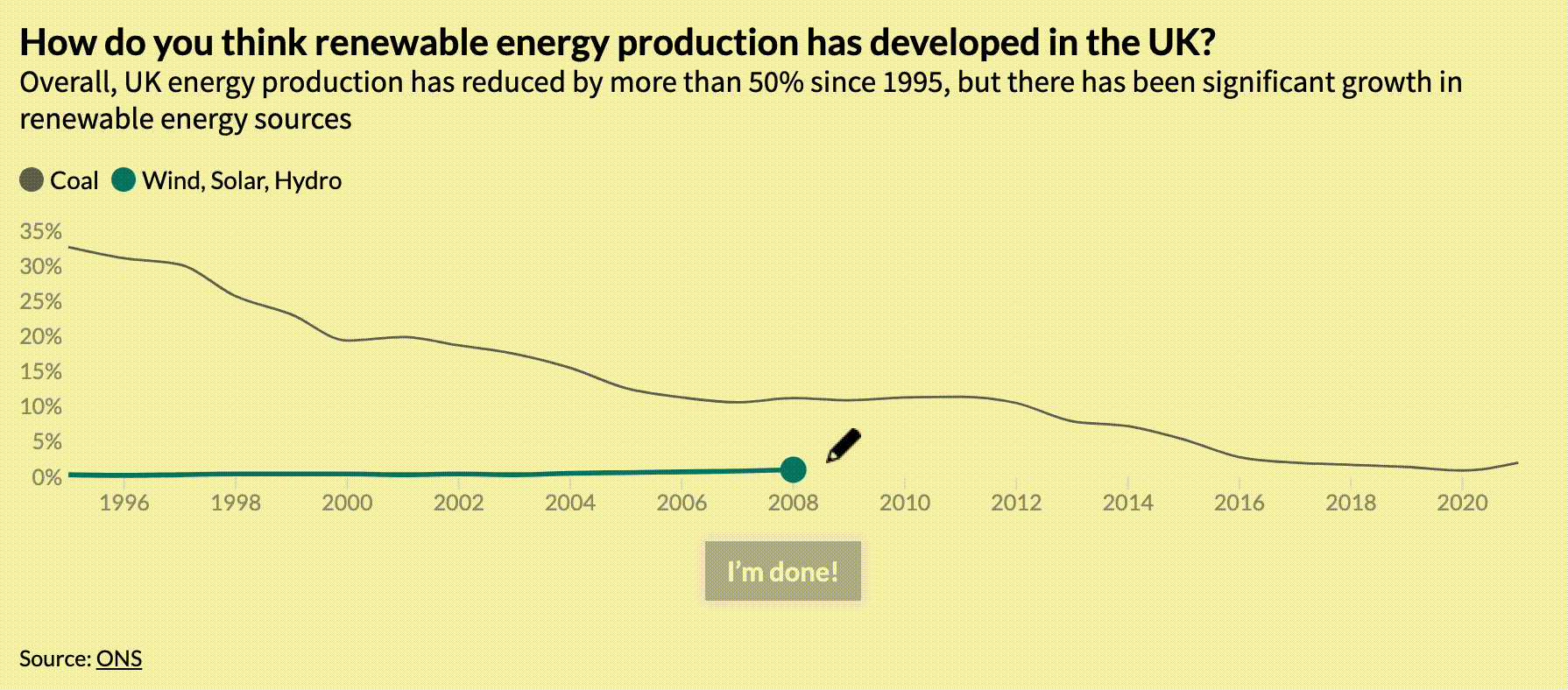
New template: Draw The Line
Our new Draw The Line template makes it quick and easy to engage audiences with time series data by asking them to guess what happened. The new template is launching as one of our premium templates, which means you’ll need to be on an Enterprise plan to use it.
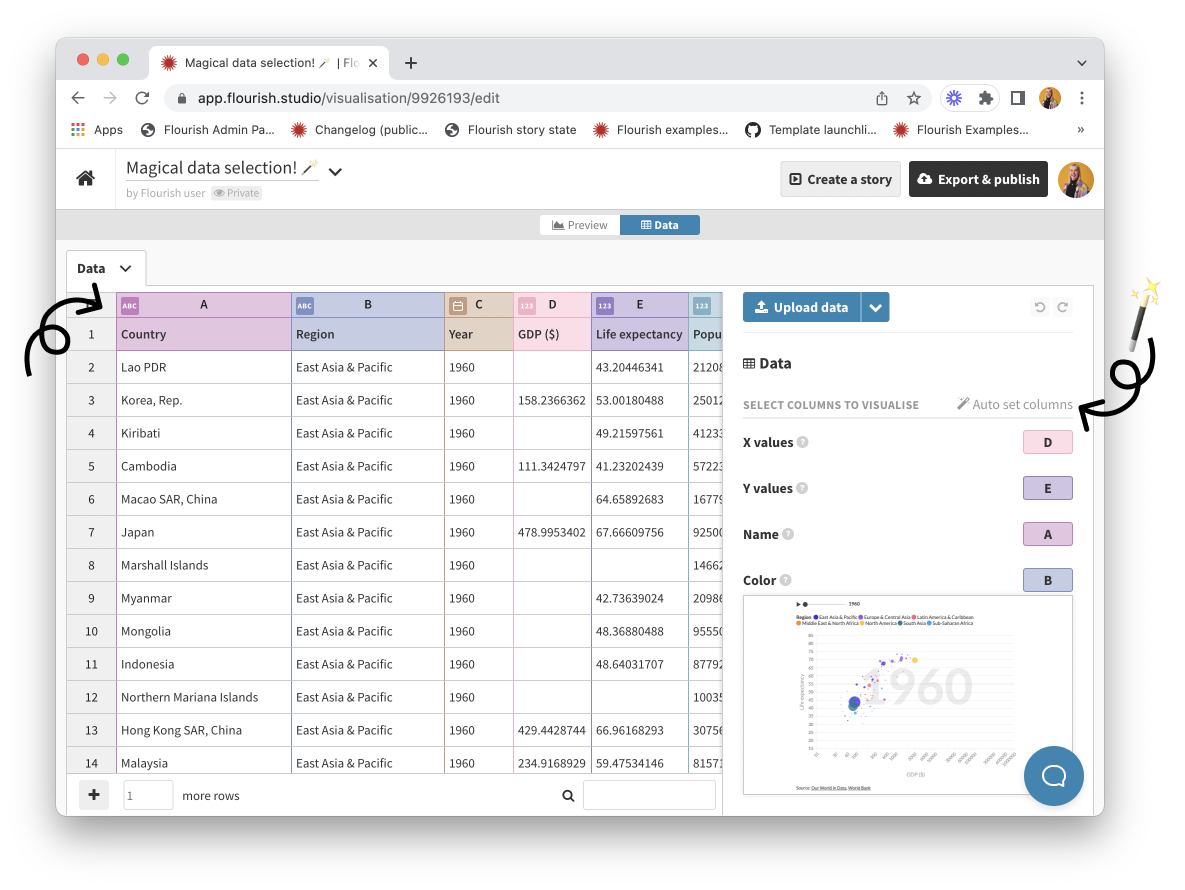
Introducing automatic column selection
Our new data typing feature automatically selects column bindings based on your data in the Flourish app. This allows us to greatly simplify the settings panel and make binding columns a lot easier. You can already test it out in our Scatter, Radar Chart and Table templates by selecting “Auto set columns”. You’ll be able to see which column types were assigned and change them in the column headers. More templates will follow soon!
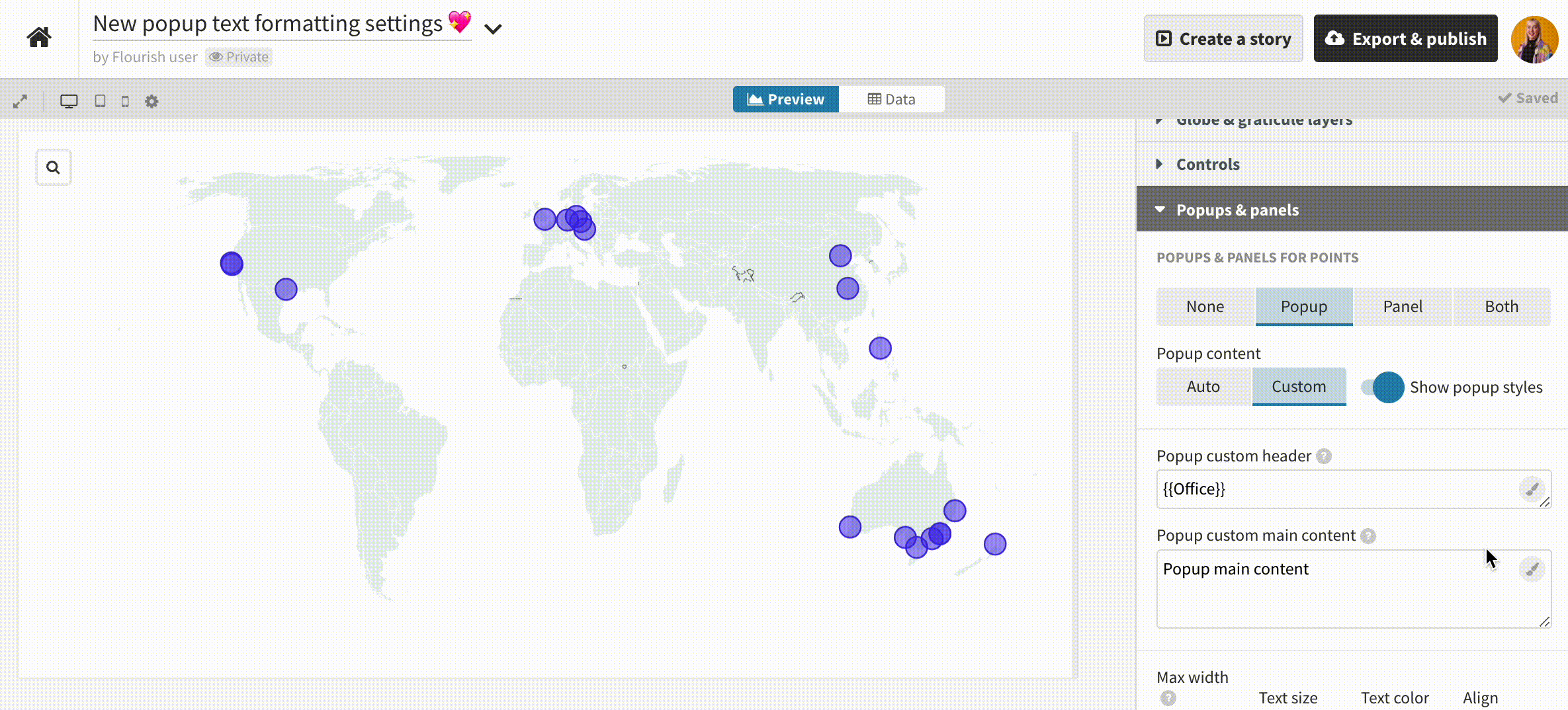
Visual popup editor in projection maps
We’ve added a visual text editor mode to the Projection Map template’s popup settings. You can now easily format your text and even add Flourish embeds! We’ll be rolling the new editor mode out to all Flourish templates that support popups and panels in due course.
Increasing engagement through data visualization
Visualizing (and grasping!) data is a complicated task, and presentation is key. In our latest blog post, we look at ways data visualization can increase engagement and improve communication across different industries and use cases. Did you know that charts can increase scroll-through to the bottom of a page by up to 317%?
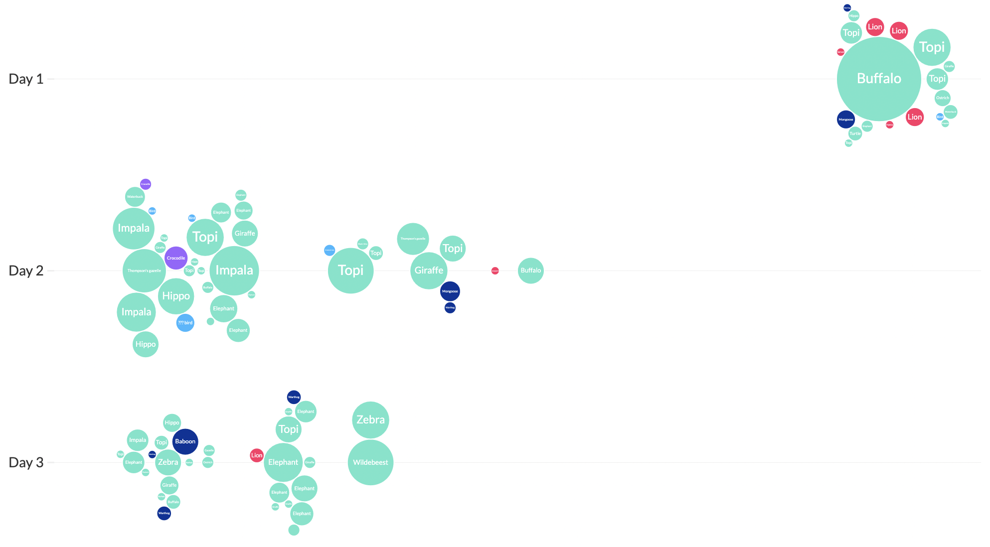
Three days on safari in data
Our support and content intern Yaning went on a safari in the Maasai Mara National Reserve and, in true Flourish fashion, she recorded all the animals she saw and visualized the data.
• Check out her visualizations in our blog
Upcoming webinars
Our “Tea Break” webinars – available to all users – are a great way to learn about new parts of the Flourish world. On April 26th we went over how to improve your data storytelling skills and we kickstarted May with a session on tips, tricks and hacks to unlock Flourish’s potential. To close this month we’ll host the session “Radar charts 101” on May 24th. Join us to learn more about how to make the most of your radar, stellar and radial bar charts.
Can’t make it? No problem. You can find all the recordings of our previous webinars on our YouTube channel.
• Sign up for our “Tea Break” webinars

Other updates
• Take your story captions to the next level by adding some basic formatting. Follow the steps in this help doc to learn how this little trick works.
• You can now shade full rows and columns in our Table template.
• We shared some tips on how to find good data sources for your projects in our social media. Follow us to get all the updates!
We’re hiring!
The Flourish and Canva teams are growing and we have great opportunities across several teams. We’re currently looking for a a senior backend engineer, a content moderator, an infosec compliance analyst, and an operations lead to work in our London-based team.
• Does this sound like you or someone you know? Apply now or spread the word!

We’ll be back in a few weeks with more updates. Until then, as always, just hit reply with any ideas, questions or feedback – and keep an eye on the changelog for more updates!
Best wishes,
Luisa and the Flourish team
Did someone forward this message to you? Join the list!
Flourish, part of the Canva family
33-35 Hoxton Square
London N1 6NN