Hi everyone,
June has been busy and we can’t wait to get you up to speed on some fresh new features and content!
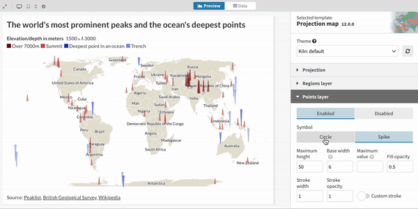
Welcome spike maps!
Our Projection Map template just got more powerful. The new spike map mode gives you the option to plot your points data as spikes rather than circles. Spikes reduce overlaps on busy maps – and unlike circles they allow you plot negative values. They look super cool too!
• Check out our blog post to learn more
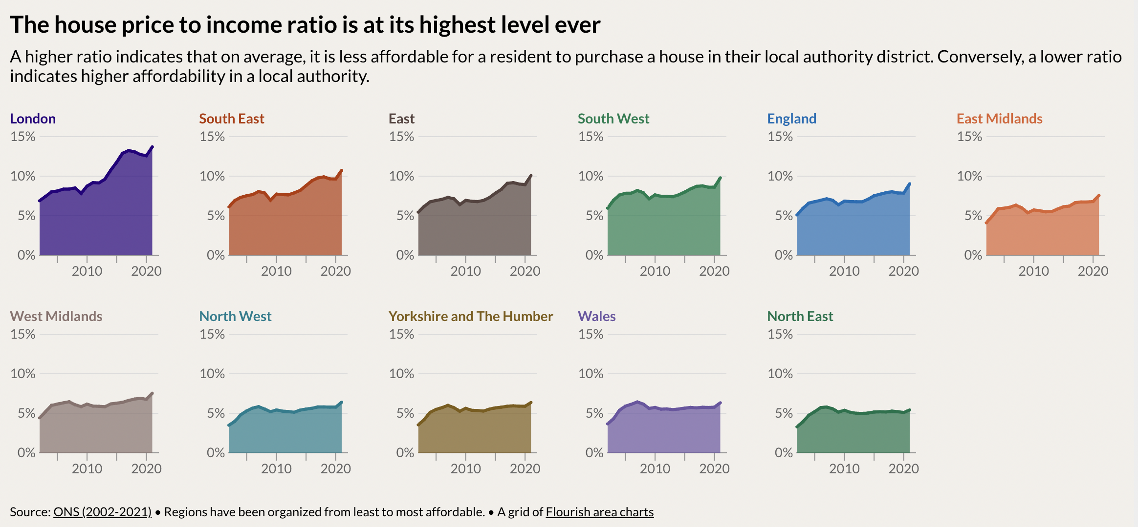
Visualizing the UK housing crisis
Home ownership is out of reach for many people in the UK. Data shows that average house prices have increased by over £47,000 since the 2020 lockdown. As our visual exploration shows, other factors such as population increases and cost of living also contribute to this issue.
• Read the full story in our blog
Unpacking Asia’s complex dynamics with data storytelling
We chatted to the creators of Kontinentalist, a digital newsroom focused on Southeast Asian affairs, to learn how they use Flourish in their daily tasks. From brainstorming and experimenting to advanced interactive scrollytelling, Flourish has helped them tell better stories.
How visualization can empower students in a data-driven world
Data visualization is a key skill in today’s data-driven world and it is never too early to start learning! Together with the Canva for Education team, we wrote a guide to help parents and teachers introduce data visualization concepts to younger generations, including five practical exercises.

“Tea Break” webinars are on holiday!
We’re taking a short break from our “Tea Break” webinars. But don’t worry, you can view any of our previous webinars on our YouTube channel and you can or visit our Help page to access hundreds of short articles showing you how to use Flourish. We’ll be back by the end of the summer with more sessions and brand new content. We’ll share more information soon!
• Visit our “Tea Break” webinars page

Other updates
• Learn how to add multiple custom prefixes and suffixes to your charts using custom popups and a little bit of CSS
• To commemorate the Queen’s Platinum Jubilee, we mapped out the family tree of Her Majesty’s beloved corgis (and dorgis) using the Sankey Diagram template. Follow us for more data-driven content!
We’re hiring!
The Flourish and Canva teams are growing. We have great opportunities across several teams, including senior backend and visualization engineers and a lead product designer to work in our London-based team.
• Apply now or spread the word!

We’ll be back in a few weeks with more updates. Until then, as always, just hit reply with any ideas, questions or feedback – and keep an eye on the changelog for more updates!
Best wishes,
Luisa and the Flourish team
Did someone forward this message to you? Join the list!
Flourish, part of the Canva family
33-35 Hoxton Square
London N1 6NN