
Hi everyone,
Amid record temperatures in London this week, we’ve been busy adding new features to Flourish and are excited to share the following updates…
Chartmaking just got easier with automatic column selection
Our new data identification feature – which we like to call data magic – makes the visualization process quicker and more intuitive by mapping columns of data to different aspects of a visualization automatically. This marks a major milestone in our goal to make the data visualization process easier for everyone.
• Check out our blog post to learn more
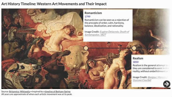
It’s about time: introducing interactive timelines
Anything good is worth waiting for and boy, is our new premium Timeline template good! It allows you to visualize chronological events interactively, add images and links, change the layout for desktop and mobile and much more.
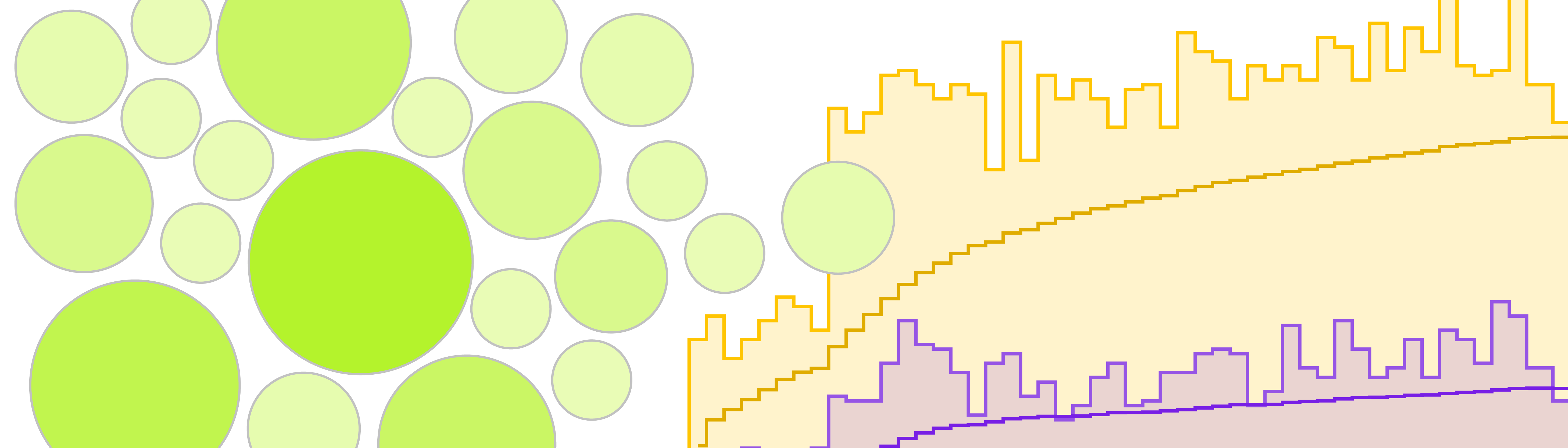
Wimbledon in eight charts – from tie breaks to ticket costs
The Wimbledon championships took place this month and we took a deep-dive into historic data to find out how many players are left-handed, which country has the most winners for the single’s event, how tickets prices have developed over time and whether ranking scores can predict the winner. (Spoiler: They can if you’re Novak Djokovic).
• Read the full story on our blog
AdKaora used Flourish to dynamically power their live marketing platform
We chatted to the team at AdKaora, a proximity marketing agency based in Milan, to learn how they used the Flourish API to automate their reports and to show real-time data to their customers.

More updates
• You can now count up to a specified date in our Countdown template
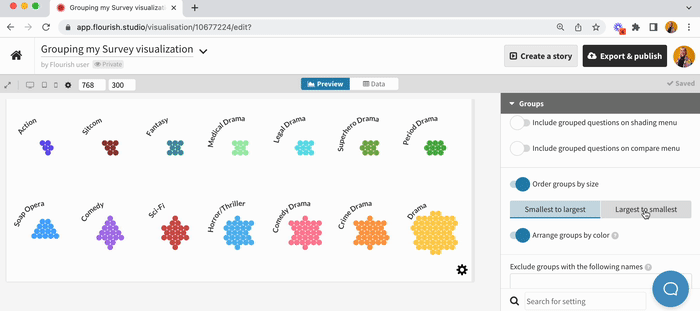
• You can now order groups in surveys in ascending or descending order
• The story editor has a new search bar for you to find your visualizations more quickly
• Learn how to create custom bins using a VLOOKUP formula in our help doc – this can be useful to color points in your projection maps numerically.
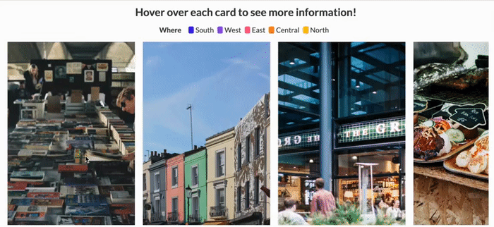
• Did you know you can create flippable cards with our Cards template with some custom CSS? Check out our help doc to learn how.
Check our changelog to see more updates on what’s new in Flourish!
Come work with us!
The Flourish and Canva teams are growing. We have great opportunities across several teams, including senior backend and visualization engineers, to work in our London-based team.
• Apply now or spread the word!

We’ll be back in a few weeks with more updates. Until then, as always, just hit reply with any ideas, questions or feedback – and keep an eye on the changelog for more updates!
Best wishes,
Luisa and the Flourish team
Did someone forward this message to you? Join the list!
Flourish, part of the Canva family
33-35 Hoxton Square
London N1 6NN