Hi everyone,
September was packed and we can’t wait to tell you all about it! We went to the ONA conference in LA, published some exciting content and launched some new features. Let’s dive straight in…
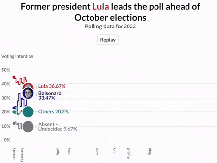
Four metrics to visualize in your elections coverage
In this post, we show you how to effectively visualize four different election metrics, from opinion polls to the race’s final results. You’ll find loads of inspiration for your own elections coverage – from maps with custom popups and arrow plots to parliament charts showing party coalitions.
• Check out our blog post to learn more
Here’s why data storytelling is important for your business
Data is at the center of most decisions businesses and organizations make nowadays and knowing how to display data is as important as knowing how to interpret it. In this blog, we argue when is it best to swap the traditional dashboard for a data-driven storytelling piece.

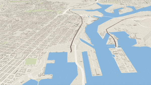
How to plot lines on a map and bring them to life with animation
Lines have arrived to our 3D Map template! With the new line layer you can now you can visualize everything from railway lines and jogging routes to disputed borders on your maps. Pro tip: use the autoplay setting on our stories to bring them to life.
• Read the full story on our blog
Common mistakes on data visualization and how to fix them
Have you ever used a chart type just because it looked “cool”? Or added many flourishes to a chart unnecessarily? No worries, we’ve all been there! In this blog, we go over some common mistakes in data visualization and how to fix them to help you improve your charting skills.
• Read the full story on our blog

Learn how to visualize elections data effectively
The US midterm elections are around the corner and Brazil’s due for a second round on their presidential race, to it’s the perfect moment to learn how to visualize elections data. Join us on Tuesday, October 11th (4-5 p.m. BST) for a session packed with tips, tricks and lots of examples to inspire yout electoral coverage. See you there!
• Visit our website for more details

More updates
• The Canva Visual Worksuite is officially live! This includes features like docs, videos, presentations, and Flourish charts available to users.
• Enterprise customers with SSO now have a Log in with SSO button in their profile. You can learn more about this here.
• It was incredible to meet some of you in person at the ONA conference in LA in September. We hosted two sessions and loved hearing more about the kinds of things our users are working on. You can check out an interactive dot visualization about the conference attendees here.
Check our changelog to see more updates on what’s new in Flourish!
Come work with us! The Flourish and Canva teams are growing. We have great opportunities across several teams, including senior backend and visualization engineers and a data visualization project expert, to work from our brand-new office in London.
• Apply now or spread the word!

We’ll be back in a few weeks with more updates. Until then, as always, just hit reply with any ideas, questions or feedback – and keep an eye on the changelog for more updates!
Best wishes,
Mafe and the Flourish team
Did someone forward this message to you? Join the list!
Flourish, part of the Canva family
33-35 Hoxton Square
London N1 6NN