Hi there,
Thanks for signing up to Flourish! This is the second of three emails we’ll send you about getting started.
One question our users often ask is: how do I choose the right visualization for my data?
The choice can feel overwhelming, but narrowing it down is easy by asking another question: what is your data trying to communicate?
Here are some suggestions based on categories from the FT’s visual vocabulary.
1. Change over time
If you mainly want to communicate change over time, use these.
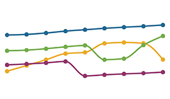
Line:
The standard way to show changing time series
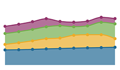
Area:
Great at showing total change, though individual series are less clear
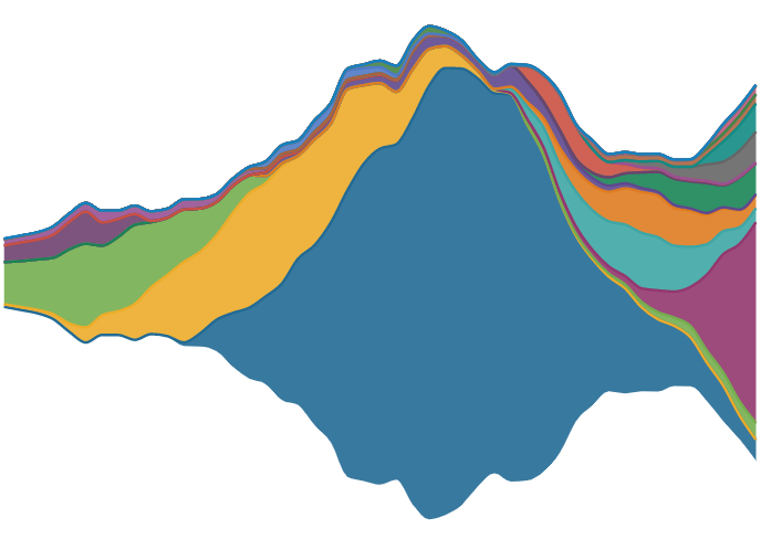
Streamgraph:
A type of area chart; use when seeing changes in proportions over time is particularly important
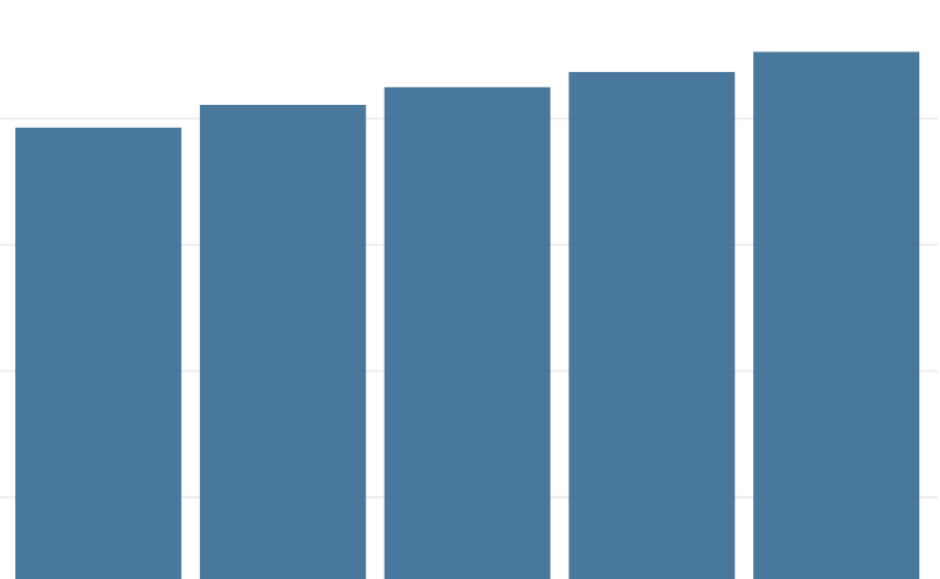
Column:
Another way to show change over time, especially for a single series
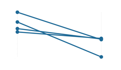
Slope:
Good for clearly conveying ‘before and after’ data
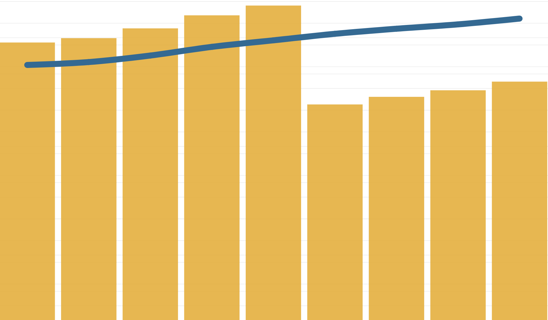
Column + line:
A good way of showing the relationship over time between an amount (columns) and a rate (line)
2. Magnitude
Use these when you mainly want to communicate size comparisons, relative or absolute.
Column:
The standard way to compare the size of things; y-axis should always start at 0
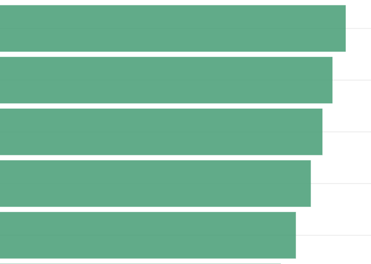
Bar:
Like columns, especially when the data are not time series, or axis labels are long
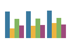
Grouped column:
As per column, but for multiple series
Grouped bar:
As per bar, but for multiple series
Radar:
A space-efficient way of comparing people, places or other entities across multiple metrics
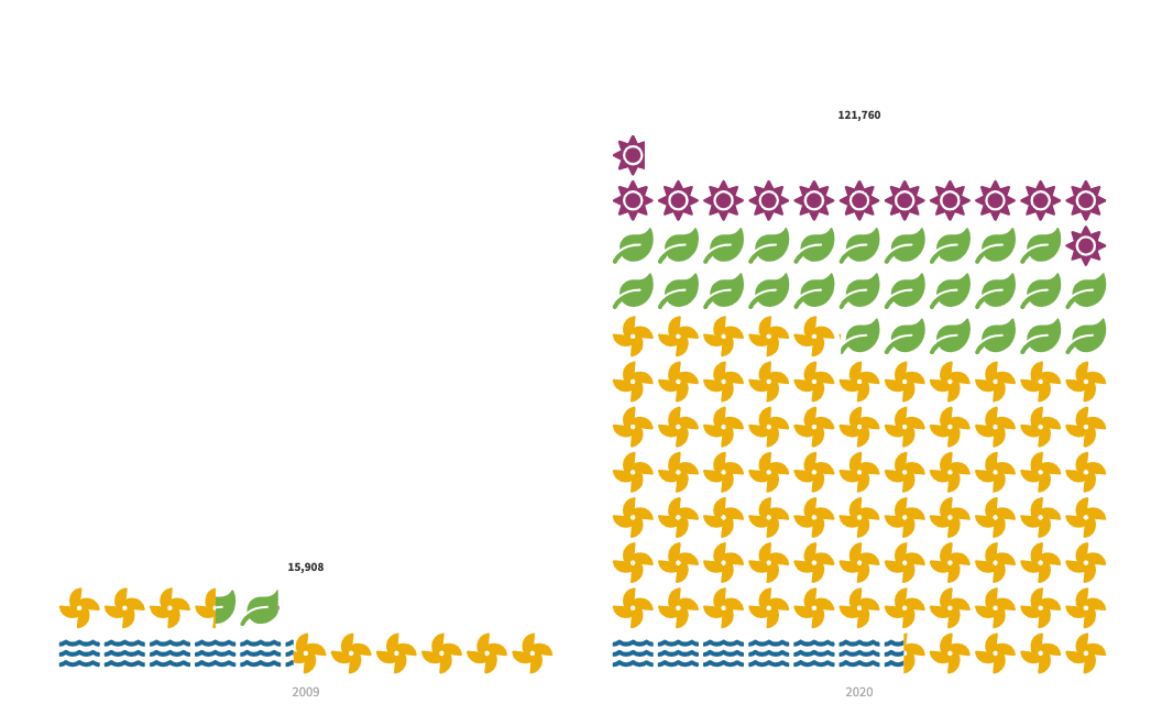
Pictogram:
A great choice for communicating statistics in a visually engaging way, this visualization type encodes numeric data as groups of repeated icons
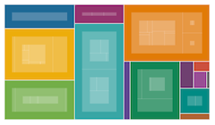
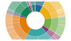
3. Parts of a whole
Use these to show how an entity breaks down into its components. (If you’re mainly interested in the absolute size, consider a size chart instead.)
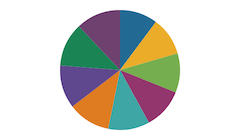
Pie:
Common, though hard to accurately compare the segments
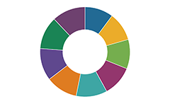
Donut:
Similar to a pie, though the centre can be used to convey additional information
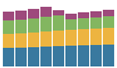
Stacked column:
Good for combining with change over time, though can be hard to read
Treemap:
Use for hierarchical part-to-whole relationships
Sunburst:
Attractive alternative to treemap, though may be harder to read
Packed circles:
Attractive alternative to treemap, though may be harder to read
Radial tree:
Attractive alternative to treemap, though may be harder to read
Waterfall:
A variation on the column chart, it is useful for showing the cumulation of positive and negative values across time or categories
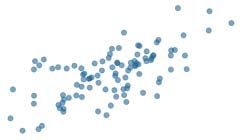
4. Correlation
Use these to show the relationship between two or more variables.
Scatterplot:
The standard way to show the relationship between two continuous variables
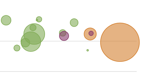
Bubble chart:
Like a scatterplot, but sizes the circles by a third variable
Connected scatterplot:
Aka Rosling chart: show how relationship has changed over time
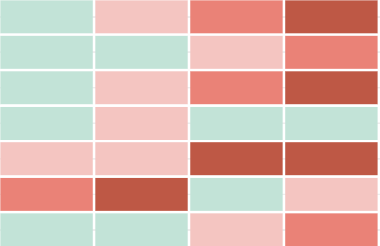
Heatmap:
A good way of showing the patterns between two categories of data, less effective at showing fine differences in amounts.
5. Ranking
Use where an item’s position in an ordered list is the most important thing about your visualization.
Ordered bar:
A simple bar chart. Just order your data as you want it to display
Line Chart Race:
Also known as a bumps chart. Show more detailed comparison over time
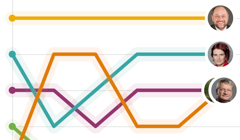
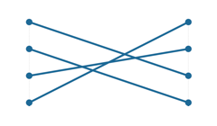
Slope chart:
Perfect for showing effectively how ranks have changed over time
Bar Chart Race:
For visualizing the changing fortunes of people or groups in competition with each other
6. Distribution
Show values in a dataset and how often they occur. The shape of a distribution is often useful to see.
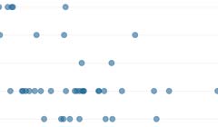
Dot plot:
A simple way to show raw values in the data, across categories
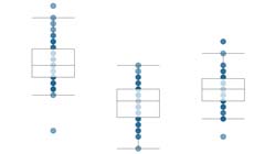
Box plot:
Summarize multiple distributions by showing the median & range of the data
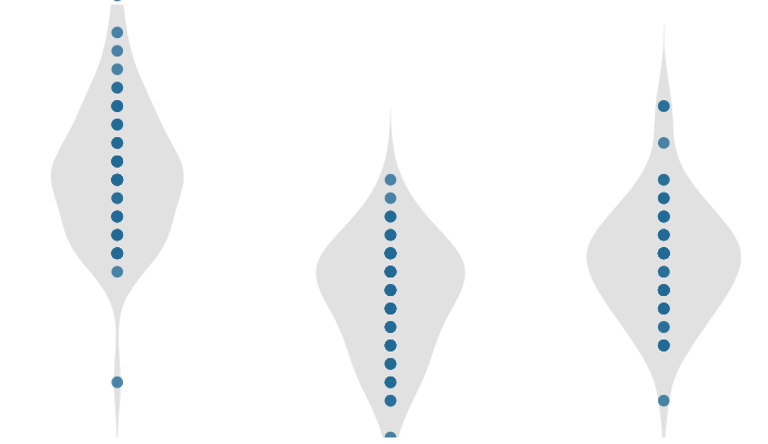
Violin plot:
Similar to a box plot but more effective at conveying complex distributions
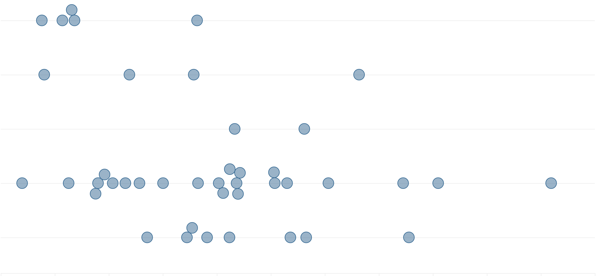
Beeswarm:
Used to emphasize individual points in a distribution. Points can be sized to an additional variable. Best with medium-sized datasets
Population pyramid:
A standard way for showing the age and sex breakdown of a population
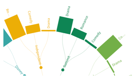
7. Flows and relationships
Use these to show volume, movement or connections.
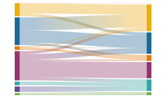
Sankey:
Show changes in volume between different conditions
Chord:
A complex but powerful way to illustate two-way flows
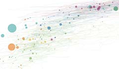
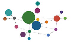
Network:
Use to show the strength and connectness of relationships
Waterfall:
A variation on the column chart, it is useful for showing the sequencing of data through a flow process, typically budgets.
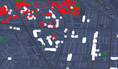
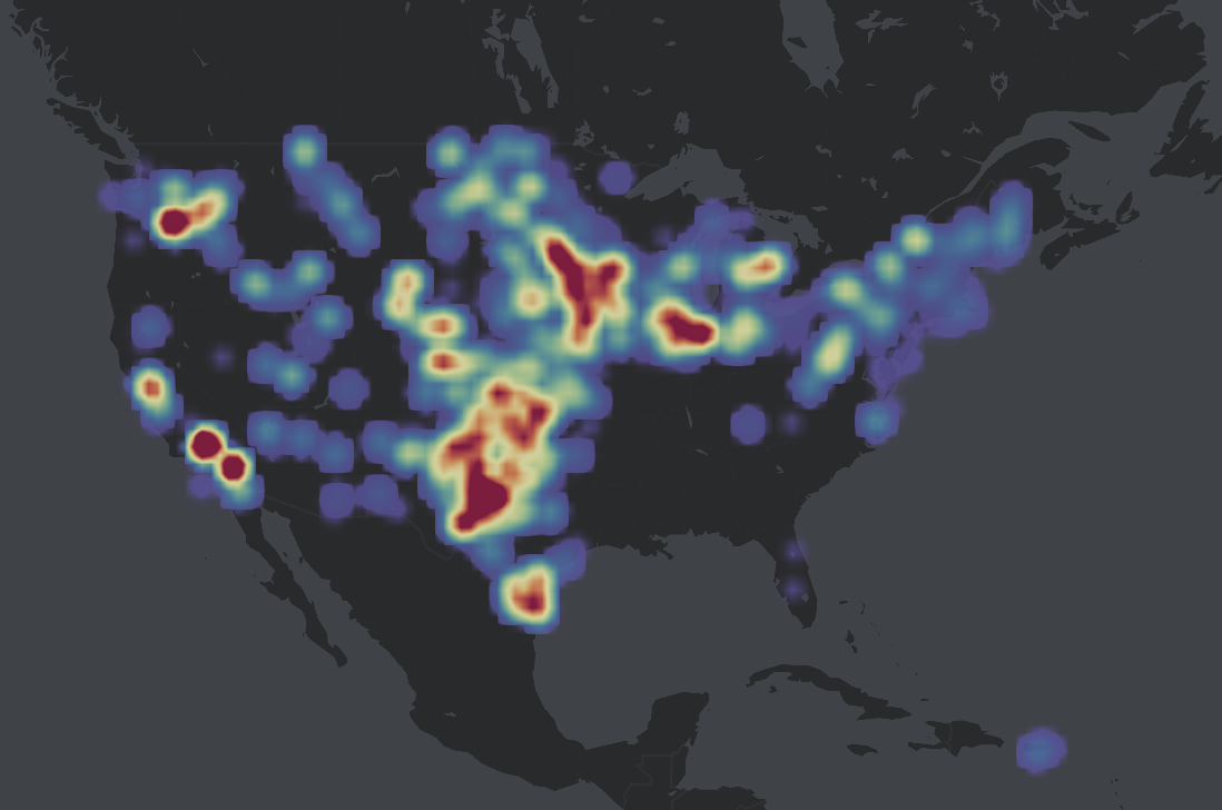
8. Geospatial
Use when geospatial patterns in your data are more important than anything else.
Projection map:
Use with your own GeoJSON data
Marker map:
Simple point map, using icons or emojis and custom regions
Connections Globe:
Unique way to show flow between countries
Arc map:
For showing unambiguous movement across a 3D Map
3D Map:
For displaying large geographic datasets along with regions and optional time slider
Heatmap:
Visualize the density of points. Ideal to identify or showcase trends and hotspots in locations data.
9. Flourish special: Election visualizations
This category is specifically for people wanting to visualise the outcome of elections.
Parliament chart:
For visualizing parliament layouts
Election chart:
Searchable bar chart ideal for election results, includes a coalition builder feature
Sankey:
Also good for showing voting changes between elections
Bar Chart Race:
For visualizing the counting of votes as they come in
Hex map:
Perfect for displaying constituency-level metrics
10. Flourish special: Individual users’ responses
Another Flourish special! If you have data about individual events or entities, use the Flourish survey visualization to let your users query your data however they wish.
Survey:
Powerful interactive ‘dot’ visualization, good for exploring survey results
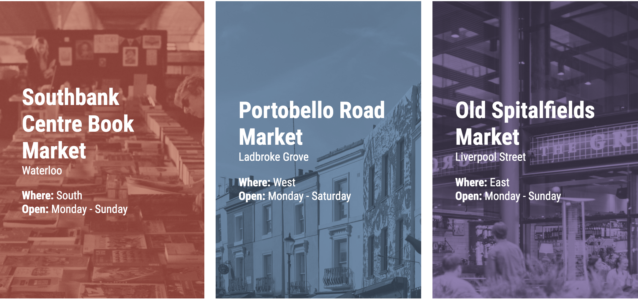
10. Flourish special: Showcasing content
Visual storytelling isn’t always about displaying data. Sometimes it’s about finding an effective and structured way to display content.
Cards:
Ideal for displaying blocks of content in a grid or carousel
Quiz:
A quiz format containing slider and multiple choice type questions
Photo Slider:
A simple interactive template to compare two pictures
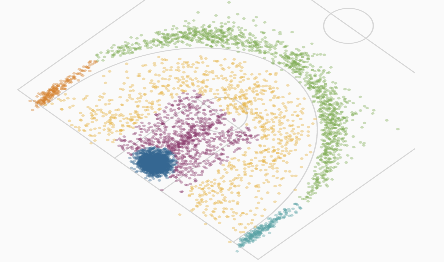
Sports:
A sports visualization to map a player's positions on a field/court
Just want to get started quickly with Flourish? See our three-minute getting started guide.
We look forward to seeing what you make!
Best wishes,
The Flourish team
Flourish, part of the Canva family
33-35 Hoxton Square
London N1 6NN
Unsubscribe