Our Data Explorer template helps you find the stories in your data – and tell them beautifully
The new template allows you to morph between various chart and map types to create rich and compelling data stories
The new Data Explorer template makes it easy to create rich interactive visualizations of datasets containing multiple metrics. It’s great for finding the stories in a dataset – and for telling those stories by animating magically between multiple types of charts and maps.
The template accepts any data where each row represents a unique entity – such as a country, company, person or product. Throw in as many numeric, categorical and geographical columns as you like – the more, the merrier! Then use the control panel in the visualization to explore and the template will do the rest.
The Data Explorer is one of premium templates, available to users on our premium plans. Get in touch with our sales team to learn more.
Let’s take a tour
Let’s try out the template with a dataset of nations, including demographic and environmental metrics such as population, GDP, carbon emissions and income group. Here’s a sample of the dataset. The blue columns contain text data (categories, names and identifiers) and the yellow ones contain numeric data:
Now let’s look at what happens when we drop this dataset into the new template. We’ll use Flourish scrollytelling to step through the views.
Each country (i.e. each row of data) becomes a bubble.
We can easily size the bubbles by any numeric metric, as we have done here with population.
We can also color the bubbles, either using a numeric column, such as GDP per capita …
… or a categorical column, such as income group.
Splitting the data into groups helps see the distribution between (and trends within) clusters – such as Europe’s large number of wealthy countries.
Sizing again by population, though, shows that many of European countries are tiny and far more people live in large middle-income nations such as India, China and Brazil.
Add more variables to tell a richer story. By positioning the bubbles by carbon emissions, we can see how populous countries are the biggest emitters in absolute terms.
But position by emission per capita – a fairer measure – and we can see that emissions seem to be mostly a function of affluence.
We can confirm this by choosing GDP per capita as a second numeric variable to position the dots. The template now automatically creates a scatter plot to show how the two metrics correlate – in this case very closely.
Changing to a map view helps see how each metric looks in terms of geographic spread. This view, for example, makes it clear that poverty is still heavily concentrated in Africa.
A tile cartogram also offers a geographic layout, while equally sizing the countries to make the small ones more easily visible.
Interviewing your data – and sharing the results
The true power of the Data Explorer template is its combination of quick exploration and beautiful explanation. Quickly selecting variables to see how they relate to each other makes it easier to discover patterns. Any views you find that are interesting can then be sequenced together into an animated story in just a few minutes.
When you share a story with others, you can decide whether to include the “explorer” controls in the visualization. In the scrolly example above, the controls are hidden, making the result feel like a piece of narrative content rather than a way to interrogate a dataset. But you may prefer to expose the controls to allow your viewers to dig into the data. Here’s the same dataset again, with controls, for you to explore …
Getting started
As with most of our templates, the magic starts in the Data tab where you can upload your data and choose which columns to visualize. Add as many categorical and numerical columns as you like. These will become available in the control panel for positioning, sizing and coloring. You can also choose a column to use as a Filter, if you want to expose smaller subsets of the data.
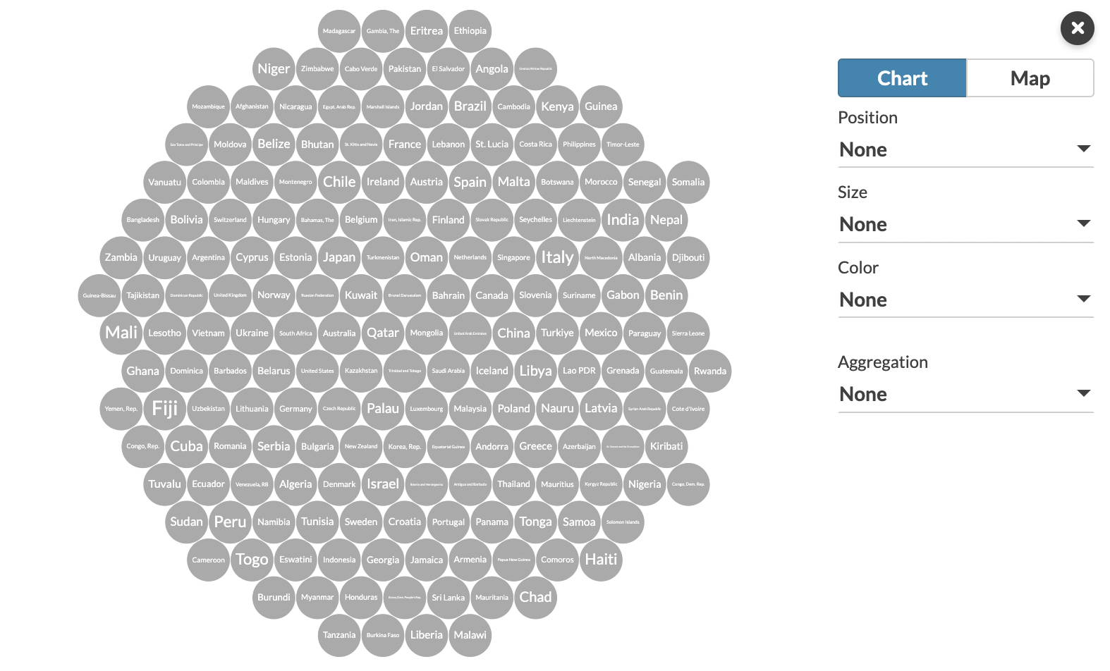
Variables can be selected and manipulated using the side panel in the Preview tab
If your data includes geographic information, you can enable one or more map views by choosing a column as the geographic “key” (such as a name or country code). The contents of this column should reference regions or coordinates listed in the Geo Regions and Geo Points data tabs. The template comes preloaded with countries in the region sheet, but you can easily customize this – for example by copying and pasting relevant geodata from any normal Flourish map.
The template performs best with tens or hundreds or rows of data. Pushing into the thousands will make a visualization that’s difficult to read and won’t animate as smoothly.
One unique trait from this template is that you can set two simultaneous color palettes: one categorical and one numeric. The correct one will be applied based on which type of data is being used for coloring.
Check out our help doc to learn more about this powerful and magical template.