How to make interactive waterfall charts
Easily create online waterfall charts that excel in visualizing financial insights
At Flourish, we’re always excited about chart types that delve deep into data, revealing compelling stories. This is the inspiration behind the versatile waterfall mode of our Line, Bar, Pie template, designed for crafting intricate visual narratives.
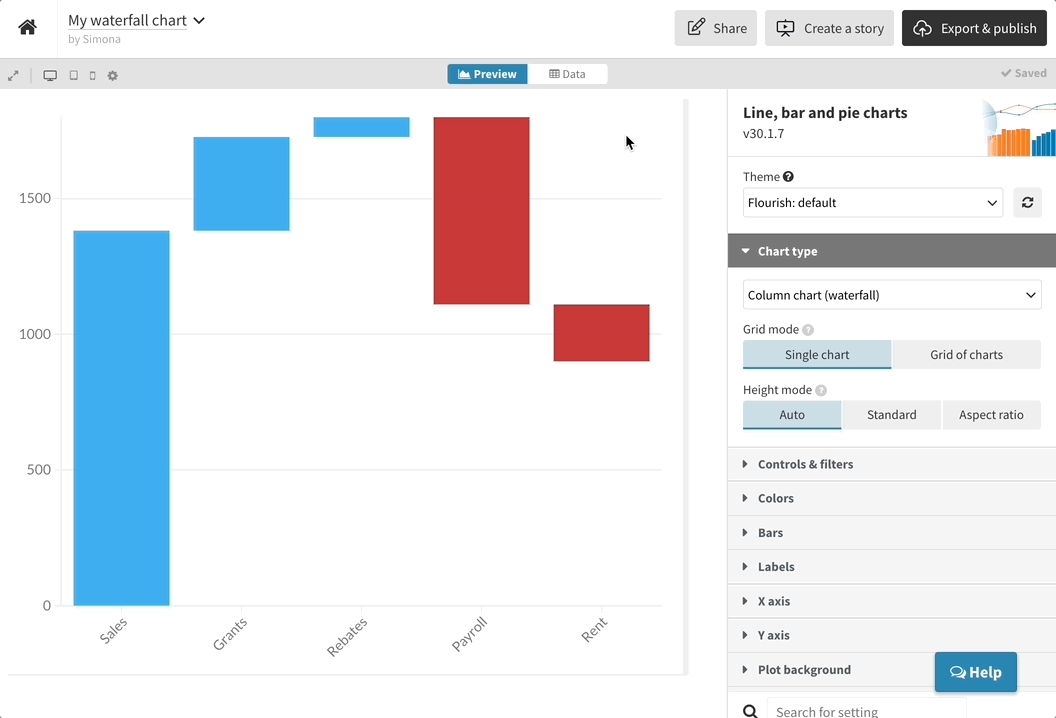
Despite its name, the waterfall chart isn’t used to visualize actual waterfalls. A variation on the column chart, it is useful for showing the cumulation of positive and negative values across time or categories.
Sometimes known as the “floating bar”, “bridge” or “Mario” chart, it visualizes a running total, with each bar plotted relative to the previous one. So you don’t just show the final outcome, but also how you got there.
Since the waterfall maker is part of the Flourish Line, Bar, Pie template, it automatically comes with loads of features such as small multiples, custom popups, number and date formatting, and animations between different chart types.
Waterfall charts: when and why?
Waterfall charts are used most frequently for financial metrics, such as revenues, costs and profits. They fall into two groups:
- Categorical: highlighting the stages in a process – for example, adding incomes and subtracting expenses to calculate profit
- Change over time: showing one metric that goes both up and down – such as month-by-month profit-and-loss and the resulting annual total
Column vs waterfall charts: what’s the difference?
In a normal column chart, each month or category is treated as separate from the next, with each bar starting from a zero baseline. This is optimal when the aim of the chart is to be able to visually compare the height of each bar.
By contrast, in a waterfall chart it’s harder to see how the size of the bars compare, but it’s super clear to see how the cumulative total builds up.
Use the story below to compare to same data in both chart types.
How to create waterfall charts in Flourish
To create a waterfall chart, simply select the waterfall starting point from the template chooser page. Alternatively, when working in the Line, Bar, Pie template, use the “chart type” dropdown to select Column chart (waterfall) for vertical bars, or Bar chart (waterfall) for horizontal bars.
Waterfall charts use the same data structure as other bar charts in Flourish. So when adding your data, you’ll need one column with your categories or time periods, and at least one column of values.
The template recognizes positive values as ones that should be plotted upwards from the previous bar, while negative values will be subtracted and move downwards.
Add a totalizer column to your data by leaving the value cell of a row blank. The template will calculate the difference between the previous bar and the X axis and draw a bar that fills the gap.
Read more about how to create your own waterfall charts (including how to color the bars based on positive versus negative values) in our help doc.
Excel at waterfall charts: tips and tricks
Great job on creating your waterfall chart! Now, let’s elevate it – here are some simple ways to truly harness its potential and make your insights flow.
- Add more context with axis highlights. This is a great way to bring attention to certain parts of your charts without overwhelming the viewer. And in Flourish, you can display text in your axis highlights across multiple lines and control the maximum width of your labels.
Use color overrides. Instead of assigning specific colors to each category (column), only highlight the most important elements. This way, the essential points take center stage and guide the user’s gaze. Read more about effective use of color in data visualization in our blog post.
Custom date axes in bar charts. Flourish makes customizing date formats on bar chart axes a breeze. If your dates are looking a bit cramped or unclear, hop over to the Data tab. There, you can tweak the format to something that’s clear and concise for your needs.
So, water you waiting for?
Create waterfall charts and explore all features in our core Line, Bar, Pie template – we can’t wait to see what you create!