5 pitfalls to avoid when working with color in data visualization
Mastering color theory for impactful data storytelling
Color is undeniably a vital element in the world of data visualization, and its impact goes beyond mere aesthetics. Whether it’s giving a boost to key concepts or sticking to the brand book, color is a constant companion in every chart.
Picking the perfect colors for a chart can be trickier than it looks, with a minefield of potential color mistakes to avoid. From the temptation of too few or too many hues to the pitfalls of overly bright or opaque choices, the journey through color can be tricky. Got carried away and ended up with a rainbow chart? We’ve all been there.
This blog is your guide through the maze of common color mistakes in data visualization, providing practical insights on how to rectify and elevate your visual storytelling.
Pitfall #1: Overwhelming with too many colors
Colors are great for distinguishing between categories in your data – but if you use too many colors it can have the opposite effect. Your visualization becomes hard to read.
Only use different colors when they actually mean something important in the data. While colors help the brain quickly identify differences, using lots of them makes this harder.
When people encounter a bunch of colors, they naturally try to figure out what each color represents. If your colors confuse them or don’t have a clear meaning, it hinders understanding.
As a rule of thumb, avoid having more than 6-8 colors in one chart. Instead, use a different chart type or group categories.
Skip the rainbow and put the focus on the vital bits. Instead of assigning specific colors to each category, highlight the most important elements, while grey is a good option for less important elements.
This way, the essential points take center stage and guide the user’s gaze.
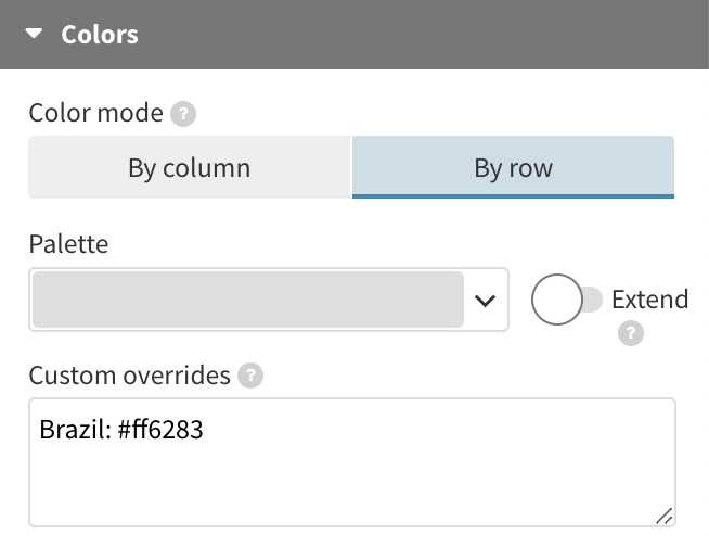
In Flourish, use the Custom overrides setting in the Colors section and disable the Extent toggle to to give all the lines, apart from the one specified in the overrides settings, the same color.
Pitfall #2: Overlooking the importance of contrast
When putting together a palette of colors, it’s important that they go together harmoniously and catch the reader’s eye. You might think going for super bright, vivid colors is the way to go, but that’s not quite the case.
While bright and bold colors do grab the most attention, using them extensively in a large area can actually lead to eye strain and make it harder for your audience to focus on your chart. Remember, understanding a graph or a map requires more than just a quick glance, so opting for slightly subdued colors is a better approach.
When choosing colors for your charts, avoid using hues at their maximum intensity in both saturation and brightness. Instead, consider either toning down one of these aspects or selecting a hue that deviates slightly from the pure color on the color wheel.
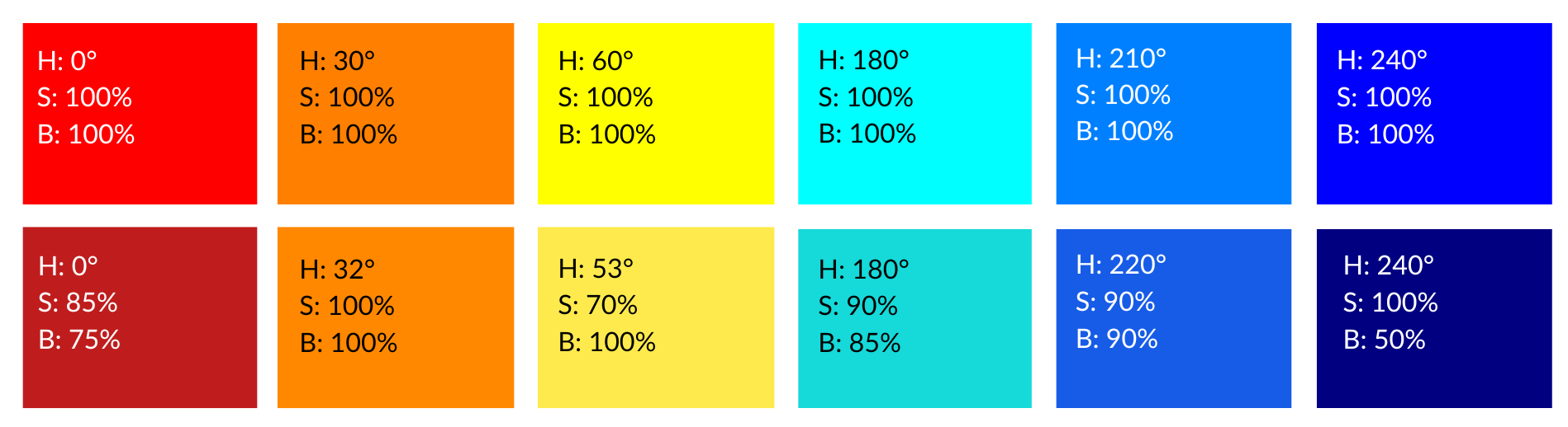
The bottom row tweaks the HSB of the colors above to create more subdued tones, which is better for large areas like charts. The first three colors are adjacent on the color wheel, while the other three are their complements on the opposite side. We deliberately limited our color selection to maintain consistency and avoid a rainbow effect.
Tools like coolors.co or Google’s color picker, which enable you to fine-tune the hue, saturation, brightness, and luminescence, offer excellent options for creating custom color palettes.
If we take pure yellow as an example (#FFFF00), its HSB (Hue, Saturation, Brightness) values would be 60°, 100%, 100%. To achieve a softer yellow, you have the option to either darken it by reducing brightness, greying it out by adjusting saturation, or shifting away from the pure hue by about 5-10°. In the example below, we kept the brightness at maximum but tweaked the hue and saturation.
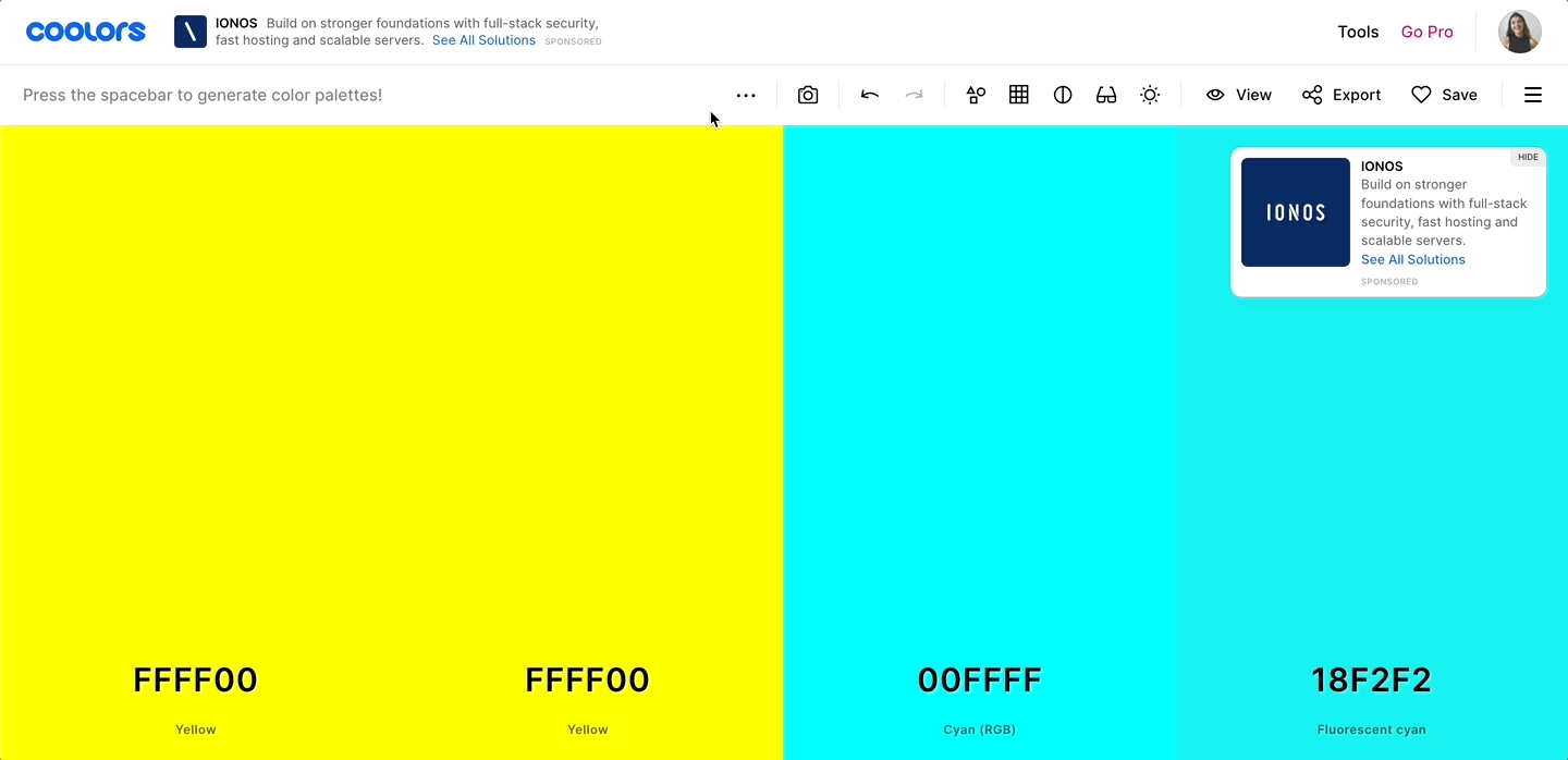
Free tools like coolors.co allow you to easily tweak the HSB to create variations of pure colors, which can be more aesthetically pleasing and provide better design flexibility.
In Flourish, we also recommend reducing the opacity of large chart elements, such as area charts or bars. This can be a simple yet effective method to alleviate eye strain. We also have an easy guide on how to make individual colors more transparent in your Flourish palette. This lets you mix colors with different levels of brightness, making your charts easier to read for everyone.
Pitfall #3: Overlooking accessibility best practices
While opting for slightly subdued colors is a best practice, it’s equally important to consider the contrast between the colors in your palette to ensure accessibility for everyone. Striking a balance between vibrancy and clarity is key to effective data visualization.
Be aware of color combinations that can pose challenges for those with color vision deficiencies due to the similarity in their appearance. Some shades of red and green, blue and purple, as well as green and yellow can be particularly hard to distinguish.
Use online tools to assess the accessibility of your chosen color palette – browser extensions like Let’s get color blind are great for simulating how your visuals might be perceived by individuals with various forms of color blindness.
Choosing a background color for your visualizations
Your branding guidelines may dictate a specific background color for your visualization that lends a distinctive or memorable touch. However, it’s worth bearing in mind that not all colors play well on colored backgrounds.
The Web Content Accessibility Guidelines (WCAG) provide information on achieving optimal contrast ratios for text and graphic elements – although data visualizations still occupy a somewhat uncertain territory in this regard.
The latest version of WCAG uses a new color contrast method called Advanced Perceptual Contrast Algorithm (APCA), which uses an updated scoring system for calculating contrast, taking text size and weight into account. At Flourish, we also utilize APCA to auto-adjust label contrast in our Line, Bar, Pie and Hierarchy templates.
If you choose to adhere to WCAG’s recommended guidelines, APCA’s Contrast Calculator is a valuable tool that allows you to test whether your labels and colors maintain a strong contrast against your chosen background. Anything below 15 will be practically invisible, and for body text (such as axis ticks), it’s advisable to achieve a contrast of more than 60.
Remember to also leave some spacing between each color (like we did in the right example above). This makes them easier to tell apart and improves the overall clarity of your visualization.
For more information on accessibility, check out our blog post detailing the steps we’re taking to enhance the usability of our tool. You can also find quick tips here to ensure your chart is more accessible to a wider audience.
Pitfall #4: Applying colors inconsistently
Visualizations are powerful storytellers, but only if they are consistent. When you’re working on multiple charts with the same topic and variables, color coding becomes critical. To avoid confusion, make sure to use identical hues for the same variables in all of your charts.
Let’s say you have multiple visualizations on population statistics, all of them featuring births and deaths.
If you switch up your color scheme in each graph, it will be tough for readers to follow the story. It can also cause them to mistake one data series for another.
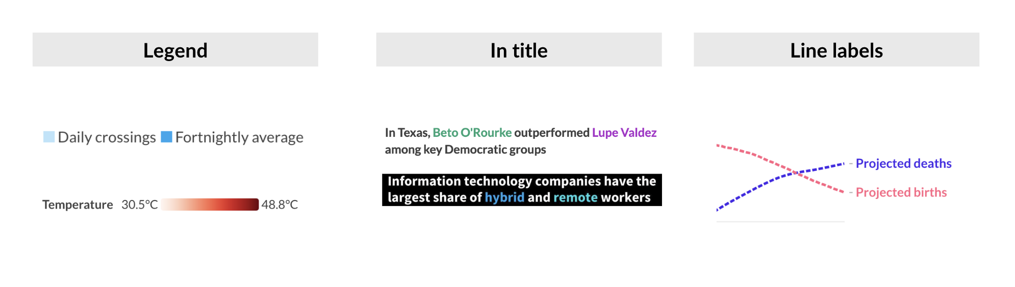
It’s equally important to tell your readers what your colors stand for. There are many ways to create a color key. Here are three of them:
Pitfall #5: Using the wrong color scale
Now, let’s talk about an element in data visualization that relies entirely on how well color is used, and that’s color scales. As a quick recap, color scales map out the relationship between the data and the colors on a chart or map. They can help us separate data into groups, highlight specific data points, or showcase numeric values.
Color scales can be categorical or numerical. A categorical scale splits data into groups or categories, like income regions or types of industry. A numeric scale assigns a color to each element on the chart based on its value. Think of it as if each value in your data is translated into a specific hue. To make sure you use the right scale, ask yourself: am I using color to communicate numbers or categories?
Numeric color scales can be sequential or diverging, and it’s important to understand when to use which one. A sequential color scale maps all the values in your data to the color spectrum, while a diverging color scale has a natural break in the middle that splits the data into at least two groups. Here, knowing which one to use is easy, just check if your data has a clear split that you want to highlight, like if you’re dealing with data below and above zero, or above or below an average or threshold.
At the same time, each of these scales can be linear or binned. Linear simply means that the colors in the chart extend from the lightest to the darkest shade infinitely, like in a gradient, while binned color scales have a specific number of bins with an assigned color and a specific number of values that fall into each bin. Which one you use will depend on how your data is distributed.
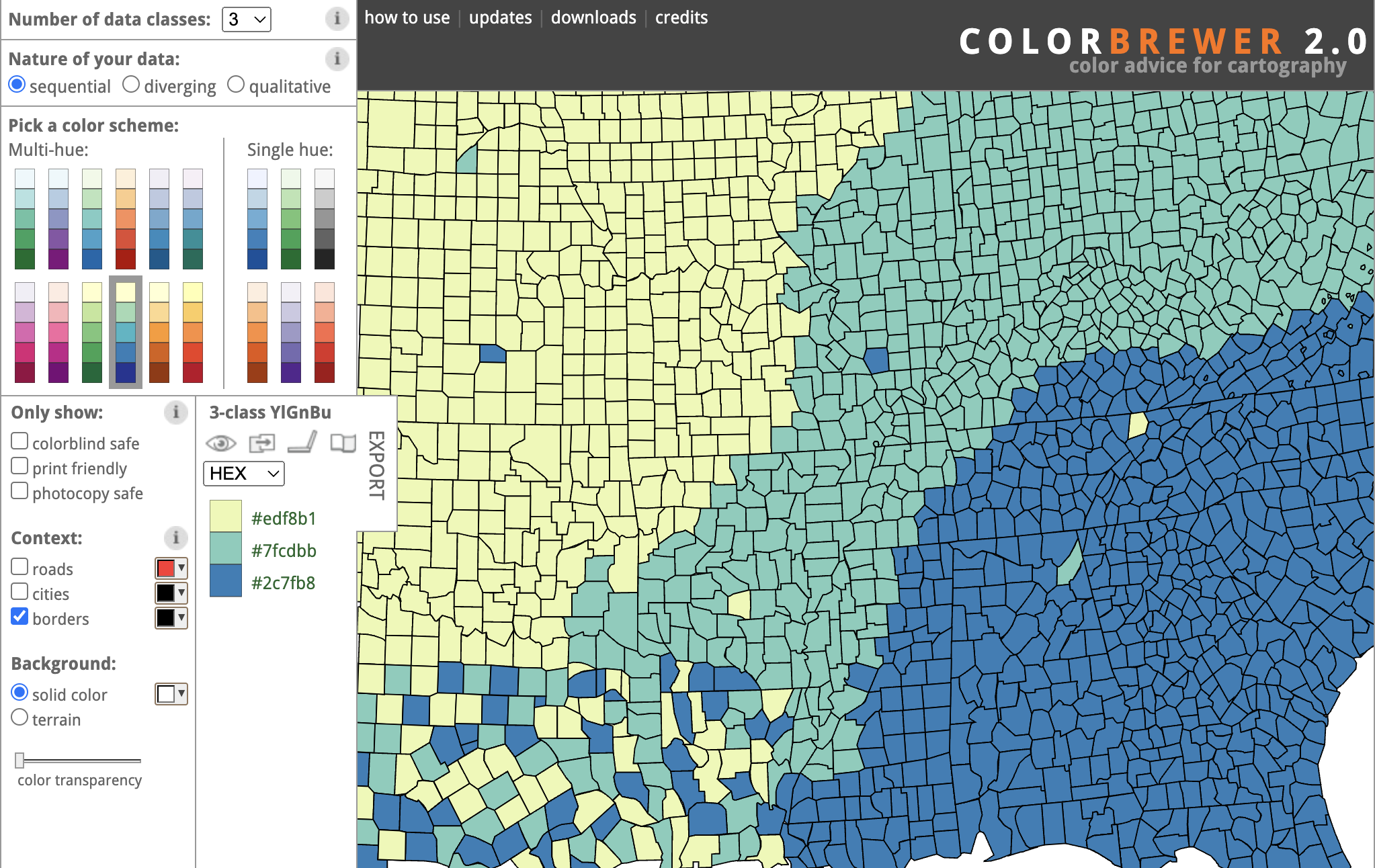
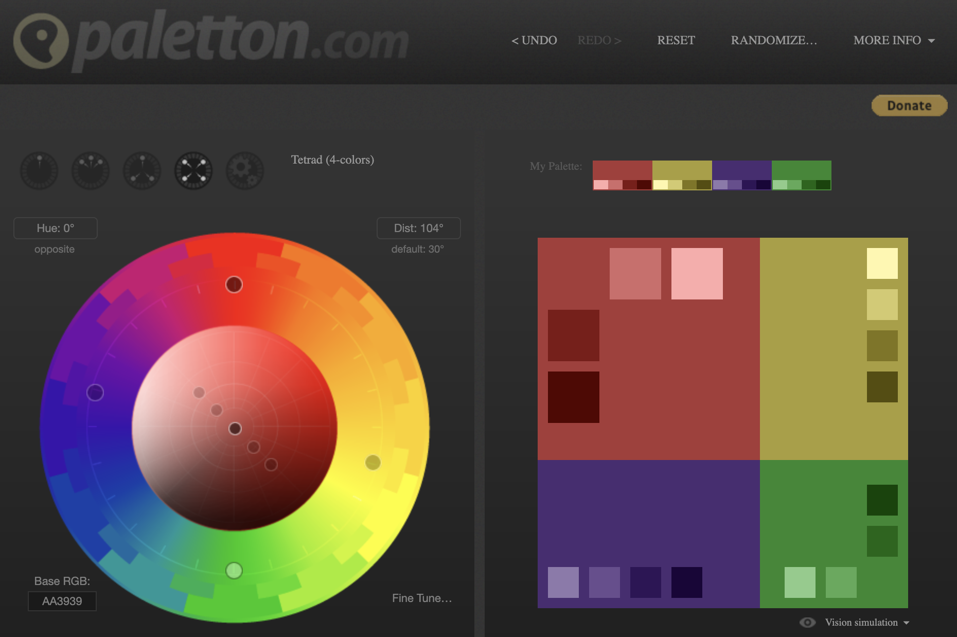
As you can see, color scales are no easy feat, but there are tools to help you choose the best hues for your chart. Paletton is a great resource when creating categorical palettes. You can select up to four hues and get their gradients too. When working with maps, ColorBrewer is a great tool to get inspiration. It offers pre-loaded standard palettes and checks them for accessibility and legibility.
Color can be used to make insights clearer and easier to find, emphasize significant points in the chart, and let you tell a more effective story. This is why it’s important to always consider your color choices as carefully as possible when creating data visualizations. As you can see, the topic of color is very broad and we could talk about it forever! But for now, we hope you enjoyed this blog and, more importantly, that you unleash the power of color in your own work.