Rethinking chart legends: when and how to use them?
Combining legends with titles makes your visualizations simpler and more impactful – and it’s super easy in Flourish
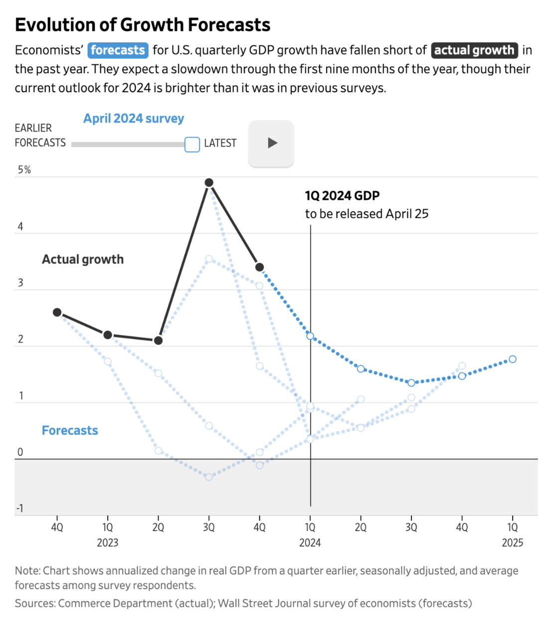
The Wall Street Journal uses a colorized subtitle to avoid using a traditional color legend
If you look around at the best hand-made charts today – created by the likes of the Financial Times, New York Times and FiveThirtyEight – many of them no longer feature a legend. Instead, the text in the title is colorized such that a legend isn’t necessary.
Learning from the industry pioneers, we’re excited to guide you through a similar approach using Flourish. Here, enhancing your charts can be achieved effortlessly with a technique we’ve coined as the “Riley legend.” Named after data journalist and Flourish alumna Katherine Riley, this feature allows you to embed context directly within the colors of your chart, streamlining your visual presentation while maintaining clarity and style.
The case for headers as legends
Why choose a colored header over a traditional color legend? Sometimes, the best explanation isn’t to tell, but to show. Let’s dive into a visual comparison to understand the advantages clearly.
Take a look at the grid of stacked area charts below, which visualizes the cumulative amount of plastic waste in water bodies since 2000.
The result…
If you asked a group of data visualization experts about their chosen field’s most important principles, they wouldn’t just respond differently; they’d also disagree on how to best visualize their answers. But one thing all of them would emphasize is simplicity.
Is using the header as the legend, in this situation, not the simplest option? We think it is. Give it a try and see how it transforms your visualization!
How to add colors to headers in Flourish
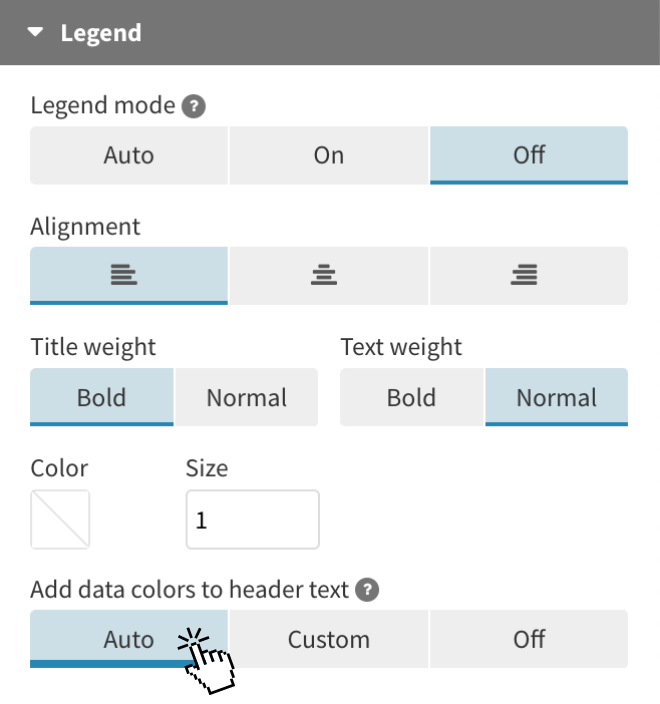
Just make a chart as usual and in the Legend settings panel, under Add data colors to header text, choose Auto. Flourish will now look through the text and color any words that match a series name in your chart. That’s it!
For a bit more control – for example, if you want Flourish to colorize the title but not the subtitle – click Custom.
This feature is already in our Scatter and Line, Bar, Pie templates. However, you can still achieve the same effect as the Riley legend in other templates by using custom HTML in the Header settings.
When should you stick with traditional chart legends?
While Riley legends are certainly popular in Flourish visualizations, there are times when a traditional color legend remains the best choice for conveying information clearly and directly. Here are a few scenarios where this is the case:
1. When using a numerical color scale
Color scales can be categorical or numerical, with the latter assigning a color to each element on the chart based on its value. This means that each value in your data is represented by a specific shade.
In situations like this, it can be challenging to convey every value to the user just by using colored headers. Additionally, without a traditional legend, users might not recognize the thresholds represented in the visualization. When dealing with numerical color gradations, including a legend is the simplest method to communicate this information effectively.
Even in these situations, you can further improve your visualization by incorporating annotations, labels, and descriptive headers to more effectively tell the story behind your chart. To learn more about the effective use of text in data visualization, check out our blog post.
2. When you want to filter data series easily
With ease of use and simplicity in mind, Flourish color legends do more than just indicate which color corresponds to which series. They also function as filters!
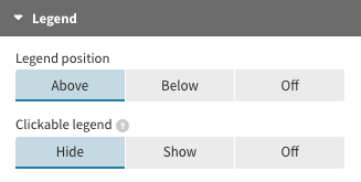
When a legend item is clicked, the corresponding dots can either be hidden or shown. This serves as an excellent alternative to using both a color legend and a separate filter, as it helps to minimize clutter. Plus, this approach allows for better focus on the visible data, which is crucial when managing multiple series.
To change the functionality of your clickable legend, head to the Legend settings in the Flourish editor and choose whether the setting should hide or show dots.
For more tips and resources on visualization techniques, check out our other blog posts. We have a library of resources to help you master data storytelling, from beginner tips to advanced strategies. Happy charting!