A beginner’s guide to using text in data visualization
Discover the most effective techniques for using text to create clear and understandable data visualizations
You come across a chart with no title, labels, or visual cues to guide you. How much can you really understand from it?
Chances are, not much – but that’s because text is undeniably one of the most vital components of data visualization.
While exploring the world of text in data visualization is quite an undertaking, we’ve put together some essential starting points to help you seamlessly integrate text into your charts. Whether it’s through headings or labels, these recommendations are designed to support you in effectively conveying your message.
1. The chart’s title is your elevator pitch
When it comes to data visualization, headers are the first point of reference for most readers. And similarly to an elevator pitch, a well-crafted chart title should quickly show the key takeaway of your data and why it matters – without delving into too much detail.
To create an effective title, take a moment to identify the chart’s primary insights and add that as a header. Concentrate on the trends and patterns in your data, but allow room for the reader to also draw their own conclusion. Any other information can go as notes in the footer.
More on writing compelling titles
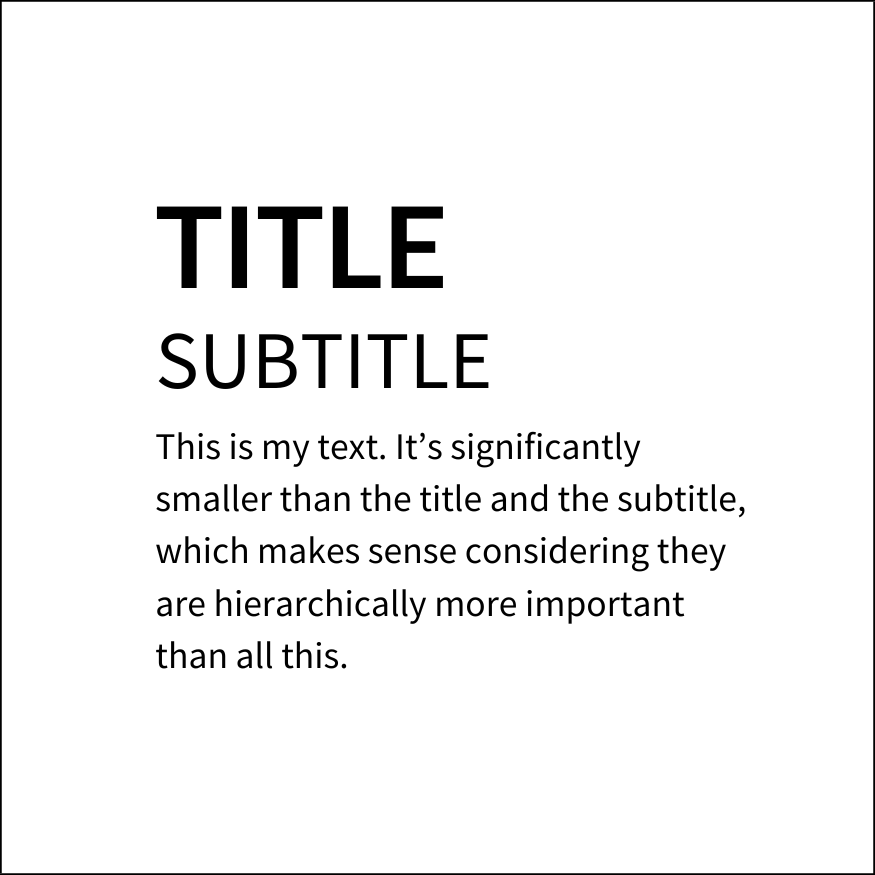
- Visual hierarchy: The most important information should always be given the highest priority and should be presented in the boldest and biggest text. For anything else, use smaller typefaces or reduced contrast – but ensure that your design still follows best accessibility practices.
- Use of color: Using color in your headers is an effective way to declutter your visualizations and grab the viewer’s attention. The best part? You can easily do this in Flourish – check our help doc to learn how.
2. Choose direct labels over legends
We’ve said it before and we’ll say it again – there are several more effective alternatives to using a standard color legend. While a few color swatches may work just fine, things can get very confusing when dealing with numerous series in your dataset.
It gets even trickier if your palette consists of closely resembling colors (hint: this should be avoided). So, what can you do to make your chart easier to understand? Label points directly.
This makes it easier for our brains to understand the graph because we don’t have to keep looking back and forth between the legend and the data.
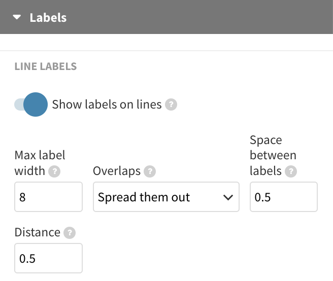
In Flourish, there are multiple ways to add direct labels. For line and area charts, you can opt for the Show labels on lines setting. Alternatively, consider our previous suggestion of adding legend colors to the header. This way, you provide a visual clue about your color coding without cluttering up the chart with extra elements.
Incorporate annotations
Annotations can be a real asset when you want to draw attention to particular data points or series, such as outliers.
Whether you prefer to include a detailed note alongside your visualization or just highlight crucial labels is entirely your choice. Our Scatter template even offers selective point labeling, allowing you to handpick which specific data points should showcase labels. Read more in our help doc.
3. Turn people’s heads, but for the right reasons
If your charts leave people in awe of your data skills, that’s wonderful! However, if readers have to physically turn their heads to read important text elements, that’s less than ideal.
As a rule of thumb, text in data visualization should be horizontal whenever possible, although the Y axis title is often an exception.
For any other text elements like axis ticks and highlights, try sticking to horizontal alignment. In Flourish, you can utilize the label angle setting, which lets you adjust the degree of label orientation to your preference.
If your axis represents time data, use the number formatting settings to shorten the axis format or choose to display less ticks in general.
However, if your categorical series are too long to wrap properly, consider switching to a different chart type. In Flourish, you can easily switch between column, bar, and other charts with just one click.
4. Remember to format your numbers
Especially when it comes to large figures, formatting the display of your numbers is incredibly useful. Is it really necessary to write 7 billion as 7,000,000,000 or even 7000000000? That’s a whole lot of zeros to deal with!
Last but not least, make sure to include relevant prefixes and suffixes. You can add them using the number formatting settings, or if necessary, even mention them in the subtitle of your chart. The key idea is to keep explanations close to the data, ensuring that the metric is always in sight.
To summarize…
- Use your title to reveal the most important information in your chart.
- Keep it clear and to the point – data visualization experts recommend titles between 6 to 12 words for optimal clarity.
- The most crucial information should be in the largest, boldest text. Color is also a helpful tool for creating visual contrast.
- Position labels as closely to the graph as possible, so eye movement between the legend and the data is minimized.
- Annotations are your best friends! They make your chart more digestible and interesting.
- Text should be horizontal when possible; switching chart types is a better alternative than rotating labels.
- Consider the readability of large figures and format numbers effectively.