Elevate your data story with annotations
Maximize the impact of your data visualizations by adding annotations to your charts and maps
In the world of data visualization, the power of storytelling is often found in the smallest details. From the choice of visual design to the selection of a chart, each decision contributes to the overall impact. However, one often overlooked aspect that holds tremendous power lies in the deliberate incorporation of annotations.
For years, Flourish users have embraced the power of enriching their charts with labels, arrows, and connector lines. And today, we are delighted to introduce a game-changing enhancement: curved annotations! These slightly curved arrows ensure your viewer’s gaze is led smoothly across your visualization, adding a touch of elegance and dynamism to your data stories.
Being more than just an aesthetic enhancement, curved annotations transform the way you present and interpret data. They allow you to move away from the rigidity of straight lines and let your narratives unfold in a more organic and engaging manner.
What are annotations?
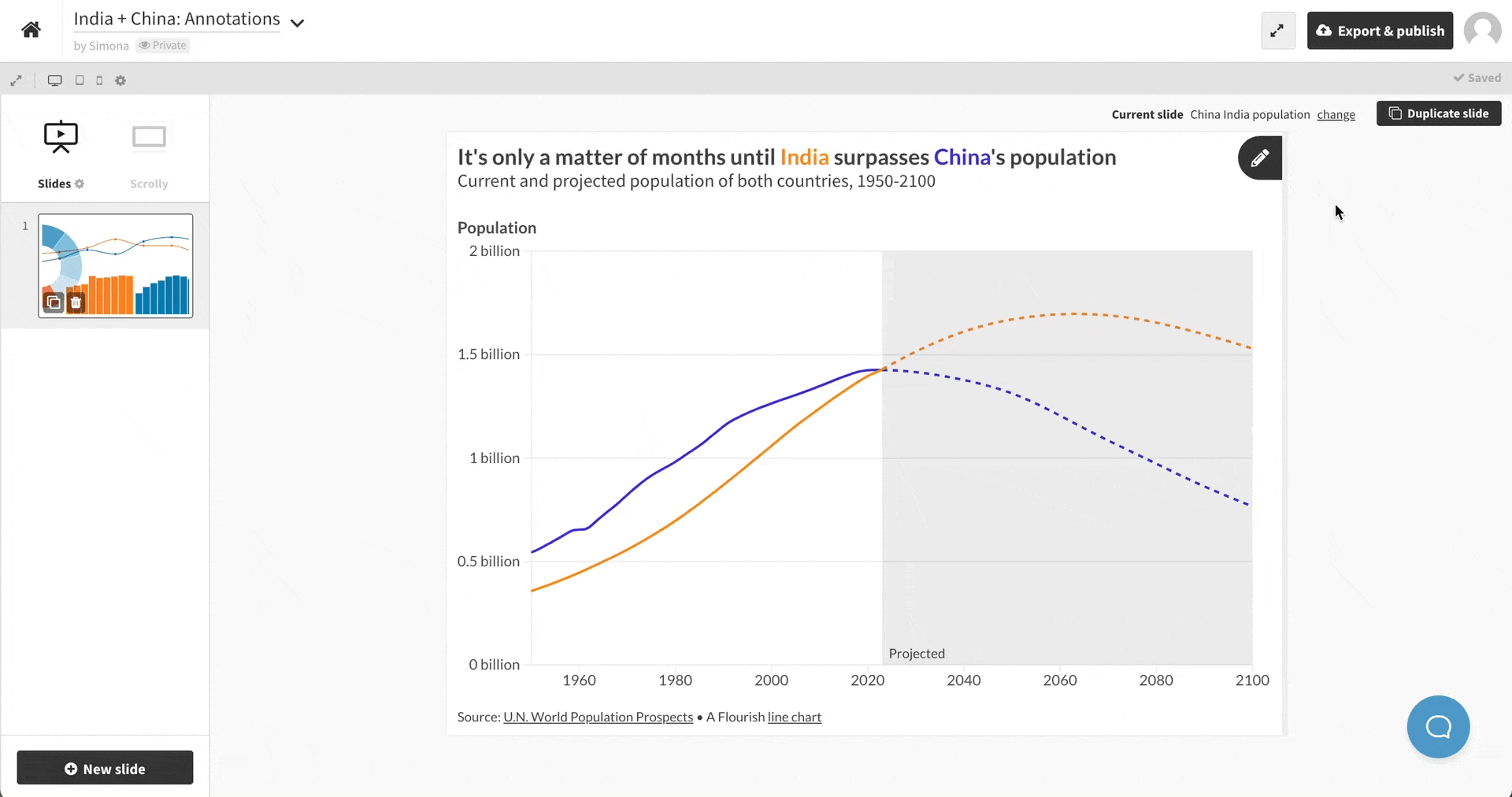
Annotations are informative or descriptive elements that are added to charts, graphs, or other visual representations of data. Alongside descriptive titles, annotations are a key tool for helping viewers interpret a chart.
Drawing attention to certain elements can make a graphic more informative and easier to read, in addition to proving useful context or clarifying your argument.
How can annotations improve your data visualizations?
By incorporating annotations, you can improve the effectiveness, clarity, and overall impact of your data visualizations, enabling better understanding and interpretation of the underlying data. Below are several ways annotations can help you achieve this.
1. Provide important context
Annotations offer additional context or background information that can aid in the interpretation of the visualization. Whether you have drastic changes in your data (like in our line chart example above) or one or more outliers (like in the beeswarm plot below), viewers will naturally wonder what these data points represent.
Annotations can answer these questions “in place”, rather than relying on the viewer reading separate accompanying text.
2. Streamline clarity
While you might want to explain everything that is happening in your graph, it’s best to avoid too much clutter and focus on the chart’s main story or a few key events.
Find more quick tips to enhance your charts and graphs in our blog post.
3. Enhance readability (especially on mobile)
In a time when tiny screens are the norm, ensuring optimal readability of data visualizations on mobile is vital. By strategically placing concise and focused annotations, you can provide context and highlight the most relevant insights without overwhelming the limited screen space.
How to add annotations in Flourish
Annotations are accessed via the Flourish story editor, so to annotate a chart, the first step is to click on “Create a story”.
Once you’re in the story editor, click the small pen icon in the top-right corner of your chart to open the annotations panel. With this open, you can now click on any valid region of the chart to add an annotation. Annotations are anchored relative to the X axis and Y axis position, so they will highlight the correct point even if the chart is displayed at a different size.
You can add labels, blocks of text, connector lines, and arrows, and further customize the styling in the annotations panel. Click on any existing annotation to select it, drag it around, or edit its styles.
Let the annotations begin!
Annotations are available in a variety of Flourish templates – such as the Scatter, Line, Bar, Pie, Marimekko and 3D Map.
Keep your eyes on our newsletter or changelog for more annotation features. Happy annotating!
Note: although we didn’t use it directly, our annotation system was partly inspired by an open-source system developed by the brilliant Susie Lu. Thanks Susie!