Never fear, unpivoting is here
How to combine columns into long format using Flourish’s latest data table feature
One of the most difficult things about using any visualization tool, Flourish included, is figuring out what format your data needs to be in. Unless you know how to code or you’re an Excel savant, this can be especially frustrating because, even once you understand the target format, there’s often no straightforward way to get your data into it.
We think this is a problem. So, over the next few months, we’re going to be adding some simple data transformation functionality to let you reformat your data inside Flourish. And today we’re rolling out the first of those new features: unpivoting!
What it does
You can think about this feature as the opposite of a pivot table. Instead of going through a spreadsheet and grouping cells by categories, as pivot tables do, unpivoting takes multiple columns and “melts” them together into just two – one which contains the original column header and one which contains the value.
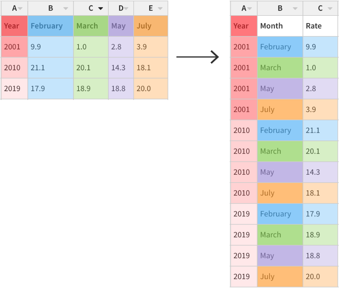
In data science, this is called going from a “wide” format (in which each row contains multiple observations) to a “long” or “narrow” format (in which each row contains just one observation).
To “unpivot”, simply highlight the columns you want to combine, open the dropdown from one of the column headers and select “Combine columns (“unpivot”)”.
Before you confirm the unpivoting, you’ll be shown a preview of your new data table. In that box, you’ll can also choose to include/exclude empty rows and whether to sort by the order of the original headers. At the moment, all of these actions are irreversible after clicking “Confirm”.
When to use it
To better undertand what this feature does, let’s consider a situation in which you might actually use it.
For example, imagine you have data on student-to-teacher ratios across the European Union and you want to make a connected dot plot showing the difference in that ratio between primary and secondary schools in each country. You know that you can make connected dot plots using the Scatter template, and when you import your data into Flourish it looks like this.
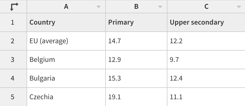
This format – with a column for the country name and a column each for “Primary” and “Upper Secondary” – makes a lot of sense when you’re reading a spreadsheet, and it would also work perfectly in Flourish if you wanted to make a grouped bar or column chart. But to draw a dot plot, the Scatter template draws a line between rows with the same data in a specified column – in this case, we want it to be “Country”. As your data is now, though, there’s only one row for every country, which means there’s no two points to draw the line between.
In the past, this is the point at which you’d have to leave Flourish and attempt to edit your data with a spreadsheet formula, or some code, or a bunch of manual editing. Now all you have to do is select the “Primary” and “Upper secondary” columns and “Unpivot” them!
Your turn!
If you want to see how all of this works for yourself, take a look at the two visualizations below and see if you can use the new unpivoting feature to make the first look like the second.
To get started, copy the first visualization by hitting the big blue button below it.
Happy unpivoting!