How to create animated 3D point maps without coding
Animate thousands of data points to show movement over time in a dynamic and engaging way
Interactive maps play a vital role in the world of data visualization, as they engage audiences, simplify complex data, and can handle larger datasets than other chart types.
However, creating an interactive map often feels like an overwhelming task, especially for non-coders. Questions like ‘Where do I start?’ or ‘Do I show all data at once?’ are not uncommon.
Fortunately, our 3D Map template makes the process as easy as possible. In this post, we focus on animated point maps, but if you are in need of a heatmap, a line map, or a map with extruded regions, this Flourish template will meet all your data visualization needs!
Two types of animated 3D maps in Flourish
The Flourish 3D Map template offers various ways to work with your points. You can create a timeline-style map where points appear and disappear over time, or take it a step further and create an animated path to show how a point moves over time.
1. Timeline-style 3D map
If you want to show how points have changed over time – for example, to display earthquakes, or how many buildings or landmarks have been constructed in a specific area over the years, a timeline-style 3D map is the ideal way to visualize it.
To make a truly stunning data story, add your visualization to a Flourish story to draw attention to specific time periods of your timeline.
Getting started
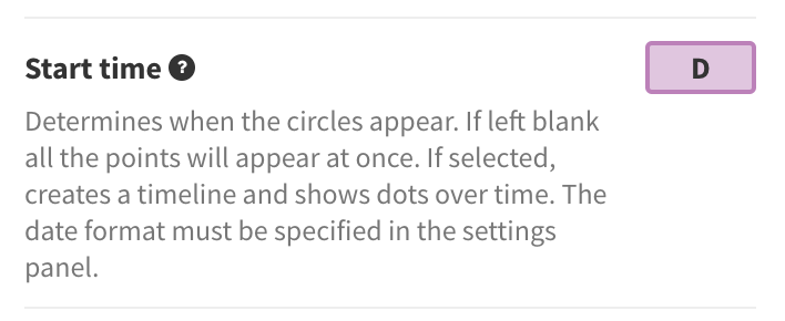
To create your own interactive map, all you need is a spreadsheet with the locations you want to plot with columns for latitude and longitude, and one column that represents time series data. The timeline will display automatically once you add a Start time binding for your points.
In the Data tab, you also have the option to size your points according to a numerical column in your dataset – in the example above, we used the price per night of each property to size our points.
Once you are happy with the style of your map and the timeline speed, it’s time to add the visualization to a Flourish story. Besides allowing you to autoplay your project, the story also lets you play particular timeline segments and lock specific areas of the map into view.
Read detailed instructions on how to play specific portions of your timeline here.
Here are a few help docs to get you started:
2. 3D map with animated points
If you want to visualize the travel path of something – like a ship, plane, car, or person – over a given period, you can easily do this with the 3D Map template.
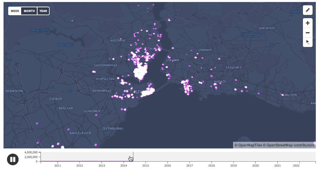
In the example below, we have a map of Chicago. Each colored dot represents a taxi and its movement throughout the day. Notice how the dots persist, moving along their paths from one location to the next.
Animating color and size
The sizes and colors of the dots will also smoothly transition if they change over time. For example, you could create a map showing a bus moving through a city, changing size to reflect the number of passengers. Or a map of a delivery network colored to show whether each vehicle is ahead or behind schedule.
Getting started
Creating an animated point path with this template is almost the same as making a regular timeline-style map. You’ll need a spreadsheet with columns for latitude and longitude, a time column, and a Name/ID column.
The key difference is the Name/ID column, which helps create an Animation group. This tells the template you’re visualizing the same point at different times.
For more information, read our help doc and our our blog post on the basics of the 3D Map template.
For more interactive map content…
Can you tell that we at Flourish love maps? To get you inspired, we’ve collected more examples that showcase the power of our versatile map templates – check some of those below.