Automated column selection: an easier way of adding data to Flourish
The new data typing feature marks the beginning of a more intuitive data visualization process
It’s one of the most exciting Flourish features – the auto-setting of columns in the Data tab! Or, as we call it internally, data magic.✨
This marks a major milestone in our goal to make the data visualization process easier and more intuitive, simplifying the step that most often trips users up – “mapping” the columns of data to aspects of a visualization.
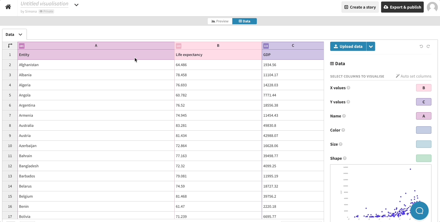
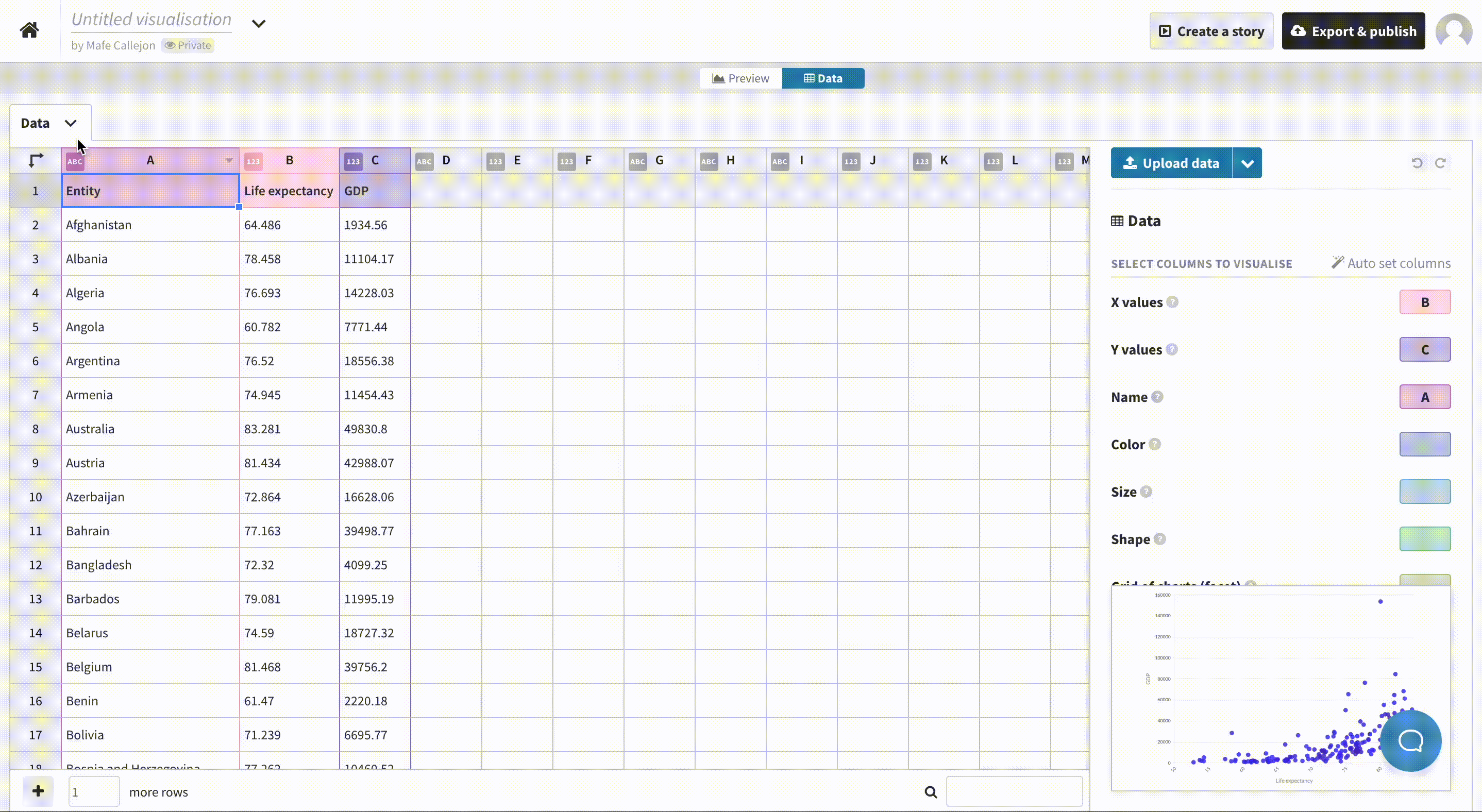
When data is uploaded, Flourish can interpret it, determine which data type each column contains and automatically choose suitable columns.
The majority our visualization templates are making use of this functionality. The rest will follow over time.

Why does this matter?
The implementation of automatic column settings marks a major development in Flourish’s evolution, with benefits both in the shorter term and the longer term. Let’s look at the immediate benefits first.
The most obvious benefit is that visualization creation is now quicker and easier, since when you upload data you’ll usually get a working visualization before even touching the column settings. In addition, since column settings can now specify which types of data they will accept, it’s harder to “break” a visualization by selecting incompatible data.
Some Flourish templates now possess the ability to automatically unbind columns with unsupported data types.
But that’s not all. Now that Flourish understands more about the data that is being used, it can surface relevant settings, too. Are you coloring by numerical values? Flourish can now show only the relevant linear color settings, rather than color settings for categorical data too. Using a column with dates? Flourish can show settings for a timeline filter, and so on.
How does it work?
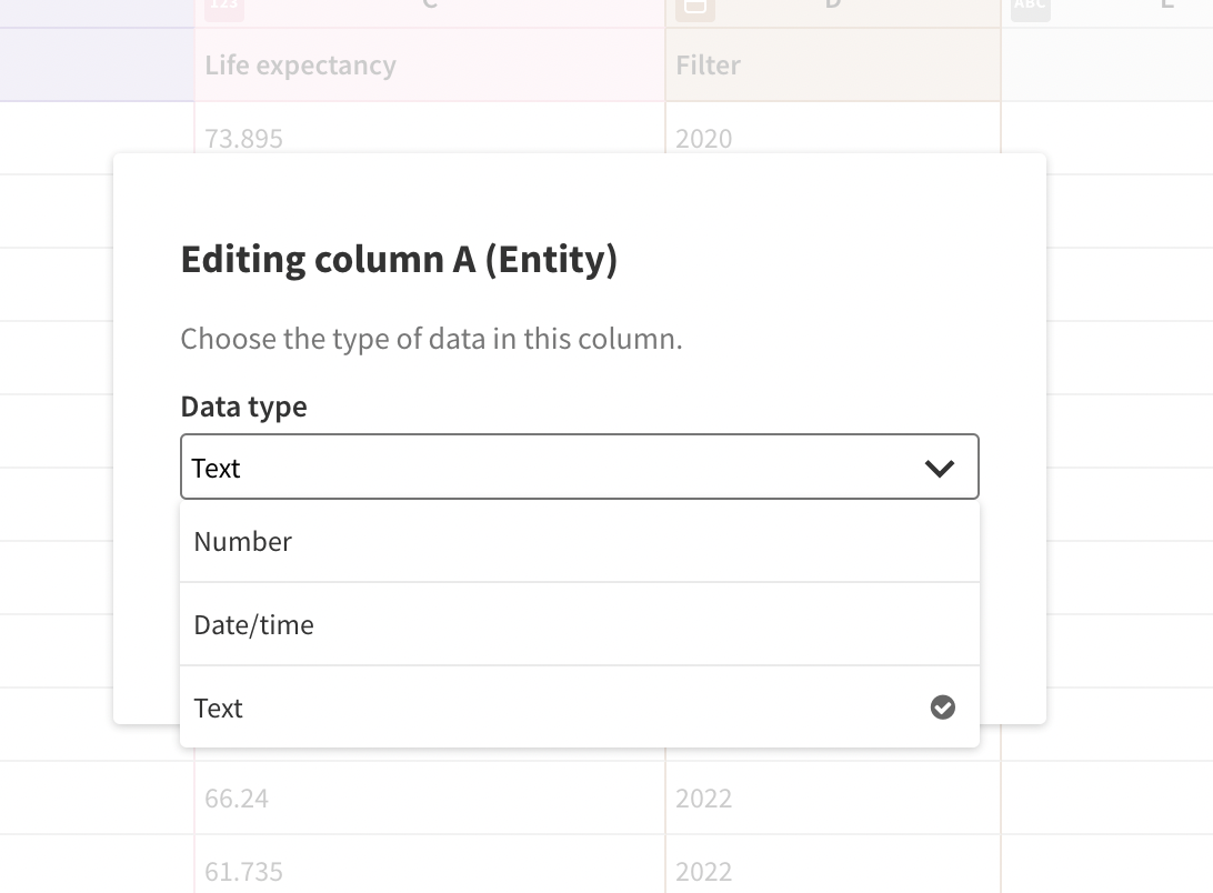
The Flourish app recognizes three types of data: numbers, text and dates and times. When you upload data, Flourish works out which data type each column contains using an interpretation system that can handle lots of date and time formats, numbers with currency symbols, and so on. If Flourish ever gets it wrong, you can override the type in the interface, but in most cases this won’t be necessary.
In parallel, visualization templates can specify for each column setting what data types are permitted – and also what the characteristics of the ideal data might look like. So when Flourish is choosing which column to select for shading a scatter plot, say, it can favour a column containing only a few values over a diverse one that would lead to dozens of indistinguishable colors and a giant legend.
Getting started
Data typing is fully automated – all you need to do is upload your data.
Flourish takes the full dataset into consideration when choosing which columns to set. Importantly, though, it will only bind columns that were already in use. For example, if you pick the “Simple scatter” example from our template chooser, only the X and Y columns will be set. But if you choose the richer “Hans Rosling” scatter starting point, Flourish will also look for suitable columns for set time, color and size. This is designed to make it as easy as possible to create a new visualization from an existing one, just by throwing in new data.
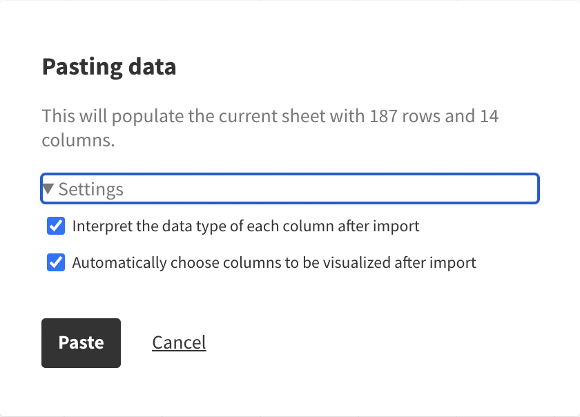
If you want to skip the magic, when uploading just uncheck “Automatically choose columns to be visualized after import” (to keep the selected columns unchanged) or “Interpret the data type of each column after import” (to keep the data types unchanged). These are useful in some special situations – for example if you’ve set up a visualization and are just uploading an updated version of the same data.
Even after you’ve uploaded data, you can also click the “Auto set columns” button just above the column selection on the right-hand side of the Data tab to run the column assignment system.
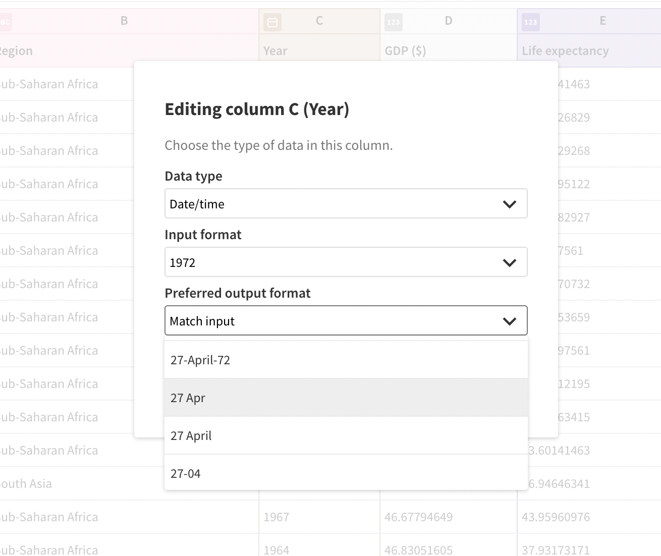
How to recognize data types
Next to the letters for each column, you’ll see an icon that indicates what type of data that column contains. There are three types of data:
If something doesn’t seem right, you can click the icon to change the data type. For example, if you have a column of years (e.g. 2000, 2005, 2010, etc) that the template has interpreted as dates, but you want it to be treated as categories, switch the data type from Date/time to Text.

Here you can also change the formatting of your dates. This doesn’t change how they are displayed in the data table; instead this information is passed through to the visualization so your preferred format for that specific column can be used in the graphic itself.
To find out more about using typed data, check our help doc.
On the Flourish roadmap…
You can find the data typing feature in the templates below. And we are continuing to add this feature to more templates.
This is just the beginning of the data magic project. Longer term, Flourish will be able to use the same system to preview and suggest chart types that are likely to work well with a given dataset. As a result, the process of visualizing your data will become even more intuitive, efficient and hassle-free.
Check our changelog or subscribe to our newsletter to stay up-to-date with our latest launches. In the meantime, we would appreciate any feedback – reach out to us at hello@flourish.studio to let us know your thoughts.