Visualizing the COP26 climate conference
How our users covered the UN climate change conference
The much-anticipated climate conference in Glasgow took place this month, bringing together scientists, activists and politicians in an effort to keep the rise in Earth’s temperature below 1.5°C. The gathering brought new national targets for greenhouse gas emissions and raised awareness of how climate changes are already impacting the world every day.
Thousands of Flourish graphics have been made in the last few weeks relating to COP26. This post highlights a handful.
1. UNDP’s State of climate ambition report
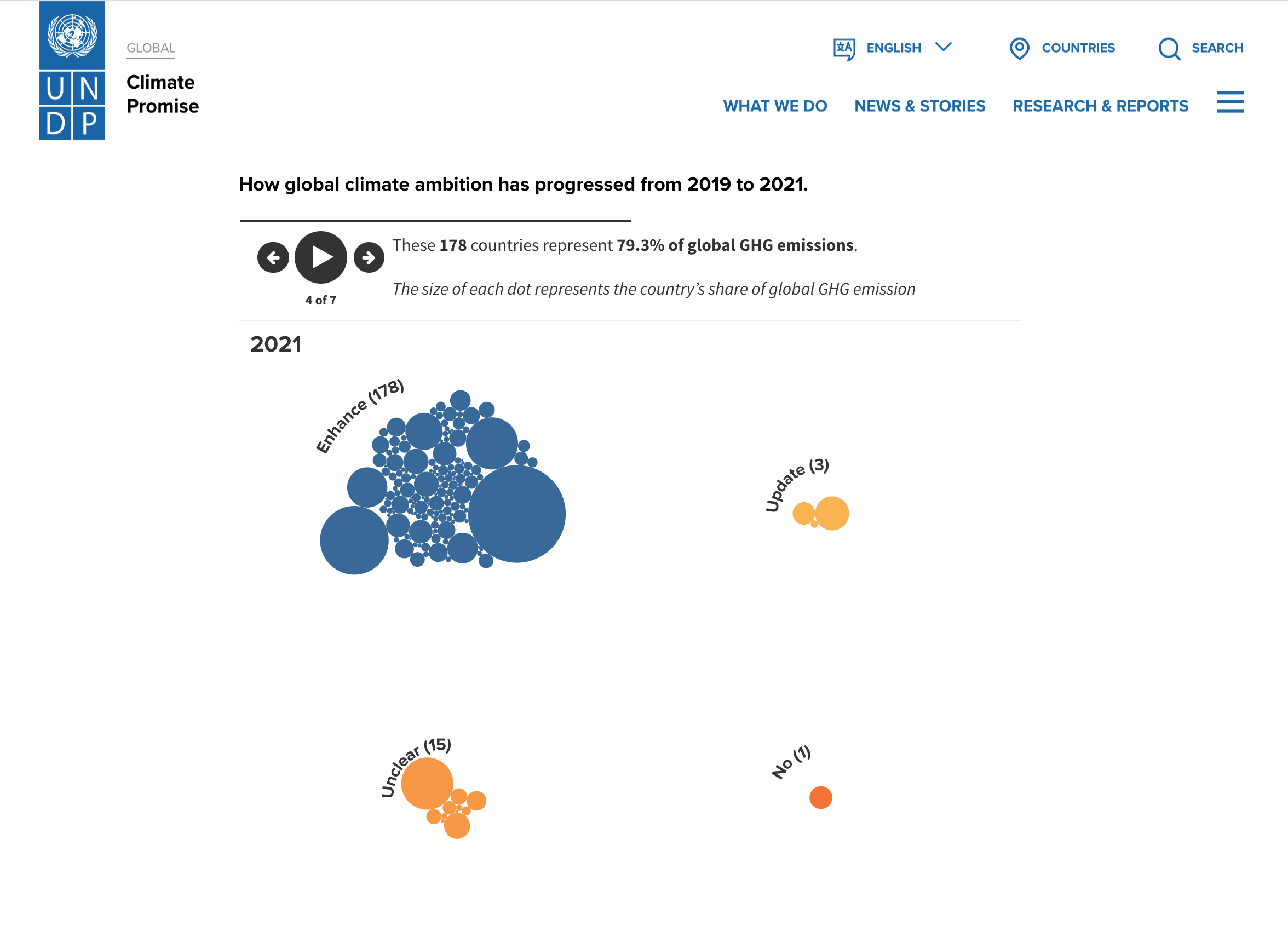
The UNDP’s State of climate ambition report explores how the world is progressing on climate ambition. Using a combination of our Survey template and a Flourish story, UNDP were able to explore their data and highlight those leading the way and those falling behind.
2. Refinitiv’s data-driven approach to COP26’s ambitious agenda
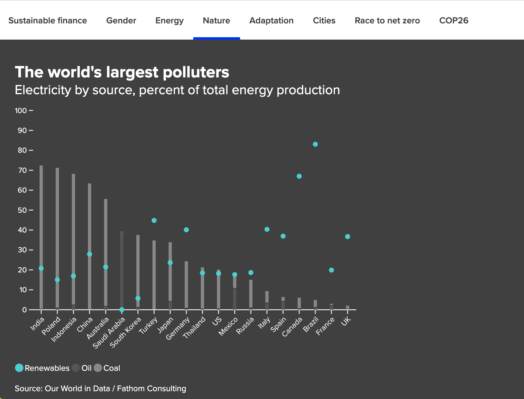
Refinitiv have used a whole host of Flourish templates in their coverage of COP26: from line and bar charts to a sunburst Hierarchy and a projection map. Slowing the animation of their charts and custom styling of popups, Refinitiv analyze the role of sustainable finance, gender, energy and more.
3. Ipsos MORI’s animated Line Chart Race
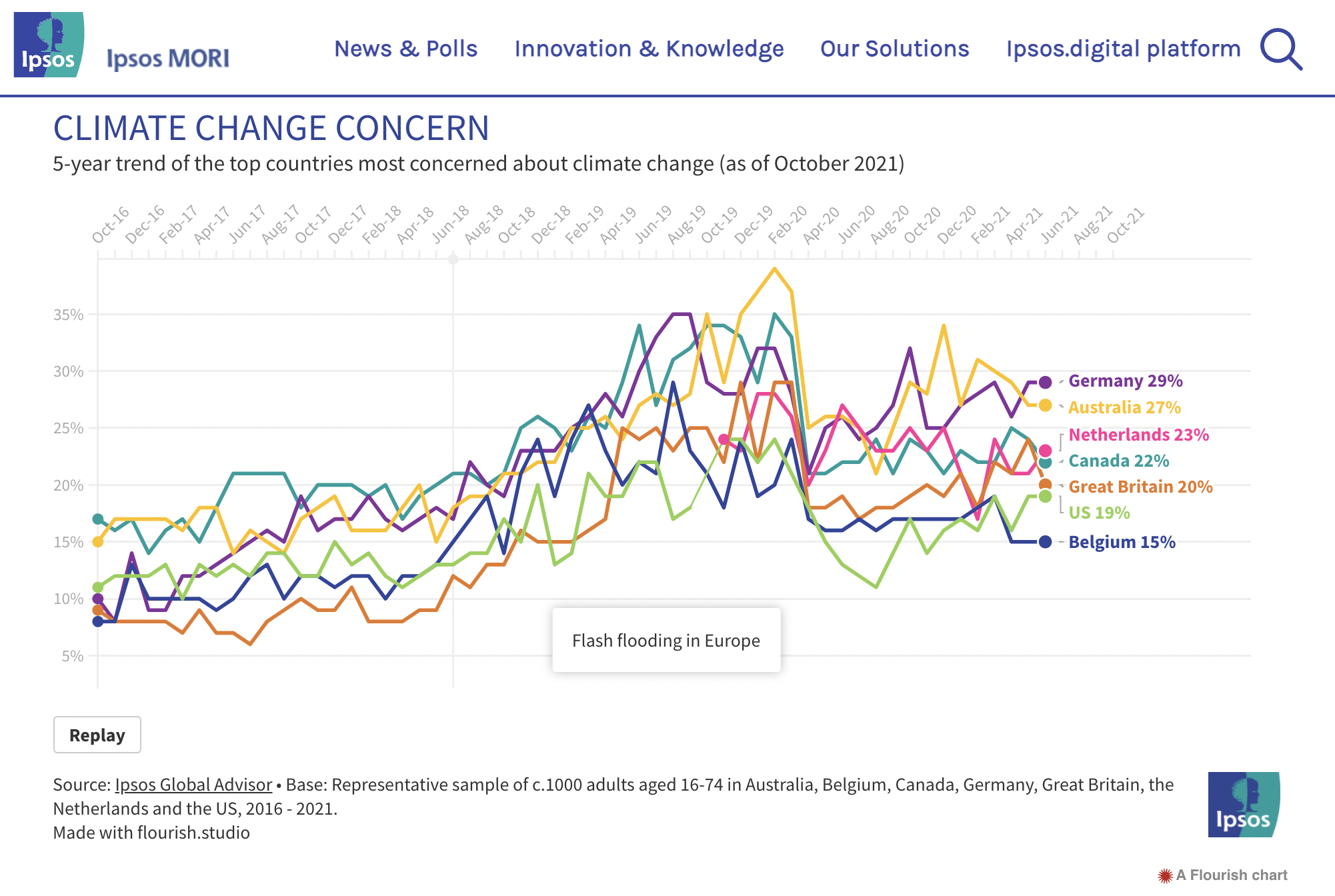
Time series data provides the perfect opportunity for animated visualizations. Ipsos MORI regularly track the topics the world is currently most concerned about, so they created a line chart race showing how concern about climate change has fluctuated over the past five years.
Adding timely captions to the visualization for key events like Greta Thunberg’s first school strike and flash flooding in Europe, we can see how climate concern changes in relation to the global context.
4. Mapping search interest by Google Trends
The Google Trends team mapped the most commonly searched for natural disasters across the world in 2021. Using color overrides and custom popups, there’s a noticable trend of more searches for “Storm” in the Eastern hemisphere, while users are more interested in “Earthquake” and “Flood” in other parts of the world.
5. Man Group on climate investment
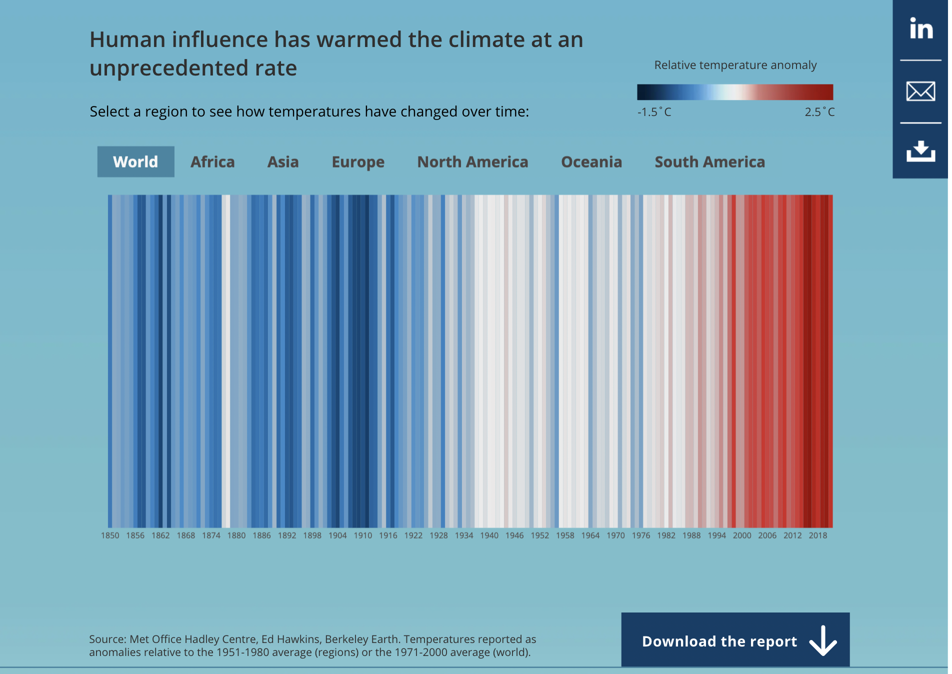
Man Group took a closer look at how investors should think about climate change, visualizing the famous “climate stripes” heatmap as well as a world projection map on the impact of global warming on working days and GDP.
6. Visualizing the menu at COP26
Our support and content intern Yaning used the Scatter template with some handy axis highlights to explore how the carbon emissions of plant-based and non-plant-based dishes on the COP26 menu compare with the average emissions of UK residents and the maximum emissions the WWF recommends to meet Paris Agreement climate targets.
7. More climate-related visualization ideas
In the cards below, you can find some more examples of climate visualizations our customers have made. If you’ve created climate visualizations with Flourish that aren’t displayed here, do reach out to hello@flourish.studio to share your creations!