How to create beautiful, interactive Gantt charts
Introducing a new Gantt template for project plans and much more
Today at Flourish, we’re introducing a new Gantt template, which is ideal for creating beautiful project plans and schedules – or for visualizing any data describing defined periods of time.
Unlike other Gantt tools, the new Flourish template lets you make a stunning visual that can be used not only as a flat image, but as an interactive graphic, complete with rich popup content. As with all Flourish charts, Gantts can be easily embedded online – and, on a business account, will pick up your company’s fonts, colors and styles.
What Gantts are – and when to use them
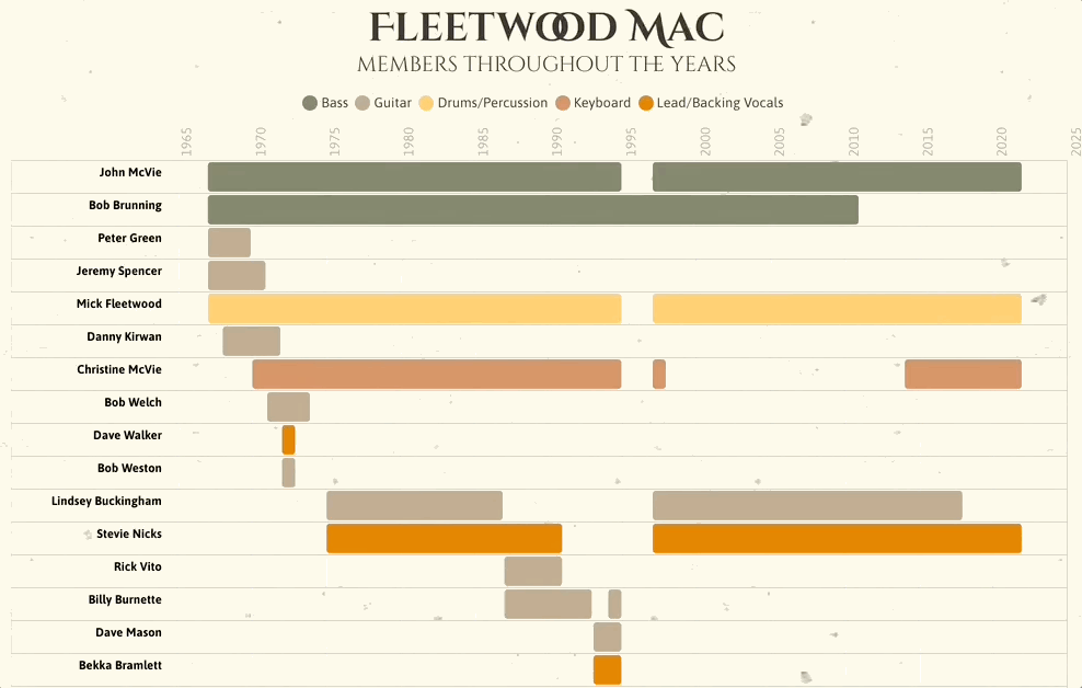
Gantt charts are similar to horizontal bar charts, except that the X axis has a time scale and each bar reflects two values rather than one: a start time and an end time. Another difference is that there can be multiple bars for each category on the Y axis. That means bars could potentially overlap, but our template takes care of this by “wrapping” bars onto multiple lines when necessary, as shown on the example above.
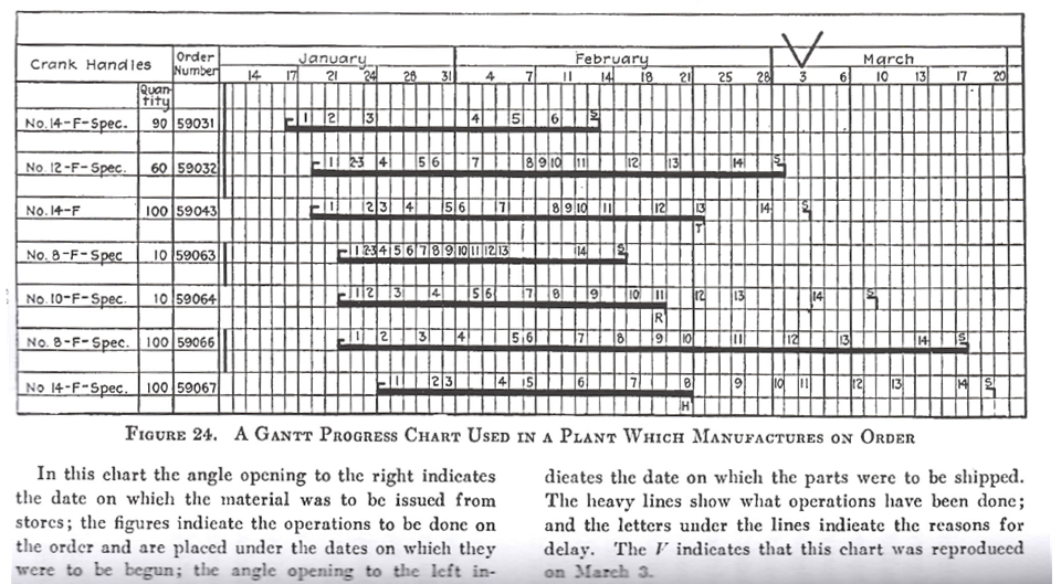
An original Gantt chart. Image credit
The classic use case for the Gantt chart is to lay out all the tasks involved in a big project, and how those are shared across teams and categories. The chart makes clear which tasks can run in parallel versus being dependent on other tasks being completed. The chart type was developed for this purpose around 1910-1915 by Henry L. Gantt and Frederick Taylor in the context of production plans for factories and workshops.
However, the same visualization style can work well for almost any dataset describing periods of time. Our example showing the evolving membership of Fleetwood Mac is a case in point. Whereas a project management Gantt typically covers a period of days or weeks, this one runs over six decades!
Handling time data
Whether your Gantt covers minutes or years, the template will attempt to parse (interpret) the dates and times in your data. If it doesn’t choose correctly – typically because the date format is obscure or ambiguous – you can choose an input date format in the settings panel, or even specify a custom date format.
Popups and panels
Popup and panels let you add rich information to each bar. You can include text, links, images or even other visualizations simply by including that content in the datasheet and selecting the relevant columns with the Info for Popups binding. From here, you can edit your popups using the settings provided, or use our custom content feature to enhance your popups and panels.
How to get started
To create a Gantt chart, all you need is a dataset with columns for the start date or time and the end date or time of each bar. To add more richness you may also want:
- A column containing the name of each bar
- A categorical column to color by
- A categorical column to group by
- A column with numbers in the range 0 to 1 representing the progress of each bar
- One or more columns with extra information to appear in popups or panels
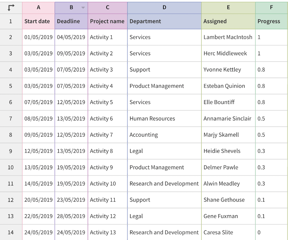
Here is an example of how a typically Gantt dataset might look:
For more tips on getting started, check out our Gantt overview help doc.