How to create interactive chord diagrams
Easily visualize connections with our Chord Diagram template
Chord diagrams can be used to visualize relationships and flows. They are both esthetically pleasing and a great way to illustrate how various parts interconnect.
Chord diagrams can be visually striking, making them an engaging way to present complex network data. They provide an immediate sense of the overall network structure and the relative importance of connections.
In Flourish, you can easily create animated Chord diagrams.
Directional vs non-directional data
The difference between directional and non-directional chord diagrams lies primarily in how they represent the flow or relationship between entities.
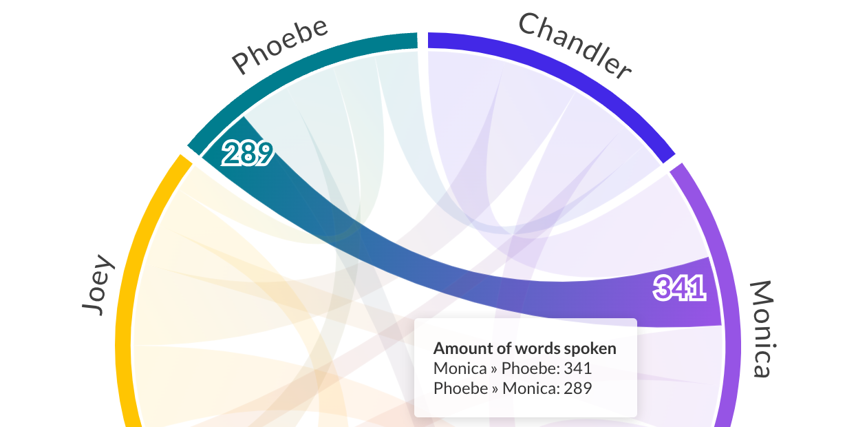
Directional chord diagrams are used to depict relationships where the direction matters. These diagrams are essential when the relationship is asymmetric. In the example above the “Chander/Monica” chord has one value for lines spoken by Chandler to Monica and another for lines spoken by Monica to Chandler, making it a directional chord diagram.
Directional chord diagrams offer a more nuanced view of interactions by highlighting the direction of flows, whereas non-directional diagrams focus on the presence and strength of relationships without considering their direction. This means that the relationship works both ways equally.
The example below is a directional chord diagram showing the number of gold medals won by various nations in the Olympic Winter Games.
Check out our help doc to learn how to structure your data for both cases.
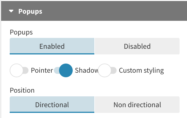
Tip: Depending on whether your data is directional or non-directional, make sure to update the popups to match your chord diagram.
How to make a chord diagram, step by step
- Select the chord diagram template
- Upload your data or just type in your values to the existing data sheet manually
- Set the three required columns for “from” and “to” (e.g. people or countries) and “value” (a number describing the size of the flow)
- Decide if your data needs two values for each chord or just one (is it directional or non-directional?)
- Get creative! Change the colors, align the labels to your liking, adjust the chords, popups, styles and animations. Don’t forget to add a header and footer.
- Once you’re happy with your chord diagram, you’re ready to publish it to the world, download it to host on your own servers or use it in a Flourish story
How to customize your chord diagram with Flourish
The Chord Diagram template gives you a lot of features for creating your ideal chord diagram. For example, you can:
- Customize your colors and change the color mode of the chords. By default, it uses a gradient color scheme, an idea inspired by the amazing Nadieh Bremer. Alternatively you can color each chord to match its larger or smaller end.
- Fine-tune the labels. Put them along the arcs – in which case any overlapping labels are automatically hidden – or rotated 90 degrees. Make them responsive or a fixed size.
- Show a customized popup to give some context and make the direction of the flows more obvious
- Highlight one or more chords to focus the eye on particular data points
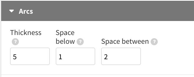
- Adjust the arc spacing
As with all Flourish templates, our chord diagrams are mobile-friendly, and they animate when the data changes.
That wraps up our journey through the world of heatmaps. Now it’s your turn – create interactive chord diagrams that highlight relationships and flows in your data.