You can now create beautiful spike maps without coding ⛰️
Our Projection Map template now includes a new mode to transform points into spikes
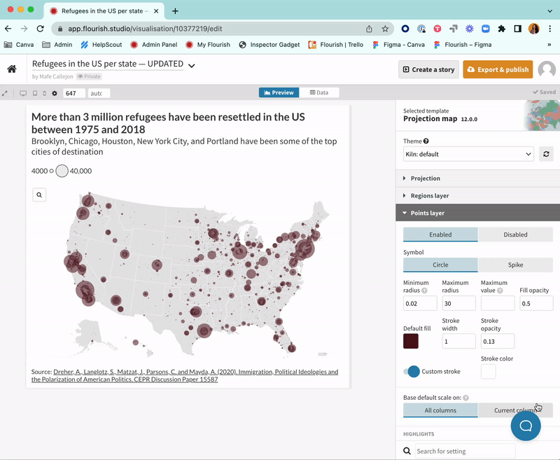
Our Projection Map template just got more powerful! The new spike map mode gives users another tool to make thematic maps. You can now easily choose whether to plot your points data as circles or spikes. The new mode allows you to visualize values through height: The greater a value, the taller the spike.
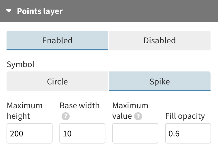
Getting started with spikes is as easy as selecting Spikes in your Points layer settings. In addition to this, you can supply a maximum height and value and customize coloring as well as outlines.
To help you get started with spike maps, we’ve provided three key points below.
1. Switching points for spikes
Traditional point maps are great for plotting data on geographic areas, but they do come with a few donwsides. First, circles tend to cluster and obstruct the legibility of the map due to the fact that the symbol grows in all directions. Meanwhile, there’s the well-known pitfall of scaling circles – bubbles covering low values can basically pass from sight in datasets with wide numerical disparities.
Since spikes map data by their height, they tend to overlap less often than other symbols, making the relationship between the values and the shapes more obvious. Also, research has shown that humans are better at perceiving differences in height and lengh than areas.
2. Plotting negative values
Spike maps have the added capability of plotting negative values – something you cannot achieve with points. Since spikes increase in height, negative values will cause spikes to be rendered downwards, rather than upwards.
Using this plotting method also allows you to reinforce certain concepts within your data. For example, we plotted the 50 most prominent peaks on Earth and the ocean’s deepest points. Even though ocean depth is measured in positive values, plotting these as “negative” spikes is a clever way to distinguish them from the peaks. Adding color categories is another great way to make the message clearer.
3. Making sure your spikes fit
Depending on which projection you’re using and the values in your data, you may find that some of your spikes get cropped. You can easily fix this by adding padding to the top or bottom of your visualization under the Projection settings in the template. Another alternative is to adjust the maximum height of your spikes but this might skew your data.
Get charting!
That’s all you need to know to get started with your own spike map. For a more detailed overview, visit our help page and check out our changelog to keep up to date with our latest features and suscribe to the newsletter to get a monthly overview of all-things Flourish!