Masters series: John Burn-Murdoch’s step-by-step animated line chart
We replicated John Burn-Murdoch’s animated line chart in Flourish, showcasing a compelling illustration of data storytelling
The Flourish team spends a lot of time admiring work by the best visualization practitioners. And so do our users. When a cool visualization goes viral, we often get asked: “Can I do that in Flourish?”. Hence this new blog series, which celebrates popular visualizations and looks at how you can achieve similar things in Flourish.
The first chart in the series was published this month by John Burn-Murdoch and shows intensive care admissions in UK hospitals. Based at the FT, John is one of the world’s most prominent chart-makers, widely respected both for his info-rich static charts as well as his striking animated pieces. John’s projects often reach huge audiences via social media and have helped inspire many graphics made by the Flourish community over the years, not to mention the Bar Chart Race and Growth comparison templates.
NEW: a common response to reports of hospitals struggling this winter is "it’s no different to a bad flu season!"
— John Burn-Murdoch (@jburnmurdoch) January 7, 2021
I’ve tracked down historical data on flu ICU admissions, including winter 2017-18, a record high.
Here’s how England’s Covid winter compares to a bad flu season 📹 pic.twitter.com/tsExrDZM31
In this chart, John uses animation to introduce a dataset year by year. He first conveys a sense of the typical annual variation in ICU admissions, then reveals the 2020–21 line to show quite what an extraordinary outlier it has been so far. Of course, the same data could just have been plotted on a simple static line chart, but the step-by-step animation and dynamic Y axis definitely makes for an engaging and expressive visual. As always with John’s graphics, there are some nice extra touches, such as the dynamic year label in the header.
John kindly answered some questions about the project for this post.
Why did you choose this approach for this data?
With this chart, the key was highlighting a difference between the normal and the abnormal. Although that can be done perfectly well in static form by simply labelling the lines, it has far more impact if you use repetition to actually demonstrate how past years all look very similar — creating an expectation for what each subsequent line will look like — and then shatter that expectation. The result is a much more powerful presentation, and much more memorable, than showing the same thing in static form.
Anything you were particularly pleased with?
At the FT we’ve shared hundreds of charts on the pandemic over the past 12 months, but this one has set records everywhere it has appeared. It has been seen by more than 10 million people on Twitter, broke records for us on Instagram and drew tens of thousands of responses on Reddit. It was especially nice seeing the number of people who specifically mentioned the use of animation as something they liked about it, and the number of people who got in touch with me directly on all sorts of platforms asking if they could share the video for their networks.
Anything you’d do differently next time?
This is a rare case where I don’t think there is!
How to make something like this in Flourish
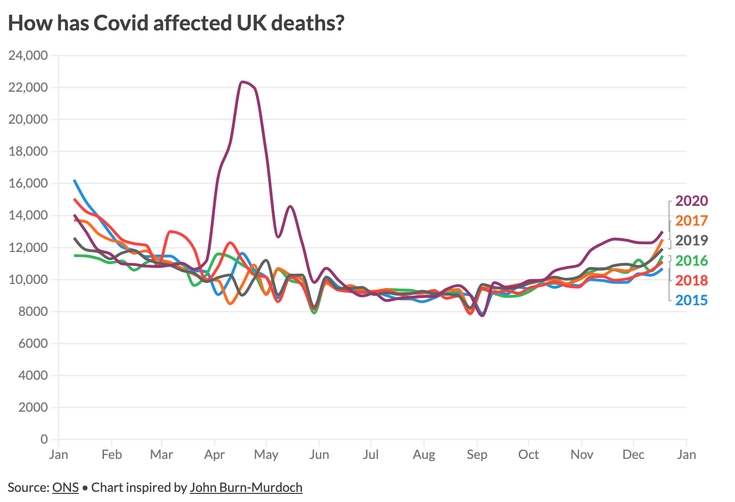
To try this technique in Flourish, we first looked for a dataset with a similar structure, eventually settling on total UK deaths by week from the ONS. Here’s the result…
Creating this type of animated chart in Flourish involves first making each view as a separate line chart, and then combining these as slides in a Flourish story. Since the slides are made with the same underlying template, you’ll get an animated transition when the slide changes.
Step 1: make the line charts
Create a normal line chart with the Line, Bar, Pie template and upload your dataset into the data table.
Select all the columns you want to visualize. That is what our chart looks like so far:
- To make data appear as if they were fading after entering, enter all of your column titles into the custom overrides option in the colors section.
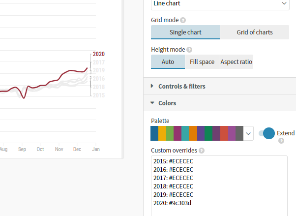
Since we are working backwards, use whichever color you want for the last line in your data. As this is the line we want to stand out, we used a dark red (#9c303d) compared to the other single series that are blue (#1d6996).
For the other series before this, we want them to appear faded to bring attention to that current data. Use a lighter shade, such as the light gray (#ececec) we used.
Tip: Take the time to set up the styles and settings carefully on this first visualization carefully before duplicating it to make the next slides. This way you can minimize the need to waste time making changes changing the same settings in multiple places.
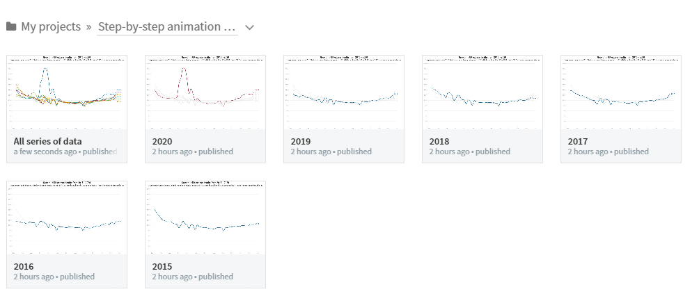
- Once you have created the first chart, duplicate this project. You will then remove the column of data you just highlighted, and update the colors setting to focus on the line for the previous year. Continue like this until you get to the first slide with a single line.
Tip: You may want to store all of these visualizations in a folder so it keeps your projects neat and organized. This is what ours looked like:
Step 2: creating the story
- Create a Flourish story and each of the visualizations as a slide.
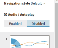
Optionally, you can now choose to have this story play through automatically (as opposed to the standard behavior where the viewer uses buttons to move between slides). Enabled this option under “Audio/Autoplay” in the top-left corner of the story editor.
Edit the duration of each slide to avoid a long pause between animations. Keeping things moving will make for more impact. You may also want to click back through to each underlying visualization to edit its animation speed once you see how the whole project looks.
Extra features
In our example, we decided to add a section at the end show excess deaths in 2020 relative to the five-year average. To achieve this we created another visualization with just two lines and used the “Shade area between lines” feature in the settings panel.
We also added an annotation on the final slide to make it really clear that the area between the lines represents the excess deaths. To add an annotation in any slide just click the pen icon in the story editor.
In each slide we updated the subtitle to include the series name. We then switched on automatically coloring of header text under the Legend settings panel. This gives an effect similar to John’s, albeit without his nice subtle animation on the text when it changes.
Try it yourself – and don’t forget to credit!
We would love to see anything you make with this kind of technique, so if you try something along these lines, let us know via Twitter. And don’t forget that whenever you make a visualization that was inspired by someone else, it’s important to credit that person or team. Imitation can be the best form a flattery – but only where it’s properly acknowledged.
Seen a brilliant visualization you’d like to see in this series? Let us know!