Pokémon GO data visualization with Flourish
A few examples of using Flourish for a data-rich hobby
I think it’s fair to say that if you’re someone who’s interested in data visualization, you see ways of applying those techniques in all areas of your life where you can see data could be gathered, even if they’re hobbies, daily habits, sports, etc.
An example of this for me recently has been Pokémon GO, which I restarted playing about 6 months ago. I’ve been enjoying it particularly because of the way it encourages you to walk lots and explore, and because it has an interesting community-building aspect. It’s also a very data-rich game, even if that data is sometimes hard to collect or extract! This post is about a couple of examples where I couldn’t resist using Flourish to visualize some Pokémon GO data.
Type advantages
One aspect of the game that I’ve found hard to navigate is essentially a complicated game of Rock, Paper, Scissors: each Pokémon has one or two “types” (which might be Grass, Steel, Fire, etc.) and Pokémon of particular types have advantage in battles over certain other types. (For example, one of the more natural ones is that Water types perform well against Fire types.) The problem is that there 18 different types, so 18² = 324 combinations that it’s potentially useful to know.
Sometimes this complete data is presented in a big table with an entry for each combination, as seen here:
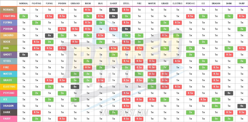
This is useful for reference, but it can be easily reduced if you just want to focus on the type advantages it might be useful to remember. For example, if a combination of types have neither advantage nor disadvantage when attacking each other, that’s not really worth remembering.
When you remove those elements, there are other ways you can represent it more concisely. For example, this representation is popular:
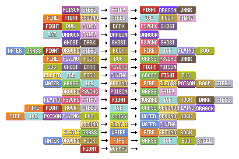
However, there are a couple of problems I have with this - the key one is that each type is represented redundantly in the chart multiple times. The other is that it still includes more data than I can easily remember - it includes any type A which is supereffective when attacking another type B, without considering the effectiveness of type B attacking type A.
The alternative representation of these type advantages that I liked best, which addresses both of these issues, is this one from Reddit user r_noob:
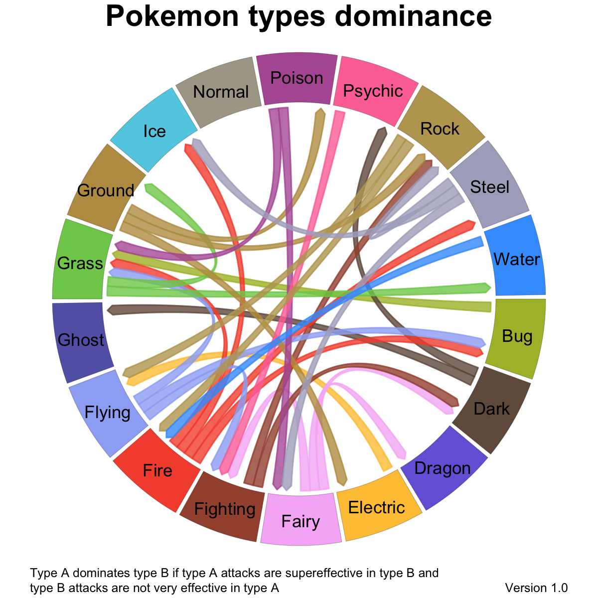
This introduces a concept of one type being “dominant” over another: that means that type A is supereffective over type B, and type B is not very effective against type B. This leaves out various combinations that are useful to know about, but those still present are arguably the most important.
I think this is a really nice representation of the data, but, as one Redditor comments, it would be nice if it were interactive so that you can highlight just the relationships with one particular type - since it’s a PNG, you can’t do that.
Fortunately, that’s where Flourish comes in. We have a very easy to use Chord Diagram template, which allows you to highlight either particular chords or all chords going to a particular arc.
My attempt to make an interactive version of that type dominance chart is here:
I’ve overriden the colors for each arc with those that are associated with those types in the game, and chosen the “color by larger end” option for the arcs. This means that if you highlight a particular type, it’s clear which arcs represent an advantage for that type (those of the same color) and those that represent a disadvantage (those of a different color). This is more obvious than the other visual cue, which is that the arcs taper from the type with the advantage to that with the disadvantage.
I find this a much easier way to explore the most important relationships between Pokémon types than any other I’ve seen, and I hope you find it useful too. Here’s a link to a single page version of the chart.
The raw data for this visualization is extracted from the GAME_MASTER file in the game, which is the canonical source of that information; there are multiple GitHub repositories which have JSON versions of that file, and the script I wrote to generate CSV files of type effectiveness data should work on any one of them.
Visualizing your progress towards level 40
In common with many games, Pokémon GO has a concept of XP, or Experience Points, which is an indication of your progress through the game. As your XP exceeds particular values, you go up a “trainer level”: you start at trainer level 1, and the maximum is level 40. (In the Pokémon GO world, players are Pokémon “trainers”.) Reaching these new trainer levels in the game is important in many several ways: new game features become available at particular levels (for example, you can fight in gyms, you have access to more powerful Pokéballs for catching Pokémon, you encounter better Pokémon in the wild, etc.)
One of the interesting aspects of these trainer levels is that they don’t go up linearly with you XP - in fact, far from it. This little Flourish story shows the exponential growth in XP requirements as you go progress through the levels - click to the next slide to see the huge jumps needed to get to level 39 and 40:
A few days ago I finally reached level 40 in the game, which is a big personal achievement, though I should say that it doesn’t make me a particularly serious player: many of the players I know from London communities have been playing intensively since 2016 and have amassed enough XP to have reached level 40 multiple times over.
However, at that landmark, I thought it would be interesting to figure out where all those Experience Points came from for me. This is interesting because there are many different actions in the game that generate XP, and some people focus much more on some than others. (One of the interesting things about the game is that there are lots of different ways to play it.) I had a hunch that a lot of my XP came from the rewards you get for raising friendship levels with other trainers, but I was interested in seeing how significant a factor it was.
Gathering the data for this was somewhat tricky; the statistics shown on the medals on your trainer profile are very helpful, and I can easily count the the number of friends of each level I’d made. However, I needed to estimate quite a few values, such as the proportion of Pokémon I caught with particular types of throw, and so on. In addition, there are various effects in the game that mean you get multiples of the usual amount of XP; I can remember, for example, that I used a “Lucky Egg” to get double the XP with all but a couple of of transitions to Ultra Friends and Best Friends, but I have no way of assessing in retrospect how much extra XP I got from special events where all catches got double XP, for example.
I suspect the data I built up isn’t far out, however, and I think it’s still interesting to explore. You can explore this Flourish Sunburst chart yourself, or click through the slides in the story for some commentary:
As expected, the amount of XP I got from the friendship level mechanism is by far the most important source. Other aspects were a surprise for me - I was fairly serious about collecting cheap-to-evolve Pokémon and evolving them in batches with a Lucky Egg on for double XP, but that turned out to be a relatively small part of the XP that got me to level 40.
The other key point that might not jump out at non-players is that the friendship mechanism that generated the bulk of my XP was only introduced into the game in 28th of June. I’m in awe of the dedication of the players who reached level 40 without any of those bonuses!