How to plot lines on a map and bring them to life with animation
Visualize everything from railway lines to disputed borders with the line layers in our map templates
Looking to visualize your favorite jogging route, transportation network or disputed border? Look no further!
Our Projection Map and 3D Map template both let you add custom line layers. Similar to regions, simply upload your lines in GeoJSON format and they will be drawn on top of your map.
In this blog post, we’ll show you some examples of when you might want to use lines to enhance your maps and how to get started.
1. Adding borders to a region map
A key use case for our lines feature is the visualization of disputed borders – while regions and points are still the central focus of your map. With the line layer, you can upload borders and customize how they are styled to match your style guides.
In the examples below, we visualized disputed borders (as defined by the World Bank) in both templates.
2. Using lines to highlight physical features
But lines can also be the most important part of your map, visualizing anything from railway lines to rivers.
The map below shows major rivers around the world, while the shading of the regions highlights the total renewable water resources a country has.
3. Mapping a transport system
You can also use lines to visualize route maps of transport systems or sporting events, with regions used in the background to help the user identify the location.
The example below shows London’s tube and rail lines and stations. With the line layer, you can not only plot the stations on top of regions using points, but add lines to show the individual tube routes on which the stations belong.
Here, the lines are customized using overrides to specify individual styles that mimic those shown on the typical Tube map.
Adding your map to a Flourish story allows you to combine different views and animate between them, creating an impressive pan-and-zoom showpiece to easily embed on any website – you can even set it to autoplay!
In addition to lines, our 3D Map template also supports animated points, heatmaps and regions, so you can combine different layers to draw attention to different aspects of your data. In the example below, we combined lines with shaded regions to visually correlate train coverage.
Getting started
First, decide which template you want to use – Projection Map or 3D Map? While the Projection Map template is the go-to template for classic choropleth maps, the 3D Map is great for more advanced features like animated points.
Read more about the differences between our map templates in our help doc.
Once you have made your decision, the steps are the same:
- To upload a line layer to your map, go to the Data tab and navigate to the Lines sheet.
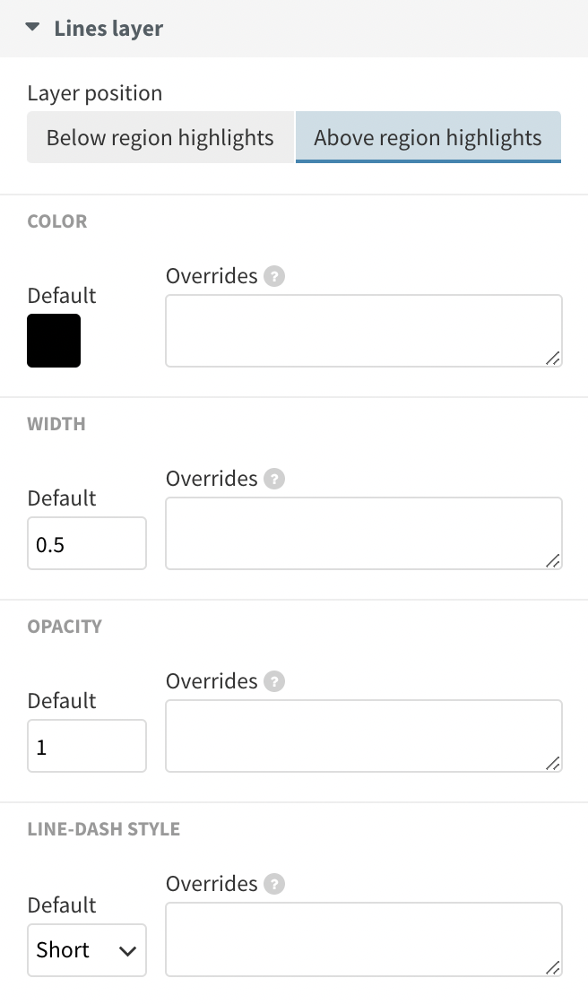
You can customize the layer position, as well as the color, width, opacity and line-dash style of your lines.
- Use the Upload data button to upload your GeoJSON lines file and match up your data with the Geometry and Series column bindings.
- Under Lines layer in the settings panel, you’ll find options to customize the layer position, as well as the color, width, opacity, and line-dash style of your lines.
- You can use the Default settings to set a single style for all of your lines, or use the overrides boxes beside these settings to style lines differently based on the Series column in your data.
- You can learn more about the different settings in our help doc.
- Optionally add your visualization to a Flourish story to animate between different views.
- Publish and embed to generate a script or iframe embed code.
Unlike regions and points, lines are passive features, meaning that you can’t interact with them or supply information in popups. If you’d like to add information on hover or click, we recommend adding points via the Points sheet to the beginning and ending of your line.
Learn more about the different settings in our help doc.
When integrating line layers into a map, it’s important to consider their visual weight and clarity, as too many lines or overly complex patterns can make the map difficult to read. Use color, opacity and line thickness effectively to convey the right amount of information without overwhelming the viewer.
Looking for line data?
We’ve updated all of our Projection Map starting points to include disputed borders line data as defined by the World Bank. If you’d like to add additional lines but don’t know how to find lines data, we recommend doing a quick Google search for the geographical features you are looking for. Searching for something like “US train lines GeoJSON”, for example, should get you off to a good start.
You can also bring your own lines data that you collected using apps like Strava or AllTrails into Flourish by transforming the exported KML or GPX file into GeoJSON using free tools like Mapshaper. Learn more about this in our help doc.
Happy line mapping!
If you want to show routes, rivers, railways and speedways, or just connections between different points in a geographical context, then a line map is for you.