Hi everyone,
It’s been a while since our last update, so there’s loads of news to share – including no fewer than three exciting new templates.
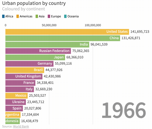
Bar Chart Race template
Bar Chart Race visualizations have taken social media by storm recently, so we decided to add them to Flourish. With rapidly ticking numbers and animated bars, this is a fun and effective way to visualize data over time. You can now make a bar race in seconds, complete with filters, by just uploading a simple spreadsheet to Flourish.
• How to make a bar chart race
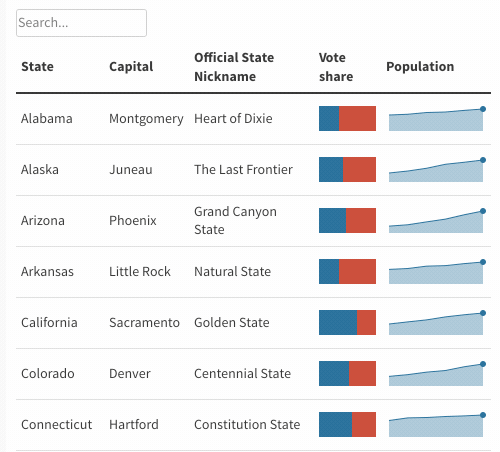
Interactive table template
Our new table template makes it easy to create attractive, embeddable, mobile-friendly tables with search and sort features. Most excitingly, the template allows you to easily convert columns of numbers into mini line or bar charts, as shown below. Read more, including some tips on when to use a table, in Katie’s launch post:
• How (and when) to create interactive tables
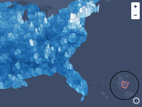
3d region map template
The latest member of our family of advanced mapping templates, the “3D region map” allows you not only to shade regions (such as boroughs, counties or countries) but also to extrude them vertically. This makes it easier to see geographically small outliers and also allows you to use height and colour to encode two different metrics. Adapt an existing example with new data or upload GeoJSON to add custom boundaries.
Developer intern
We have a job ad live for our paid intern position (described on Twitter recently as the “coolest internship in London”!). This time we’re looking for a promising visualization developer. If that’s you, please apply. If not, please spread the word :-)
Business accounts
We’ve expanded our commercial team to include a brilliant account manager, Anna Al-Damluji, to help our enterprise customers get the best use from Flourish, and a head of business development, Richard South, to take Flourish to new customers. We’ve also expanded our enterprise feature set to include SSO (single sign-on), richer security documentation and better team administration tools.
• Enquire about our business accounts
Template improvements
Almost all the templates have new features. A few examples:
• You can now use sliders and menus when shading using the Projection Map
• Our popular Survey template now has circular labels around the groups and scaled labels on the individual dots
• You can turn off roads and national borders on and off on our new zoomable base maps
• The Slope Chart template now supports multiple stages
On the web
• Our Head of Development, Mark, wrote a post on visualising Pokemon data with Flourish
• Alli Torban covered our new “Talkie” audio-driven data graphics feature on her Data Viz Today podcast audio-led visualisation stories
That’s it for now. We’ll be back in a week or two with a major new Flourish feature, and a couple of weeks after that with an even bigger one!
In the meantime, as ever please do press reply with suggestions and feedback.
Best wishes,
Duncan and the Flourish team
PS. In case you missed it last time…
• Talkies: audio-driven data storytelling
• Arc map time slider and controls
• Visualising the polar vortex
• Versioning for template developers
• New shapes in Survey template
Flourish, part of the Canva family
33-35 Hoxton Square
London N1 6NN