Hi everyone,
A whole host of updates for you this month, including two brand new templates!
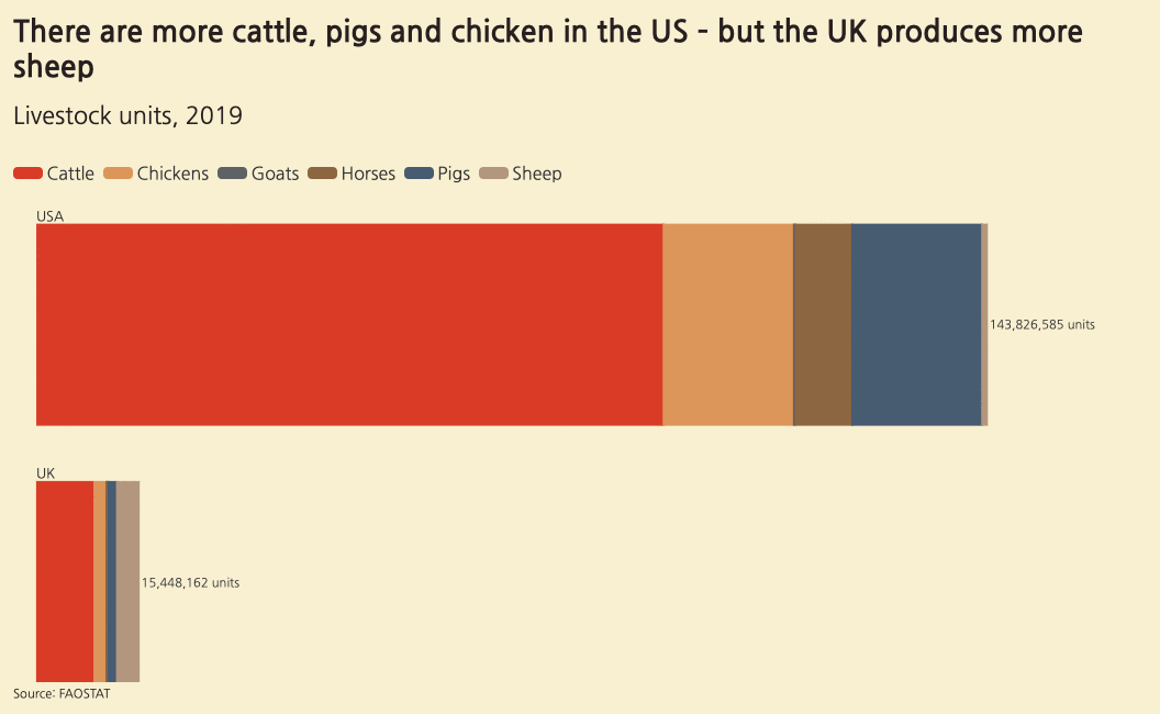
Pictogram
Our new Pictogram template is great for creating pictogram and isotype charts, where numeric data is encoded as groups of repeated icons. Try it out now and swap your bar charts for something more visual and engaging.
• Learn more and see examples in our blog
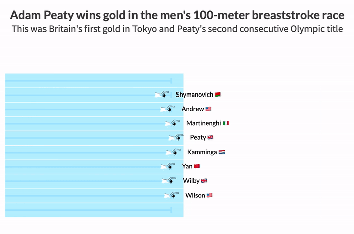
Sports Race
This brand new template, launched just in time for the Olympics, turns event results data (such as lap or length times) into an interactive replay of a race, with animated icons that move around a highly customizable track or course.
• Check out the new template in our Olympics blog post
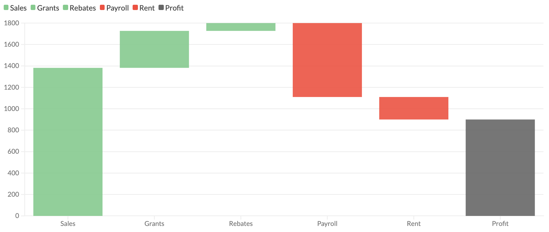
Waterfall charts
You can now make waterfall charts in the Line, Bar, Pie template. Commonly used for financial data, waterfalls help show the cumulation of positive and negative values over time or across categories.
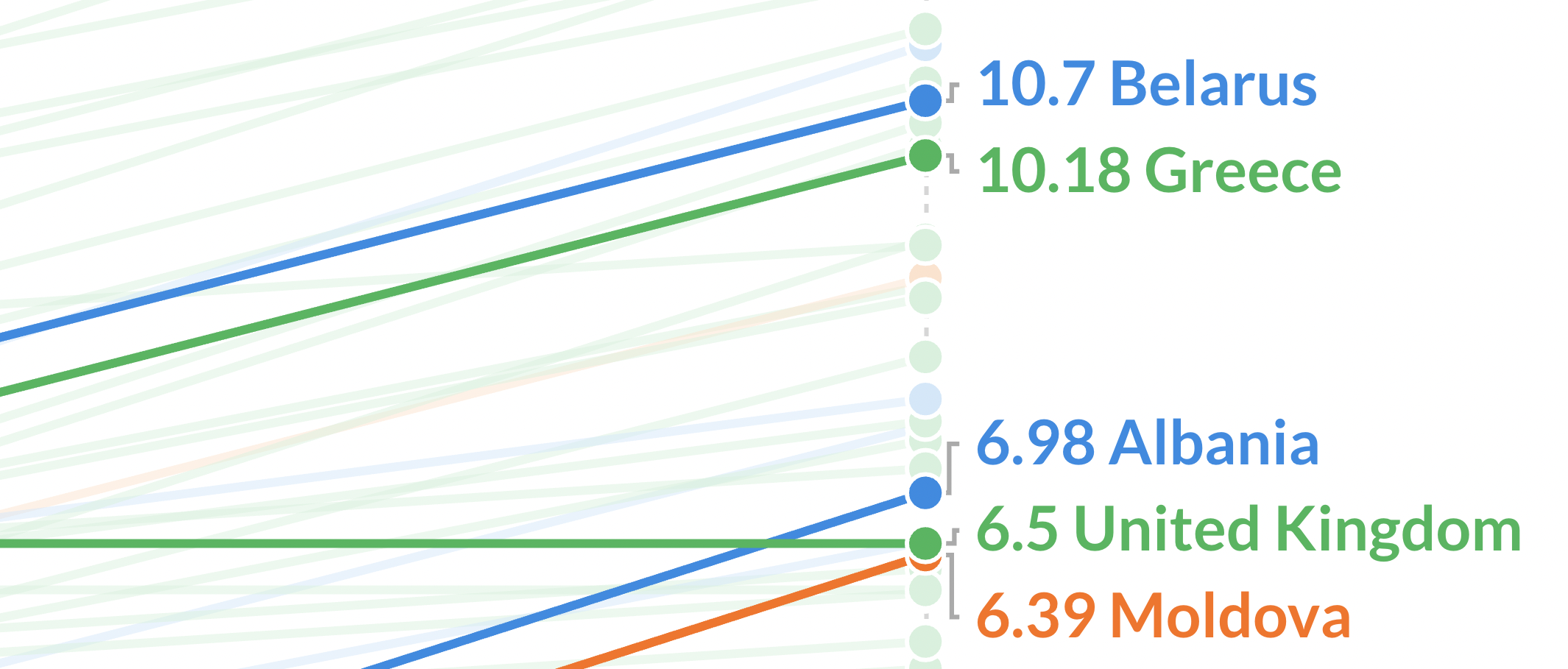
Slope chart improvements
The Slope Chart template now has improved labelling with automatic overlap prevention, connector lines and richer styling settings.
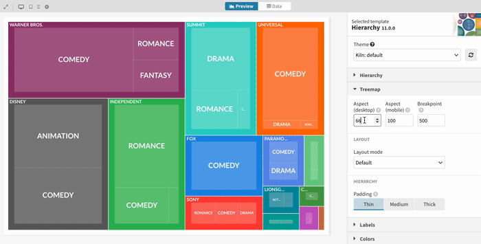
New treemap settings
When you make a treemap in the Hierarchy template, you can now control the aspect ratio. This can even be different on desktop and mobile.
New “Tea break” webinars
Our “Tea break” webinars – which are now available to all users – are a great way to learn about new parts of the Flourish world. The next one, on 17 August, will cover a deep dive into our Line Chart Race template and demo some of its new features.

We’re hiring!
The Flourish team is growing and we have great opportunities across several teams, including DevOps, information security and enterprise sales.
• Apply now or spread the word

We’ll be back in a few weeks with more updates. Until then, as always, just hit reply with any ideas, questions or feedback – and keep an eye on the changelog for more updates!
Best wishes,
Luisa and the Flourish team
Did someone forward this message to you? Join the list!
Flourish, part of the Canva family
33-35 Hoxton Square
London N1 6NN