Hi everyone,
March is here and spring is almost upon us! Flourish is blooming and we’ve got new content and updates to share with you, so keep reading.
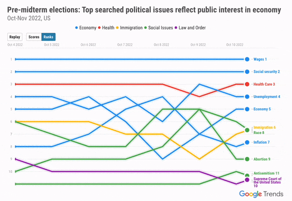
Learn how to visualize Google Trends data tomorrow in our webinar with a special guest
Google Trends is a rich data source that gives unique insights into what people all over the world are thinking about and how they’re responding to unfolding events. In our next webinar, Google’s Senior Data Analyst Leslie Leuenberger will show you how to use Google Trends data in Flourish. Read our blog to learn more and to get some inspiration for your projects.
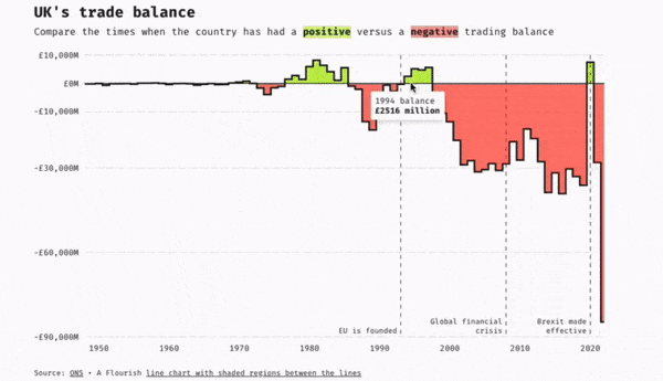
Learn more about the inventor of the line, bar, and pie charts in our latest blog
In our latest Masters series we celebrated the work of William Playfair. He created three of the most popular charts in use today: the line, bar, and pie charts. Read our blog to learn more about the evolution of these 200-year-old charts and how technology has transformed them.
• Check out our blog post to learn more
More updates
• Do you want to learn the basics of Flourish? Register in our training site for free.
• Looking for inspiration? Check out our examples page, which we frequently update with inspiring projects and visualization techniques.
Check our changelog to see more updates on what’s new in Flourish!
Before you go
Join us for Canva Create: Brand New Era! On March 23 we’ll learn more about the future of design, collaboration, and new ways to enhance your Flourish projects in Canva.

We’ll be back in a few weeks with more updates. Until then, as always, just hit reply with any ideas, questions, or feedback!
Best wishes,
Mafe and the Flourish team
Did someone forward this message to you? Join the list!
Flourish, part of the Canva family
33-35 Hoxton Square
London N1 6NN