Hi everyone,
This is a very special day for our dear newsletter: our 50th issue! Thank you so much to all of you who read and tune in to the latest news of the Flourish team and product. To celebrate this milestone, the Marketing and Content team picked their favorite blogs and charts of all time. Keep reading to get inspired!
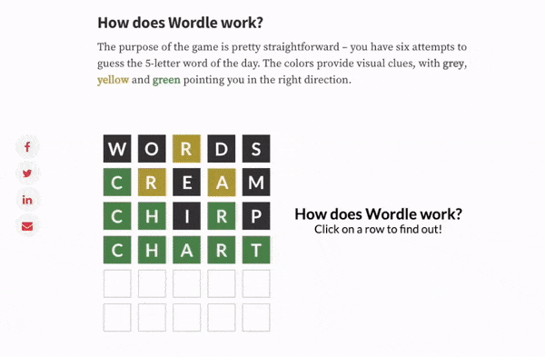
The incredible rise of Wordle – visualized!
The Wordle blog is a must-read for anyone captivated by the game’s sudden and astounding success. The piece is filled with stunning data visualizations that bring to life the global frenzy surrounding the game. It captured the joy of Wordle so well it had to be my favorite Flourish content!
— Annie, Social media specialist
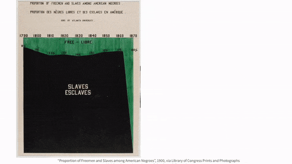
Masters series: The data visualization legacy of W.E.B. Du Bois
I chose the Du Bois’ Masters series because I find his work so special and groundbreaking. Not only did it provide an in-depth analysis of the social and economic conditions of African Americans in the USA in the early 1900s, but it also showed the value of data visualization as a tool for understanding complex social issues. Recreating his charts made me think about the past and, from a data visualization perspective, I was both inspired and curious about his choice of charts, color palettes, and his sources of inspiration!
— Simona, Content specialist
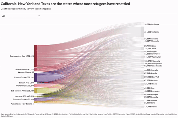
One dataset, ten visualizations
This is one of my favorite blogs I’ve ever worked on. Thinking about all the possible ways to visualize a single dataset was a great exercise that I’d recommend to any dataviz practitioner. It really pushes you to be creative and to think out of the box — and it’s a great way to test the limits of each chart type. The point map and the sankey diagram are some of my all-time favorite visualizations to this day.
— Mafe, Content specialist
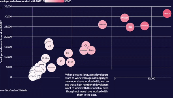
Visualizing the 2022 StackOverflow developer survey
I chose this scrollytelling piece because it provides an insightful and visually captivating overview of the programming language landscape. Our versatile Data Explorer template really shines in this project, seamlessly morphing between scatter plots, beeswarm charts and timelines. My favorite view compares coding languages developers want to work with versus those they’ve already worked with — I had no idea Rust and Go were the new cool kids on the block!
—Luisa, Product manager
We’ll be back in a few weeks with some very exciting product updates and new content to keep you inspired, so stay tuned. Until then, as always, just hit reply with any ideas, questions, or feedback!
Best wishes,
Mafe and the Flourish team
Did someone forward this message to you? Join the list!
Flourish, part of the Canva family
33-35 Hoxton Square
London N1 6NN