One dataset, ten visualizations
Exploring the possibilities, strengths and weaknesses of different chart types
One dataset can be represented in multiple ways depending on what you want to focus on: want to showcase evolution over time? A line chart will do the work. Care to emphasize the geographical distribution of the data? Then a map is, most likely, the best choice. The exercise of trying to come up with as many charts as possible is not only fun — that is if you are a data visualization geek like most of us here at Flourish — but also useful to understand the strengths and weaknesses of each chart type in a given situation and choose the one that best fits the story you are trying to tell.
With this idea in mind, we embarked on a journey to come up with different charts based on a single dataset: historic settlements of refugees in the US from 1975 until 2018. The goal was to design as many insightful visualizations as possible. Some charts will prove more effective than others, but that is the whole point of this exercise!
Ranking
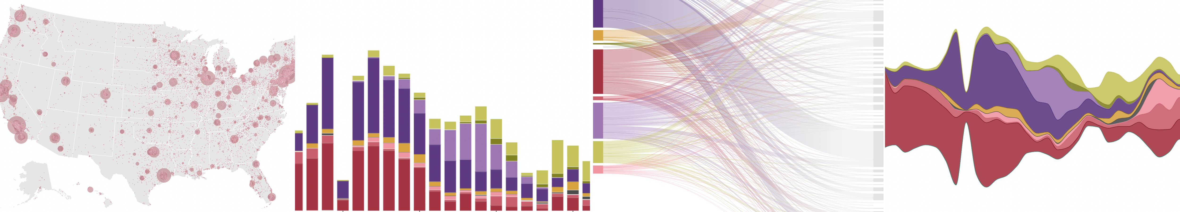
One of the first questions we wanted to answer was how many refugees came from each country. Although there are different ways to answer this question, a bar chart is a very simple and effective way of doing so and allows for easy comparisons.
To avoid having a long list of countries with very low numbers, we calculated the average number of refugees per country and kept the ones above average. Those below average were aggregated into the “All others” category. Learn more about the data prep behind this article.
Change over time and distribution
With this particular dataset, one of the main questions we had was whether there had been any patterns over time, like a sudden influx of refugees during a certain time, or from a specific region. To answer it, we looked at different ways of showing change over time to reflect the fluctuations in the number of refugees.
Line charts
Line charts are the most traditional way of showing change over time. First we looked at the general picture, visualizing the total number of refugees resettled per year. Then, we broke it down by region of origin and built a multi-series line chart where each line represents a region. In theory, this is a good way of approaching this problem, but in practice we can see that there are too many lines for the chart to be readable. Another issue is the difference between the values of the series. Some regions have higher numbers of refugees than others, and so others become illegible with this scale. Using a multi-select filter allows users to focus on a particular series or several of them and make comparisons.
Stacked column charts
Interestingly, bar and column charts weren’t originally created to show time variances: William Playfair invented the bar chart because he had missing series of data for certain years. Still, they can be effective ways to show change over time, especially when the data has different segments that get buried because of the Y axis scale. Our chart below visualizes the total number of refugees settled per year, where the column’s height represents the annual total, and the segments are the total per region. This is a good solution to show the origin of the refugees while spotting some trends, and it is still easy to establish comparisons between each year. We’ve also included a filter to allow the user to dig deeper into the data and focus on specific regions.
This stacked column chart is more readable than the previous line chart, but some segments of the columns are just too small and hard to read.
Streamgraphs
Another alternative to show change over time, and one that works well with multiple variables, is the streamgraph. In this chart type the layers are organized alongside a central axis and then they are organically stacked both upwards and downwards the axis, giving them more room to spread and resulting in an easier chart to read for users. The lack of a Y axis can be a disadvantage in some cases as it isn’t easy to estimate the magnitude of the different areas, but annotations can help solve that problem. The main strength of this chart type is the distribution of the areas. Here the proportion of refugees from specific regions is much clearer and, although it is hard to determine the quantities for each particular year, the overall message is much more clearly delivered than with the other charts. You can learn more about how and when to use streamgraphs in our blog post.
Flow
When the data we’re working with includes changes in state, charts representing flow can be a good way to showcase it. In the case of our dataset, we are talking about literal flow as we’re dealing with migratory movements.
Sankey diagrams
Sankey diagrams are a good option to represent flow through the intertwining of links going from one node to another. We created a series of charts showing the relationship between country and region of origin and state of settlement. We also colored the links based on the regions of origin to make the charts more readable and added filters so users can nagivate through the data more thoroughly. You can learn more about how and when to use our Sankey and alluvial diagrams in our help docs.
One drawback from Sankey and alluvial diagrams is that they can be hard to read, especially when dealing with many links. In this case, the versions with filters prove to be more effective because they are less data-dense and show all nodes and links clearly. Often with Sankeys, less is more.
Geographic distribution
Since the dataset included the longitute and latitude of all the US cities with refugees, we decided this was a good opportunity to create some maps to see the geographical distribution of refugees in the country.
Proportional symbol map
You might think that coloring your states by the number of refugees that are resettled into them would be the most straightforward way to visualize this data, but when doing this, you’d have to take into account the size, capacity and density of each state in the first place. As this isn’t easy to do without transforming your data to per-capita or per-acre, you should only shade regions where the quantitative measure is directly associated with and continuously relevant across the spacial region. For our dataset, this isn’t the case. Therefore, we opted for a proportional symbol map, most commonly called a bubble map.
This chart type locates a geometric shape — usually a circle — on a map and scales it according to specific values from the data. This comes in useful when displaying totals, like here where we plotted the total number of refugees settled in different US cities. This chart is very effective in showing the distribution of refugees: We can see that most refugees have been resettled to the East Coast, the Great Lakes region and the edge of the West Coast. Besides plotting the location and size of the refugee population per city, each point has a popup with additional information.
Heatmap
Flourish’s 3D Map template allows users to display their data points as a heatmap, where the points are represented as clusters rather than as individual circles. The result is a map that showcases the density of the data distributed on the geographic area. By adding data for each year and activating the timeline functionality, we transformed it into an animated heatmap showing the waves of refugee resettlements over time in the country.
Afterword
As the examples in this post show, there are often lots of different options to visualize any given dataset. The right choice depends what features of the data you’re trying to showcase. If you want to read more about good practices in the field, you can check our guide to creating compelling visualizations and our help doc on choosing the right visualization for your data. Or if you want some data to experiment with, check this help doc where we’ve compiled some resources.
Of course, our examples only scratch the surface, so let us know if you come up with other visualizations for this dataset. You can tag us on Instagram and Twitter using the hashtag #madewithflourish. We’d love to see your creations!
About the data
For this project, we used the geocoded data file gathered by Dreher, A., Langlotz, S., Matzat, J., Parsons, C. and Mayda, A. for their paper Immigration, Political Ideologies and the Polarization of American Politics. The dataset is a combination of their digitized ORR records and data from the Bureau for Population, Refugees and Migration after 2008. Their original dataset included records of refugee settlement split by country of origin and city of settlement in the US. We merged the original dataset with a separate dataset of US states names and FIPS (Federal Information Processing Standards) codes to get a broader overview of the refugees’ places of resettlement, and we also added sub-region data from the United Nations to have a broader look at where refugees came from.
We cleaned and wrangled the data to generate smaller datasets that focused on specific aspects that could help answer some of the questions we had about the topic. Whenever we work with data, it’s important to explore it and to look at it from different perspectives. This is useful not only from an analysis perspective, but also from a visualization one, as different data formats are required for different chart types that can show insights in their own unique way.