Masters series: The data visualization legacy of W.E.B. Du Bois
Step-by-step guide on creating visualizatins inspired by Du Bois
The Flourish team spends a lot of time admiring work by the best visualization practitioners. And so do our users. When a cool visualization goes viral, we often get asked: “Can I do that in Flourish?”. Hence this blog series, which celebrates popular visualizations and looks at how you can achieve similar things in Flourish. You can check out previous Master’s series posts here and here.
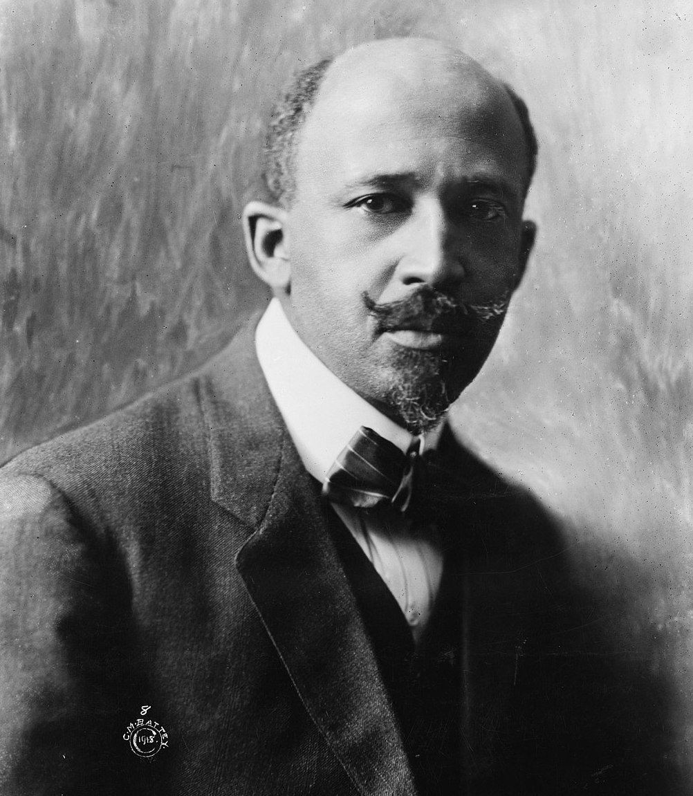
W.E.B Du Bois (1868 - 1963) put together a celebrated series of charts, graphs and maps to commemorate the lives of Black Americans at the turn of the century.
For today’s Masters series post, we went back in time and explored W.E.B. Du Bois’ data portraits from the late 19th century. Inspired by the TidyTuesday Du Bois Challenge by AJ Starks, Allen Hillery and Sekou Tyler in 2020, we chose a few of Du Bois’ most significant data visualizations that focus on race in the US and recreated them with Flourish.
W.E.B. Du Bois was a social scientist and prominent African-American rights activist who took on the complex task of gathering and manually visualizing the lives of Black Americans in the 1890s. His 58 visualizations were compiled and presented as part of the exhibition “American Negro” in the 1900 World’s Fair in Paris, where Du Bois’ work won a gold award.
Note: As the purpose of this post is to recreate Du Bois’ visualizations, we have retained the language he used to describe African Americans, which would not be acceptable today.
1. Area graphs
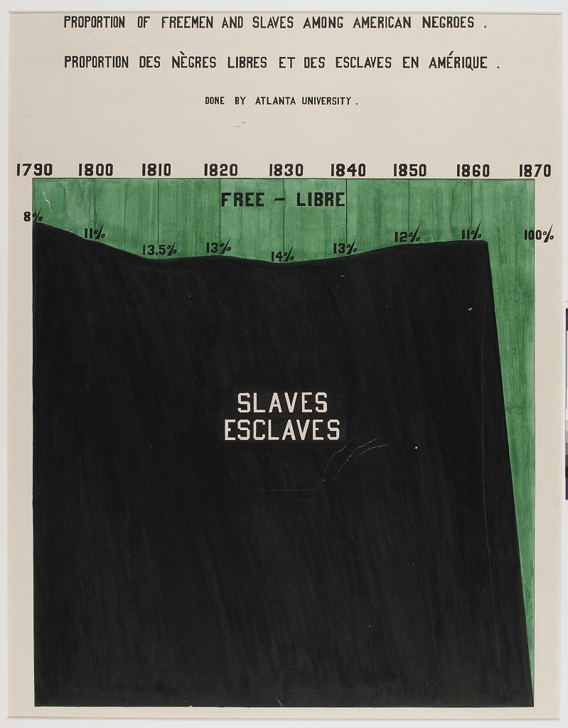
“Proportion of Freemen and Slaves among American Negroes”, 1900, via Library of Congress Prints and Photographs Division, Recreation using our Line, Bar, Pie template
Du Bois often used blocks of color and geometric shapes to visualize data, and this area chart has a similar style. It explores the division between free and enslaved African Americans from the end of the 18th century until just after the 13th Amendment officially abolished slavery in 1865.
To recreate this chart:
- Select our stacked area chart starting point and import your data.
- Under Layout settings, set a background image by turning the Image option on.
- Set the opacity of the area to 1 under the Lines, dots and areas setting.
- In the Plot background settings, upload an image for the textured background.
- Position the X axis on top of the visualization.
- In the Labels settings, turn on stack totals labels.
- Add your visualization to a Flourish story in order to add annotations for the area labels (Slaves and Free).
- We used the free Google font Odibee Sans to make our visualization look more similar to the original. Additional fonts are available on our Enterprise plan as part of company themes.
2. Pie charts
Several of Du Bois’ charts use circles, including spirals, which became one of his data visualization trademarks. For this example, we used our pie chart starting point to recreate Du Bois’ butterfly-style segment chart.
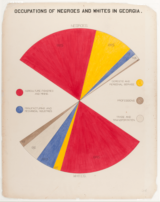
“Occupations of Negroes and Whites in Georgia", 1900, via Library of Congress Prints and Photographs Division, Recreation using our Line, Bar, Pie template
To recreate this chart:
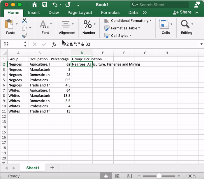
In order to get the correct data structure for our pie chart, we used an Ampersand operator (=A2 & ": " & B2) in Excel to combine our first and second columns.
- Select our pie chart starting point.
- Before importing your data to Flourish, combine the first (“Group”) and second (“Occupation”) using an Ampersand operator in Excel.
- Import your data and bind your columns: You should have one column for percentages (“Value”) and one column for group and occupation (“Label”).
- Add two additional rows (we called them “Space” and “Space2”) and set their value to 75. These will be our “invisible” slices.
- In the Preview tab, set “Space” and “Space2” to be transparent via your color overrides. This is also where you can define the rest of your colors.
- Add your visualization to a Flourish story in order to add annotations for the percentage labels and the legend. We used custom HTML to add and shade circle characters (⬤).
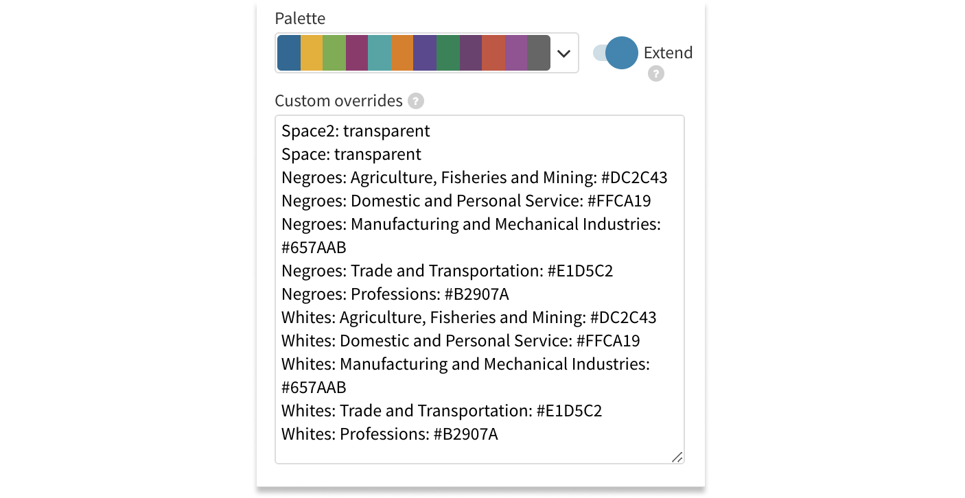
You can use transparent overrides to hide certain slices of your pie.
3. Bars & columns
Bars and columns were Du Bois’ most used chart types of all – 30 out of 58 visualizations display them. The dominant palette of these graphs is often pink/red, with the additional two or three solid colors, but there are many exceptions such as the example below.
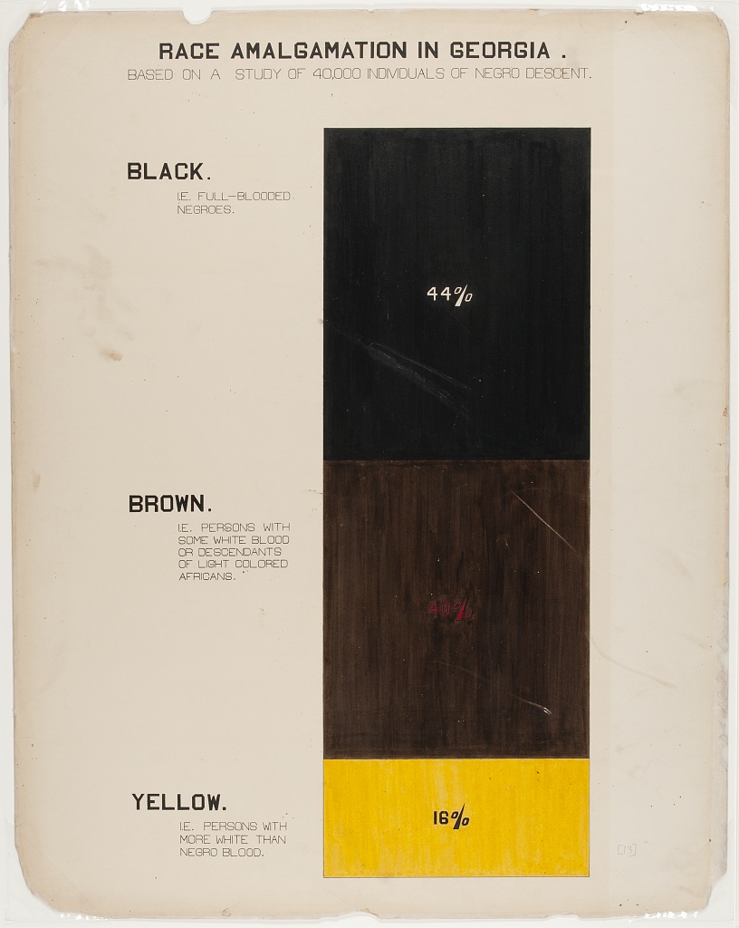
“Race Amalgamation in Georgia” 1900, via Library of Congress Prints and Photographs Division, Recreation using our Line, Bar, Pie template
For the recreation of this chart, we used our stacked column starting point. We added the result into a story, allowing us to use annotations for the descriptions on the left-hand side.
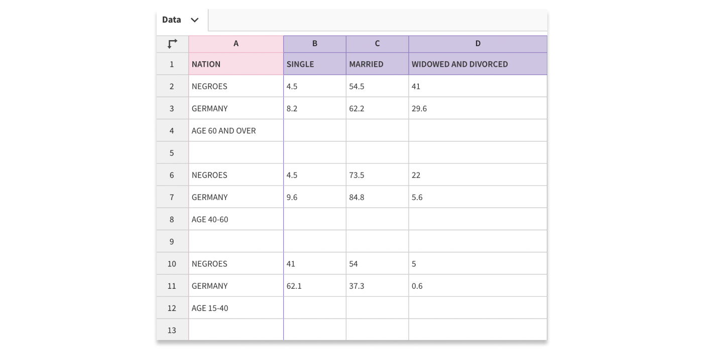
Another of Du Bois’ bar charts shows the marital status of people from different age groups and backgrounds.
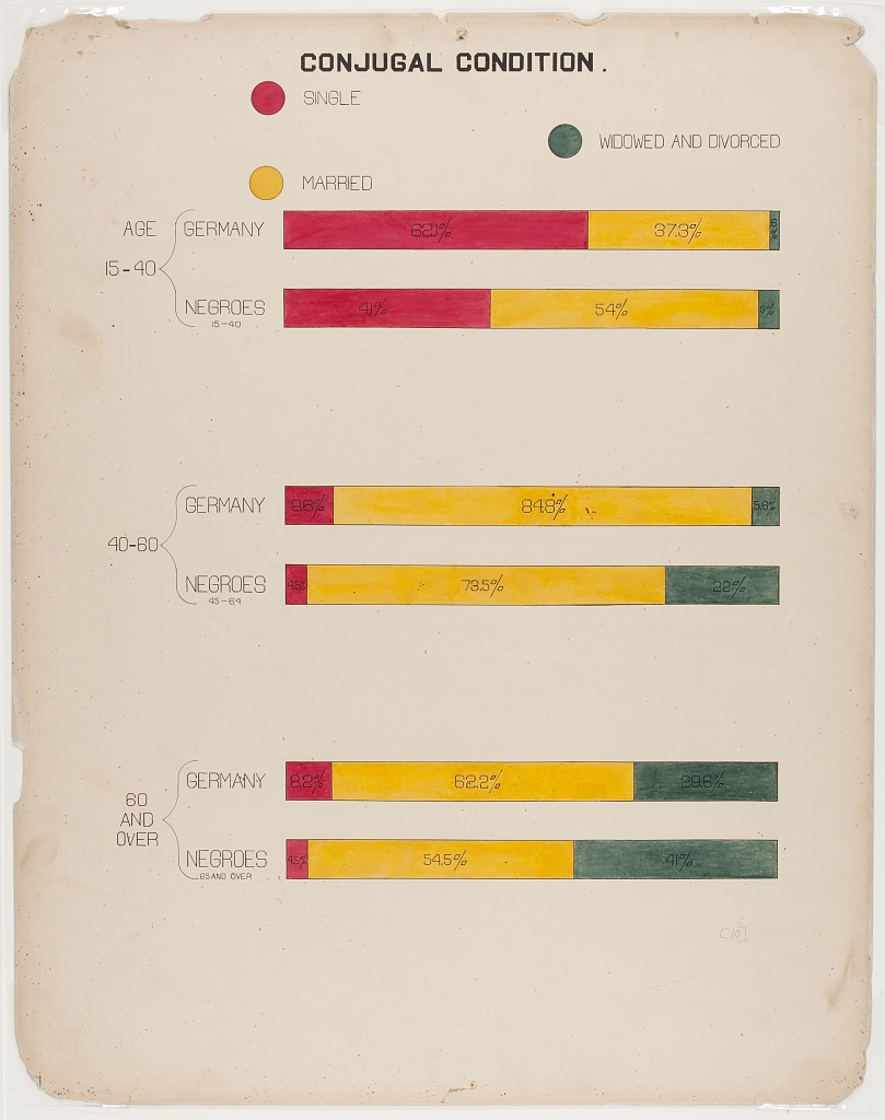
“Conjugal Condition”, 1900, via Library of Congress Prints and Photographs Division, Recreation using our Line, Bar, Pie template
To recreate this chart:
- Select our bar chart (stacked %) starting point.
- In the Data tab, import your data. In order to add a title for the paired bars, create separate rows for each label and add a non-breaking space in each value column.
- Under the Y Axis settings, disable the axis line.
Using non-breaking spaces allows you to use the relevant labels as 'titles'.
4. Maps
In addition to charts, Du Bois created multiple data maps to show the socioeconomic and demographic characteristics of the US and the state of Georgia in particular.
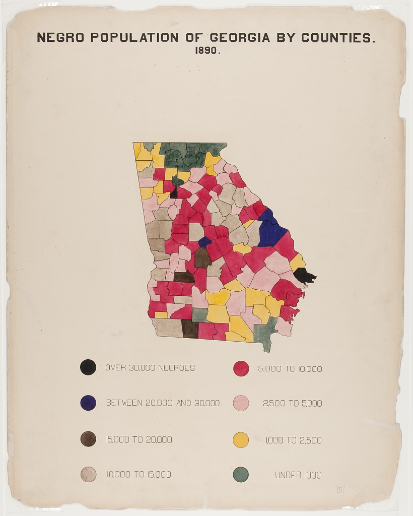
"Negro Population of Georgia by Counties", 1900, via Library of Congress Prints and Photographs Division, Recreation using our Projection Map template (Data source: #DuBoisChallenge)
For this example, we used our US (Counties) Projection Map starting point and deleted the non-Georgia regions.
Click through the story below to see how we created this map!
There are many more of W.E.B. Du Bois’ charts and maps that could be recreated with Flourish, and we’d love to see anything you’ve created with this kind of approach. If you try something along these lines, let us know via Twitter.
Thanks to TidyTuesday as well as AJ Starks, Allen Hillery and Sekou Tyler for compiling this data and making it available. If you’re interested in learning more about W.E.B. Du Bois’ visualizations, we highly recommend this Nightingale blog series.
Have you come across a brilliant visualization you’d like to see in this series? Let us know!