Dot plot vs scatter plot: Everything you need to knowLearn the key distinctions and how to pick the right chart for your dataPosted on 17 June 2026 by Lavinia Rossi
What great scrollytelling looks like — and how to build it yourselfDiscover scrollytelling examples and how Flourish makes scrollytelling possible without writing a single line of codePosted on 27 May 2026 by Vanessa Fillis
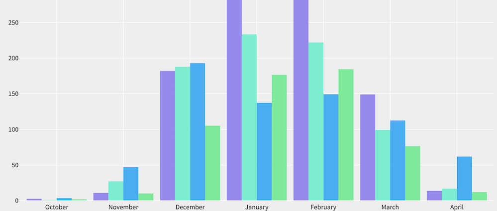
Grouped bar charts: What they are and when to use themA clear guide to comparing categories side by side, and how to build them in FlourishPosted on 13 May 2026 by Lavinia Rossi
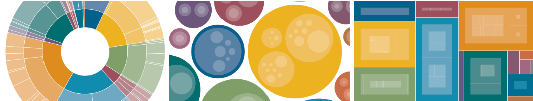
What are radial hierarchy charts and how to create one (with examples)Understand how radial charts work – explore radial trees, sunburst diagrams, and when to use eachPosted on 08 May 2026 by Lavinia Rossi, Oli Darley, Simona Tselova
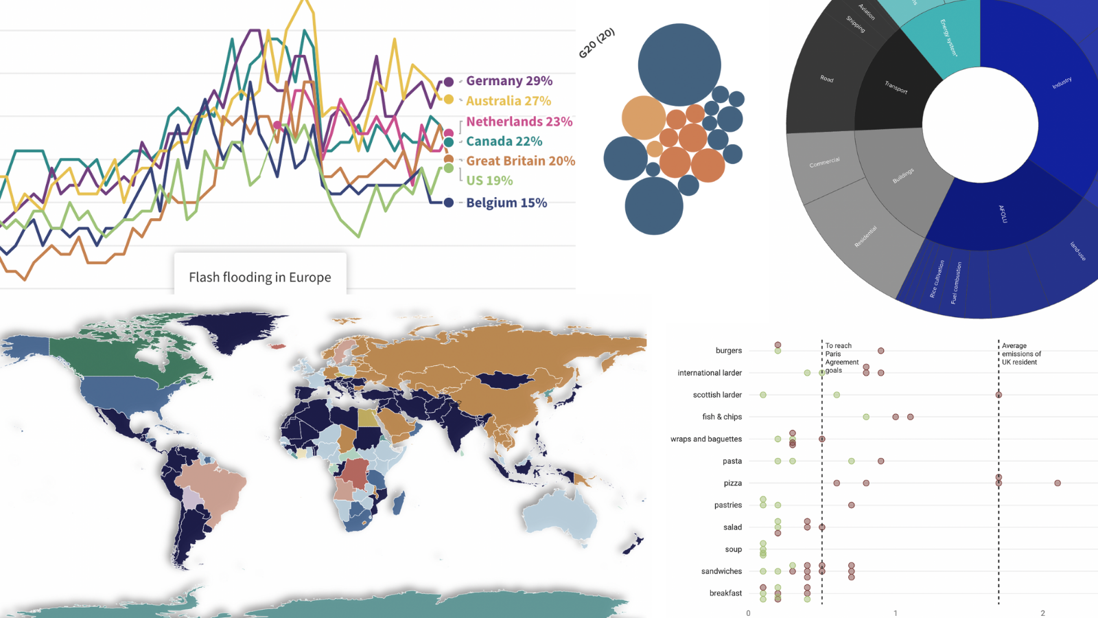
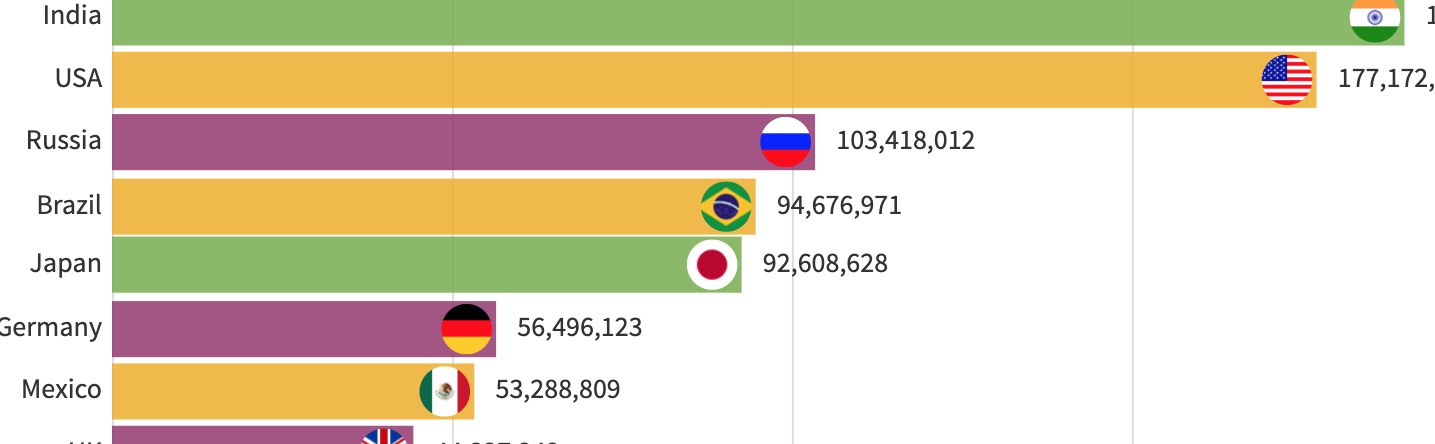
8 types of charts you need to master data visualizationA beginner-friendly guide on what each chart shows, how to read it, and how to make it clearerPosted on 13 April 2026 by Simona Tselova
How to use radar charts for clear, insightful data storiesLearn when radar charts work, when they mislead, and how to create clearer alternatives with FlourishPosted on 30 March 2026 by Duncan Clark, Simona Tselova, Lavinia Rossi
Bar graph vs line graph: how to choose the right chartA clear breakdown of when to use bar graphs versus line graphs — and how to choose the right one for your data.Posted on 20 March 2026 by Lavinia Rossi
After 3,000+ charts, here’s why I trust Flourish for interactive data storiesWhy I think Flourish is the best data visualization tool for newsroomsPosted on 02 March 2026 by David Foster
How to grab attention with data – my checklist for interactive storytellingWhat 3000 charts taught me about creating engaging visualizationsPosted on 03 February 2026 by David Foster
Visualize the World Cup: 15 charts to power your football coverageFrom fixtures to player stats, build interactive football visuals for every stage of the tournamentPosted on 27 January 2026 by Joseph Witcombe and Simona Tselova
Sales reporting: how to create interactive sales reports that drive business decisionsA practical approach to sales reporting that leadership teams rely onPosted on 07 January 2026 by Rob Porter
Dual axis charts: why they spark debate, and how to get them rightA closer look at how dual axis charts work, the ways they can mislead, and the moments when they genuinely reveal useful insightsPosted on 18 December 2025 by Simona Tselova
Drive engagement: a guide to transforming charts with filtersReveal insights and comparisons in your data by adding interactive filters to your Flourish visualizationsPosted on 22 October 2025 by Vanessa Fillis
How AI can help you make better chartsLearn six practical ways to leverage AI for data visualizationPosted on 07 July 2025 by María Fernanda Callejón
Beyond the Numbers: data that connects starts with storytellingTakeaways from Canva’s new report to elevate how your business works with dataPosted on 05 June 2025 by Simona Tselova
A marketer’s guide to data storytelling: from insight to impactShowcase results, identify trends, and get buy-in with visualizations that speak louder than numbersPosted on 05 June 2025 by Cherie Robertson
From numbers to narrative: smarter ways to share sales performanceLearn how to turn sales metrics into clear, useful stories that drive actionPosted on 05 June 2025 by Cherie Robertson
Eurovision through the years: a charted history of music’s biggest contestExplore the history and trends of Eurovision, illustrated in 9 comprehensive chartsPosted on 15 May 2025 by Vanessa Fillis and Simona Tselova
Big news: Two new ways to tell better stories with your data 🎉Introducing ‘Start with data’ and a refreshed Flourish app in CanvaPosted on 11 April 2025 by Flourish team
Linear vs logarithmic: choosing the right scale for your storyDiscover when to use linear or logarithmic scales to bring clarity to your data and tell a stronger storyPosted on 13 March 2025 by María Fernanda Callejón
4 powerful ways nonprofits use data visualization to share their storiesLearn how nonprofits are transforming complex data into compelling visual stories using FlourishPosted on 07 January 2025 by Luisa Bider
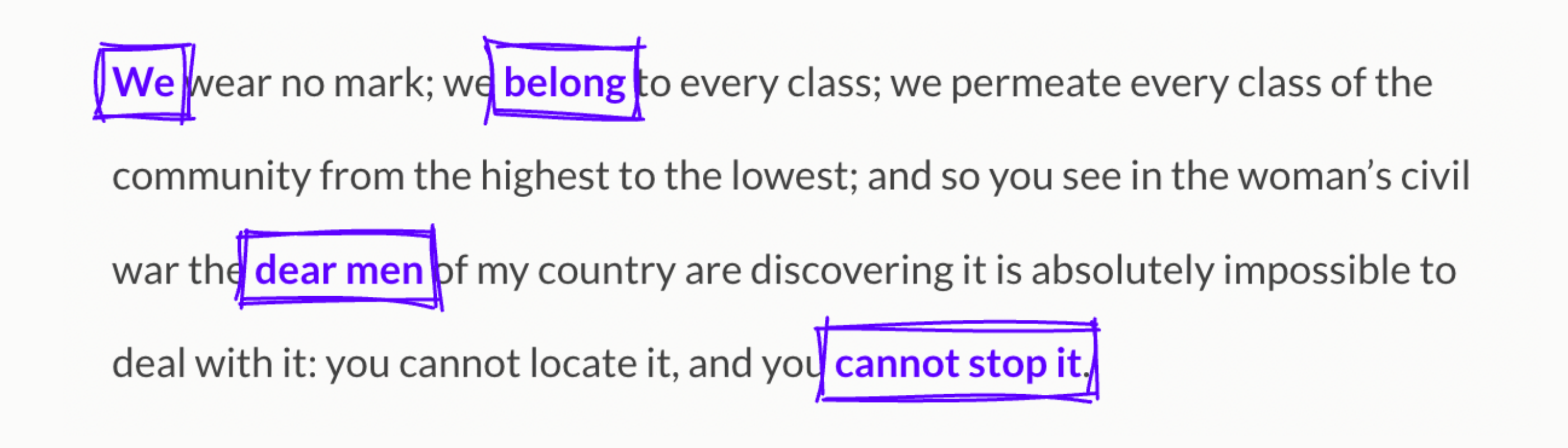
Flourish: Your data, beautifully toldOur refreshed brand embodies what we stand for – human, truth and magicPosted on 12 December 2024 by Flourish Marketing Team
The Eras Tour in charts: visualizing Taylor Swift’s record journeyUnpacking the tour’s milestones and global impact through data storytellingPosted on 10 December 2024 by Annie Parker
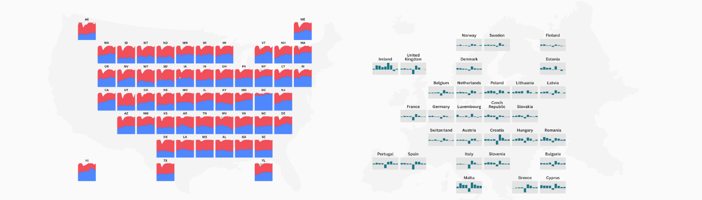
Grid maps: where charts meet maps for easy data comparisonExplore small multiples like never before and discover a better way to compare regional dataPosted on 23 October 2024 by Duncan Clark
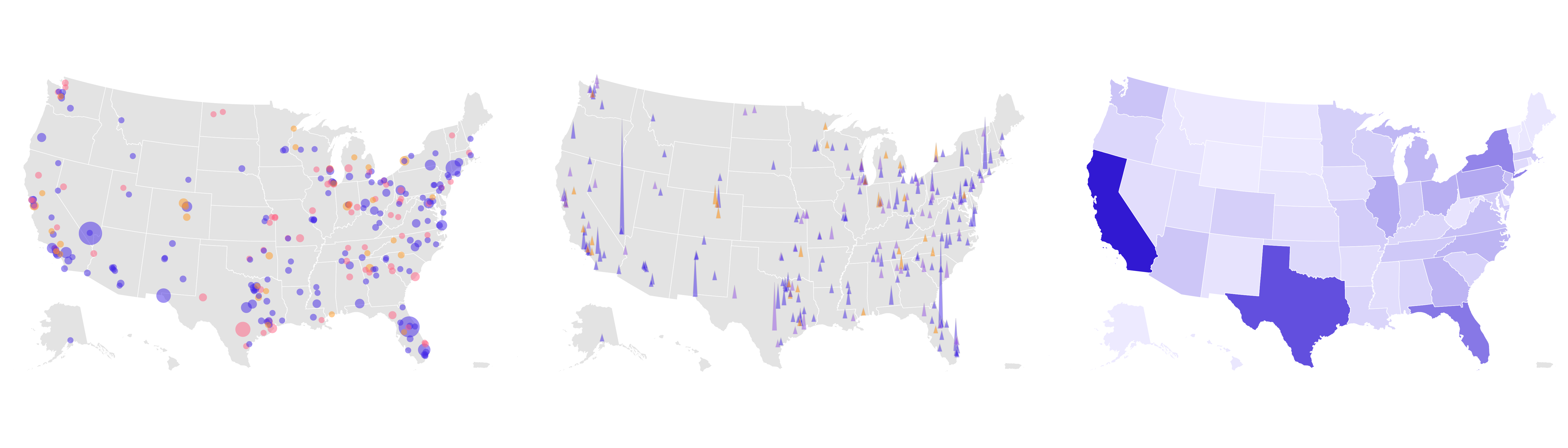
Visualizing 100 years of US elections with interactive mapsExplore how political landscapes shifted over the last century with dynamic visualizationsPosted on 09 October 2024 by Vanessa Fillis
16 ways to visualize US elections dataMaster every stage of election reporting with our guide to visualizing US election data: from predictions to post-vote insightsPosted on 06 September 2024 by Flourish team
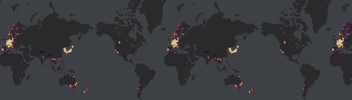
How to create animated 3D point maps without codingAnimate thousands of data points to show movement over time in a dynamic and engaging wayPosted on 19 July 2024 by Simona Tselova
8 easy ways to visualize financial market dataBring clarity to complex financial data with interactive data visualizationsPosted on 19 June 2024 by Scott Barber and Vanessa Fillis
Rethinking chart legends: when and how to use them?Combining legends with titles makes your visualizations simpler and more impactful – and it’s super easy in FlourishPosted on 05 June 2024 by Simona Tselova
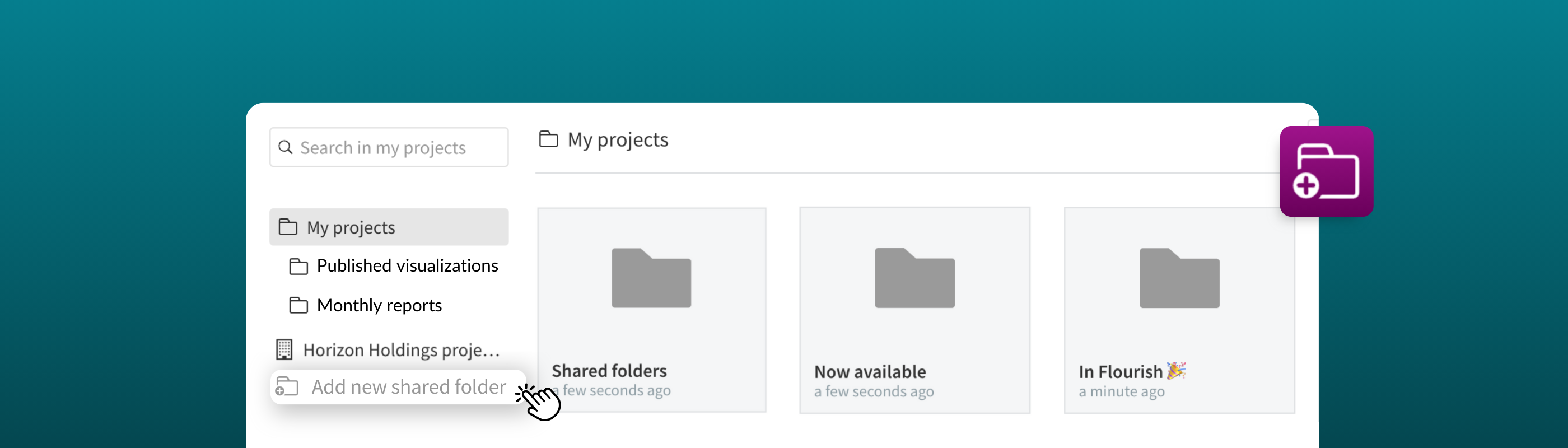
Organize, centralize, and collaborate with shared folders 🗂The new folder system brings a level of simplicity and collaboration to managing your team’s projectsPosted on 29 May 2024 by Vanessa Fillis and Simona Tselova
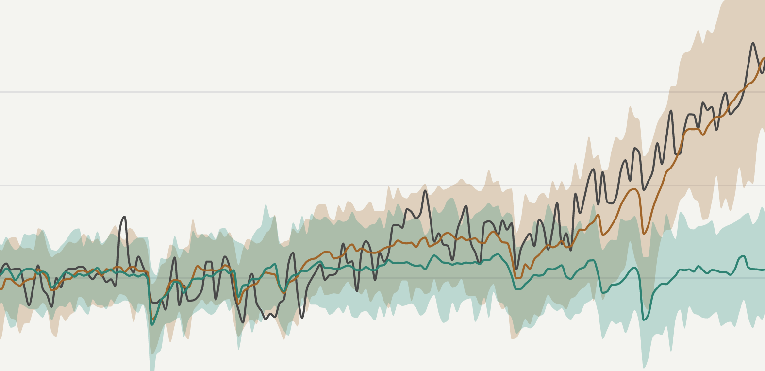
How to identify trends and patterns with data visualizationDiscover five engaging chart types to show the story behind your data, from dynamic bump charts to informative scatter plotsPosted on 26 April 2024 by Mafe Callejón and Vanessa Fillis
Daring to diverge: Flourish and WPP’s journey in data storytellingUncover the process behind creating engaging and interactive visualizations that push the boundaries of conventional data designPosted on 19 April 2024 by Oli Darley
A visual exploration of gender inequality statistics in 2024Visualizing the gender divide from the classroom to the boardroomPosted on 08 March 2024 by Vanessa Fillis and Mafe Callejón
How to visualize the OlympicsExploring the evolution, achievements, and highlights of the Winter and Summer Olympics through data visualizationPosted on 26 February 2024 by Vanessa Fillis
9 ways to transform text and images into interactive visualizationsFrom cards and quizzes to photo sliders and timelines, Flourish helps you turn any qualitative data into stunning pieces of contentPosted on 10 January 2024 by Simona Tselova
Explore the data behind the Nobel Prize in 7 interactive chartsRevealing patterns in gender, age, and nationality of prize winners through data visualizationPosted on 08 December 2023 by Vanessa Fillis and Mafe Callejón
5 pitfalls to avoid when working with color in data visualizationMastering color theory for impactful data storytellingPosted on 15 November 2023 by Vanessa Fillis, Mafe Callejón and Simona Tselova
How we’re making Flourish visualizations more accessibleExplore our latest updates and learn about our commitment to accessibilityPosted on 13 November 2023 by Luisa Bider
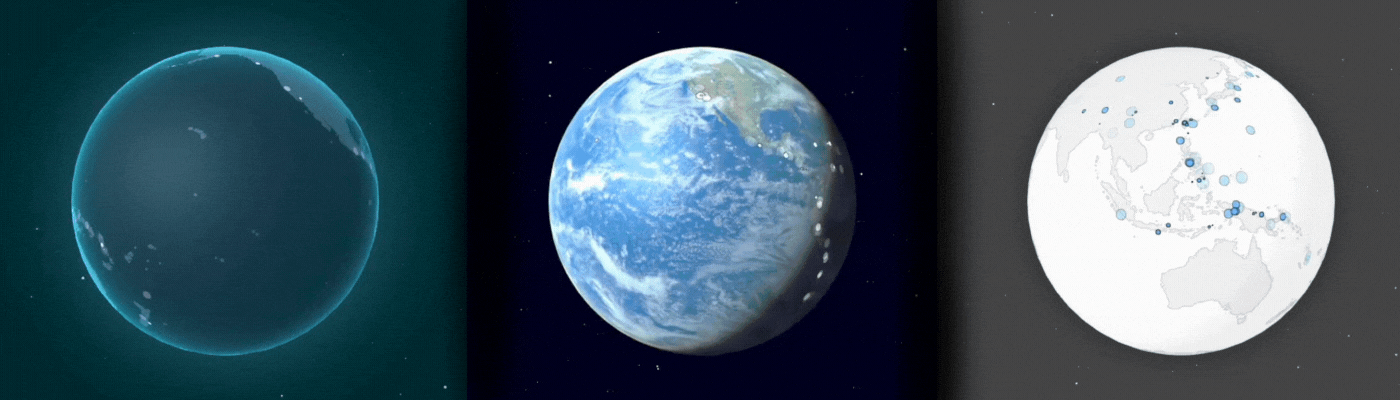
Explore the world in data: introducing the 3D GlobeRedefine the way you tell stories about the world with our new 3D Globe templatePosted on 01 November 2023 by Vanessa Fillis and Simona Tselova
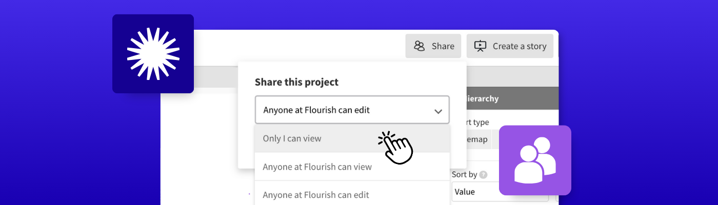
Unlock powerful collaboration with sharing permissions in FlourishTake control of your visualizations and stories for seamless teamworkPosted on 12 October 2023 by Vanessa Fillis
A beginner’s guide to using text in data visualizationDiscover the most effective techniques for using text to create clear and understandable data visualizationsPosted on 15 September 2023 by Simona Tselova
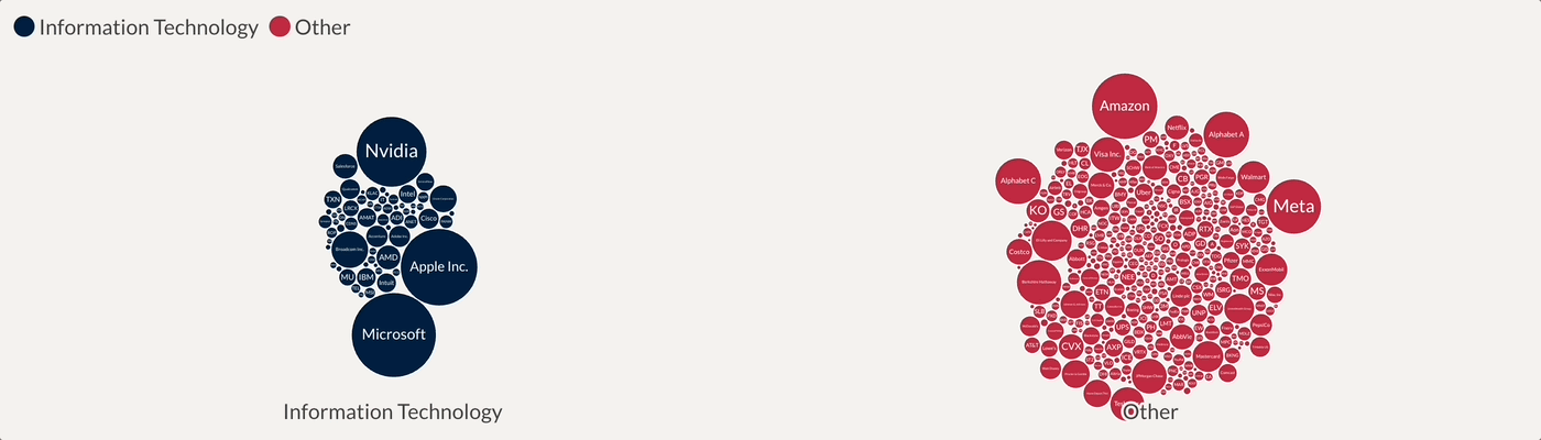
How to choose the right chart type for your dataConfused about which visualization type to choose? This post will help you pick the most effective Flourish visualization for your dataPosted on 13 September 2023 by Vanessa Fillis and Anna Powell-Smith
3 reasons why visual communication is key to business growthInsights from Canva’s Visual Economy Report to elevate how your business communicatesPosted on 08 September 2023 by Annie Parker
From static to interactive: turn SVG diagrams into exciting experiences on your websiteCaptivate and educate your audience with interactive illustrations, infographics, and website elementsPosted on 25 August 2023 by Vanessa Fillis
8 ways to visualize football dataBring Premier League data to life with interactive charts, league tables, fantasy football, and morePosted on 10 August 2023 by Joseph Witcombe
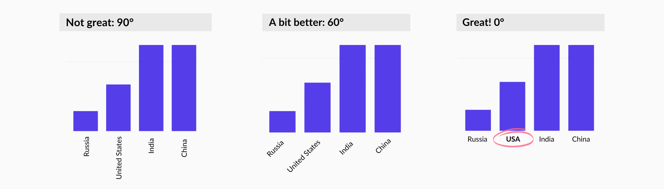
Elevate your data story with annotationsMaximize the impact of your data visualizations by adding annotations to your charts and mapsPosted on 03 August 2023 by Luisa Bider and Simona Tselova
Record-breaking heat: visualizing the effects of the climate crisisWe explored rising temperatures and their impact through interactive data visualizationsPosted on 13 July 2023 by Vanessa Fillis
World Refugee Day: visualizing migration trendsWe looked at the latest migration data to understand where people go when they have to leave their homesPosted on 20 June 2023 by Mafe Callejón and Vanessa Fillis
How Tortoise & Sky News built a powerful data exploration tool with the Flourish SDKLearn how the two newsrooms used Flourish to create the Westminster Accounts, an innovative data exploration platformPosted on 16 June 2023 by Simona Tselova and Vanessa Fillis
Introducing scrollytelling: the future of immersive data storytellingCreating immersive digital stories is easier than ever with our new no-code scrollytelling builderPosted on 10 May 2023 by Simona Tselova
Boost engagement with interactive calculators – from budgets to carbon footprintsDiscover our premium template, perfect for creating powerful, embeddable calculators – with Google Sheets integrationPosted on 20 April 2023 by Luisa Bider
How to visualize Google Trends dataUncovering insights – how to make the most of Google Trends with FlourishPosted on 10 March 2023 by Luisa Bider
Masters series: William Playfair, the father of statistical graphicsCelebrating the legacy of the creator of the line chart, bar chart and pie chart 200 years after his deathPosted on 22 February 2023 by Mafe Callejón
We don’t make mistakes, just happy accidents: Visualizing Bob Ross’ worksExploring the palette and patterns of Bob Ross’ paintings through data visualizationPosted on 17 February 2023 by Luisa Bider
My type on paper: the data behind Love Island successWe analyzed the data behind Love Island to find out which couples are still together, and who might've entered the show looking for fame instead of lovePosted on 03 February 2023 by Annie Parker
Choosing the right map type for your dataLooking to represent your geographical data on a map? This post will help you pick the most effective map type for your dataPosted on 01 February 2023 by Mafe Callejón
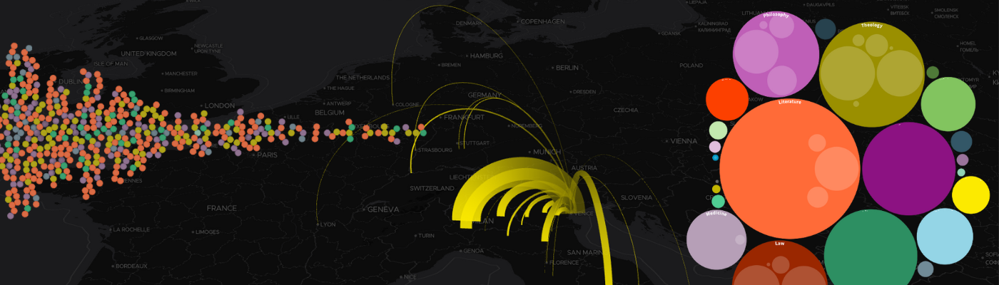
A visual exploration of a 15th century bookshopA collaborative project with the University of OxfordPosted on 25 January 2023 by Mafe Callejón
A guide to creating charts and graphs for social mediaLearn how to create visually appealing charts for social media using Flourish and CanvaPosted on 06 January 2023 by Simona Tselova and Annie Parker
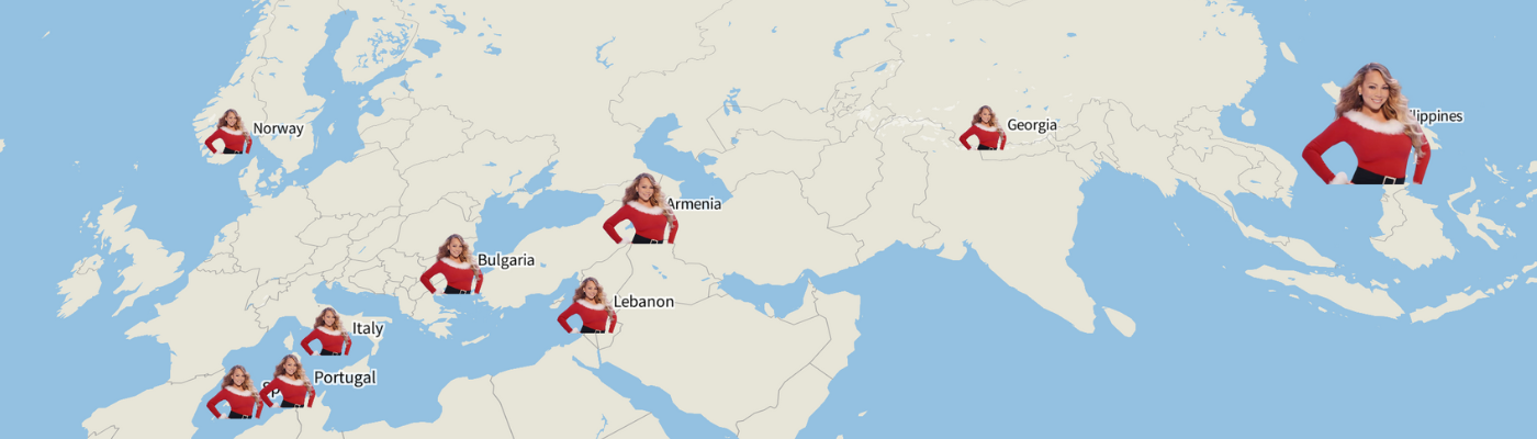
All I want for Christmas… is data 🎵Using Billboard charts and Google Trends data, we visualized the search trends behind the most streamed Christmas song, “All I Want For Christmas Is You”Posted on 20 December 2022 by Katherine Riley and the Flourish team
Visualizing our 2022 readsCombining our love for reading with our passion for data visualizationPosted on 16 December 2022 by Flourish team
Flourish year in review 2022Reflecting on a year of growth and collaborationPosted on 12 December 2022 by Flourish team
How to create interactive marimekko chartsCompare magnitude and part-to-whole with our new Marimekko templatePosted on 07 December 2022 by Mafe Callejón
Enhance your data storytelling with animated chartsFive ways to create animated charts that bring your data to the next levelPosted on 02 December 2022 by Simona Tselova
7 quick ways to upgrade your data visualizationsSharing our top tips on how to best use Flourish to create compelling visualizations – without the stressPosted on 21 November 2022 by Annie Parker
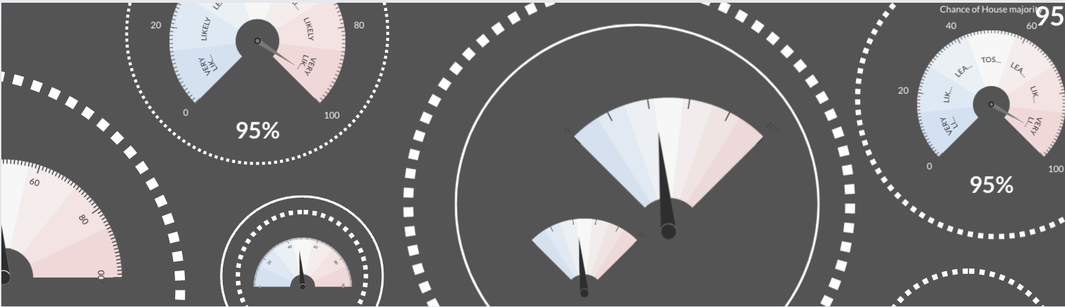
How to create interactive gauge visualizationsTrack everything from KPIs to elections data with our new Gauge templatePosted on 04 November 2022 by Luisa Bider
PDFs are bad for data visualization and storytelling – but what’s the alternative?The use of PDFs is common among organizations, but they don’t guarantee best resultsPosted on 26 October 2022 by Simona Tselova
4 metrics to visualize in your elections coverageFrom voting intention to results, learn how you can bring elections data to life with interactive graphicsPosted on 06 October 2022 by Mafe Callejón
Why data storytelling is important for your businessHow to effectively tell stories with data to convey a meaningful message across your industryPosted on 30 September 2022 by Simona Tselova
4 data visualization mistakes you’re probably making and how to fix themHow to avoid misleading your readers with your chartsPosted on 12 September 2022 by Yaning Wu and Mafe Callejón
Our Data Explorer template helps you find the stories in your data – and tell them beautifullyThe new template allows you to morph between various chart and map types to create rich and compelling data storiesPosted on 08 August 2022 by Mafe Callejón
Bring your text to life with our Text Annotator templateAdding definitions, explanations and notes to text is now easier than everPosted on 25 July 2022 by Simona Tselova and Luisa Bider
Automated column selection: an easier way of adding data to FlourishThe new data typing feature marks the beginning of a more intuitive data visualization processPosted on 14 July 2022 by Simona Tselova
AdKaora used Flourish to dynamically power their live marketing platformHow the proximity marketing agency used Flourish to automate and customize their reportsPosted on 06 July 2022 by Luisa Bider
It’s about time: bring history to life with interactive timelines 🕰️Design beautiful, responsive and interactive timelines that represent key events over time and captivate your audiencePosted on 01 July 2022 by Simona Tselova
Wimbledon in 8 charts – from tie breaks to ticket costs 🎾A visual analysis of the Wimbledon tournament in the Open EraPosted on 28 June 2022 by Simona Tselova and Mafe Callejón
You can now create beautiful spike maps without coding ⛰️Our Projection Map template now includes a new mode to transform points into spikesPosted on 20 June 2022 by Mafe Callejón and Simona Tselova
Is the UK housing crisis escalating?Visualizing the increase in average house prices while inflation soarsPosted on 06 June 2022 by Simona Tselova
Unpacking Asia’s complex dynamics with data storytellingHow Kontinentalist uses Flourish to solve technical challenges and promote data literacyPosted on 25 May 2022 by Yaning Wu
Increasing engagement through data visualizationHow to flourish through data storytelling instead of data dashboardingPosted on 05 May 2022 by Simona Tselova
3 days on safari in data 🦒Visualizing data on journeys across the Maasai Mara National ReservePosted on 29 April 2022 by Yaning Wu
Draw The Line: introducing a chart type that invites you to participateFlourish now makes it easy to create fun and engaging “you draw it”-style line chartsPosted on 26 April 2022 by Luisa Bider
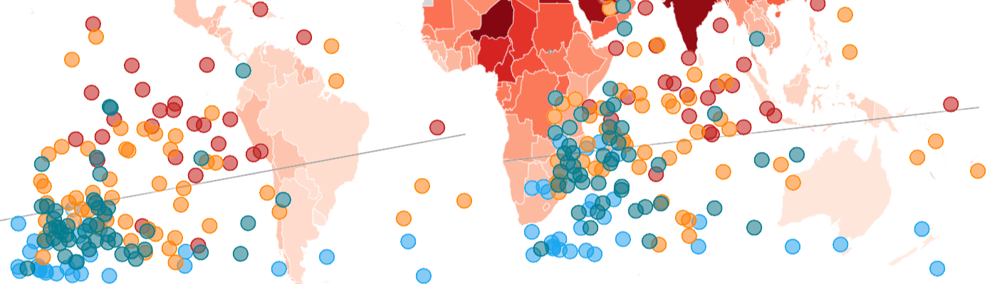
Visualizing air pollution across the worldFor this year’s World Health Day, we take a closer look at environmental influences on healthPosted on 07 April 2022 by Yaning Wu and Luisa Bider
Improving investigative stories through interactive visualizationHow Finance Uncovered used Flourish to supercharge their reportingPosted on 23 March 2022 by Connor Musoke-Jones
5 ways to effectively visualize survey responsesOn a scale of one to ten, how do you feel about visualizing survey data?Posted on 11 March 2022 by Yaning Wu
The life and works of Jane Austen – in data 📚Celebrating one of Britain’s most-loved female authors through visualizationPosted on 03 March 2022 by Annie Parker
The incredible rise of Wordle – visualized!Plotting the global success of the viral word puzzle in data graphicsPosted on 25 February 2022 by Luisa Bider and Simona Tselova
Masters series: Recreating John Snow's cholera mapSee an interactive version of John Snow's iconic cholera mapPosted on 21 February 2022 by Mafe Callejón
Bubbles, they bounce! Introducing bubble chartsMake your visualizations pop with our new Bubble Chart templatePosted on 18 February 2022 by Simona Tselova
Some big news: Flourish is now part of the Canva familyTogether we will empower the world to design with data – starting with some exciting new offerings for our usersPosted on 02 February 2022 by Duncan Clark
Technical notice of domain changeWe’re planning to change some domain names that are used internally by the Flourish editor. This is a technical change that will not affect most Flourish users.Posted on 31 January 2022
Flourish year in review 2021Looking back at the year that was – across our community, product and companyPosted on 21 December 2021 by Flourish team
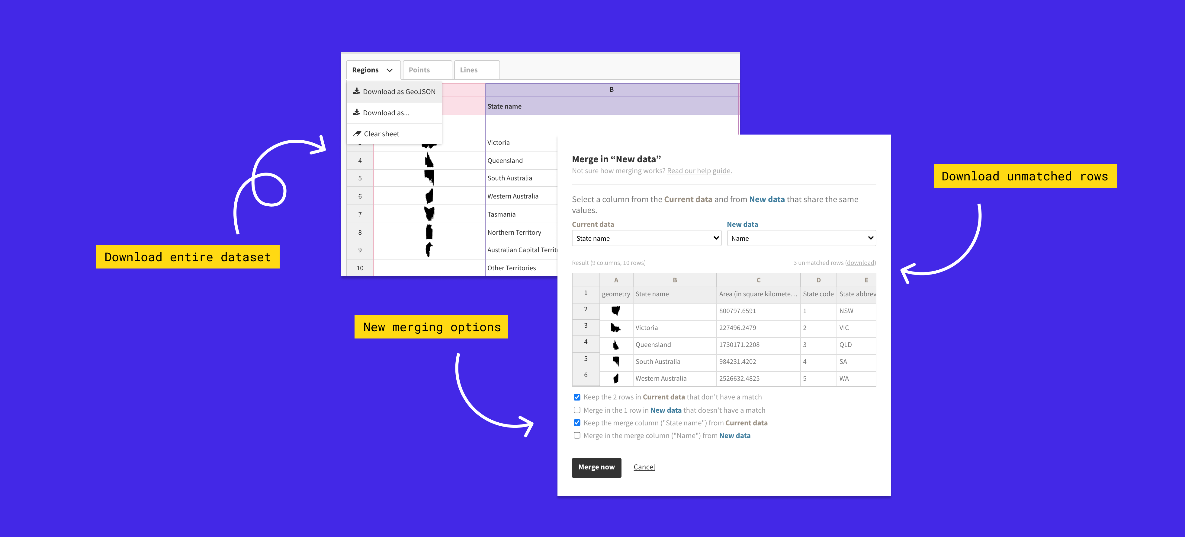
Let’s get merging! You can now join datasets more flexibly than everIntroducing our improved data joining and downloading functionalityPosted on 14 December 2021 by Ilias Stathatos and Luisa Bider
Introducing heatmaps, raster tiles and popup panels to our 3D Map templateOur powerful 3D Map template now allows you to transform your points data into animated heatmapsPosted on 24 November 2021 by Luisa Bider
Visualizing the COP26 climate conferenceHow our users covered the UN climate change conferencePosted on 09 November 2021 by Flourish team
How to make a stunning word cloud in minutes 📖Our template makes it simple to create beautiful embeddable word clouds, complete with animation and custom fontsPosted on 22 October 2021 by Ilias Stathatos
Masters series: The data visualization legacy of W.E.B. Du BoisStep-by-step guide on creating visualizatins inspired by Du BoisPosted on 18 October 2021 by Flourish team
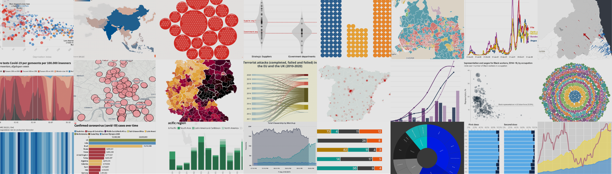
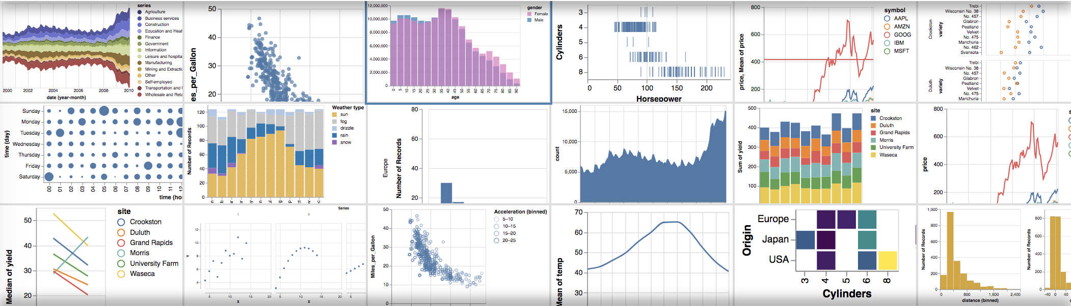
One dataset, ten visualizationsExploring the possibilities, strengths and weaknesses of different chart typesPosted on 13 October 2021 by Mafe Callejón
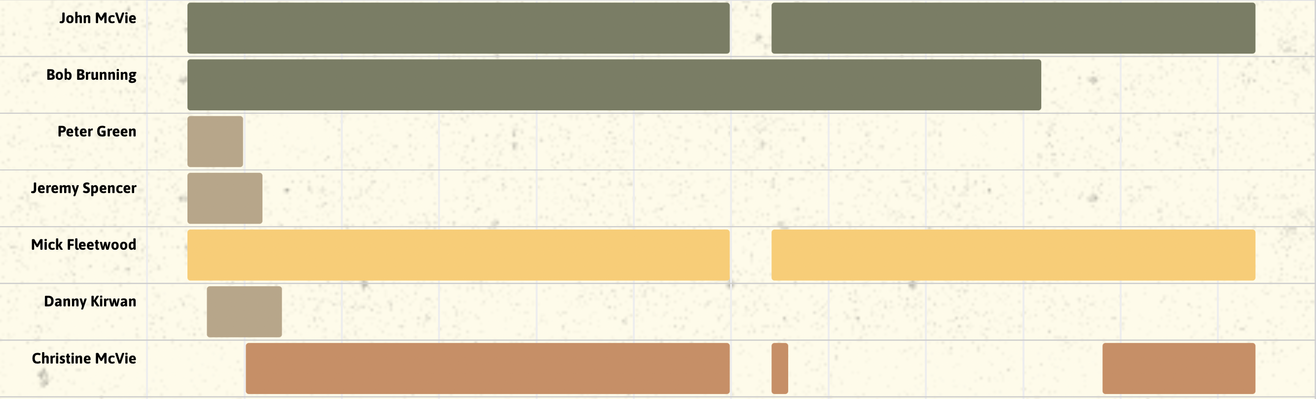
How to create beautiful, interactive Gantt chartsIntroducing a new Gantt template for project plans and much morePosted on 09 September 2021 by Olivia Lawlor
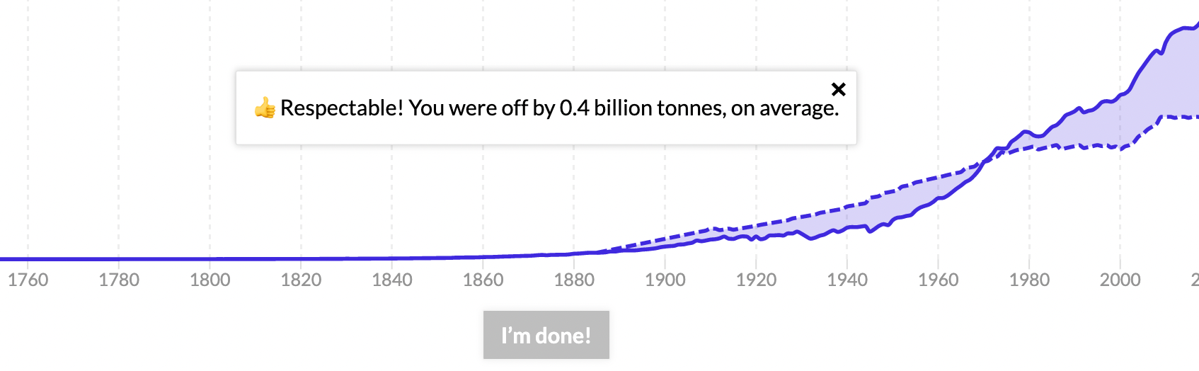
How data visualization can help you communicate effectivelyWe recreated some of the IPCC's climate charts and this is what we learnedPosted on 20 August 2021 by Mafe Callejón
A guide to creating compelling visualizationsIntroducing a five-step best data practice frameworkPosted on 10 August 2021 by Simona Tselova
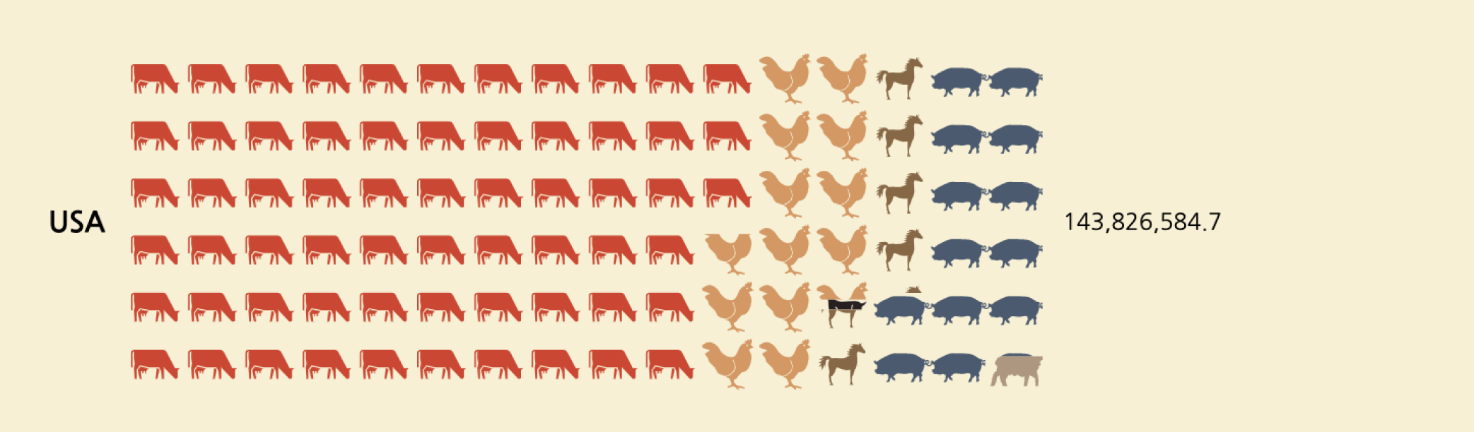
Create interactive pictograms without codingCreate beautiful and interactive isotype charts with our Pictogram templatePosted on 09 July 2021 by Luisa Bider and Duncan Clark
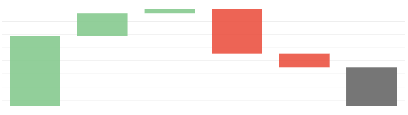
How to make interactive waterfall chartsEasily create online waterfall charts that excel in visualizing financial insightsPosted on 05 July 2021 by Helena Robertson
How to create eye-catching countdowns and number tickers without codingOur new templates make it easy to count up and down to numbers and datesPosted on 27 May 2021 by Luisa Bider
Decoding UK elections with interactive visualizationsExplore 6 ways to visualize political shifts with Flourish's versatile templates, from polling insights to post-election breakdownsPosted on 06 May 2021 by Vanessa Fillis
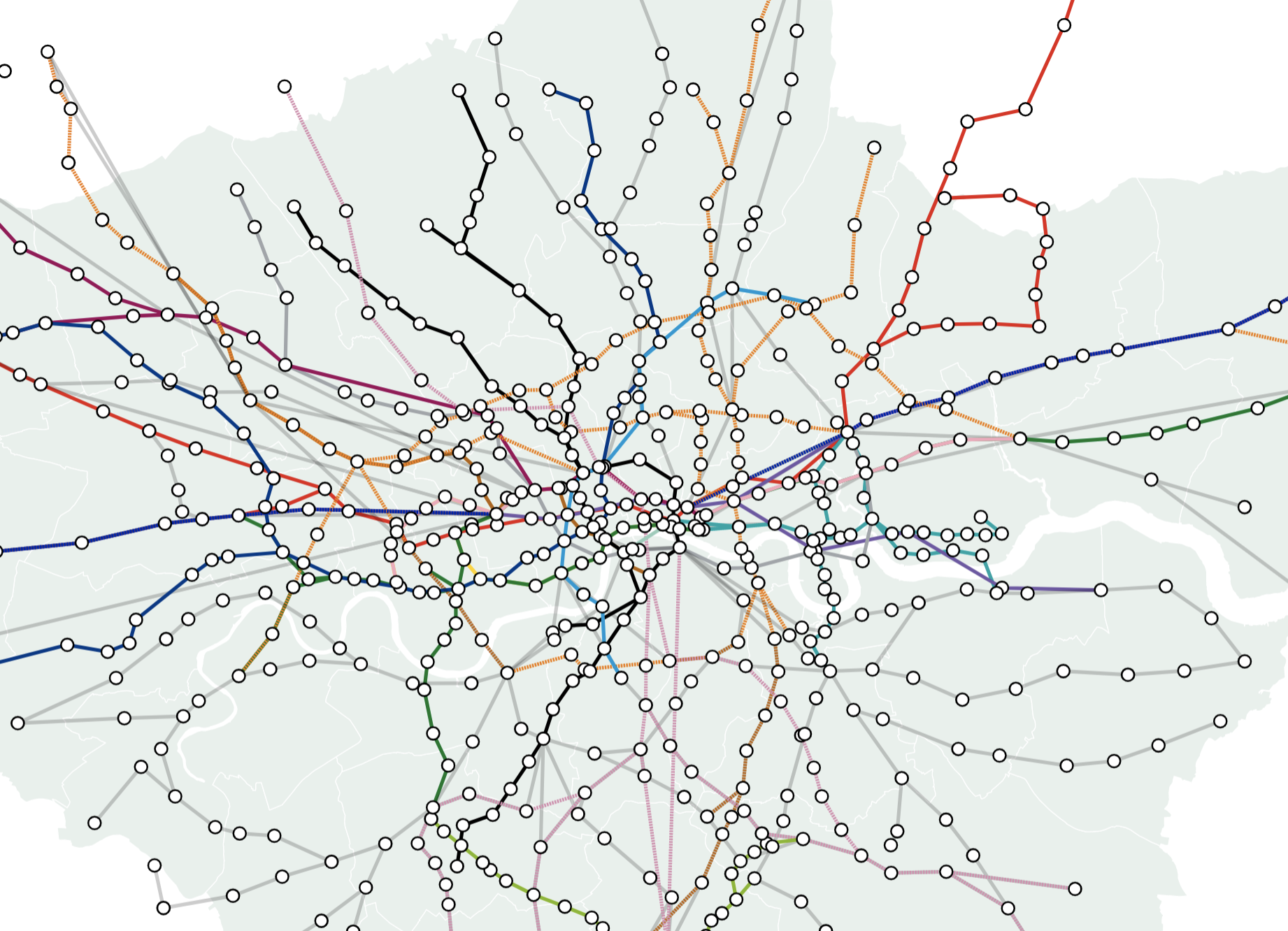
How to plot lines on a map and bring them to life with animationVisualize everything from railway lines to disputed borders with the line layers in our map templatesPosted on 22 April 2021 by Helena Robertson, Luisa Bider and Vanessa Fillis
Masters series: Maarten Lambrechts' connected scatter plotOur series celebrates great visualizers and helps Flourish users follow in their tracksPosted on 06 April 2021 by Olivia Lawlor and Helena Robertson
3 reasons why your charts need popups and panelsThe Flourish tooltip and panel overlay features offer more flexibility to tell rich data storiesPosted on 04 March 2021 by Luisa Bider
3 ways to make your charts more accessibleHow to increase impact and engagement by designing for everyonePosted on 01 March 2021 by Lyndsey Pereira-Brereton and Luisa Bider
Masters series: John Burn-Murdoch’s step-by-step animated line chartWe replicated John Burn-Murdoch’s animated line chart in Flourish, showcasing a compelling illustration of data storytellingPosted on 19 January 2021 by Olivia Lawlor and Helena Robertson
Flourish year in review 2020Looking back at a year like no otherPosted on 23 December 2020 by Luisa Bider, Olivia Lawlor and Ilias Stathatos
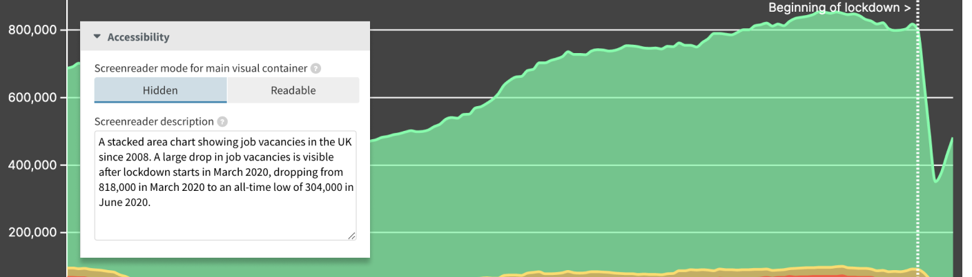
How to make your visualizations more accessible with good alternative descriptionsAdd text-based screenreader descriptions to the visual aspect of your Flourish graphicsPosted on 18 November 2020 by Luisa Bider
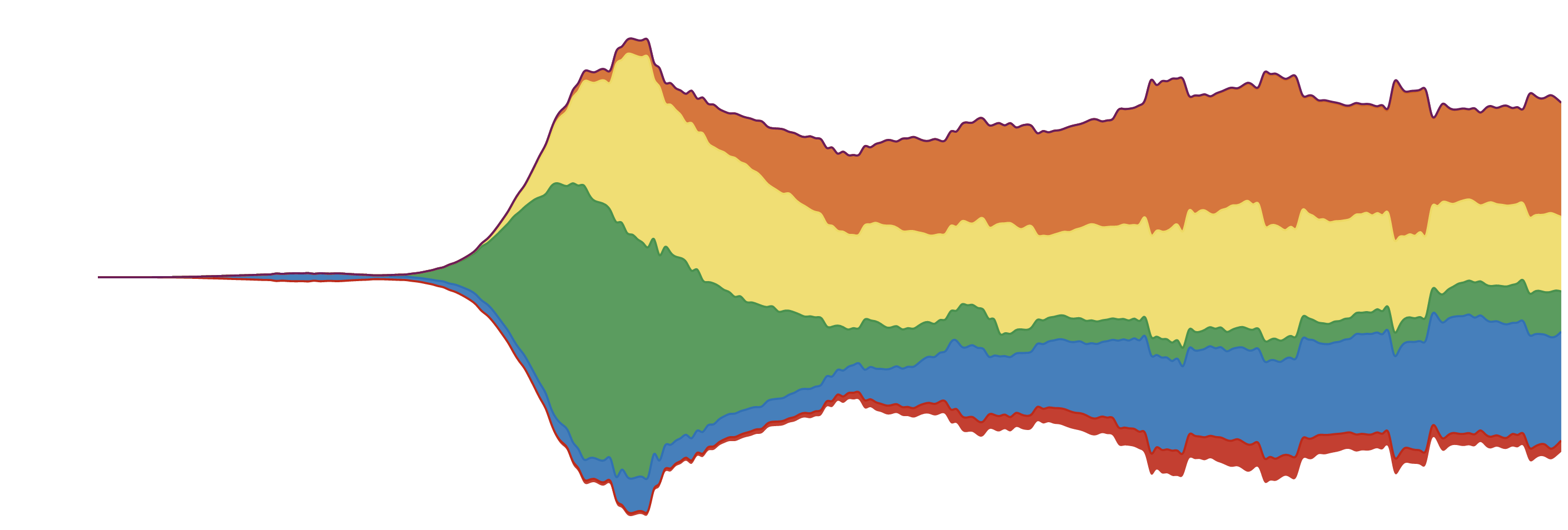
Streamgraphs: how to make them and what you need to knowStreamgraphs effectively showcase data trends and patterns, and with Flourish, crafting one is easy and code-freePosted on 19 October 2020 by Luisa Bider
You can now add regions to your high-performance WebGL-based data mapsOur powerful 3D Map template support regions in addition to points, timelines and basemapsPosted on 10 September 2020 by Luisa Bider
Unlock smarter decisions and enhance insights with live data visualizationsExplore the benefits of creating real-time charts and maps from CSVs and Google SheetsPosted on 21 July 2020 by Luisa Bider
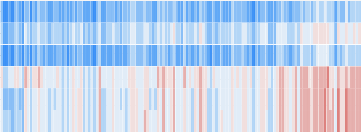
Unveiling patterns: how to master interactive heatmaps with Flourish 🔥Explore heatmap examples, from climate science to market trendsPosted on 16 July 2020 by Luisa Bider and Vanessa Fillis
Technical notice of domain changeWe’re planning to move the files that are used by published projects to a different domain. This is a technical change that will not affect most Flourish users.Posted on 09 July 2020
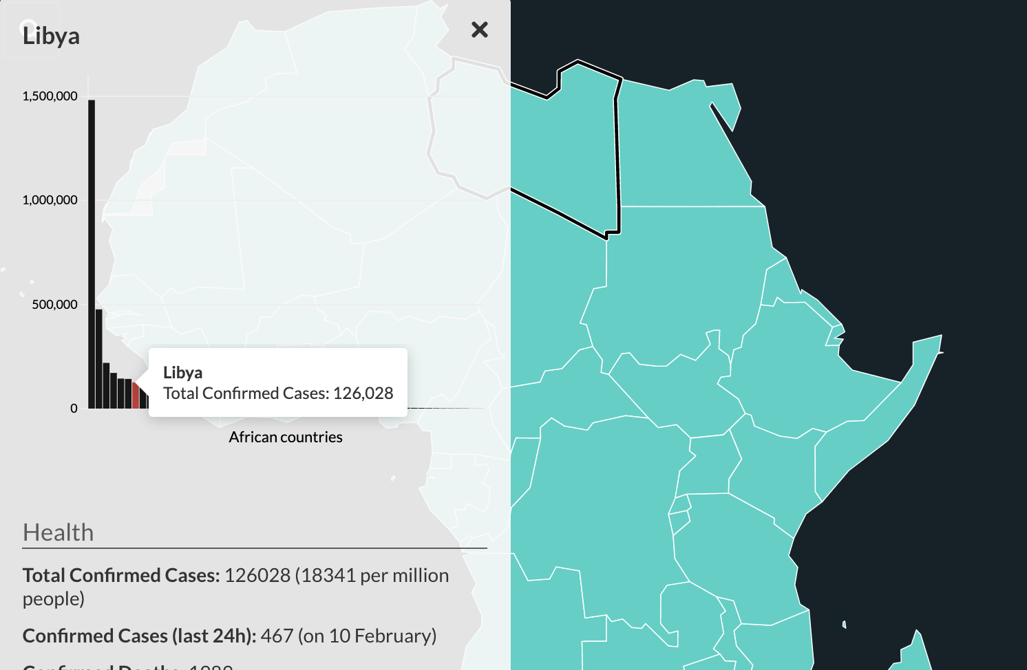
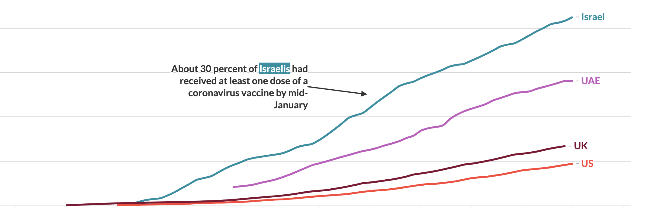
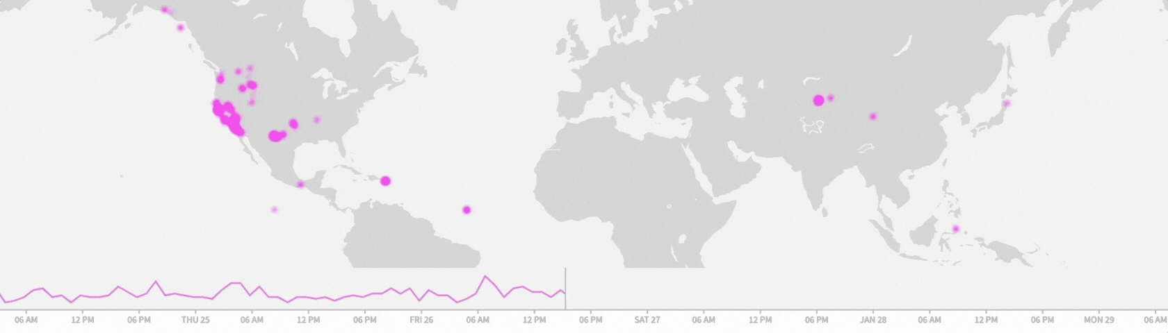
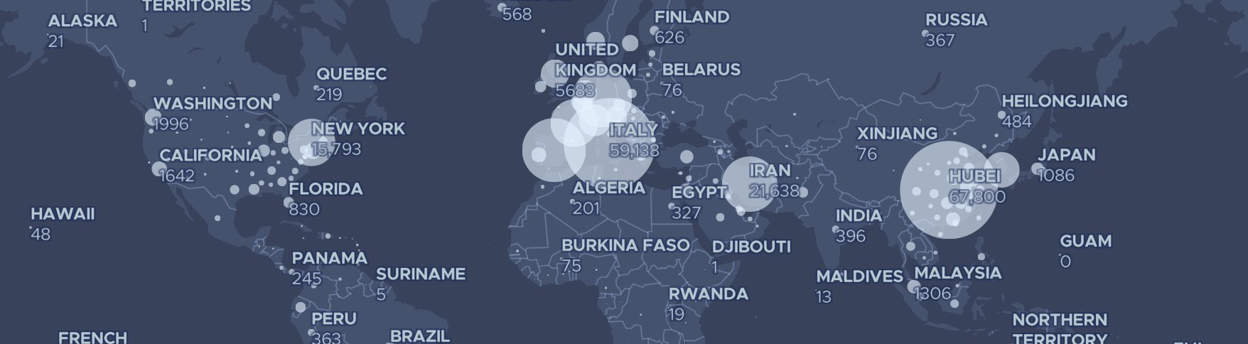
Free regularly updated Covid-19 visualizations to embedA collection of mobile-friendly graphics about the coronavirus crisisPosted on 23 March 2020 by Duncan Clark
How Code for Africa created the Bubble Network templateA Q&A with CfA’s head of data about developing custom Flourish templatesPosted on 21 January 2020 by Katherine Riley, with Jacopo Ottaviani
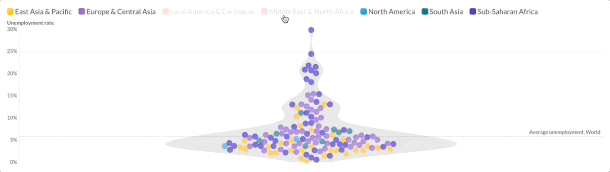
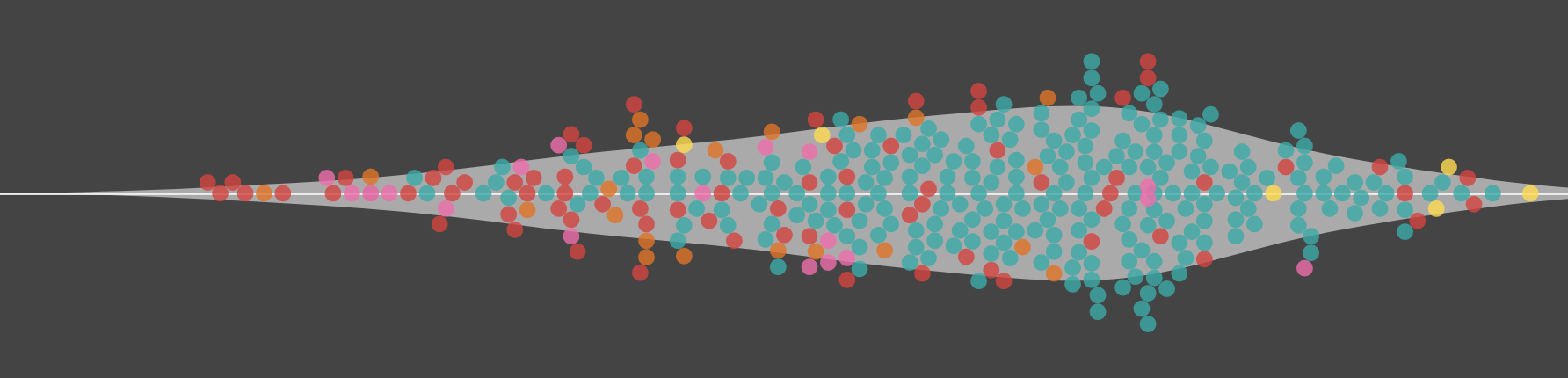
Introducing beeswarms 🐝, violin plots 🎻 and WebGL charts ⚡️The latest version of our popular Scatter template adds both features and firepowerPosted on 03 December 2019 by Katherine Riley
9 ideas para hacer gráficos en eleccionesLos mejores consejos para enriquecer tu cobertura electoral con FlourishPosted on 23 October 2019 by Katherine Riley, translated by Pablo Sanguinetti/Google News Lab
Elevate your visual storytelling with our flexible Cards templateEasily create content blocks for landing pages with this highly customizable Flourish templatePosted on 17 October 2019 by Sarah Soutoul
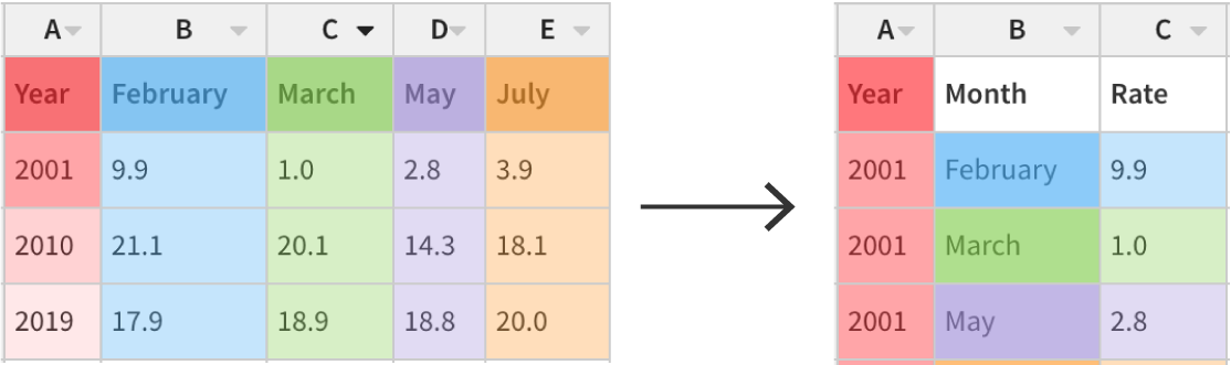
Never fear, unpivoting is hereHow to combine columns into long format using Flourish’s latest data table featurePosted on 15 October 2019 by Katherine Riley
How Sky News revealed Flourish’s secret scrollytelling featureA Q&A with the data journalist and the developerPosted on 05 September 2019 by Katherine Riley, with Carmen Aguilar García and Edward Hollinghurst
(Ar)row row row your plot 🏹You can now create interactive animated arrow plots to show the direction of change on a scatter chart or dot plotPosted on 27 August 2019 by Katherine Riley
Ready, set, race! How to make a line chart race visualization without codingThe Line Chart Race template offers a dynamic perspective of your data, where every point tells a storyPosted on 15 July 2019 by Duncan Clark
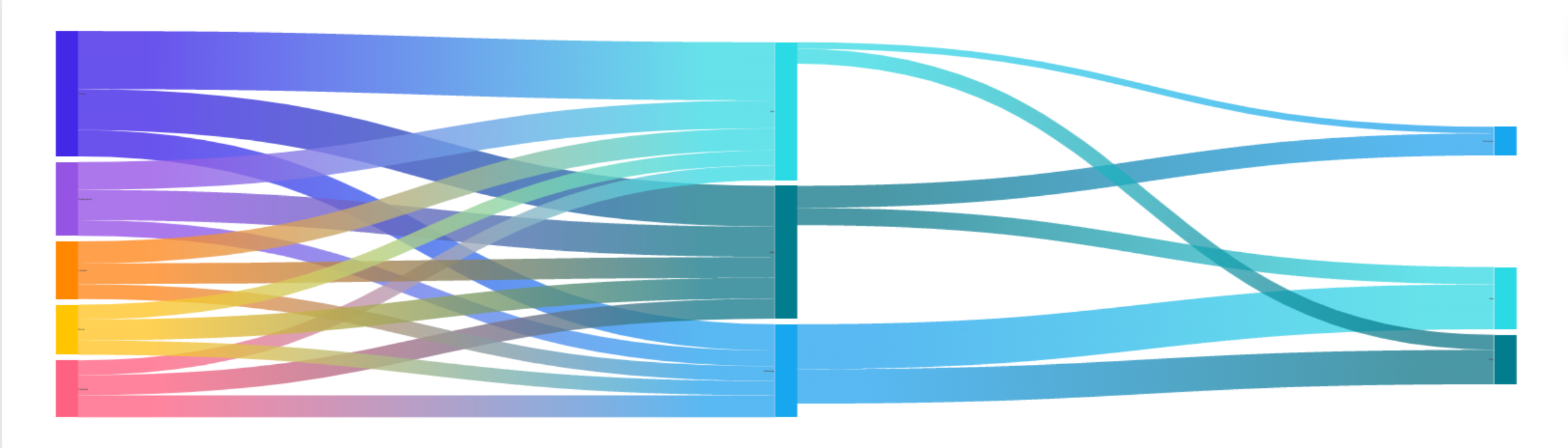
How to make animated Sankey charts and alluvial diagramsOur Sankey Diagram template lets you create stunning sankey and alluvial diagrams that help you visualize flowPosted on 12 July 2019 by Duncan Clark
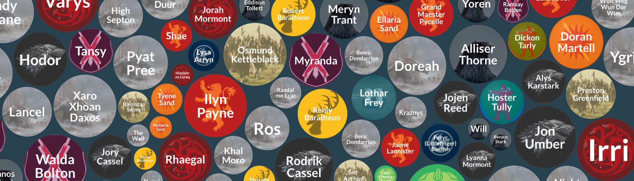
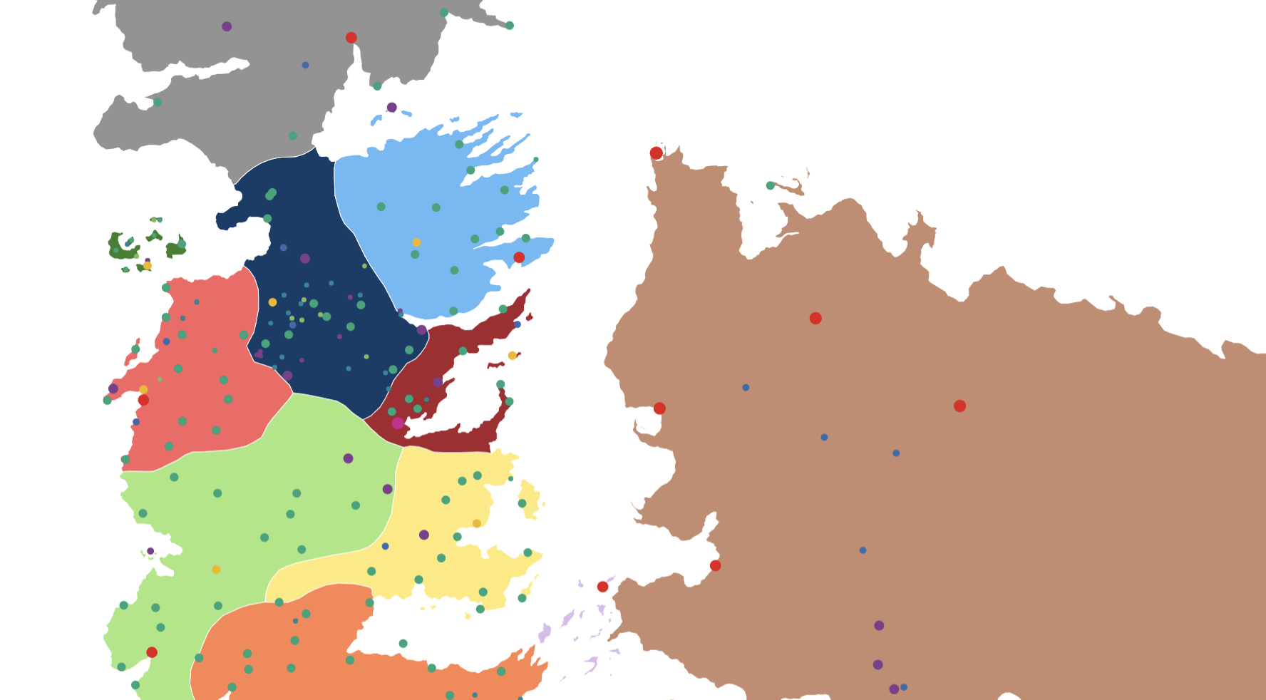
The lands and battles of Game of Thrones. Mapped!A Song of Flourish and Ice: mapping and visualizing Game of Thrones dataPosted on 17 May 2019 by Katherine Riley
How to make Bar Chart Race visualizations without codingAnimated bar charts are taking social media by storm. You can now make one in seconds by uploading a spreadsheet to Flourish.Posted on 21 March 2019 by Katherine Riley
Pokémon GO data visualization with FlourishA few examples of using Flourish for a data-rich hobbyPosted on 18 March 2019 by Mark Longair
When tables are the most effective form of data visualization7 situations where it makes sense to use an interactive table instead of a conventional visualization – and how to make them in FlourishPosted on 11 March 2019 by Vanessa Fillis and Katherine Riley
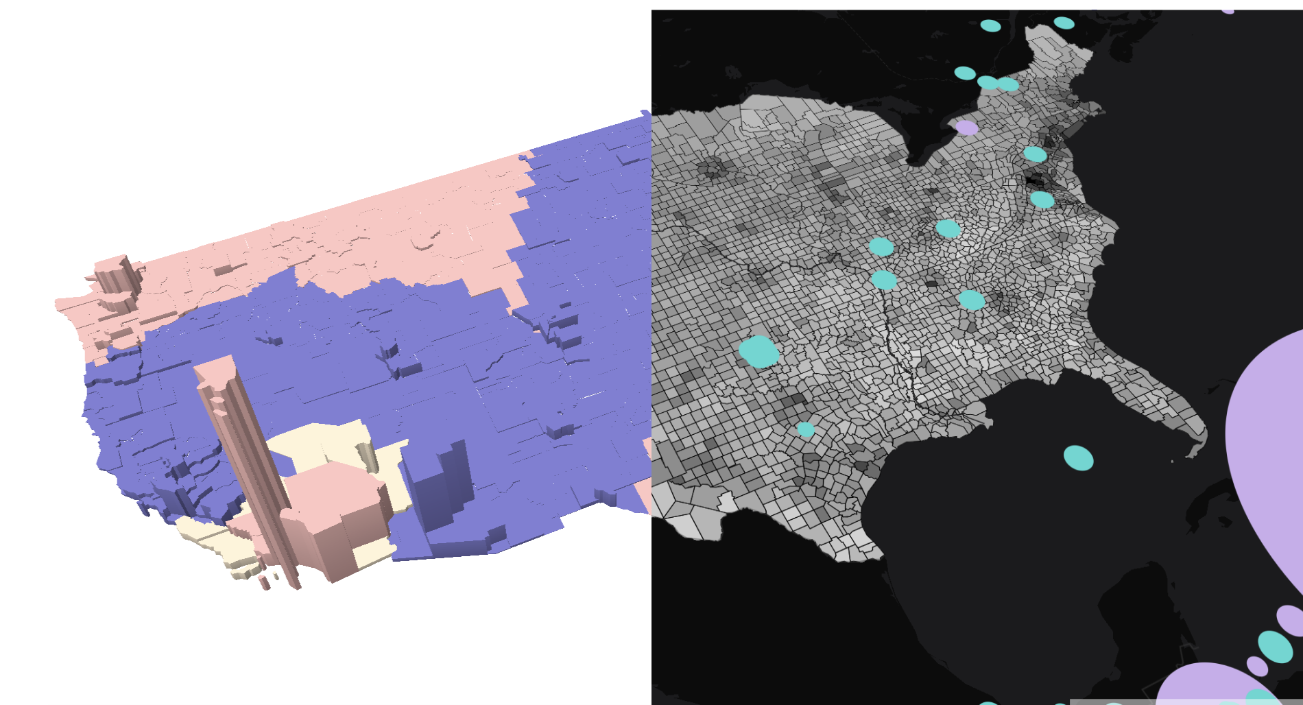
Announcing 3D region mapsUse elevation levels to visualize geographic dataPosted on 18 February 2019 by Katherine Riley
Why data visualization needs a play buttonAudio can enrich visual storytelling and bridge the gap between the exploration and explanation of data. You can now make audio-driven visualizations, or Talkies, without coding. Click play to learn more!Posted on 07 February 2019 by Duncan Clark
Which American city has the worst winter weather?As the polar vortex hits the northern United States, we dig into the dataPosted on 01 February 2019 by Katherine Riley
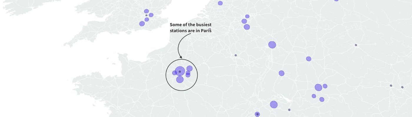
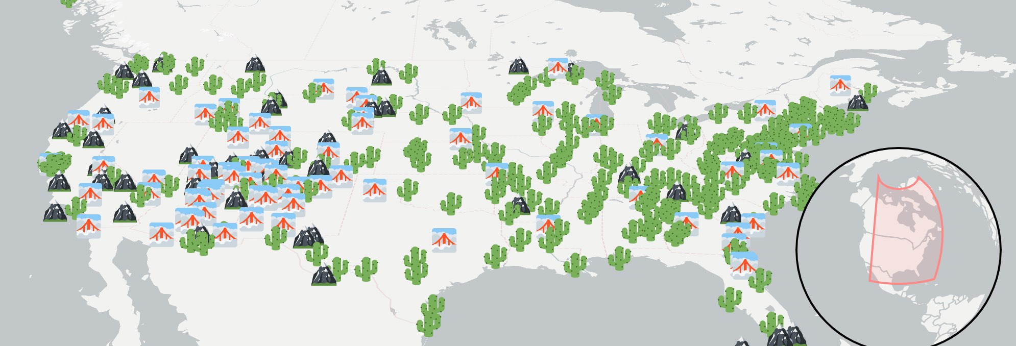
How to create stunning marker maps: dot maps, locator maps, and moreVisualize data with icons, emojis and images for a more engaging user experiencePosted on 11 December 2018 by Katherine Riley and Duncan Clark
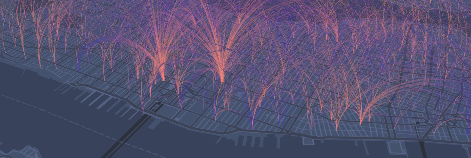
Announcing arc mapsVisualize any kind of geographic flows with our new templatePosted on 16 November 2018 by Katherine Riley
Your ultimate guide to creating custom maps with FlourishWith our Projection Map template, you can upload new geographies and customize themPosted on 23 October 2018 by Flourish team
How to visualize hierarchical data with FlourishFrom treemaps to radial trees, Flourish’s Hierarchy template makes it possible to produce five types of zoomable graphics without codingPosted on 20 September 2018 by Vanessa Fillis and Duncan Clark
How Business users can manage their teams and protect their dataFlourish's new company pages and approval workflows give Business users full control over users and accessPosted on 24 August 2018 by Anna Powell-Smith
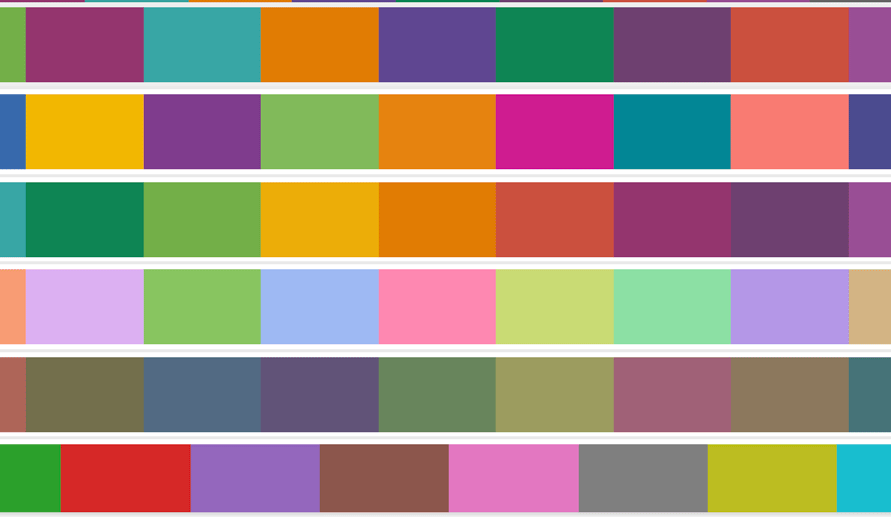
New! Tools to help you use color effectively in your visualizationsIntroducing the new Palette menu and other tools to give you full control over colors in your Flourish visualizationsPosted on 21 August 2018 by Tim Brock
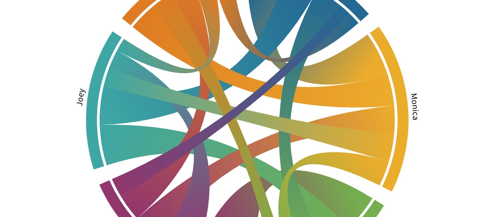
How to create interactive chord diagramsEasily visualize connections with our Chord Diagram templatePosted on 25 July 2018 by Vanessa Fillis and Julien Assouline
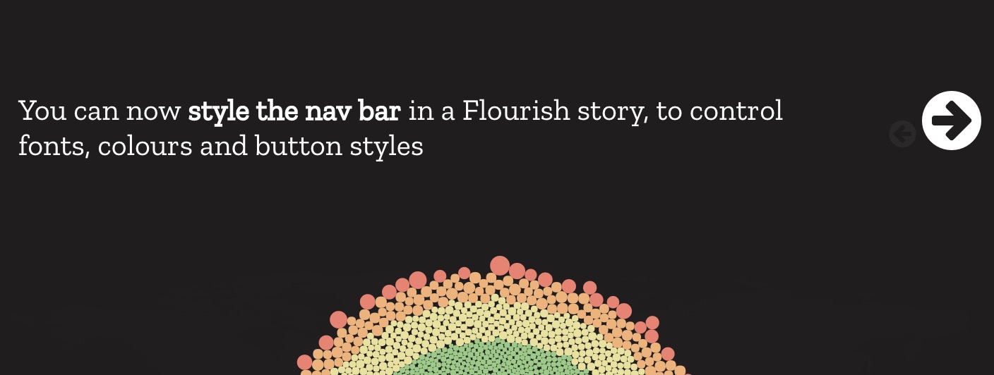
Customising fonts and colors in story navigation barsBusiness and newsroom users can now customize the controls in Flourish storiesPosted on 10 July 2018 by Duncan Clark
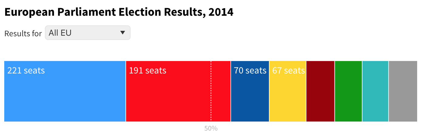
How to create interactive parliament charts in FlourishEffortlessly visualize election results with our interactive Parliament Chart templatePosted on 06 July 2018 by Vanessa Fillis and Julien Assouline
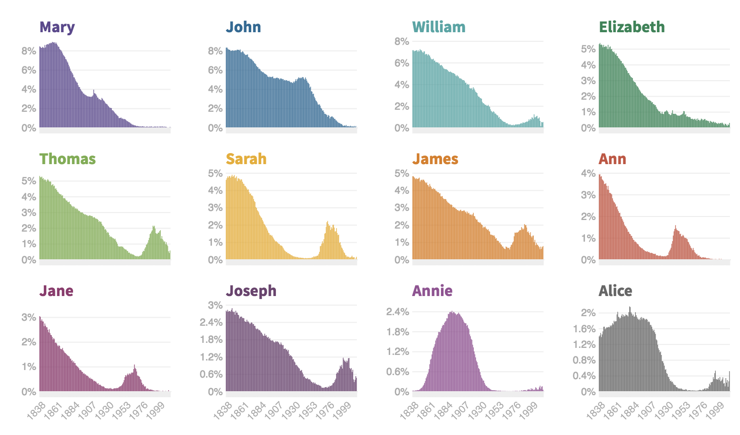
Fun with Flourish – how popular was your name in Victorian Britain?We've built a tool with the University of Edinburgh to let you see how popular your name was in Victorian BritainPosted on 04 July 2018 by Anna Powell-Smith
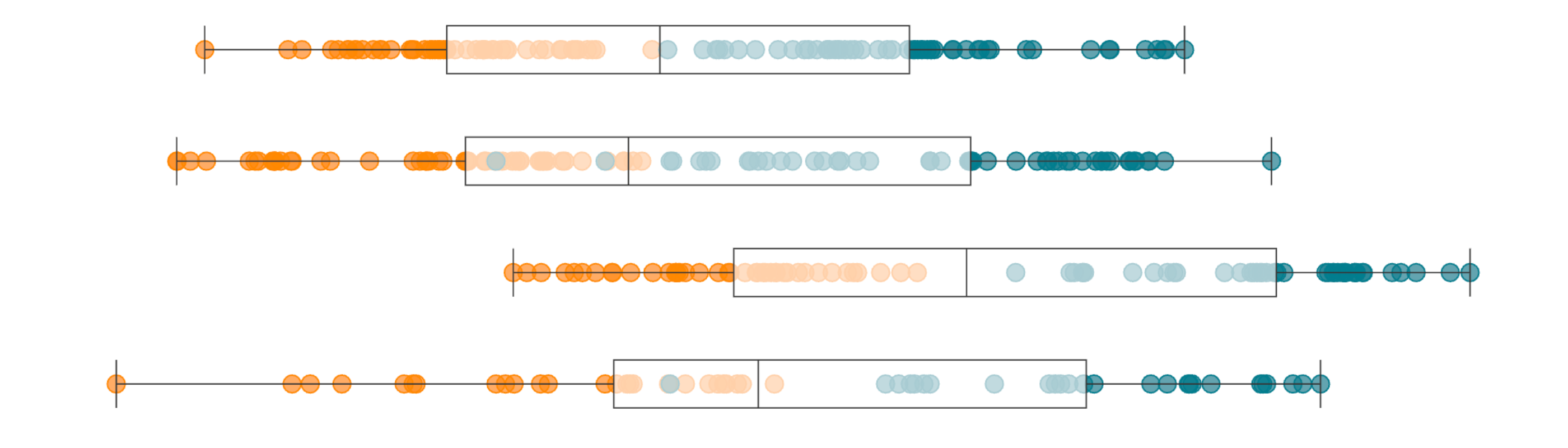
Box plots: what are they and how to build one without codingUse our box and whisker plot template to better explore the distribution of your dataPosted on 22 June 2018 by Anna Powell-Smith
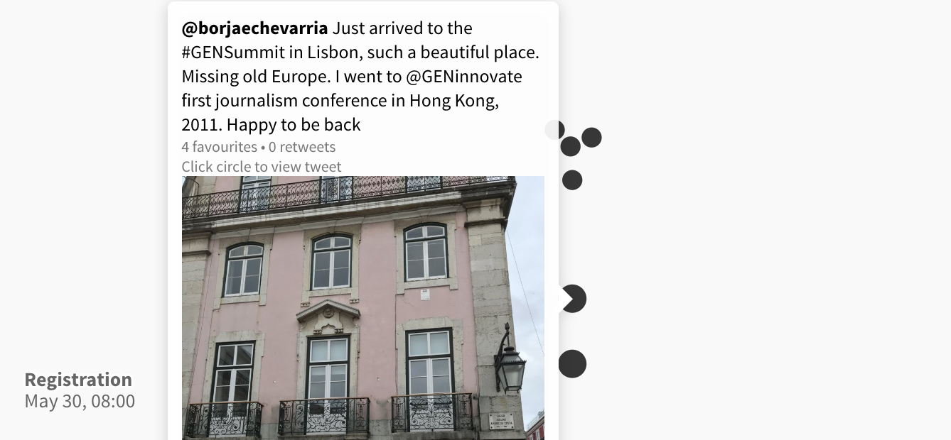
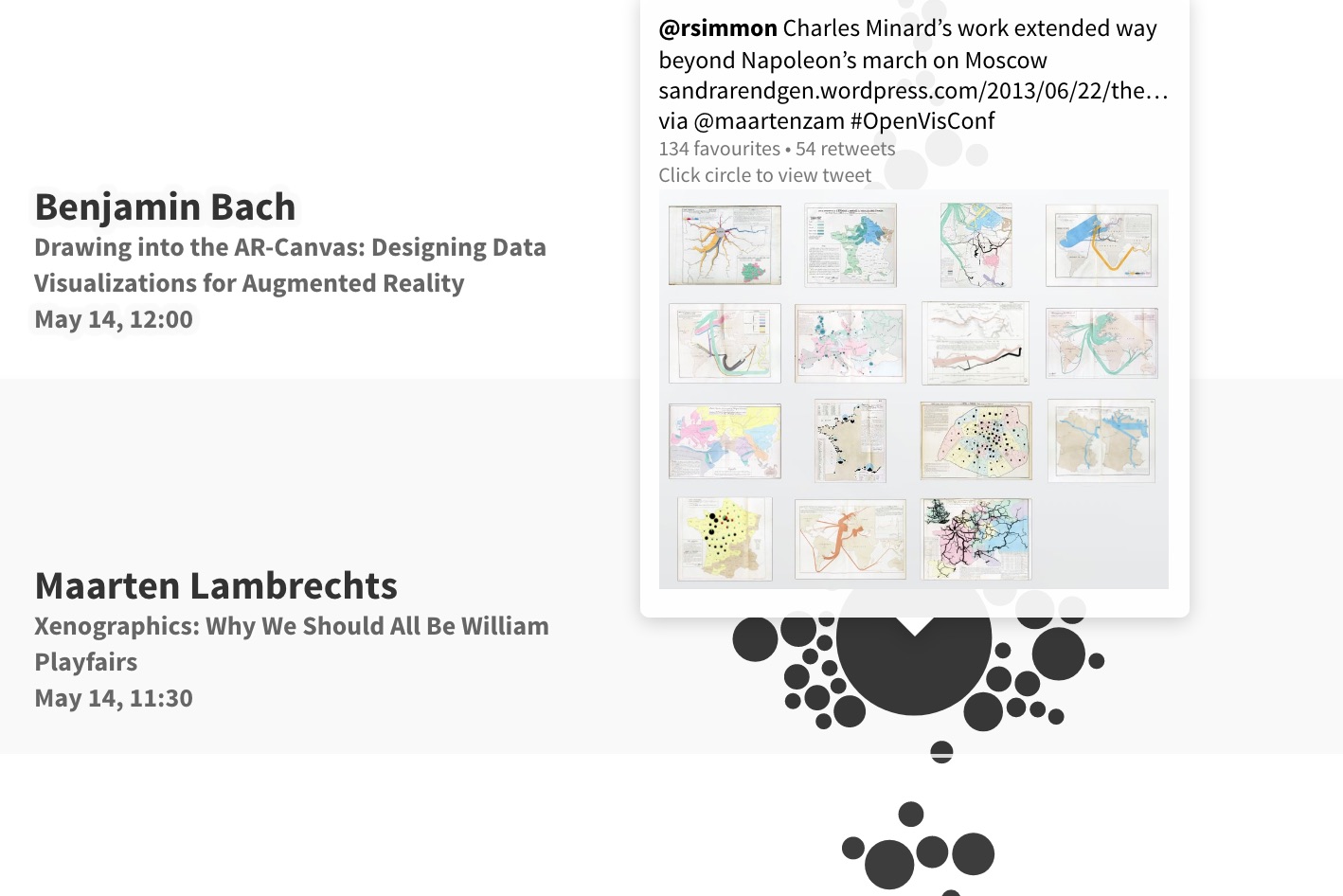
GEN Summit 2018 on TwitterLive tweet monitor from GEN Summit in LisbonPosted on 30 May 2018 by Daan Louter
Now you can create and publish Vega-Lite charts in FlourishOur new template makes it easy to publish charts using Vega-Lite configurationPosted on 29 May 2018 by Anna Powell-Smith
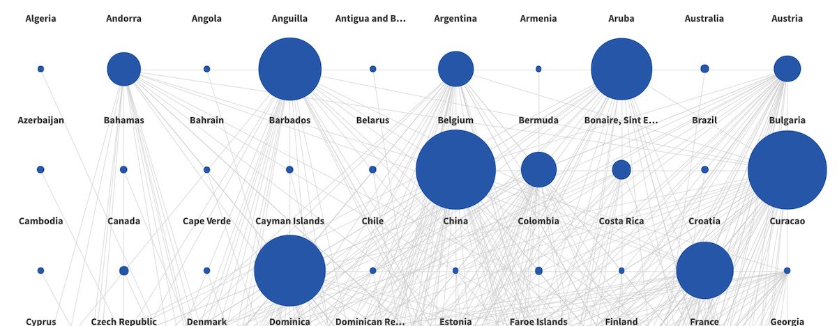
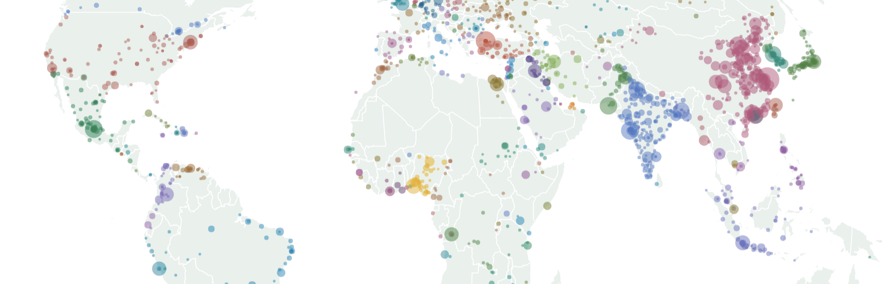
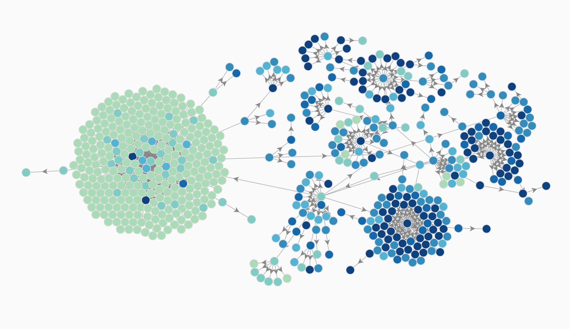
Visualizing the extraordinarily complex structure of modern corporationsExploring the ownership structures of UK companies with Flourish’s new network graph visualizationsPosted on 24 April 2018 by Anna Powell-Smith
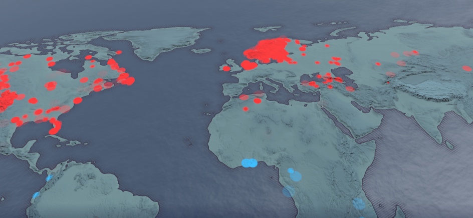
Finding climate change buried in 500 million data pointsThis interactive Flourish map, made by trawling a huge database of daily weather records, puts 2018’s freezing winter in the context of global warmingPosted on 27 February 2018 by Duncan Clark
Public launch! 🚀🚀🚀From today anyone can sign up and start producing visualizations and storiesPosted on 01 February 2018
Flourish wins GEN Startups for NewsMedia-sector prize awarded at the GEN Summit 2017 in ViennaPosted on 27 June 2017 by Duncan Clark
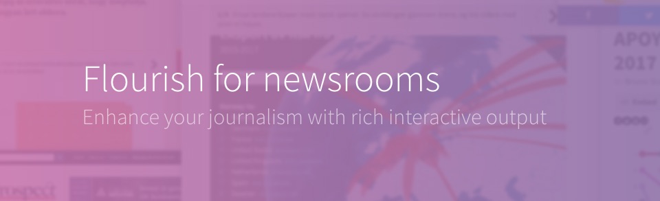
Flourish + Google = free for newsrooms!We’re partnering with Google News Lab to provide free team accounts to journalistsPosted on 10 April 2017
Announcing our fundraise and developer launchDevelopers can now make their own Flourish templatesPosted on 28 March 2017
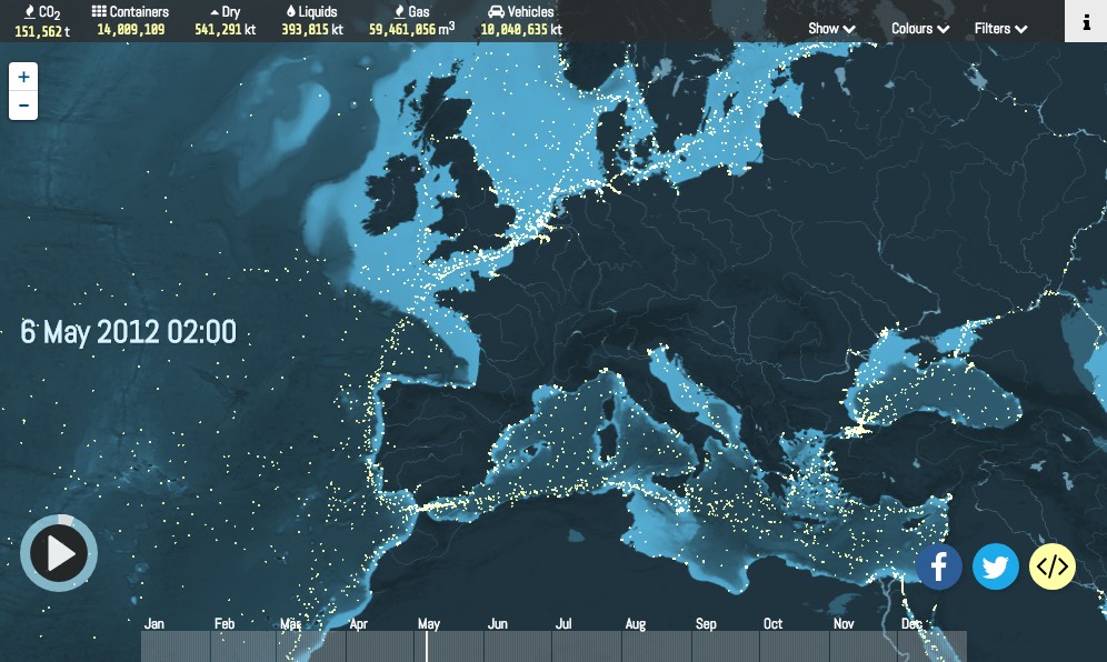
Shipmap wins at IIB AwardsKiln project wins Gold at the 2016 Information Is Beautiful AwardsPosted on 03 November 2016 by Duncan Clark
Flourish press beginsThe word is beginning to get out there 🗣Posted on 30 September 2016 by Duncan Clark
Flourish at Founders ForumFlourish one of the “rising stars” at London tech conferencePosted on 16 June 2016 by Duncan Clark
Data Journalism UnconferenceFlourish prototype gets first public outing at NYC data journalism eventPosted on 19 May 2016 by Duncan Clark
Hello world!Announcing Flourish, a new tool for data visualization and other interactive contentPosted on 18 May 2016 by Duncan Clark