How to visualize Google Trends data
Uncovering insights – how to make the most of Google Trends with Flourish
In a world where people search the internet dozens of times a day, Google Trends is an amazingly rich data source that gives unique insights into what people all over the world are thinking about. By tracking the popularity of search terms over time, it offers amazing insights into what people are curious about – and how they’re responding to unfolding events.
Whether you’re a journalist seeking to compare the popularity of a political candidate across the country, a researcher identifying emerging trends, or a marketer trying to optimize campaigns, understanding how to use, interpret, and visualize Google Trends data can be a game-changer. In this blog post, we’ll explore how you can leverage Google Trends data to gain insights into what people are searching for and how they’re reacting to different events.
What is Google Trends data?
Google Trends offers a sample of anonymized, categorized, and aggregated Google search data that unlocks insights into human curiosity and behavior. It is a real-time dataset of mammoth proportions and enables users to investigate insights and opinions around events as they happen.
With Google Trends, users can easily search for a specific topic or set of search terms and uncover search interest over time, popular locations for the search, and related searches. The dataset is dynamic and can be filtered by real-time and historic searches. Google Trends normalizes search data to make comparisons between terms easier. Search results are normalized to the time and location of a query by the following process: Each data point is divided by the total searches of the geography and time range it represents to compare relative popularity. The indexed data is presented on a scale of 0 to 100, with 100 representing the highest search interest for the selected time and location.
Google Trends data for storytelling
As a data storyteller, you need powerful tools to uncover insights that captivate your audience.
By tracking the popularity of search terms over time and across geographic locations, Google Trends provides a window into how people think and react to different events and issues. And by normalizing search volumes to account for differences in population and search behavior, it enables you to compare the relative interest in different topics, regardless of their absolute numbers.
But Google Trends is not just a source of data; it’s also a powerful storytelling tool in its own right. The trends it reveals can be used to contextualize other datasets, such as demographic data from the census. By overlaying trends data with demographic data, you can paint a more complete picture of how different groups of people are affected by different issues and events.
You can also compare multiple search terms, to see how they relate to each other or to external events. This can be useful for market research, for example to compare different brands’ popularity over time.
Getting started
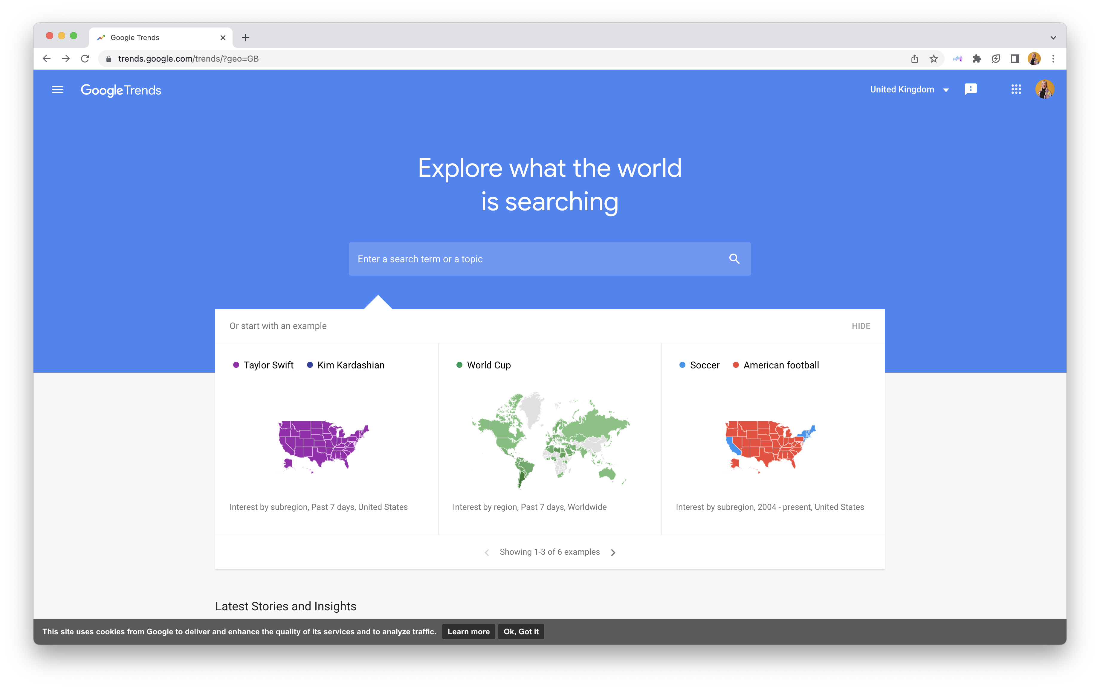
- Choose your search term or topic: Start by navigating to Google Trends. Here you can choose a search term or topic that you want to explore. Google Trends uses language-agnostic topics that account for synonyms and misspellings, making them more reliable than search terms.
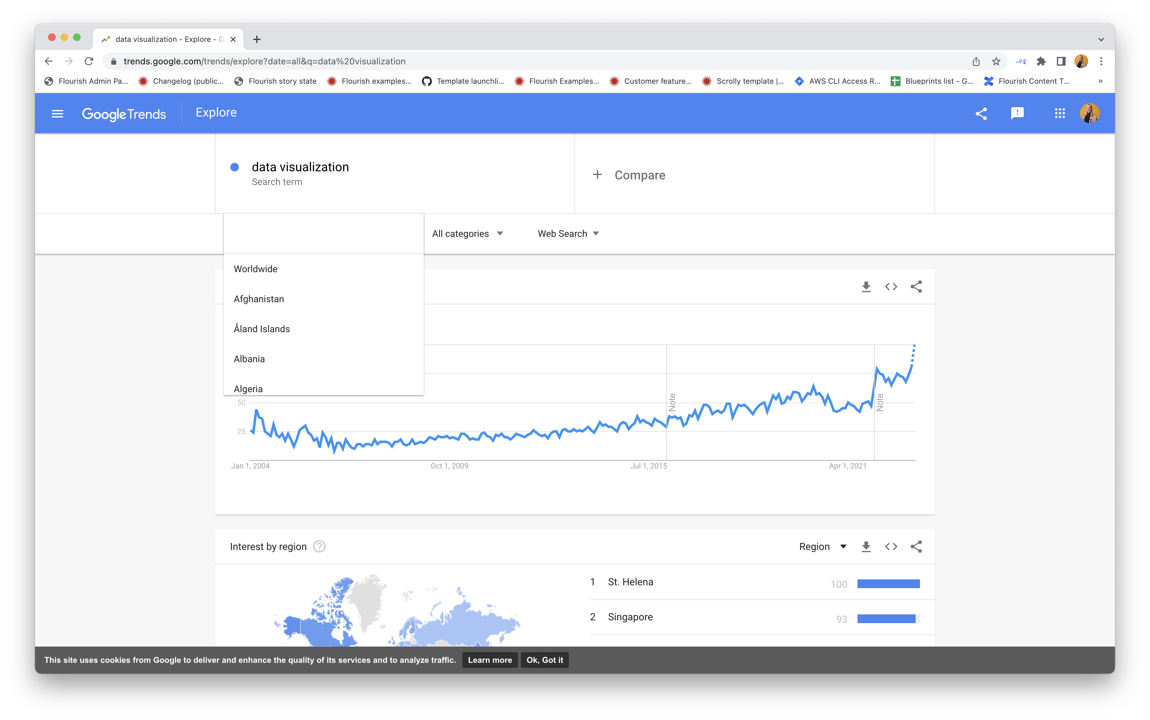
- Set the timeframe and location: Once you have chosen your topic, select a timeframe. You can choose between Realtime (past 7 days) and Longterm (data older than the past 7 days). Google Trends data goes back to 2004, so you can analyze trends over a long period of time. You can also select a location for your search, whether it’s worldwide, a specific country, region, or city (though city data may be limited).
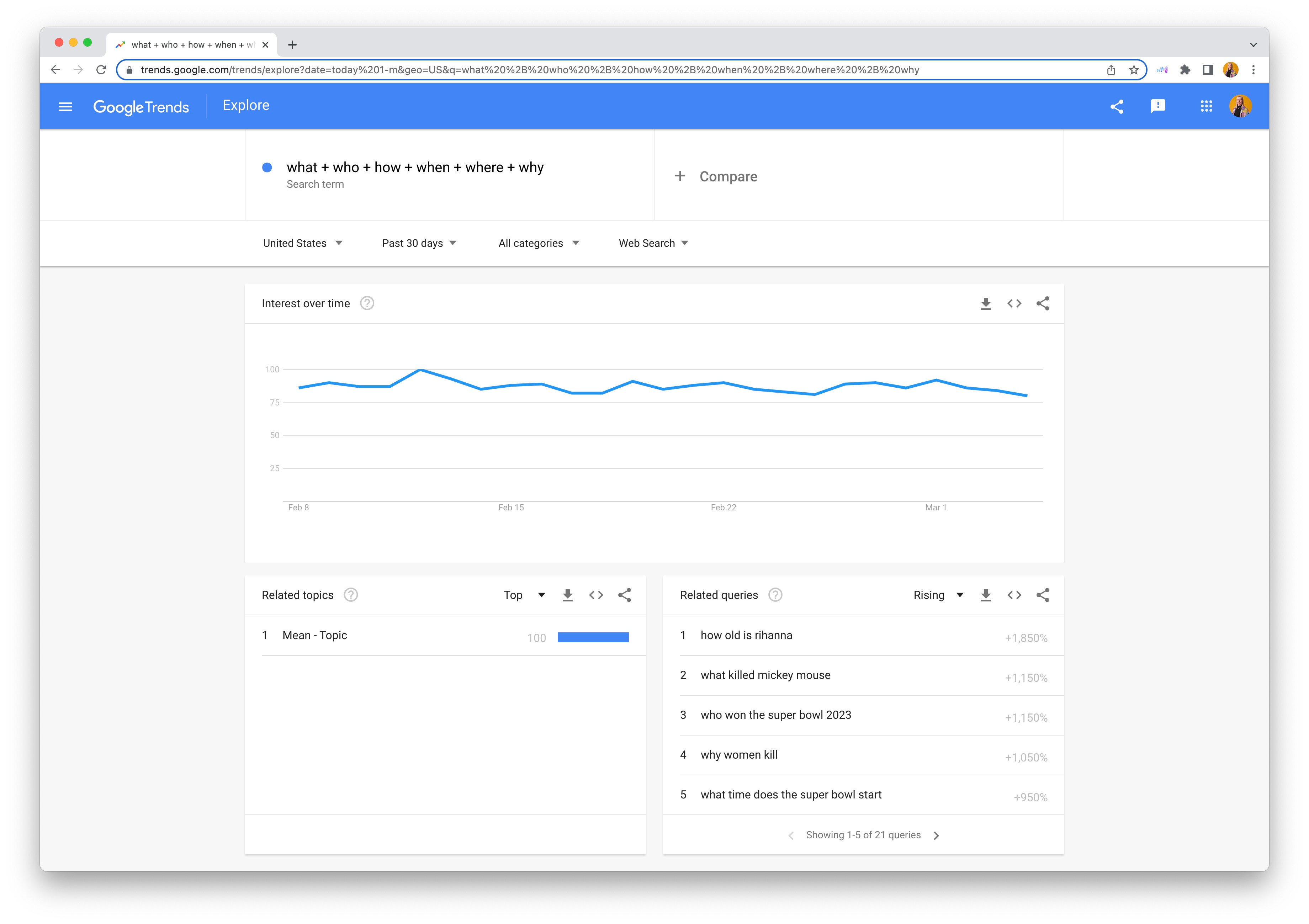
- Narrow down your search further: You can also type in question words to see what people are searching for and choose from different categories to narrow down the results. In the below example, we used search terms to see what people in the US have been searching for in the last month.
- Explore the output: After selecting your search term, timeframe, and location, you will see the data grouped into four sections: Interest over time, Compared breakdown by region, Related queries, and Interest by region.
Bringing Google Trends data into Flourish
- Download the data: Start by downloading the data from Google Trends and viewing it in Excel or Google Sheets. Here, you can remove the top section containing metadata.
- Upload your data into your visualization: Choose a template to visualize your data and upload your data into Flourish. Learn more about the different upload options in our help doc.
- If applicable, reformat your data: Choose a chart type from our template chooser and take a look at the default data. This is the structure your data will need to be in to visualize it. Keep in mind that your data structure will depend on the chart type you choose: If you’re looking to visualize your data in a line chart, you can keep the structure output from Google Trends, but if you’re looking to create a heatmap or a scatter plot, you’ll need to transform it into long-format data by unpivoting it. You can learn more about this in our help doc.
Some visualization ideas
- Analyze interest over time in a line chart or a heatmap: The interest over time section, which visualizes how search interest has changed over time, can be great to spot spikes and trends over time.
- Compare topics or terms: You can also compare different search terms or topics. You can select up to five topics on the Google Trends tool to compare and visualize the output as a line chart race, racing bars, a line chart, and more. This is useful for comparing public opinion topics over time.
- Look at related queries in word clouds or bubble charts: The related queries section, which is split between Top searches and Rising or trending searches, is great to see what people are searching for and find potential new topics to explore. Top searches are the most-performed searches in the time-range, geography, and language selected, while Rising or trending searches are those which have seen the largest increase in search interest. You might want to visualize these in a word cloud or a bubble chart to highlight clusters and related topics.
- Analyze location data in a map: Finally, explore the Interest by region section, which allows you to compare topics within and by location. This can reveal interesting geographic trends like which type of natural disaster is most relevant and searched-for in each country. Use filters to compare multiple locations over time and gain a deeper understanding of regional search trends.
Take a look at our webinar to learn more
To learn more about how you can visualize Google Trends data using Flourish for your own projects, watch our webinar below.